
57% of support teams already use AI in some part of support, but that number hides the bigger problem: most of them still can't tell you which issue is actually driving churn risk or effort spikes across the customer base. You felt this recently if you sat in a product or CX review, someone pointed at a chart, and nobody could prove what was behind it.
Key Takeaways:
- AI-generated insights from customer conversations only matter if you can trace them back to real tickets and quotes.
- Sampling breaks fast once you cross a few hundred tickets a month. At 1,000 tickets, even a 10% review gives you a partial story.
- The real job is not scoring tickets. It's finding drivers, affected segments, and fix priority.
- A simple decision rule works: if a metric can't link back to source conversations, don't use it to set roadmap priority.
- You don't need a new helpdesk to get better insight. You need an intelligence layer on top of the one you already have.
AI-generated insights from customer conversations sound smart in a deck. In practice, they're usually thin. It's usually a sentiment trend, a word cloud, maybe a sampled set of comments, and then a room full of people arguing about what it means.
Same thing with support dashboards. They look clean. They feel quantitative. But clean charts built on sampled tickets or weak tags still give you false certainty. If you want a better way to see what's breaking without ripping out your helpdesk, Learn More.
Why AI-generated insights from customer data usually fail
AI-generated insights from customer data usually fail because the insight layer sits too far from the raw conversations. You get a number, but not the reason. You get a trend, but not the affected segment. You get a red flag, but not enough evidence to make a confident product or CX call.

At 8:14 AM on a Tuesday, a support ops manager is in Zendesk, a PM is in Looker, and the CX lead is scrolling through a Slack thread from leadership asking why churn-risk tickets spiked 18% this month. The ops manager exports 40 tickets, skims them for an hour, and pastes three quotes into a deck. Now the room is stuck on the wrong question: not "what changed," but "do we trust these examples at all?" That's what bad ai-generated insights from customer conversations do. They turn a decision meeting into a debate club.
The old metric stack breaks after 500 tickets a month
500 tickets a month is a useful threshold. Below that, a strong operator can still brute-force some manual review and stay roughly close to the truth. Above that, the review habit starts to fail fast because the time cost compounds and the blind spots get bigger.
Let's pretend a manager reviews 10% of 1,000 monthly tickets and spends 3 minutes per ticket. That's 300 minutes, or 5 hours, for a partial read. Make it 2,500 tickets and you're at 12.5 hours for a sample that still misses edge cases, quieter signals, and segment-specific issues. According to Zendesk's customer service benchmark work, support volume and channel complexity keep rising, which makes sample-based review even less reliable over time Zendesk Customer Experience Trends.
Score-only dashboards create fake confidence
A score is a lagging signal. That's the first rule. If all you know is sentiment dropped or effort rose, you still don't know what to fix. That's why score-watching became such a comfortable habit. It gives leadership something easy to track, even when it doesn't explain the actual problem.
There's a case to be made for CSAT and NPS as directional measures. Fair enough. They help you see movement over time. But they rarely answer the operational question that matters in a real meeting: what broke, for whom, and how widespread is it? If your dashboard can't answer those three things in under 10 minutes, the dashboard isn't helping. It's delaying the decision.
The missing layer is evidence, not more AI
The common belief is that teams need a smarter model. Usually they don't. They need an evidence standard. If the output can't survive one skeptical follow-up question from product, finance, or leadership, it isn't insight yet.
A simple framework helps here. Call it the Proof Chain. Every insight needs four links:
- A measurable pattern
- A clear driver
- A defined segment
- A ticket-level trail back to source evidence
Break one link, and the whole thing gets weak. That's why so many ai-generated insights from customer conversations die in the room. They sound plausible, but plausible isn't enough. The next question is obvious: if scores aren't enough, what should replace them?
The real shift is from scores to drivers and fix priority
The real shift is from looking at conversation scores to understanding conversation drivers. Scores tell you that something moved. Drivers tell you why it moved. Fix priority comes from combining the driver with impact, segment, and frequency.
This isn't theoretical. Product teams already know how to prioritize bugs. CX leaders already know how to triage escalations. The gap is that support conversation data usually arrives as free text, scattered tags, and exports that require manual cleanup before anyone can use it. According to McKinsey's work on customer care and analytics, organizations that turn service interactions into structured operational feedback improve decision speed because teams can act on cause, not just symptom McKinsey on customer care analytics.
Use the 3D Priority Model
You can rank ai-generated insights from customer conversations with a simple model: Driver, Damage, Distribution. I call it the 3D Priority Model.
Driver asks what category is actually causing the problem. Damage asks how severe the issue is, using signals like negative sentiment, churn risk, or customer effort. Distribution asks how broadly the issue spreads across segments, products, regions, or customer tiers.
If Driver is fuzzy, stop and clean up the taxonomy. If Damage is low but Distribution is high, you may have a broad nuisance issue. If Damage is high and Distribution is narrow, you may have a high-risk cohort problem. If all three are high, that jumps to the top of the list. That's the kind of rule an exec team can actually use.
Why free-text becomes useless without normalization
Free-text feedback and usable customer insight are opposites until you normalize the language. A support inbox without normalization works like an unscanned warehouse receiving dock: boxes keep arriving, labels are inconsistent, and the urgent shipment is buried behind six harmless ones. Everyone knows the inventory is technically there. Nobody can pick it fast enough when the order matters.
Normalization fixes that. Raw signals still matter because they catch emerging issues. But if you want reporting that survives executive review, you need a mapped layer. In practice, that means granular themes rolling up into stable categories and broader drivers. Otherwise, your ai-generated insights from customer tickets stay interesting but not usable.
If you can't segment it, you can't prioritize it
What if onboarding complaints are rising, but only for EMEA self-serve accounts created in the last 30 days? Now you have a decision. Without that cut, you just have anxiety with a trendline attached.
Say negative sentiment is rising around onboarding. That's not enough. Is it happening in self-serve accounts or enterprise onboardings? New customers or long-time customers? One region or all of them? If you can't cut the data by segment, the roadmap discussion turns abstract fast. And abstract conversations waste weeks.
We're not 100% sure why some teams still accept segment-blind reporting as normal, but the legacy workflow trained people to live with it. Export, pivot, argue, repeat. That loop is the problem. So how do you turn ai-generated insights from customer conversations into something operational every week?
How to turn AI-generated insights from customer conversations into action
AI-generated insights from customer conversations become useful when you design for action first, not analysis theater. That means defining the question, structuring the signals, validating the evidence, and then ranking fixes with a repeatable rule. Not fancy. Just disciplined.
A lot of teams skip straight to charts. Bad move. The chart should be the end of the process, not the start. If you want the signal to hold up, use a four-part operating loop: classify, group, validate, decide. That's the loop that turns support data into something product and CX can both use.
Start with a diagnostic before you automate anything
Before you build dashboards or review new tools, ask five questions:
- Can you explain a negative trend with ticket-level evidence in under 15 minutes?
- Are your support tags consistent across agents and months?
- Can you isolate one issue by customer segment without exporting data?
- Can leadership click from a chart to the exact conversations behind it?
- Are you reviewing 100% of conversations or a sample?
If you answered no to 3 or more, you're still in the anecdote stage. That's the threshold. Below 2 no's, you probably have enough structure to improve with process changes. At 3 or more, you need a better intelligence layer, not another reporting meeting.
Build a two-layer taxonomy, not a giant tag mess
Around 50 recurring issue types, a flat tag system starts lying to you. Not maliciously. Structurally. Synonyms pile up, agents improvise, and reporting splits one issue into five labels.
Layer one is granular. These are the messy, emerging, highly specific issue descriptions coming out of customer conversations. Layer two is stable. These are the categories leadership can track month to month. Add one more level above that for broad drivers if you want cross-functional reporting. Same thing with product bug analysis, by the way. Raw notes catch the edge case. Stable categories let you act at scale.
This is also a good place for an honest limitation. More structure can feel slower at first. That's true. You spend time naming things and cleaning the taxonomy. But without that work, reporting quality decays every month. Short-term speed, long-term chaos. Pick one.
Apply the 30-20-10 validation rule
When a trend first appears, don't trust it and don't dismiss it. Test it. That's where the 30-20-10 rule earns its keep.
Use 30 ticket reviews when you're trying to understand whether a driver is real. Use 20 when you're comparing two segments or time periods. Use 10 strong, representative tickets when you need to bring the story into a leadership or product review. If the pattern changes materially when you inspect those sets, don't escalate it yet.
Why these numbers? They force enough contact with real conversations to catch obvious misreads without dragging you back into full manual review. It's the middle ground between blind trust in the chart and old-school ticket archaeology.
Rank fixes with the WIR score
Bold claim: without a scoring rule, prioritization meetings default to whoever tells the sharpest story. That's fine for a ten-person startup. It gets expensive fast in a scaled support org.
WIR stands for Weight, Intensity, Reach.
Weight is issue volume or share of conversations. Intensity is the severity signal, like negative sentiment, effort, or churn risk. Reach is the business spread, meaning how many segments, products, or account tiers it touches. Score each 1 to 5. Any issue scoring 12 or above gets reviewed this cycle. Any issue below 8 waits unless it hits a strategic account or launch blocker.
Not everyone agrees with scorecards like this, and that's valid. Some teams prefer pure judgment from senior operators. In a low-volume, high-context environment, that can work. But once ai-generated insights from customer conversations are feeding multiple stakeholders, a light scoring rule doesn't remove judgment. It keeps it honest.
Once you've got classification, grouping, validation, and prioritization in place, the obvious question becomes who or what makes that workable every week. That's where the tool layer finally matters. If you want to see how that model works in practice, See how Revelir AI works.
How Revelir AI makes ad hoc support analysis actually usable
Revelir AI makes ad hoc support analysis usable by turning support conversations into structured fields you can filter, group, inspect, and trace back to source tickets. It sits on top of your current support data, so you don't need a new helpdesk to get better insight. That's the contrarian part, and honestly, it's the part most teams miss at first.
Data Explorer turns scattered tickets into a working analysis surface
Data Explorer is the center of it. It's a pivot-table-like workspace where teams can filter, group, sort, and inspect every ticket with columns for sentiment, churn risk, effort, tags, drivers, and custom metrics. That matters because the core problem with ai-generated insights from customer conversations isn't just classification. It's navigation. You need to move through the data fast enough to answer real questions while people are still in the room.
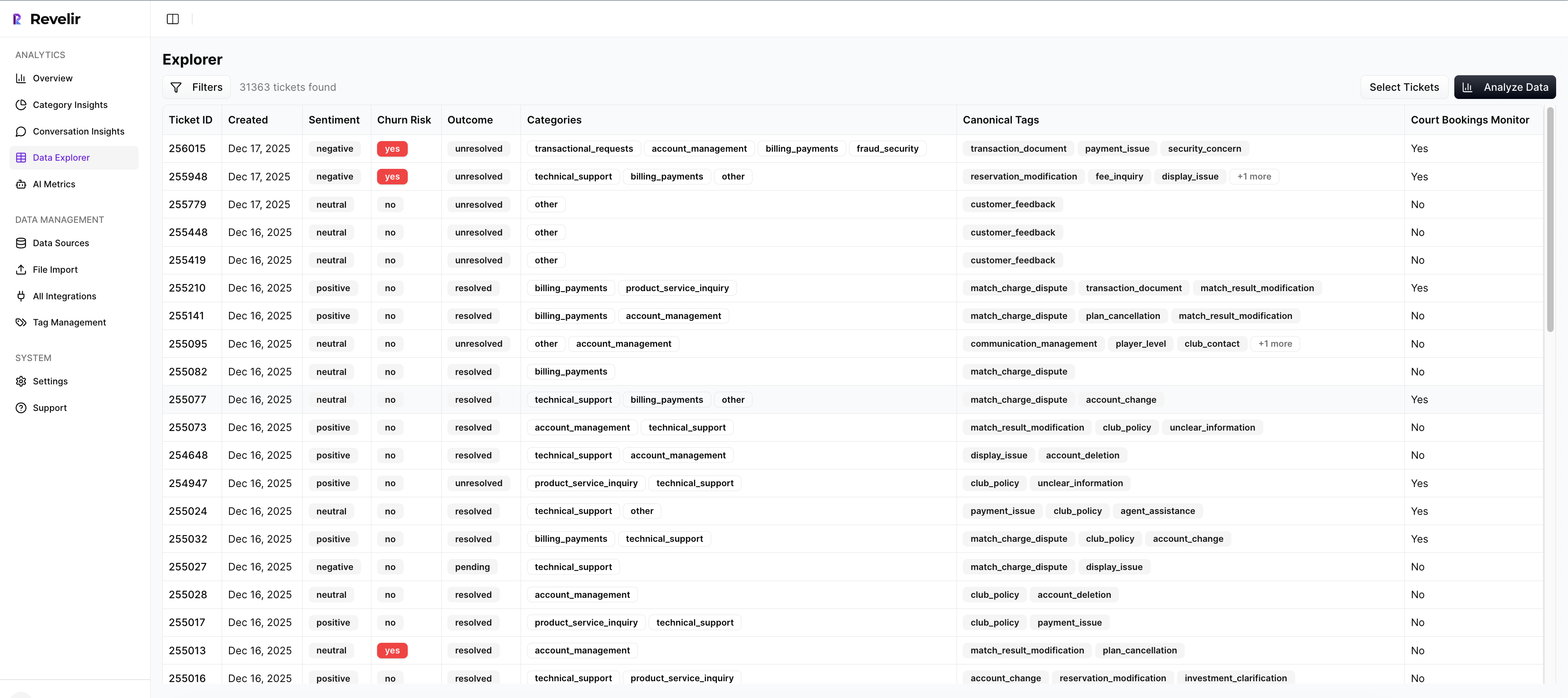
Instead of exporting rows into a spreadsheet, a team can work from one analysis surface and cut the dataset by the segment or issue they care about. If billing complaints show high effort in one customer cohort, you can isolate that pattern quickly and inspect the underlying tickets. That's a different operating speed from the old export-and-pivot loop.
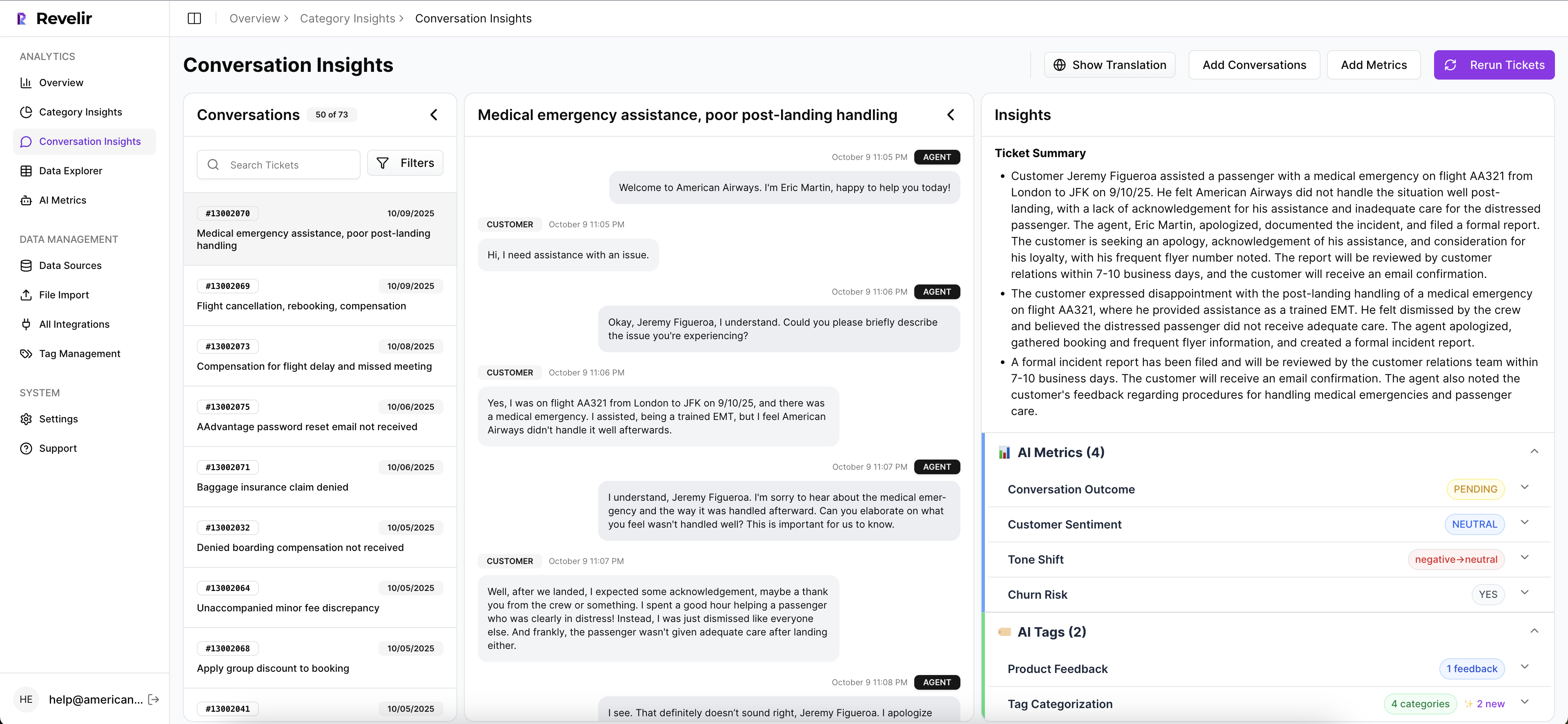
Analyze Data and Drivers make the "why" visible
Analyze Data handles grouped analysis by dimensions like Driver, Canonical Tag, or Raw Tag, and summarizes metrics such as sentiment, churn risk, customer effort, and custom metrics. That's where the "what broke?" question becomes "why did it break?" in a useful way.
Drivers give leadership-friendly groupings like Billing, Onboarding, Account Access, or Performance. The Hybrid Tagging System does the messy but important work underneath that. Raw Tags catch emerging patterns. Canonical Tags create stable reporting categories. Revelir AI also supports Custom AI Metrics, so a team can define business-specific classifiers in its own language instead of relying on one-size-fits-all labels. That makes prioritization sharper because you're not trapped inside generic sentiment buckets.
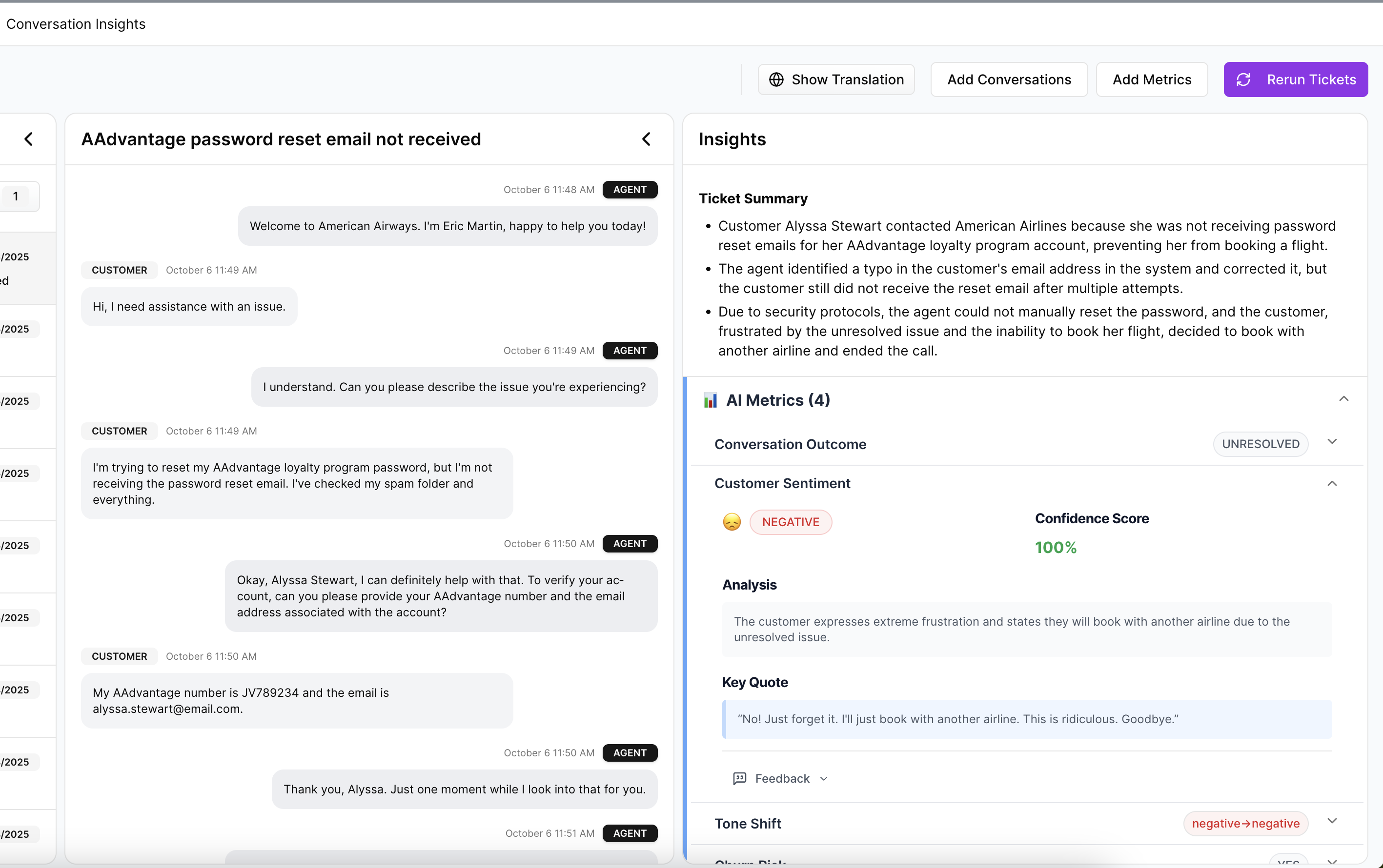
Traceability keeps the insight from falling apart in the meeting
This one matters more than most vendors admit. Evidence-Backed Traceability links aggregate numbers back to the original conversations and quotes. Conversation Insights gives ticket-level drill-downs with transcripts, AI-generated summaries, tags, drivers, and metrics so teams can validate patterns before they overreact.
Revelir AI also processes 100% of ingested tickets through Zendesk Integration or CSV Ingestion, which cuts the blind spots that come with sampling. And if the data needs to move elsewhere after analysis, API Export makes that possible. So when a spike in churn risk shows up in one segment, you're not stuck defending a black-box chart. You can walk the room from grouped metric to actual customer language. That's the difference between an interesting insight and a defensible decision.
If your team wants to stop debating samples and start ranking fixes with evidence, Get started with Revelir AI (Webflow).
Why evidence-backed customer insight wins
AI-generated insights from customer conversations aren't hard to produce anymore. The hard part is producing ones you can trust. That's the whole game.
When the insight is tied to a driver, a segment, and the actual ticket trail, teams move faster because they stop arguing about whether the pattern is real. They can finally argue about what to fix first, which is a much better problem.
Frequently Asked Questions
How do I analyze customer feedback trends over time?
You can analyze customer feedback trends by using Revelir AI's Data Explorer. Start by filtering your dataset to focus on specific time periods or segments. Then, utilize the Analyze Data feature to summarize metrics like sentiment and churn risk. This will help you identify patterns in customer feedback and understand how they evolve over time. By linking these insights back to the original tickets, you can validate your findings and make informed decisions.
What if I need to prioritize multiple customer issues?
To prioritize multiple customer issues, you can use the WIR scoring system within Revelir AI. Score each issue based on Weight (volume of tickets), Intensity (severity of the issue), and Reach (how many segments it affects). This scoring helps you identify which issues need immediate attention. Any issue scoring 12 or above should be reviewed in your next cycle, while those below 8 can wait unless they impact a strategic account.
Can I customize the metrics I track in Revelir AI?
Yes, you can customize the metrics you track in Revelir AI using the Custom AI Metrics feature. This allows you to define specific classifiers that are relevant to your business, such as reasons for churn or upsell opportunities. You can create custom questions and value options, and the results will be stored as columns in your dataset, making it easier to filter and analyze your data according to your unique needs.
How do I ensure all tickets are processed without bias?
Revelir AI ensures all tickets are processed without bias by utilizing its Full-Coverage Processing feature. This means that every ticket ingested—whether from Zendesk or uploaded as a CSV—is analyzed, eliminating the blind spots that come with sampling. By processing 100% of your support conversations, you can gain a comprehensive view of customer issues and avoid missing critical insights that could impact your decision-making.
When should I consider restructuring my tagging system?
You should consider restructuring your tagging system when you notice inconsistencies or when your current flat tag system becomes unwieldy. If you have around 50 recurring issue types, it’s time to implement a two-layer taxonomy. This involves creating granular raw tags for specific issues and stable canonical tags for reporting. This structure helps ensure clarity and improves the quality of your reporting over time.