

Sampling 10% of tickets doesn’t give you 10% of the truth. It gives you a story you can’t defend when the CEO asks, “Show me the actual conversations.”
The importance of full-population insights shows up the moment you have to explain why a metric moved, who it affects, and whether it’s big enough to act on. If your answer depends on a few reviewed tickets, a CSAT dip, and someone saying “we’ve seen this before,” you don’t have a signal. You have a guess.
Key Takeaways:
- Full-population insights matter because sampled support reviews miss quiet but expensive patterns.
- A metric only gets trusted when it can be traced back to the original tickets and quotes.
- Score-only dashboards tell you what changed, not why it changed.
- If you review fewer than 30% of tickets manually, your edge cases are probably driving more decisions than your real trends.
- Custom AI metrics matter when your business needs labels like renewal risk, onboarding confusion, or billing trust, not just positive or negative sentiment.
- The fastest path to better CX decisions is simple: analyze 100% of conversations, group them into usable categories, then validate the pattern in the actual tickets.
Why Full-Population Insights Matter More Than Most CX Dashboards Admit
Full-population insights matter because customer issues rarely spread evenly across a support queue. Small samples hide the exact pockets of churn risk, effort spikes, and repeated friction that leaders actually need to fix.

It’s usually obvious in the meeting. Someone pulls up a dashboard. Sentiment is down. Maybe effort is up. Then the room stalls because nobody can answer the next question, which is the only question that matters: why? That gap is the whole problem.
A support leader at a company handling 1,000 tickets a month might review 100 manually and feel pretty good about coverage. Fair enough. Manual review catches nuance. But even the math works against you. A 10% sample at three minutes per ticket is five hours for a partial view, and that partial view still leaves 900 conversations untouched, which is exactly where the pattern you missed is sitting. Learn More
Same thing with survey scores. They look clean because they collapse mess into one number. Executives like numbers. Product teams like trend lines. But scores are lagging indicators, and worse, they’re compressed indicators. They tell you temperature, not cause. A drop in CSAT can mean onboarding confusion, delayed refunds, broken permissions, or agents dealing with a known product defect for two straight weeks. If you can’t break that apart, you can’t prioritize.
The visible problem is noise, but the hidden problem is false certainty
Most teams think the issue is data overload. Too many tickets. Too many comments. Too much text. I’d argue the deeper issue is false certainty. A sampled review feels like evidence because humans touched it, summarized it, and put it in a deck.
That’s where the Coverage Confidence Rule matters: if fewer than 80% of conversations are included in the analysis, treat every trend as directional, not decision-grade. That threshold sounds strict. It is. But below that point, you’re not seeing enough of the weird stuff, the segmented stuff, or the slow-building stuff that later turns into escalations.
Let’s pretend you sampled 50 tickets from enterprise accounts and found mostly billing issues. Good. Maybe billing is a problem. But what if the unreviewed set shows onboarding friction spiking among mid-market customers after a product change? Now your roadmap discussion gets hijacked by the wrong theme because the sample produced a cleaner narrative than reality.
That’s why the importance of full-population insights isn’t academic. It changes what gets staffed, fixed, escalated, and ignored.
The old playbook breaks right where leadership pressure starts
Manual review has a real strength. It catches nuance. Critics of full automation aren’t wrong to point that out. If you’re only handling 100 tickets a month, and the founder still reads them all, a manual system can work.
But that exception proves the rule. Once volume crosses roughly 500 to 1,000 tickets per month, the process shifts from insight work to triage work. People stop reading for understanding and start scanning for examples that support what they already suspect. Nobody means to do this. It just happens.
What you feel in that moment is familiar too. You’re trying to walk into a product review with confidence, but you know one sharp follow-up question can blow up the whole narrative. “How many customers does this affect?” “Can we see examples?” “Is this a real trend or just a rough week?” If the answers depend on sampling, you’re exposed.
So the next question becomes obvious: if sampled insight creates debate, what does a decision-grade system look like?
The Real Problem Isn’t Ticket Volume, It’s Missing Decision-Grade Evidence
The real problem isn’t that support data is unstructured. It’s that most teams never convert that mess into evidence they can defend across functions.
You can see this in how teams talk. Support says customers are frustrated. Product asks which workflow. Finance asks how large the issue is. Ops asks whether it’s increasing. Everyone’s asking for proof in a different format, and the underlying data can’t answer cleanly.
Scores measure temperature, not mechanism
A score is useful, but only up to a point. CSAT, NPS, and basic sentiment all compress a messy conversation into a simple output. That simplicity is the appeal. It’s also the limit.
The Mechanism Gap test is simple: if a metric can’t answer both what happened and why it happened, it’s an alert, not an insight. That distinction matters. Alerts tell you where to look. Insights tell you what to do next.
A basic sentiment trend might show more negative conversations in the last 30 days. Fine. But was that driven by refunds, login failures, shipping delays, plan confusion, or one high-volume bug? Without drivers, tags, and ticket-level proof, the score just sends the room into interpretation mode. And interpretation mode is where bad prioritization gets made.
I’ve seen this pattern a lot. The team spends 20 minutes debating what the score means, then five minutes making the actual decision. Backwards.
Manual tagging sounds disciplined until the taxonomy drifts
Manual tagging gives teams a sense of control. There’s a case to be made for it, especially early on, because it forces people to define categories and think clearly about language. That part is useful.
Then reality shows up. One agent tags “billing_bug.” Another tags “invoice_issue.” Someone else stops tagging entirely during a spike week. A manager merges categories at quarter end. Six weeks later, you’ve got reporting that looks tidy on paper and shaky everywhere else.
That drift is more than a data hygiene issue. It changes the story. If taxonomy changes faster than reporting logic, quarter-over-quarter comparisons turn slippery. You think the product improved. Maybe the labels just changed.
A better rule is the 15% Drift Threshold: if more than 15% of issue labels need reinterpretation each quarter, your taxonomy is unstable enough to distort prioritization. At that point, your dashboard isn’t a reporting tool. It’s a translation problem.
Executive trust rises or falls on traceability
This is the part most teams underestimate. Leadership doesn’t just want a metric. They want to know the metric can survive scrutiny.
A chart without traceability is like an audit without receipts. It might be directionally right. It might even be very right. But the moment someone asks for proof, the confidence drops. You’re left scrambling for screenshots, copied quotes, and one or two tickets that sort of support the point.
That scramble is expensive. Not just in time. In trust.
The Traceability Test is blunt: if every aggregate number can’t be clicked back to source conversations within two steps, it won’t hold up in a contentious meeting. That might sound harsh. Honestly, it’s generous. In high-stakes roadmap reviews, even one unprovable chart can make people question the rest.
If that’s the real failure mode, then fixing it means redesigning how insight gets built in the first place.
What Full-Population Insight Systems Do Differently
Full-population insight systems analyze every conversation, structure the messy parts into usable fields, and keep every summary tied to the original evidence. That’s how they turn support data into something product, CX, and leadership can actually use.
Nobody's checking support transcripts because they love transcripts. They’re checking because the business needs answers that hold up. So the new model has to do two jobs at once: scale the analysis and preserve the evidence.
Start with coverage, not anecdotes
At 100% coverage, you stop asking whether a pattern is representative and start asking whether it matters enough to act on. That sounds subtle. It isn’t. It changes the whole conversation.
A practical diagnostic helps here:
- Are you analyzing every ticket or just reviewed subsets?
- Can you break trends down by segment, issue type, and time period?
- Can you validate any spike with underlying ticket examples in under five minutes?
- Can product and CX teams use the same evidence source?
- Can you explain why a metric moved without reading fresh tickets manually?
If you answered no to three or more, you don’t have a decision system. You have a reporting ritual.
That’s why the first design rule is Coverage First: if the queue is large enough that humans can’t read all of it weekly, the system has to process all of it automatically. Otherwise your review cadence becomes a bottleneck and your insight quality drops exactly when volume goes up.
Turn free text into business language
This is where a lot of tools fall apart. They can classify sentiment, maybe spot some broad topics, and that’s about it. Useful. But thin.
Real teams need Business Language Fit. That’s the framework I’d use. If the metric labels don’t match how your company makes decisions, adoption stalls. Product wants “activation blocker.” CX wants “high-effort billing contacts.” Retention wants “renewal risk.” Generic labels rarely survive that handoff.
So instead of stopping at a basic positive or negative read, the better model creates structured fields the business actually understands. Drivers answer the high-level why. Tags capture specific patterns. Custom metrics let teams classify the questions they actually care about.
There’s a good analogy here. A raw support queue is like a warehouse with every item dumped on the floor. You do technically have inventory. You just can’t run the business from it. Structure is the shelving system. Traceability is the barcode. Without both, you’re still guessing in a crowded room.
Keep the proof attached to the metric
A number gets stronger when it stays connected to the ticket, not when it gets abstracted away from it. This sounds obvious, but most reporting systems do the opposite. They summarize first, then make you go hunting for examples later.
The better rule is Quote-Linked Insight: never present a pattern to leadership without both the aggregate signal and three source conversations that validate it. If the pattern is real, those three should be easy to pull. If they’re hard to find, the signal probably isn’t stable enough yet.
Picture the before-and-after. Before, a CX lead says, “Negative sentiment around onboarding seems to be rising.” Then the room asks for examples, and someone promises to follow up. After, the lead says, “Onboarding-related negative sentiment rose 14 points among new mid-market accounts, driven mostly by account setup and permissions confusion, and here are the tickets.” Very different meeting.
That shift is what makes the importance of full-population insights so practical. It shortens the distance between finding the issue and getting alignment on what to do.
Use one analysis layer for CX and product
A lot of companies still split this work. Support owns ticket reviews. Product owns research. BI owns dashboards. Everyone brings a partial truth to the same meeting.
That model breaks because support conversations are one of the few places customers tell you, unprompted, what’s broken. Not in survey language. In real language. Messy, annoyed, specific language. That’s gold if you can structure it.
The Shared Evidence Model solves this. One layer. Same source. Same metrics. Different cuts. CX can look at effort and sentiment by driver. Product can isolate feature-related churn risk. Ops can spot spikes by segment or plan type. If teams are pulling from different evidence bases, misalignment is almost guaranteed.
And there’s a threshold here too: when two or more teams maintain separate reporting on the same support issues, resolution time usually rises because debate replaces diagnosis. One source cuts that lag.
Diagnose your maturity before you buy anything
Not every team needs the same setup on day one. That’s a fair point. Some are still stuck in exports and spreadsheets. Others already have dashboards but no traceability. A few have broad AI summaries but can’t customize the metrics to their own business language.
So use this simple spectrum:
- Level 1: Sampled insight. A few tickets, some scores, lots of interpretation.
- Level 2: Structured reporting. Dashboards exist, but the why is still fuzzy.
- Level 3: Full-population insight. Every conversation is processed, grouped, and reviewable.
- Level 4: Decision-grade evidence. Metrics map to business questions and link directly to tickets and quotes.
If you’re at Level 1 or 2, don’t start by adding more dashboard tiles. Start by fixing coverage and traceability. If you’re at Level 3, the next gain usually comes from custom metrics and sharper taxonomy. That’s the path. Not another prettier chart.
Once you see the model, the product question gets simpler: what actually makes this practical without forcing your team into a new workflow?
How Revelir AI Makes Full-Population Insight Usable
Revelir AI makes full-population insight usable by processing 100% of support conversations, turning them into structured fields, and keeping every metric tied to the original ticket and quote. That combination matters because leadership trusts numbers more when the receipts are built in.
If your current process depends on exports, hand-tagging, and stitched-together examples before every review, the cost isn’t just time. It’s credibility. Revelir AI is built to remove that gap without asking you to replace your helpdesk.
Traceable metrics that hold up in real meetings
Revelir AI leans hard into Evidence-Backed Traceability, and that matters more than most vendors admit. Every aggregate number can link back to the source conversations and quotes. So when a product leader asks, “What’s behind this spike?” you’re not scrambling through screenshots or asking the team to pull examples later.
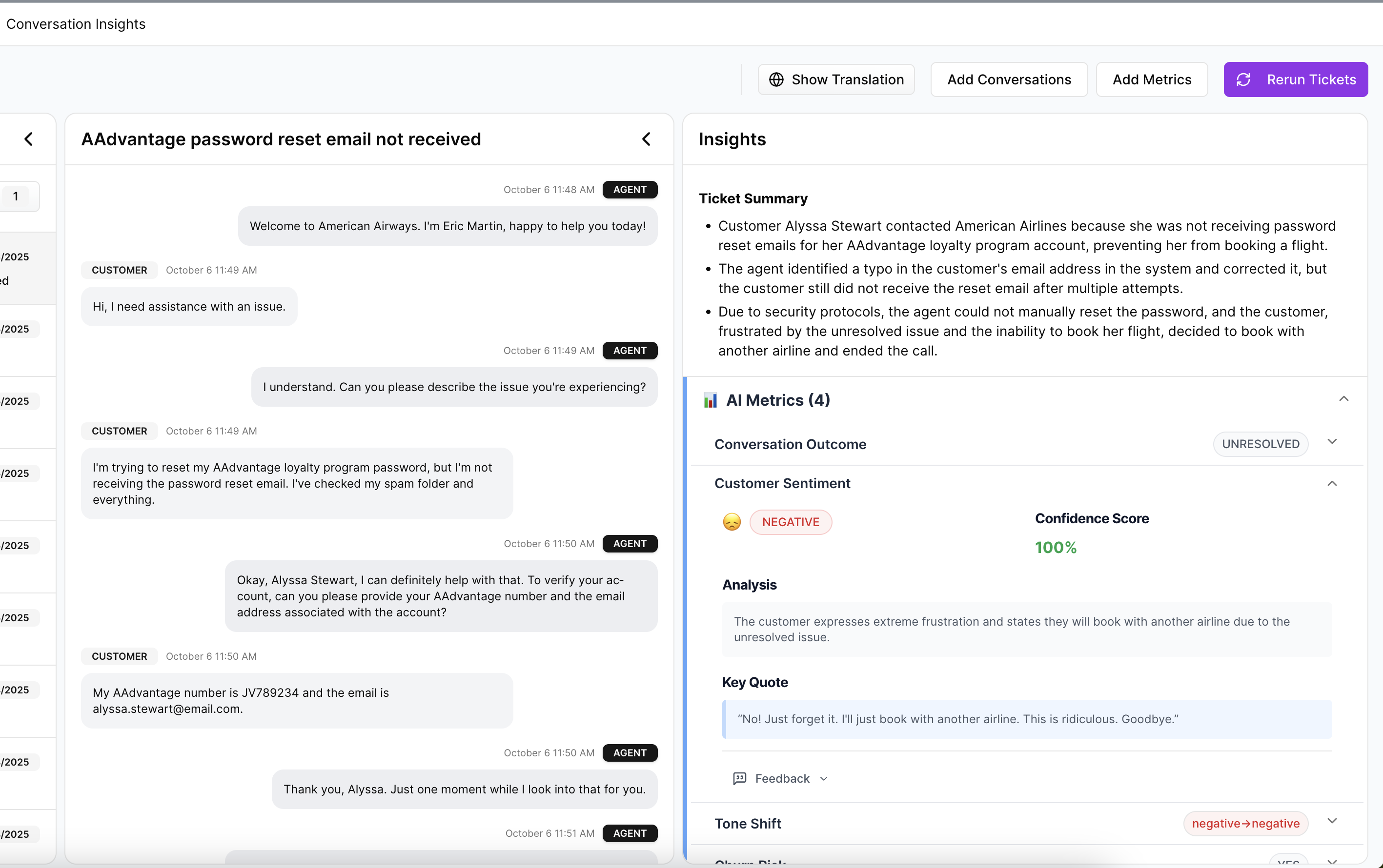
Conversation Insights supports that workflow at the ticket level. You can drill into full transcripts, AI-generated summaries, tags, drivers, and metrics to validate the pattern. That makes the chart more than a chart. It becomes something you can defend in a roadmap review, a board prep session, or a customer escalation recap.
Custom metrics in the language your business already uses
Basic sentiment is fine as a starting point. It just isn’t enough for most serious teams. Revelir AI includes an AI Metrics Engine for core signals like Sentiment, Churn Risk, Customer Effort, and Conversation Outcome. Then it goes further with Custom AI Metrics, so you can define classifiers that match your business language.
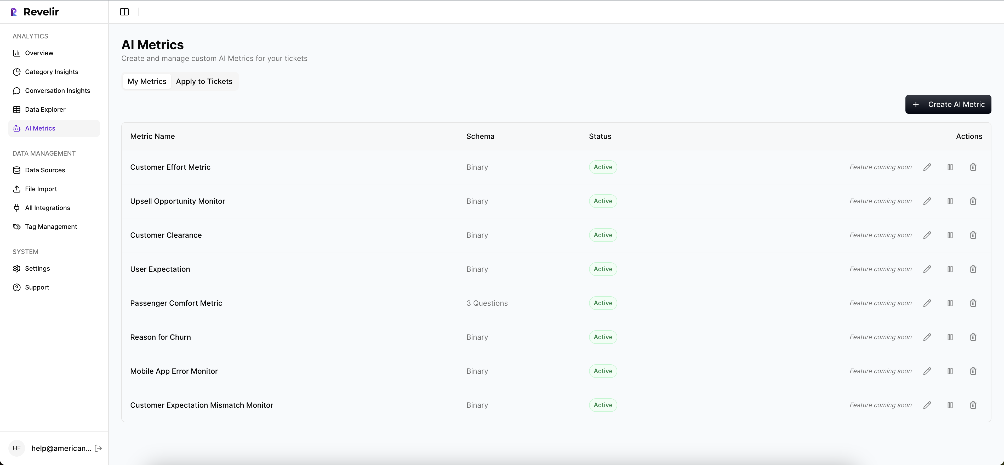
That’s a big deal. Instead of forcing every team into generic labels, you can create metrics around the questions you already ask, things like reason for churn, upsell opportunity, or a domain-specific issue category. Those results become structured columns you can filter and analyze, which means the analysis fits the business instead of the business bending around the tool.
Full coverage, useful structure, no sampling debate
Revelir AI also processes 100% of ingested tickets with Full-Coverage Processing. No sampling. No manual upfront tagging required. If your data lives in Zendesk, the Zendesk Integration brings in historical and ongoing tickets with transcripts and metadata. If you want to start with an export, CSV Ingestion handles that path too.
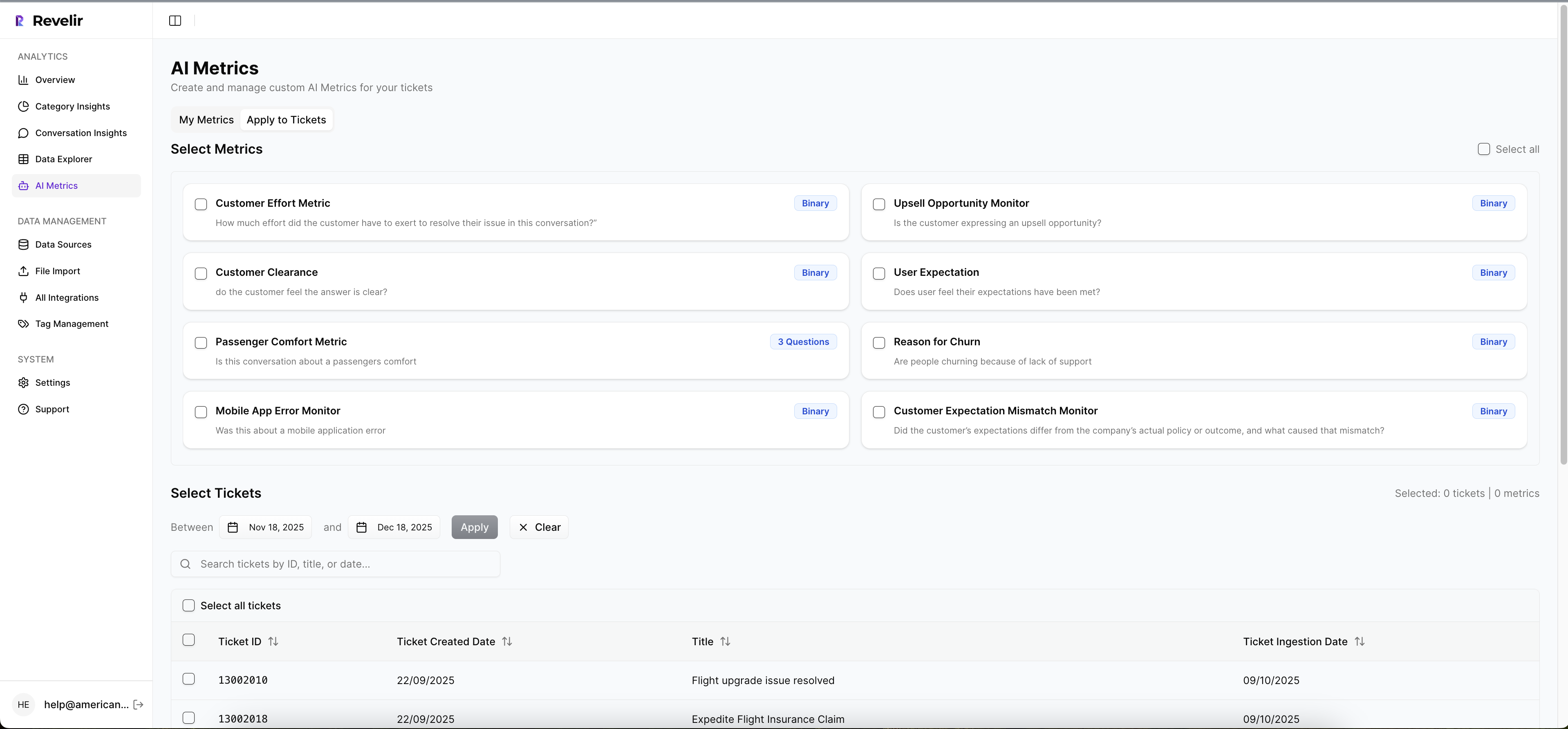
From there, Data Explorer gives teams a pivot-table-like workspace to filter, group, sort, and inspect every ticket across sentiment, churn risk, effort, tags, drivers, and custom metrics. Analyze Data adds grouped summaries by Driver, Canonical Tag, or Raw Tag, with links back to the underlying tickets. That’s the real payoff: the five-hour sampled review gets replaced by a full-population view you can actually interrogate.
If you want to see what that looks like in practice, Get started with Revelir AI (Webflow).
Why the Best CX Decisions Start With Full-Population Evidence
The importance of full-population insights comes down to one thing: trust. Not trust in a dashboard. Trust in the decisions that follow from it.
Sampling had a good run because it was the only practical option for a long time. That’s changed. Now the teams moving faster are the ones working from full coverage, structured metrics, and traceable proof. They spend less time arguing about whether a pattern is real and more time fixing what customers are actually telling them.
If your support data still has to be translated, defended, and reconstructed before leadership can use it, that’s the bottleneck. Fix that first.
Frequently Asked Questions
How do I analyze customer support tickets effectively?
To analyze customer support tickets effectively, start by using Revelir AI's Data Explorer. This tool allows you to filter and group tickets based on various metrics like sentiment, churn risk, and effort. You can drill down into specific tickets to see the full transcripts and AI-generated summaries, which helps in understanding the context behind the metrics. Additionally, consider using the Analyze Data feature to summarize key metrics by dimensions such as driver or tag, making it easier to spot trends and issues.
What if I want to customize metrics for my business?
If you want to customize metrics for your business, you can use Revelir AI's Custom AI Metrics feature. This allows you to define your own classifiers based on the specific questions your business needs to answer, such as reasons for churn or upsell opportunities. Once set up, these custom metrics will be stored as structured columns, making them easily filterable and analyzable within the Data Explorer, ensuring the insights align with your business language and needs.
How do I ensure I'm capturing all relevant support conversations?
To ensure you're capturing all relevant support conversations, utilize Revelir AI's Full-Coverage Processing feature. This processes 100% of ingested tickets without requiring manual tagging upfront, eliminating the risk of missing important insights due to sampling. Additionally, connect Revelir AI to your helpdesk, like Zendesk, for continuous, automated processing of both historical and ongoing tickets. This way, you can analyze every conversation and gain comprehensive insights into customer issues.
Can I link insights back to specific customer tickets?
Yes, you can link insights back to specific customer tickets using Revelir AI's Evidence-Backed Traceability feature. This allows you to trace every aggregate number directly to the source conversations and quotes, providing the proof needed for discussions in meetings. When you analyze data, you can easily access the underlying tickets and their details, ensuring that your insights are not just numbers but are backed by real customer interactions.
When should I consider moving to full-population insights?
You should consider moving to full-population insights when your ticket volume exceeds 500 to 1,000 per month. At this scale, relying on sampled insights can lead to missed patterns and critical issues. Using Revelir AI, which processes 100% of your support conversations, allows you to gain a complete understanding of customer sentiment and issues. This shift helps you make informed decisions based on comprehensive data rather than guesswork, ultimately improving customer experience.