

74% of support teams miss the real pattern because they never look at all the tickets. And if you're still sampling, the importance of full coverage isn't academic, it's the difference between guessing and actually knowing what to fix.
It's usually not that teams lack data. It's that the only data anyone trusts in the meeting is a score, a screenshot, or three tickets somebody cherry-picked five minutes before the call.
Key Takeaways:
- The importance of full coverage shows up when sampled tickets hide churn risk, effort spikes, and segment-specific issues.
- CSAT and NPS can tell you something changed, but they rarely tell you why.
- If you review less than 30% of conversations, assume you're missing a meaningful pattern.
- Drivers and canonical tags turn noisy ticket text into reporting language leaders can act on.
- If a chart can't link back to the ticket and quote behind it, expect pushback in product and exec reviews.
- Full conversation coverage matters most when you need to prioritize fixes across customer segments, not just count ticket volume.
- Learn More
Why the Importance of Full Coverage Gets Missed
Full coverage matters because support conversations are where the root cause lives, not just the symptom. When you analyze every ticket, you stop arguing about whether a sample was representative and start seeing which issues drive negative sentiment, high effort, and churn risk across real customer groups.

A lot of teams still run support analysis like it's 2018. One CX lead reads 25 tickets on Monday. A product manager pulls a few angry conversations before the roadmap meeting. Someone else checks CSAT and says billing "seems worse lately." Nobody's checking the other 975 tickets. That's not insight. That's selective memory with better formatting.
Sampling creates fake confidence
A sample feels efficient because it gives you something fast. Fair enough. If your team handles 500 tickets a month and you manually read 50, that can feel responsible. But once volume hits 2,000 or 10,000, sampling stops being a shortcut and starts becoming a blindfold.
I think this is where most teams go wrong. They treat a partial read as if it reflects the whole system. The "Coverage Confidence Rule" is simple: if less than 80% of conversations are analyzed, you can use the result for hypothesis generation, not prioritization. That sounds strict. It should.
And the risk isn't evenly distributed. Rare but expensive issues almost always hide in the edges. Enterprise churn signals. Multi-touch onboarding friction. Confusing billing language that only affects one region. Those don't always show up in the top 20 tickets someone happened to read. Same thing with subtle effort problems. Customers may not sound furious, but the friction is still there, and it still costs you later.
Score dashboards flatten the story
Scores are useful. They're just incomplete. A drop from 82 to 76 tells you something changed, but it doesn't tell you whether the change came from login failures, delayed refunds, bad handoffs, or a product regression that only hits new accounts.
That's the problem with score-only thinking. It compresses messy reality into one clean number. Executives love the number because it's tidy. Operators hate it because it doesn't tell them what to do next. Both reactions make sense.
Try the "Signal Ladder" test. Level 1 is volume. Level 2 is score. Level 3 is driver. Level 4 is evidence. If your team is stuck at Levels 1 and 2, you'll keep having vague conversations about "customer dissatisfaction" instead of deciding which workflow, feature, or policy to fix first.
The day-to-day cost is more human than people admit
A sampled workflow doesn't just miss patterns. It drains trust. You walk into a review with a slide that says churn risk is up, and the first question is obvious: "Based on what?" Then the room slows down. Then somebody asks for more examples. Then the follow-up project becomes validating the original finding instead of acting on it.
That part wears people out. You know there's a problem. You can hear it in the tickets. But you can't defend it cleanly enough to move a roadmap or change a process. So the issue lingers. And customers keep hitting it.
If sampling creates debate, what does a better system actually look like?
What Full Coverage Actually Changes in Support Analysis
Full coverage changes support analysis by turning free-text conversations into a complete operating signal. Instead of reading random tickets and hoping a pattern appears, you can measure every conversation, group the issues, and see which ones really drive cost, friction, and churn risk.
Let's pretend you're a support leader reviewing last month's volume spike. The old way gives you counts, maybe some CSAT comments, maybe a spreadsheet export with messy tags. The better way gives you all conversations, classified consistently, grouped into drivers, and tied to segment-level outcomes. Big difference.
Start with the coverage threshold that changes behavior
The importance of full coverage gets real once ticket volume passes the point where humans can't read enough conversations to spot patterns reliably. In my view, that threshold is around 300 tickets a month for one person doing ad hoc review, and around 1,000 tickets a month for any team still using spreadsheets plus manual tags.
After that, manual review becomes like trying to understand a movie by watching every ninth scene. You still get a plot. Sort of. But you'll miss the cause-and-effect that actually matters. That's what sampled support analysis does to decision-making.
Use the "300/1000 Rule":
- Under 300 tickets a month, manual review can still work for narrow questions.
- Between 300 and 1,000, partial review becomes risky for prioritization.
- Above 1,000, full coverage isn't a nice-to-have. It's the minimum standard if product and CX are using the data to make decisions.
Not everyone agrees with that threshold, and that's fine. Some teams are more disciplined than others. But once support data is informing roadmap conversations, I'd argue the bar has to move up fast.
Turn free text into drivers, not just tags
Coverage alone isn't enough. If you process 100% of conversations but leave the output as a pile of disconnected labels, you've just created a bigger mess. The work is turning that raw text into a structure leaders can use.
This is where the "Raw to Driver Model" matters. First, you capture granular themes. Then you normalize them into canonical categories. Then you group them into drivers that answer the real question: why are customers upset, working harder, or at risk? If a team skips the middle layer, reporting gets noisy. If they skip the top layer, reporting gets tactical but not strategic.
A good example: raw tags might show "refund_delay," "refund_missing," and "charge_reversal_confusion." Useful, but messy. Canonical tags merge those into a clearer reporting bucket. Drivers then roll them into something leadership can actually discuss, like Billing. That one shift cuts meeting friction because people stop debating terminology and start discussing impact.
Diagnose before you prescribe
Most teams jump to solutions too early. They see negative sentiment, assume product bug, and start escalating. But full coverage lets you diagnose before you prescribe. That's a big deal.
Ask these four questions first:
- Is the issue concentrated in one segment or spread across all customers?
- Does the issue correlate more strongly with effort, churn risk, or sentiment?
- Is the pattern rising week over week or tied to a single event?
- Can you pull 5 direct examples in under 2 minutes to validate the read?
That's the "4Q Diagnostic." If you can't answer at least three of those, you're not ready to prioritize a fix. You're still in anecdote territory. Honestly, this surprised us more than anything else when looking at support analytics workflows. Teams often have lots of dashboards and still can't answer basic prioritization questions cleanly.
Want to see what that kind of analysis looks like in practice? See how Revelir AI works
Prioritize by downside, not by volume
Volume is loud. Impact is what matters. A high-volume issue that creates low effort and low churn risk may deserve less attention than a smaller issue hitting your best customers at the worst point in their journey.
So use the "DEF Score": Driver x Effort x Fallout.
- Driver: Is this issue part of a recurring theme or just noise?
- Effort: Does it create visible customer work, confusion, or repeated contact?
- Fallout: Does it connect to churn risk, bad outcomes, or high-value segments?
You don't need perfect math here. You need a repeatable rule. If an issue scores high on two of the three, move it into active review. If it only has volume and nothing else, watch it, but don't let it hijack the roadmap.
A lot of product teams already do a version of this for bugs and feature requests. Same thing with support conversations. The difference is that full coverage gives you the evidence base to do it with more confidence and less internal debate.
Evidence is what makes the insight stick
A chart without source context rarely survives cross-functional review. Someone always asks for examples. They should. Black-box analytics create skepticism for a reason.
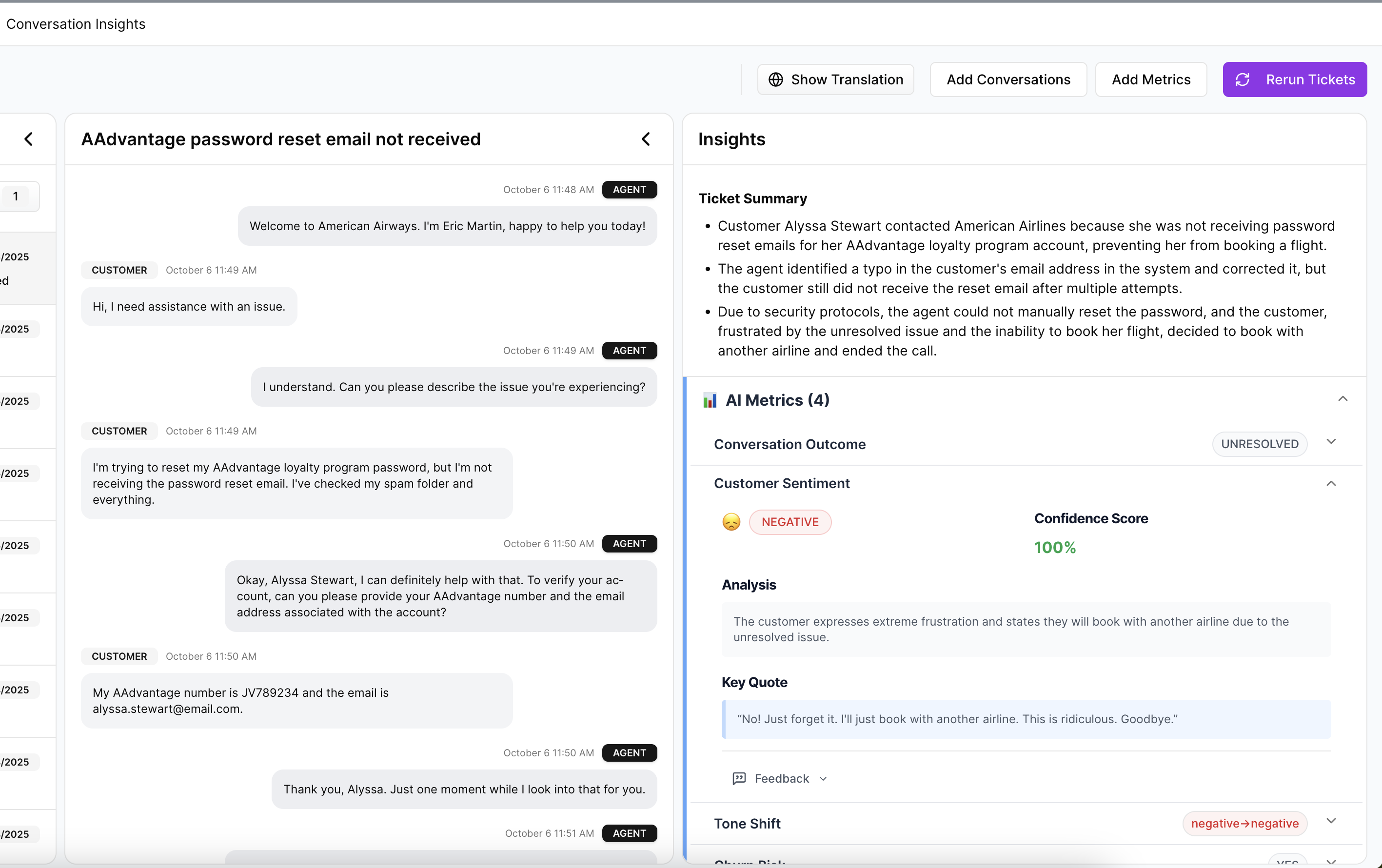
That's why the last layer is evidence. If a grouped metric says onboarding issues drive high effort for new accounts, you should be able to click through and inspect the conversations behind that result. If a churn-risk pattern spikes for billing complaints, you should be able to pull exact quotes, not vague summaries from memory.
The "Proof in 90 Seconds" rule is useful here: if your team can't go from an aggregate claim to three validating conversations in under 90 seconds, the insight probably won't travel well inside the company. It may still be true. But it won't move fast. And speed matters when customers are already feeling the friction.
So if that's the new way to analyze support, where does a tool actually fit without becoming another dashboard nobody trusts?
How Revelir AI Makes Full Coverage Usable
Revelir AI makes the importance of full coverage practical by turning every ingested support conversation into structured, traceable metrics. Instead of dumping you into another generic dashboard, it gives CX and product teams a way to group issues, inspect the underlying tickets, and trace patterns back to the source conversations with evidence.
Structured tags that don't fall apart at scale
Revelir AI uses a Hybrid Tagging System with Raw Tags and Canonical Tags, plus Drivers, so you're not stuck choosing between detail and clarity. Raw Tags surface the specific themes showing up in tickets. Canonical Tags give you reporting categories your team can actually align around. Drivers roll those patterns up into higher-level themes that work in leadership conversations.
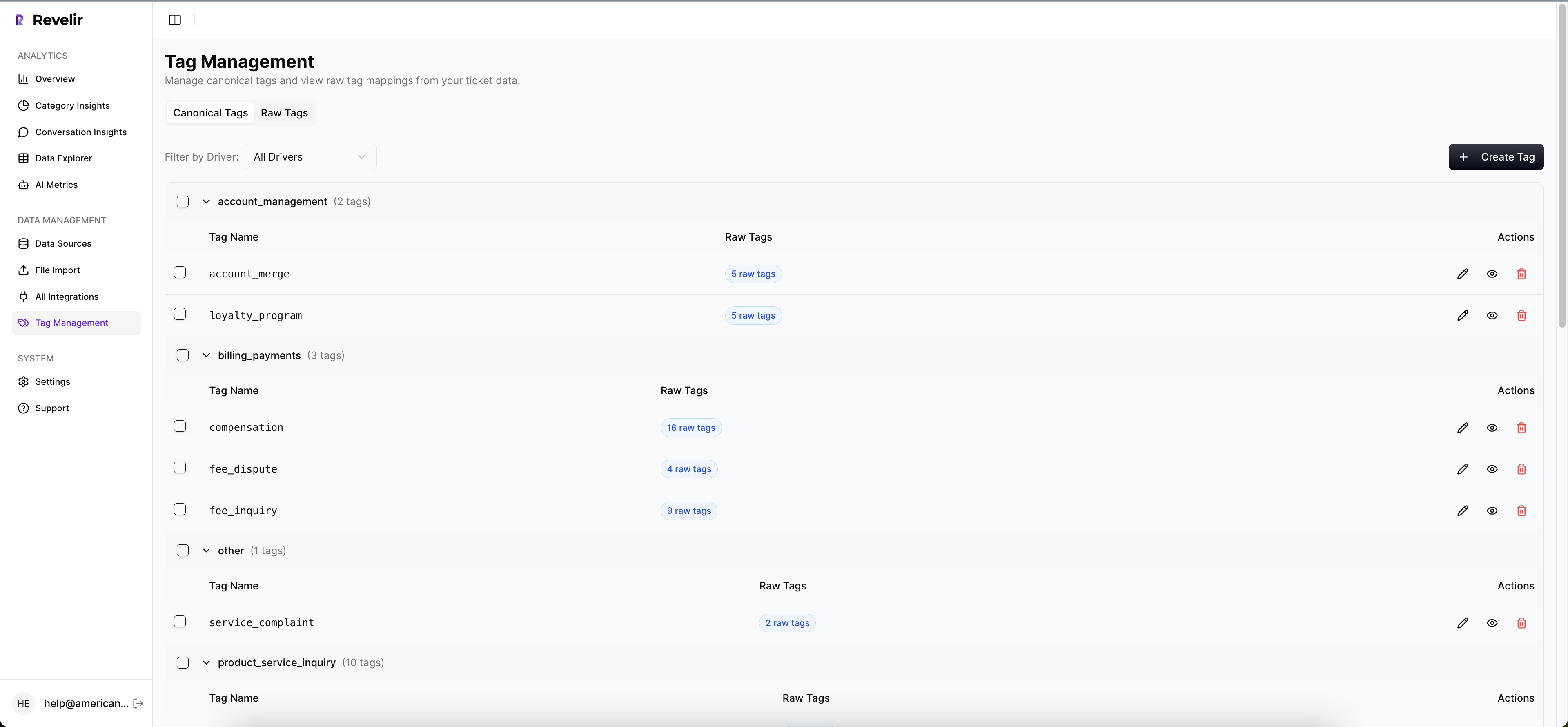
That's a big deal because most manual tagging systems break in one of two ways. They're either too loose to trust or too rigid to capture what's changing. Revelir AI gives you both layers. Users can map raw to canonical tags, refine the taxonomy, and let the system learn those mappings over time. That means the structure gets sharper instead of messier.
Metrics you can filter, group, and defend
Revelir AI also applies its AI Metrics Engine across conversations, including Sentiment, Churn Risk, Customer Effort, and Outcome. If you need something more specific to your business, Custom AI Metrics let you define your own classifiers and store them as usable columns in analysis.
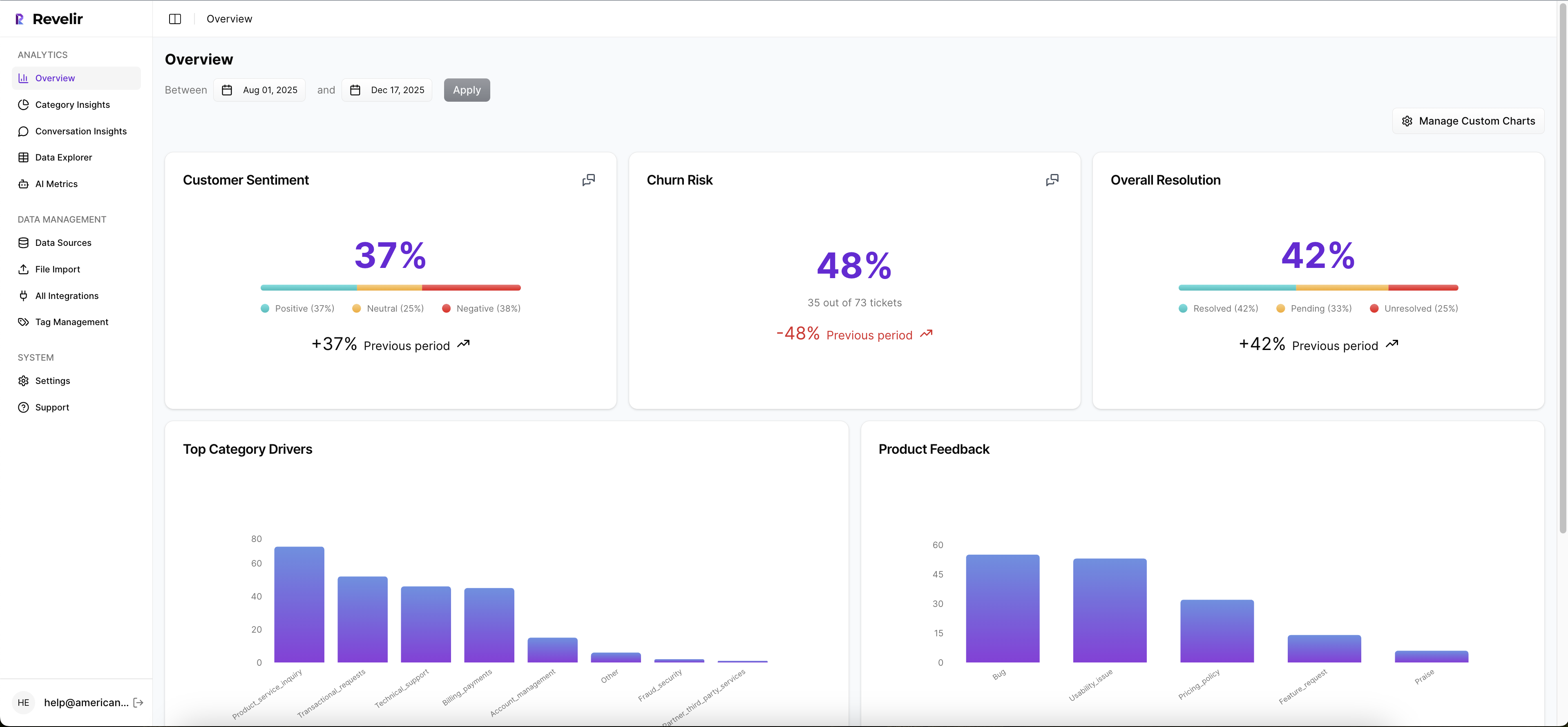
Then you can work through that data in Data Explorer and Analyze Data. Data Explorer gives you a pivot-table-like workspace to filter, group, sort, and inspect tickets with columns for tags, drivers, sentiment, churn risk, effort, and custom metrics. Analyze Data gives you grouped summaries by dimensions like Driver, Canonical Tag, or Raw Tag, with tables and stacked charts that link back to underlying tickets. So the old workflow of export, clean, pivot, screenshot, argue gets compressed into one place.
Proof stays attached to the number
This is the part that matters most in real meetings. Revelir AI includes Evidence-Backed Traceability and Conversation Insights, so every aggregate number can connect back to source conversations and quotes. If someone questions the pattern, you can validate it. Fast.
And getting data in doesn't require a helpdesk overhaul. Revelir AI supports Zendesk Integration for historical and ongoing ticket imports, and CSV Ingestion for pilots, backfills, or teams working from exported support data. If you need to move structured metrics into your existing reporting stack after analysis, API Export is there too.
If your team is done debating samples and wants a cleaner way to work from support data, Get started with Revelir AI (Webflow)
Why Full Coverage Wins the Prioritization Argument
The importance of full coverage isn't that it sounds more rigorous. It's that it changes the quality of the decision. When you can see all conversations, classify them in a way humans can use, and trace every claim back to a ticket, prioritization gets faster and harder to argue with.
It's usually that simple. Sampled insight creates debate. Full coverage creates direction.
You don't need more dashboards. You need a better standard for evidence. And if support conversations already contain the signal, the question isn't whether to analyze them. It's whether you're willing to keep missing most of them.
Frequently Asked Questions
How do I analyze support tickets with Revelir AI?
To analyze support tickets using Revelir AI, start by integrating it with your helpdesk platform like Zendesk. Once integrated, Revelir will automatically ingest all your support conversations. You can then use the Data Explorer to filter and group tickets by various metrics like sentiment, churn risk, and effort. This allows you to see patterns and insights across all conversations, not just a sample. If you need to dive deeper, you can use the Analyze Data feature to summarize metrics and link back to the underlying tickets for more context.
What if I want to customize metrics in Revelir AI?
If you want to customize metrics in Revelir AI, you can use the Custom AI Metrics feature. This allows you to define specific classifiers that are relevant to your business needs, such as identifying upsell opportunities or reasons for churn. Once created, these custom metrics will be stored as columns and can be used across filters and analyses in the Data Explorer. This way, you can tailor the insights to better fit your team’s objectives.
How do I ensure full coverage of support tickets?
To ensure full coverage of support tickets, make sure Revelir AI is set up to process 100% of your ingested tickets without relying on sampling. This means integrating it with your helpdesk for ongoing ticket imports or using CSV ingestion for historical data. By doing this, you eliminate blind spots and biases that come from sampling, allowing you to analyze every conversation. This comprehensive approach helps you identify critical issues that may not be visible in a smaller sample.
When should I use the Evidence-Backed Traceability feature?
You should use the Evidence-Backed Traceability feature in Revelir AI during meetings or presentations where you need to support your findings with concrete examples. This feature allows you to link aggregate metrics directly to the source conversations and quotes, making it easier to validate your insights. If stakeholders question a pattern, you can quickly pull up specific tickets to provide context and evidence, which builds trust and credibility in your analysis.
Can I track customer sentiment over time with Revelir AI?
Yes, you can track customer sentiment over time using the AI Metrics Engine in Revelir AI. This engine automatically computes sentiment scores for each conversation, categorizing them as positive, neutral, or negative. You can then use the Data Explorer to filter and group these sentiment metrics by time periods or specific issues. This allows you to observe trends and changes in customer sentiment, helping you identify areas that may need attention.