
Step-level customer effort mapping sounds more precise than effort scoring, but it's usually where teams get lost. They build a neat chart, assign a few labels, and call it insight. Nobody's checking whether those steps match how work actually moves through support, so the score turns into one more dashboard people argue about instead of one they use.
Same thing with support effort in general. A conversation can feel painful because the customer had to repeat themselves, wait for an internal handoff, bounce between teams, or restart a broken workflow. If you only score the whole ticket, you miss the part that actually needs fixing. That's why step-level customer effort mapping matters: it forces you to find the process step creating repeat contacts and transfers, not just the ticket that ended badly.
Key Takeaways:
- Step-level customer effort mapping works only when your process steps match real agent workflows, not an org chart or a slide.
- The unit of analysis is the step, not the whole ticket, because high-effort conversations often contain multiple kinds of friction.
- You need both text and metadata to detect step boundaries with confidence.
- A weighted scoring model beats gut feel when you need comparable effort scores across flows.
- Transcript evidence matters because leadership will ask for proof, and they should.
- The goal is simple: identify the top 3 high-effort process steps in a flow and leave with a ranked fix list.
Why Conversation-Level Effort Scores Miss the Real Problem
Conversation-level effort scores miss the real problem because they flatten a multi-step process into one label. That makes reporting easier, but it hides where friction actually starts, where it compounds, and where you should intervene first.
Most teams think the hard part is measuring effort. It isn't. The hard part is deciding what the effort belongs to. If a customer starts in billing, gets transferred to account access, then waits on a product bug workaround, what exactly are you scoring? The ticket? The customer mood? The final outcome? That's where most effort programs go wrong.
Whole-ticket scoring creates fake clarity
A single effort score feels clean. Execs like clean. Analysts like clean. Dashboards really like clean. But clean isn't the same as useful.
Let's pretend a support leader says, "Password reset has high customer effort." Sounds actionable. Then you read the tickets and realize the reset itself wasn't the issue. The real cost showed up after identity verification failed, the customer got routed to the wrong queue, and the agent had to request a manual override. The effort lived in a specific step chain, not in the headline category.
That's the hidden cost of skipping step-level customer effort mapping. You end up fixing the label with the most volume instead of the step with the most drag. And those are rarely the same thing.
Process friction hides inside the handoffs
High effort usually shows up in transitions. That's where customers repeat context, agents lose history, and nobody owns the gap. A ticket can look routine at the category level while still being brutal in the middle.
In my experience, repeat contacts and transfers are the biggest tell. Not because they always mean the product is broken, but because they expose process design problems. Missing permissions. Bad routing. Weak macros. Approval loops. Partial ownership. Same thing with "resolved" tickets that leave the customer annoyed. The label says success. The transcript says otherwise.
You feel this on the team side too. Support leads know something is off, product managers get anecdotal escalations, and leadership keeps asking the same question: what exactly should we fix first? That question gets strangely hard when your data model stops at ticket-level effort.
Sampling makes the problem worse
Sampling adds a second layer of distortion because now you're flattening the ticket and only looking at some of them. That's a bad combo. A lot of teams still do this because manual review feels safer than automated structure. Fair point. Bad automation creates bad confidence. But partial review creates partial truth, and partial truth is expensive.
Research on support analytics keeps pointing in the same direction: unstructured conversation data contains signals that survey-only programs miss, especially around root causes and repeat pain patterns. That's why transcript analysis matters so much in customer intelligence work, and it's why teams increasingly combine text analysis with operational metadata instead of relying on score snapshots alone. You can see the broader shift in CX and contact center analysis in sources like McKinsey's work on customer care analytics and Zendesk reporting on service trends.
How Step-Level Customer Effort Mapping Actually Works
Step-level customer effort mapping works by breaking a support flow into real process steps, detecting when conversations move between those steps, and scoring effort at the step level using observable events. The point is not perfect taxonomy. The point is comparable friction you can act on.
This is the part most teams skip because it feels messy. Honestly, that's exactly why it matters. If the process itself is messy, your model should reflect that instead of pretending every ticket follows a clean path.
Start with canonical steps, not departmental labels
Canonical process steps are stable workflow stages that reflect how work actually gets done. They should describe the customer journey and agent motion clearly enough that different teams would code the same interaction the same way.
Bad version:
- Billing
- Support
- Product
- Escalations
Better version:
- Customer identifies issue
- First agent triage
- Identity or account verification
- Initial resolution attempt
- Internal transfer or escalation
- Follow-up and confirmation
- Case closure
See the difference? One is a reporting structure. The other is a process. Step-level customer effort mapping falls apart fast when your steps are really just departments in disguise.
Your first pass should come from real agent workflows, not a workshop fantasy. Pull a sample of transcripts across a single flow, maybe account recovery or refund disputes, and mark where the work meaningfully changes. What triggered the shift? What new action was required? What information had to be repeated? That's usually where the step boundary lives.
A practical way to define canonical steps:
- Pick one high-volume flow with known friction.
- Review transcripts and metadata side by side.
- Mark distinct changes in ownership, task, or required customer action.
- Name each step in plain language.
- Test the step list on a fresh sample and see where coders disagree.
If people can't apply the steps consistently, the model is still too vague.
Use text and metadata together to find step boundaries
Step boundaries don't always show up in words alone. Sometimes the transcript makes it obvious. A customer repeats their issue. An agent says the case needs another team. A new verification request appears. Easy enough. Other times the strongest clue is metadata: queue change, assignee change, reopen event, timestamp gap, tag shift.
You need both.
Text signals that often mark a new step:
- Restatement of the issue after a handoff
- New request for documents or verification
- Agent language that changes from diagnosis to workaround
- Resolution language followed by re-contact
- Escalation phrases that indicate dependency on another team
Metadata signals that often mark a new step:
- Queue or assignee changes
- Long pauses between replies
- Reopen status after closure
- Transfer markers
- Multiple linked contacts from the same account
If you've tried doing this with transcript text alone, you've probably seen the failure mode. The model catches semantic changes but misses operational ones. Same thing in reverse. Metadata-only approaches find movement but don't know why it happened. Put them together and the pattern gets much sharper.
For teams building step-level customer effort mapping, the useful question isn't "Can AI detect every step perfectly?" It can't. The better question is "Can we detect enough boundaries reliably enough to compare step friction across time?" Usually, yes.
Score events, not vibes
A lot of effort models drift into opinion fast. One analyst thinks a transfer should count as high effort. Another says it depends. A support lead wants to overweight negative language. Product wants to overweight repeats. This is where you need a scoring model before the meeting, not during it.
A solid step-level customer effort mapping model starts with observable events. Things you can count. Things you can defend.
Common event inputs:
- Repeat explanation by customer
- Transfer to another team or queue
- Additional verification request
- Delay beyond expected response window
- Reopen after initial resolution
- Manual workaround or exception handling
- Negative sentiment tied to the step
- High effort signal tied to the step
Then you weight them. Not equally. A transfer usually costs more than a slight tone drop. A reopen often matters more than one clarification question. The exact scheme depends on your business, but the point is consistency.
One practical weighting approach:
- Minor friction events: 1 point
- Moderate effort events: 2 points
- Major breakpoints like transfer, reopen, or repeat contact: 3 points
- Compounding penalty when 2 or more major events happen in the same step: +2
Then normalize by step volume so one huge category doesn't drown everything else. That's how you get comparable step-level effort scores instead of just a leaderboard of busy queues.
Not everyone agrees on weighting the first time through, and that's fine. We were surprised to find that most debates calm down once people see transcript examples next to the score. Numbers alone create skepticism. Evidence plus numbers usually ends the room debate.
Validate the model with transcript evidence
Validation matters because black-box scoring dies the second a product leader asks, "Show me the tickets." If you can't trace a step score back to specific conversations and quotes, you've built a fragile metric.
This is where a lot of AI analytics efforts lose trust. They summarize beautifully, but nobody can audit the output. That's a problem. Especially for CX and product teams that need to make prioritization calls in front of skeptical stakeholders.
Your validation loop should be simple:
- Pull the highest-scoring steps
- Review representative conversations from each
- Check whether the observed friction matches the events that drove the score
- Adjust definitions or weights where the mismatch is obvious
- Re-run and compare
And yes, you need examples in the dashboard itself. Not later. Not in a separate doc. Right there, attached to the metric. That's what turns step-level customer effort mapping from an interesting analysis into something teams can defend in a roadmap meeting.
Turn the model into a ranked fix list
The output should not be a heatmap with no owner. It should be a short remediation plan. Three steps. Specific failures. Clear evidence.
For each high-effort step, you want:
- The step name
- Volume
- Average weighted effort score
- Main effort drivers
- Representative transcript evidence
- Likely root cause
- Proposed fix
- Owner
- Review date
That sounds basic because it is. Most teams don't fail at insight generation. They fail in the last ten feet between insight and action.
If you want to go deeper on converting service data into structured operational patterns, NICE's guidance on customer journey and interaction analytics is useful context, and Gartner's service and support research hub has a lot of material on linking service insight to broader CX decisions.
If you want to see how a full-coverage, evidence-backed approach works in practice, See how Revelir AI works.
What a Good Step-Level Effort Dashboard Needs to Show
A good step-level effort dashboard shows where effort spikes, what drives it, and which conversations prove it. If the dashboard can't move you from score to root cause to transcript evidence in one workflow, it's not ready for decision-making.
This is where people overbuild. They chase elegant dashboards before they earn a useful data model. Don't do that. Start with what a support leader or PM actually needs to answer in five minutes.
Show steps as operating units, not just chart labels
The dashboard should treat steps as units of operational analysis. That means each step needs enough context to stand on its own.
At minimum, each row or grouped view should show:
- Canonical process step
- Volume of tickets touching that step
- Step-level effort score
- Transfer rate
- Repeat contact rate
- Sentiment mix
- Related drivers or tags
That mix matters because effort alone can mislead. A step might have moderate effort but huge volume. Another might have lower volume but extreme repeat contacts. You need both severity and scale if you're trying to prioritize fixes honestly.
Pair summary views with evidence drill-downs
Summary views are for scanning. Drill-downs are for trust. You need both. Otherwise every discussion turns into "Can someone pull a few tickets after this?"
Nobody wants that. It slows everything down and usually kills momentum.
A strong dashboard pattern is:
- Group by canonical step
- Sort by weighted effort score or total effort burden
- Break down by driver, segment, or queue
- Click through to underlying conversations
- Pull quotes that explain the score
Same thing with leadership readouts. A chart gets attention. A quote gets belief. Put those together and the next move becomes obvious.
Make comparison easy across time and segments
Good step-level customer effort mapping gets much more useful when you compare by segment. New users vs existing customers. Enterprise vs SMB. Last month vs this month. One queue vs another. That's where hidden process failures show up.
Maybe verification isn't broadly painful. Maybe it's painful only for international customers. Maybe transfers aren't the issue overall, but one product line creates a transfer chain every time. Those are the kinds of patterns you miss when the model stays at conversation level.
The best dashboards don't just say "effort is high." They say "effort is high in this step, for this segment, because of this repeated failure mode."
How Revelir AI Makes Customer Effort Analysis Usable
Revelir AI makes customer effort analysis usable by giving teams full-coverage conversation analysis, structured metrics, flexible grouping, and traceable evidence in one workflow. That matters because the real failure isn't lack of data. It's that most teams struggle to turn messy transcripts into analysis they can trust without weeks of manual work.
Full coverage and structured metrics change the starting point
Revelir AI processes 100% of ingested tickets through Zendesk Integration or CSV Ingestion, so you aren't guessing from samples or waiting for manual tagging to catch up. Sampling creates debate. Full-Coverage Processing gives you a cleaner base to work from.
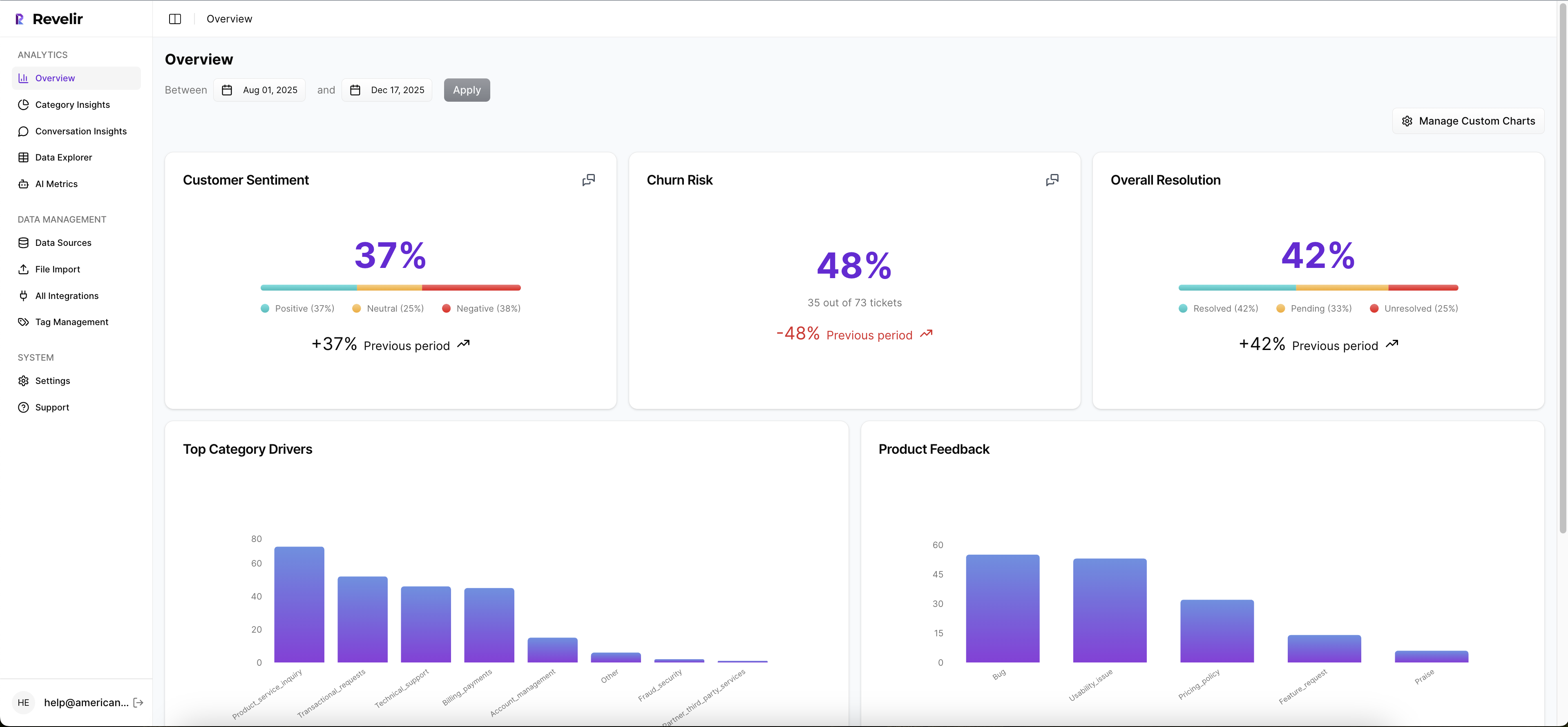
Then the AI Metrics Engine adds structured fields like Sentiment, Churn Risk, Customer Effort, and Conversation Outcome. If your team needs something more specific, Custom AI Metrics let you define the business question in your own language and store the result as another usable column. That gives teams a more flexible way to analyze effort alongside the metrics that matter to their business.
Grouping, taxonomy, and evidence make the model defensible
This is where Revelir AI gets practical. The Hybrid Tagging System gives you AI-generated Raw Tags for emerging detail and Canonical Tags for the reporting structure humans need. Drivers add a higher-level layer for the "why," which makes it much easier to group friction patterns in a way leadership can follow.
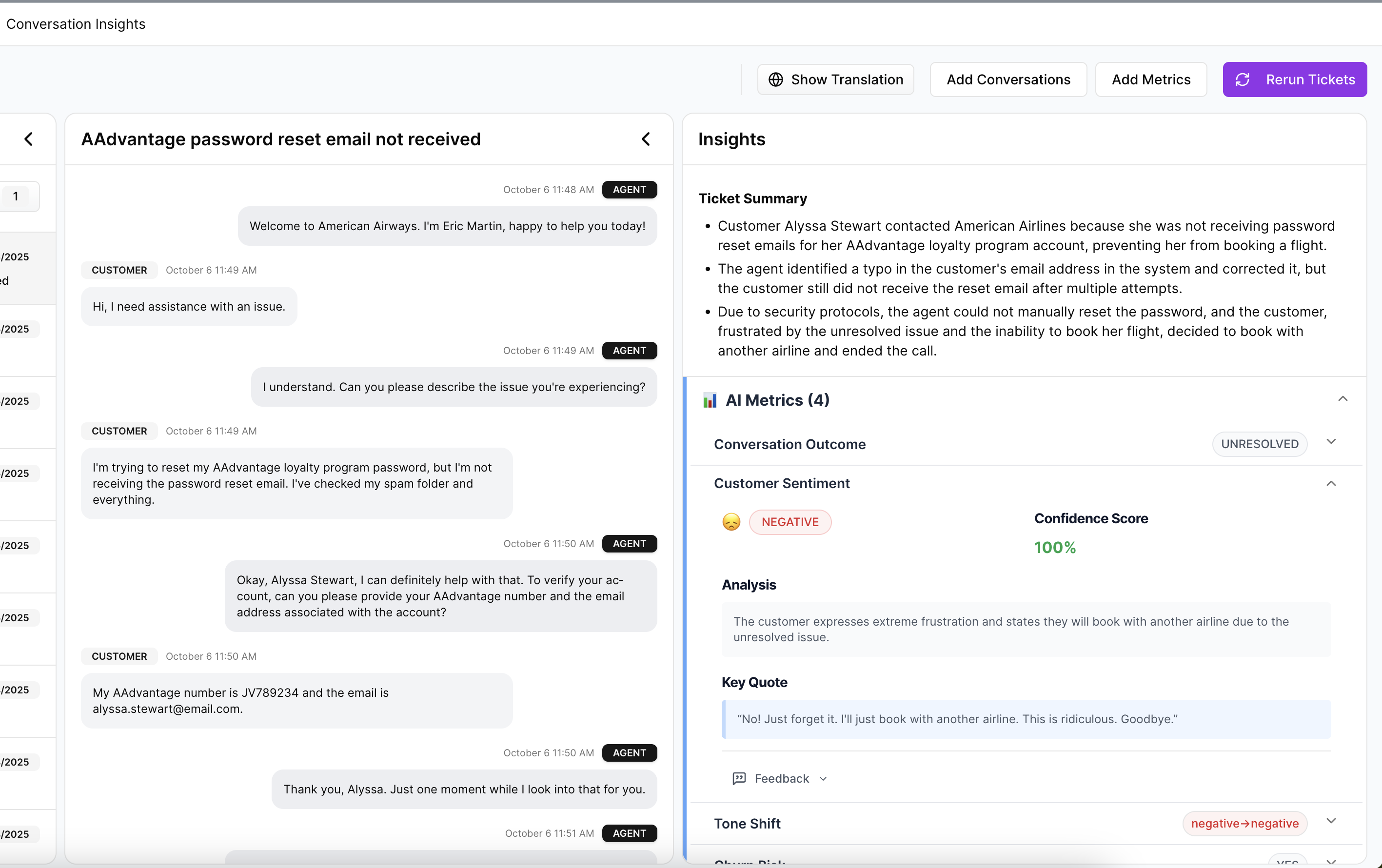
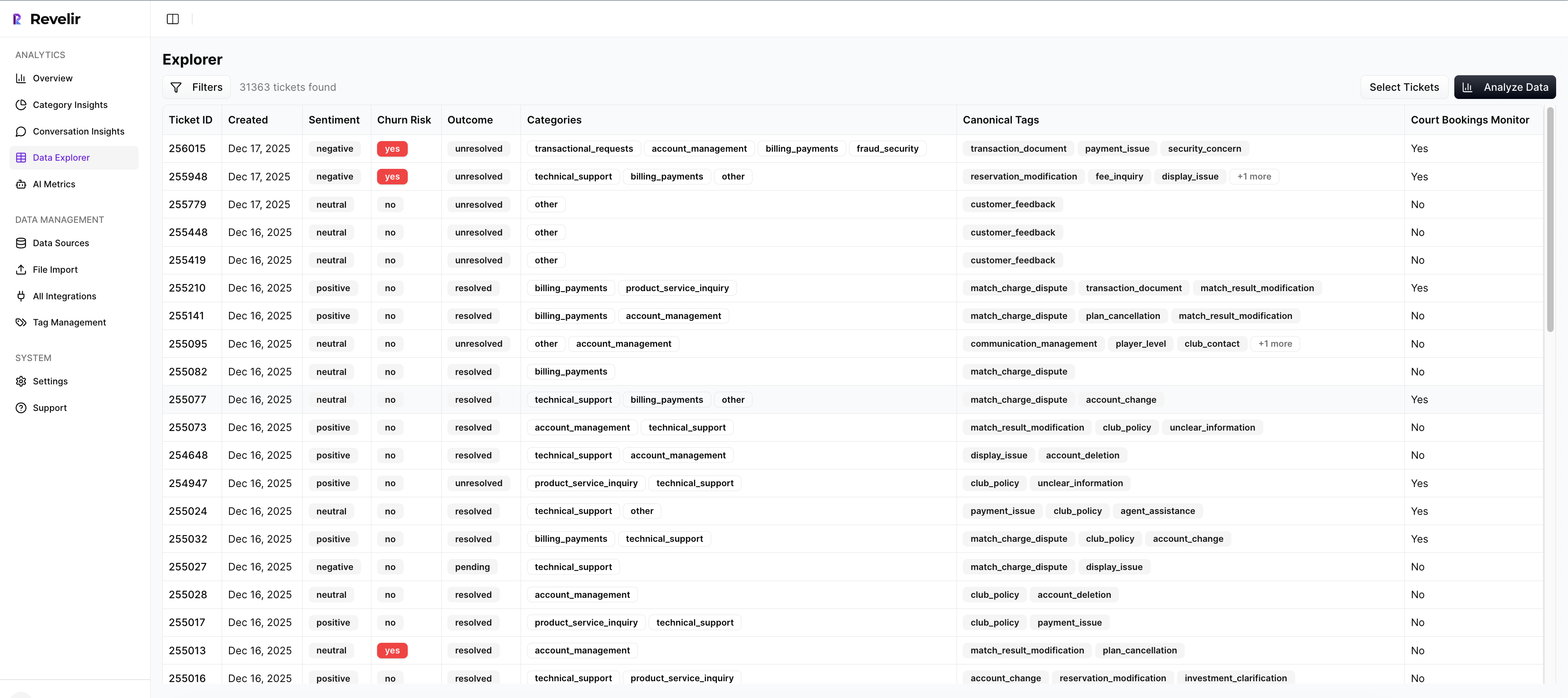
Inside Data Explorer, you can filter, group, sort, and inspect every ticket with columns for effort, sentiment, churn risk, tags, drivers, and custom metrics. Analyze Data lets you summarize those metrics by Driver, Canonical Tag, or Raw Tag using interactive tables and charts linked back to the source tickets. Then Conversation Insights lets you drill into the full transcript, summaries, tags, drivers, and AI metrics for validation.
That's the missing piece in a lot of customer effort work. Revelir AI doesn't just give you a score. It gives you the trail back to the conversation. Evidence-Backed Traceability means every aggregate number can link to the exact tickets and quotes behind it, so when someone asks why a pattern is showing up, you can answer with proof instead of a hunch.
If you want to move from customer effort analysis to a real remediation plan, that's the path. Review the transcript evidence. Export structured metrics into your existing reporting workflow with API Export if you need to carry the analysis somewhere else.
From High-Effort Steps to a Fix Plan Your Team Will Trust
Step-level customer effort mapping works when it ends in ownership, evidence, and a short list of fixes. That's the bar. Not a prettier dashboard. Not a smarter label. A usable plan.
Most teams don't need more effort scores. They need to know which three process steps are causing the most avoidable drag, which customers are getting hit, and what transcript evidence proves it. Do that well and within 4 to 8 weeks, you can walk into a product or CX review with something a lot more solid than anecdotes.
If that's the direction you want, See how Revelir AI works.
Frequently Asked Questions
How do I integrate Revelir AI with my existing support platform?
You can integrate Revelir AI with your existing support platform, like Zendesk, by connecting it through the built-in integration feature. This allows Revelir to automatically pull in ticket data, including transcripts and metadata, for continuous analysis. Simply follow these steps: 1) Go to the integration settings in Revelir AI. 2) Select your support platform and authorize the connection. 3) Once connected, Revelir will start processing all new and historical tickets without manual exports, giving you a comprehensive view of customer interactions.
What if I want to analyze specific customer segments?
You can analyze specific customer segments using the Data Explorer feature in Revelir AI. Here’s how: 1) Use the filtering options to select the desired date range or customer attributes. 2) Group the data by relevant tags or drivers that align with your segment. 3) Review the resulting metrics to identify trends or issues specific to that segment. This approach helps you understand unique friction points and tailor your support strategies accordingly.
Can I customize metrics in Revelir AI?
Yes, you can customize metrics in Revelir AI using the Custom AI Metrics feature. To do this: 1) Define your specific business questions or metrics you want to track. 2) Set up the value options that will be used to classify the results. 3) These custom metrics will then be stored and can be used across your analyses in the Data Explorer. This flexibility allows you to focus on the metrics that matter most to your business.
How do I ensure my tagging system is effective?
To ensure your tagging system is effective, use the Hybrid Tagging System in Revelir AI. Here’s how to optimize it: 1) Regularly review and refine your Canonical Tags to align with your organization’s language and reporting needs. 2) Monitor the Raw Tags generated by the AI to identify emerging themes that may require new canonical categories. 3) Encourage team members to provide feedback on the tagging process to improve consistency and accuracy. This ongoing adjustment helps maintain a clear and effective tagging structure.
What if I need to validate my analysis with transcripts?
You can validate your analysis with transcripts using the Conversation Insights feature in Revelir AI. To do this: 1) Access the ticket-level drill-downs to view full transcripts associated with high-scoring steps. 2) Pull quotes that illustrate the key issues or friction points identified in your analysis. 3) Use this evidence to support your findings in discussions with stakeholders, ensuring your insights are backed by concrete examples.