

72% of support teams still make big decisions from tiny slices of ticket data, according to Zendesk’s CX research and the way most teams still review conversations by hand. If you spent time this week debating whether five angry tickets mean a real trend, you already felt the problem with key metrics for evaluating support quality.
It’s usually not that teams lack data. It’s that nobody’s checking the full picture, and then everybody acts surprised when the dashboard says one thing while the tickets say another.
Key Takeaways:
- The best key metrics for evaluating support don’t start with scores. They start with full conversation coverage.
- If you’re reviewing less than 20% of tickets, you’re managing on sampled stories, not evidence.
- CSAT and sentiment can tell you something changed, but drivers explain what broke.
- A useful metric should pass the Traceability Test: can you click from the number to the ticket?
- Product and CX teams should review metrics in three layers: signal, driver, evidence.
- If a metric can’t guide prioritization, it’s reporting noise.
- Teams that analyze 100% of conversations stop arguing about whether a pattern is real and start deciding what to fix.
If you want a quick picture of what full-coverage support analysis looks like before we get into the weeds, Learn More.
Why Most Support Metrics Miss What Actually Matters
The key metrics for evaluating support quality are supposed to help you decide what to fix, who’s affected, and how urgent the problem is. Most teams don’t have that. They have a dashboard full of scores, a spreadsheet full of exports, and a meeting full of opinions.

The visible metric is rarely the real metric
A score is a surface signal. It tells you something moved. It usually doesn’t tell you why. That sounds obvious, but teams still run support like a cardiologist who only checks pulse and never orders imaging. You get motion without diagnosis.
Same thing with CSAT. Same thing with NPS. Same thing with basic sentiment labels. They can show decline, improvement, or volatility. Fine. But if negative sentiment rose from 11% to 18%, what are you actually supposed to do next? If you can’t break that number into drivers, affected segments, and ticket evidence, the metric isn’t decision-ready.
That’s the first rule I’d use here: if a support metric doesn’t tell you what to inspect next within 10 minutes, it’s too shallow for operational use. Call that the 10-Minute Action Rule. Leaders don’t need prettier charts. They need metrics that survive contact with an exec review.
Sampling creates fake confidence
Sampling feels responsible. It feels efficient. And to be fair, there is a reason teams do it. Manual review catches nuance, and nobody wants to read 8,000 tickets. That’s a valid instinct. The problem is that once ticket volume crosses a few hundred per week, the sample starts acting like a rumor.
Let’s pretend your team handles 4,000 tickets a month and reviews 200. That’s 5%. If one product issue affects a narrow cohort but creates high churn risk, there’s a good chance your sample misses it or underweights it. Then the room fills the gap with stories. The loudest anecdote wins.
Picture a support lead on Friday afternoon. They’ve got a dashboard saying CSAT is steady, three Slack screenshots from angry enterprise customers, and one PM asking whether onboarding friction is actually getting worse. Nobody knows. Everybody has a theory. That’s not insight. That’s improv with spreadsheets, and it gets expensive fast.
The real job is evidence, not score-watching
What’s really going on here? The problem isn’t that teams need more metrics. It’s that they’re using metrics detached from source evidence. That breaks trust immediately, especially once product, CX, and ops all start asking different questions from the same dataset.
A metric has to do three jobs at once. First, surface a pattern. Second, explain the likely driver. Third, let you verify the claim in the actual conversations. I call that the Signal-Driver-Evidence Stack. If you only have signal, you’re still guessing. And once you see that, the rest of the old setup starts to look flimsy.
The Key Metrics for Evaluating Support Need a Different Model
The key metrics for evaluating support should be arranged like a decision system, not a score board. That means you start with broad signals, move into causal drivers, then validate with ticket-level evidence. Not the other way around.
Start with the Coverage Threshold
100% conversation coverage is the threshold that changes the quality of the conversation. Below that, you’re estimating. At 100%, you’re measuring. That sounds like a small wording shift. It isn’t.
The Coverage Threshold is simple: if your metric framework excludes any meaningful chunk of support conversations, assume blind spots. I’d put the practical line at 80% minimum for directional analysis and 100% for executive decisioning. Under 80%, your team should treat trend calls as provisional. Over 95%, now you can start talking about patterns with some confidence.
This is where a lot of teams get stuck in old thinking. They believe more precision in the score solves the problem. It doesn’t. Better math on partial data still gives you partial truth. Zendesk’s customer experience reporting keeps reinforcing the same broader point: support volume, complexity, and customer expectations have all gone up. That means partial review methods break faster now than they used to.
Separate signal metrics from decision metrics
Not every metric deserves the same status. Some are alerts. Some are diagnosis. Some are proof. If your dashboard blends them together, the team will overreact to easy numbers and underuse the important ones.
Here’s the model I’d use:
- Signal metrics: sentiment rate, churn risk rate, customer effort rate, conversation outcome
- Driver metrics: issue drivers, canonical tags, raw emerging themes
- Evidence metrics: ticket count, quote frequency, traceable conversation examples
- Segment metrics: by plan, product area, region, agent team, or time period
That stack gives you a conditional rule you can actually use: if a signal metric moves by 15% or more week over week, don’t escalate the score itself. Escalate the top three drivers behind the score and validate them in tickets first. That one change cuts a lot of noise.
Honestly, this surprised us more than anything else when looking at how teams use support analytics. The issue usually isn’t missing data. It’s bad metric hierarchy. Everybody stares at the top-line number because it’s easy to digest. Very few teams build the bridge from score to cause.
Use driver-based metrics to answer “why”
Scores aren’t strategy. Drivers are. That’s the contrarian take, but I don’t think it’s even that contrarian anymore. It’s just what happens when you’re tired of sitting in meetings where everyone agrees something is wrong and nobody agrees why.
A driver metric groups conversations into meaningful themes such as billing, onboarding, account access, performance, or technical issues. Once you pair those drivers with sentiment, effort, or churn risk, you stop asking “Did support get worse?” and start asking “Which issue is pushing negative sentiment among high-value customers this month?”
That question is operational. It can drive action.
The Driver Depth Rule is useful here: if your support metric cannot be grouped by a stable taxonomy within two clicks, it won’t help cross-functional teams prioritize fixes. Product wants themes. CX wants impact. Leadership wants confidence. Drivers give you all three.
There’s a good reason mature analytics teams use structured dimensions and not just summary charts. Google’s guidance on contact center analytics points to the same operational shift: raw conversations become useful only when they can be organized into patterns, categories, and inspectable evidence.
Build metrics in the language your business already uses
Generic sentiment labels are fine until they stop being fine. If your business cares about refund risk, setup confusion, premium account friction, or failed handoff rate, then those need to become actual metrics. Otherwise the team spends half the meeting translating from generic labels into the business problems people really care about.
That’s where custom metrics matter. A support organization with a marketplace model may need “seller fraud concern” or “listing delay complaint.” A SaaS company may need “implementation blocker” or “admin permission confusion.” An airline may need “passenger comfort” or “flight cancellation recovery.” Same idea. Different language.
Not everyone agrees that custom metrics should come early. Fair point. If your taxonomy is immature, too many custom fields too fast can make reporting messy. But once you know the recurring questions leadership asks, custom metrics stop being a nice extra and become part of the operating system. The metric framework should fit the business. Not the other way around.
Validate every metric with ticket evidence
A metric without traceability is a political problem waiting to happen. The minute somebody asks, “Can you show me examples?” your whole reporting system gets tested. If the answer is “Give me a day, I’ll pull some tickets,” trust drops.
The Traceability Test is brutally simple: can you move from aggregate number to exact conversation in one workflow? If yes, the metric is defensible. If no, expect argument. Expect delays. Expect people to dismiss valid trends because the proof feels hand-built.
Let’s pretend you walk into a product review and say onboarding-related negative sentiment is up 22% among new accounts. Good start. Now the PM asks which conversations drove that, whether the issue is setup confusion or permission errors, and whether the affected cohort is concentrated in one segment. If you can answer that in the room, the meeting moves. If you can’t, the metric just became background decoration.
If you want to see what that kind of workflow looks like in practice, See how Revelir AI works.
What Good Support Measurement Looks Like in the Real World
Good support measurement gives you fewer vanity numbers and more operating clarity. You should be able to spot risk, understand cause, and defend the conclusion without launching a side project.
The Three-Layer Review Cadence
A review cadence works best when it follows a fixed order. First signals, then drivers, then evidence. I call this the Three-Layer Review. It keeps teams from jumping straight from one ugly chart to a hasty conclusion.
Here’s the structure:
- Layer 1: Signals
- Check sentiment, churn risk, effort, and outcome trends
- Look for changes above a 10% to 15% threshold
- Layer 2: Drivers
- Group the affected conversations by driver and canonical tag
- Compare the top three drivers across time periods or customer segments
- Layer 3: Evidence
- Read the underlying tickets
- Pull quotes and test whether the narrative actually holds
This sounds almost too basic. It isn’t. Most teams skip Layer 2 and go from signal straight to anecdote. That’s where the errors pile up.
The Red Flag checklist most teams ignore
You can usually tell a support analytics setup is broken before the team says it out loud. There are a few obvious signs.
- Leadership asks for examples every single time a metric is presented
- Product teams don’t trust support reports without manual ticket screenshots
- Analysts spend more than 2 hours per week stitching exports together
- Trend reviews end with “we need more digging” instead of a clear next action
- Teams rely on sampled ticket reads for escalations or roadmap decisions
- The same issue appears under three different tags depending on who labeled it
If you see three or more of those, the current reporting model is already failing. That’s the 3-Red-Flag Rule. Fix the measurement system before you fix the dashboard.
Before-and-after: sampled reporting vs full-coverage metrics
Before, a team sees CSAT drop two points. They pull a sample of tickets. Five mention billing confusion, two mention bugs, one is just angry in general. The team decides billing needs attention. Maybe they’re right. Maybe they just sampled the loudest cluster.
After, the team reviews 100% of conversations from the same period. Negative sentiment is broken out by driver. Billing confusion is real, but a growing onboarding issue is creating higher effort and more churn risk among new accounts. That issue was quieter in the sample because it generated fewer emotionally dramatic tickets. Still serious. Still costly.
That’s the surprising connection a lot of teams miss: the issues most likely to hurt retention are not always the ones most likely to sound dramatic in a sampled review. Quiet friction compounds. Support conversations catch it early if you measure all of them.
What to prioritize first
If you’re rebuilding how you think about key metrics for evaluating support, don’t start with 30 numbers. Start with a narrow core set and build outward.
The first five I’d use are:
- Negative sentiment rate
- Churn risk rate
- High effort rate
- Top drivers by volume and severity
- Traceable ticket count behind each flagged pattern
Then add business-specific metrics once the basics are stable. If a team can’t reliably connect those five to action, adding more metrics usually creates more confusion, not more insight.
I’d argue this is where a lot of analytics projects go wrong. They optimize for completeness too early. Better move: get one review loop working end to end. Then expand. Measurement is less like building a dashboard and more like tuning an instrument. Small shifts matter. Bad calibration ruins everything.
How Revelir AI Makes Full-Coverage Metrics Usable
Revelir AI is built for the exact gap most teams are stuck in: support conversations contain the truth, but the truth is trapped in free text. Instead of forcing your team to sample tickets or manually build reporting logic in spreadsheets, Revelir AI processes 100% of ingested conversations and turns them into structured, evidence-backed metrics you can actually use.
From raw tickets to usable metrics
Revelir AI handles full-coverage processing with no sampling, so the metric layer starts with every ingested conversation rather than a hand-picked subset. That matters because the biggest mistake in support analytics usually happens before reporting even starts. The dataset is already incomplete.
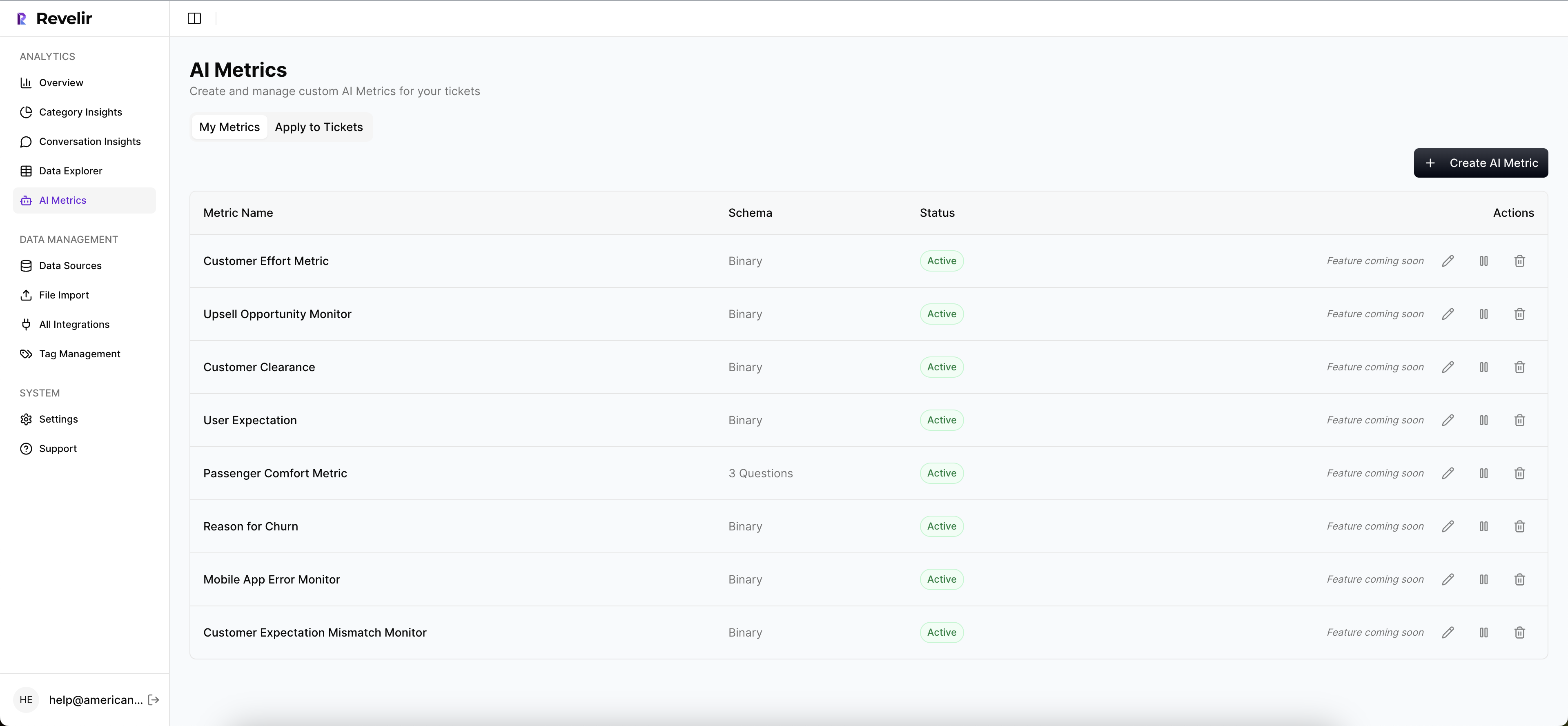
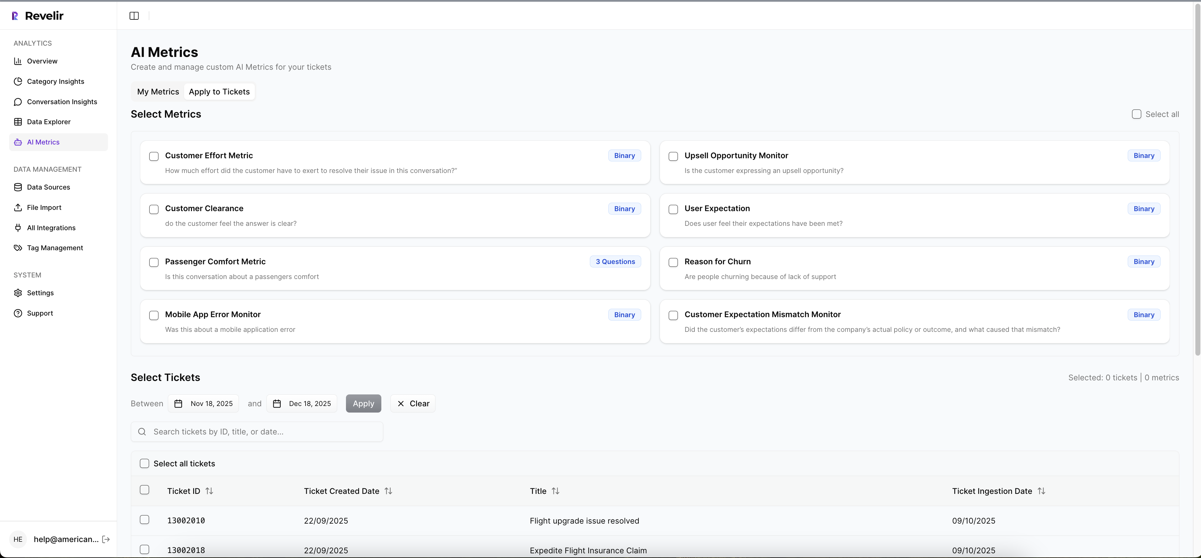
On top of that, Revelir AI applies its AI Metrics Engine to structure core signals such as sentiment, churn risk, customer effort, and conversation outcome. If your business needs more than standard labels, Custom AI Metrics let you define your own classifiers in the language your team already uses. Same thing with taxonomy. The Hybrid Tagging System combines AI-generated Raw Tags with Canonical Tags your team can refine over time, and Drivers group those tags into leadership-friendly themes.
From dashboard claim to proof
This is where a lot of tools fall apart. They summarize. They don’t prove. Revelir AI keeps the proof attached. Evidence-Backed Traceability links every aggregate number back to the source conversations and quotes, and Conversation Insights lets teams drill into full transcripts, summaries, tags, drivers, and metrics at the ticket level.
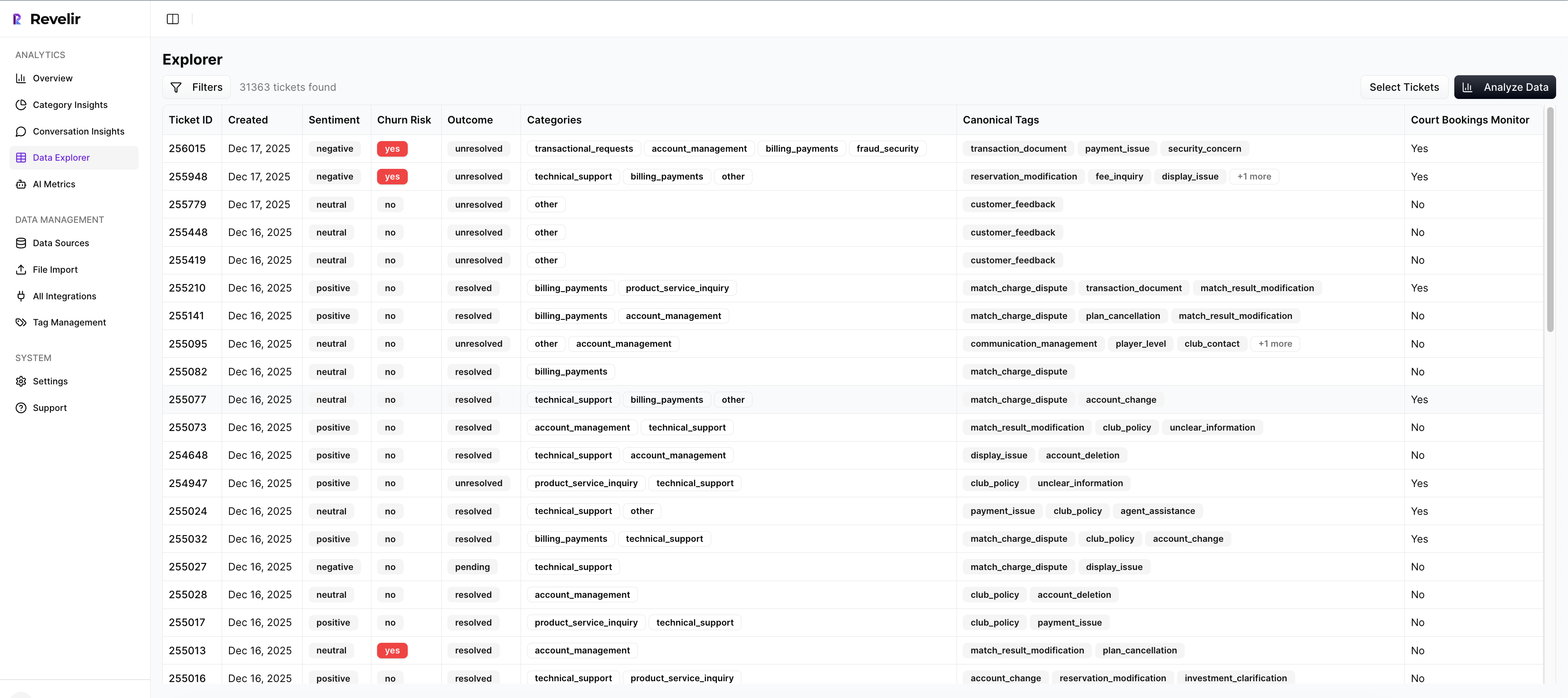
For day-to-day analysis, Revelir AI gives teams two practical ways to work. Data Explorer acts like a pivot table for tickets, with filters, grouping, sorting, and columns for the exact fields teams care about. Analyze Data adds guided grouped analysis across Driver, Canonical Tag, Raw Tag, and metric dimensions. If your support data already lives in Zendesk, the Zendesk Integration pulls in ongoing ticket data. If you want to start with an export, CSV Ingestion gets you there. And if the insights need to flow into an existing BI workflow, API Export handles that handoff.
That changes the cost equation from earlier in the article. Instead of spending hours reviewing a tiny sample and then arguing about whether it’s representative, teams can work from full coverage, group by drivers, and verify the pattern in the underlying tickets without leaving the analysis flow.
If you’re ready to stop sampling and start measuring what customers are actually saying, Get started with Revelir AI (Webflow).
Better Metrics Start When You Stop Guessing
The key metrics for evaluating support aren’t mysterious. They just need to be built in the right order. Start with full coverage. Add signals. Organize by drivers. Keep the evidence attached.
That’s usually the break point. Once your team can move from score to cause to proof, support stops being a pile of anecdotes and starts becoming a reliable decision system.
Frequently Asked Questions
How do I use Data Explorer to analyze support tickets?
You can use Data Explorer in Revelir AI to analyze support tickets effectively. Start by accessing the Data Explorer workspace, where you can view all your support tickets in a row-level format. Use the filtering options to narrow down tickets by date, sentiment, churn risk, or other metrics. You can also group and sort the data to identify trends. If you want deeper insights, click on any ticket to drill down into the conversation details, which helps you validate patterns and gather evidence for your analysis.
What if I need to create custom metrics for my team?
If you need to create custom metrics, Revelir AI allows you to define domain-specific classifiers using Custom AI Metrics. You can set up questions and value options that reflect the specific needs of your business. Once defined, these custom metrics are stored as columns in your data, making them usable across filters and analyses in the Data Explorer. This feature helps ensure that your metrics align with the unique language and priorities of your organization.
Can I integrate Revelir AI with my existing helpdesk?
Yes, Revelir AI can integrate directly with your existing helpdesk, such as Zendesk. This integration allows you to import historical and ongoing support tickets seamlessly. Once connected, Revelir will continuously pull in ticket data, including transcripts, tags, and metadata, ensuring that your analysis stays up-to-date without the need for manual exports. This way, you can maintain a full-coverage analysis of all your support conversations.
When should I use evidence-backed traceability?
You should use evidence-backed traceability whenever you present metrics to stakeholders. Revelir AI provides this feature, linking every aggregate number back to the source conversations and quotes. This traceability builds trust and transparency in your reporting, allowing you to defend your conclusions with concrete examples. If someone asks for proof of a metric, you can quickly show the underlying conversations, making your insights more credible and actionable.
Why does my team need to analyze 100% of support tickets?
Analyzing 100% of support tickets is crucial because it eliminates blind spots and biases that come from sampling. With Revelir AI's full-coverage processing, you can ensure that every conversation is analyzed, allowing you to capture all relevant patterns and insights. This comprehensive approach helps you identify subtle issues that might not be visible in a sampled review, leading to better decision-making and more effective prioritization of fixes.