

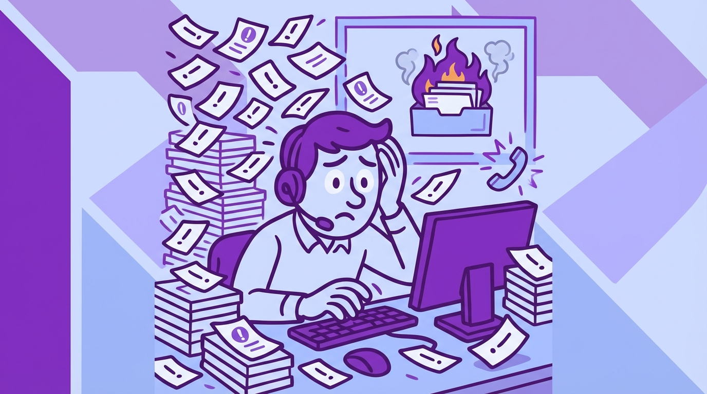
You already know when customers are upset. Agents feel it. Leaders hear it in escalations. The hard part is Identifying Frustration Signals in Customer Support Conversations fast enough to change the next week’s numbers, not just the QBR slide. It’s usually buried in free text, spread across thousands of tickets, and nobody’s checking beyond a few samples.
Let’s pretend you have 5,000 tickets a month. You skim a handful, watch CSAT dip two points, and guess at root causes. Same thing with churn risk: everyone “feels” risk, but proof is thin. The fix isn’t another score. It’s translating raw conversations into drivers and evidence you can stand behind in a product review, with zero debate about whether it’s representative.
Key Takeaways:
- Stop sampling. Measure 100% of conversations and remove blind spots.
- Track frustration signals as metrics, not vibes, then link every metric to exact quotes.
- Use drivers and canonical tags to explain the “why,” not just the “what.”
- Quantify the cost of delay, then prioritize by impact, cohort, and trend.
- Prove insights with traceability so product and CX can act faster together.
- Turn one-off “findings” into a repeatable review you can run every week.
Why Score Watching Misleads CX Leaders
Score trends don’t reveal which customers are frustrated, why they’re stuck, or what to fix first. Scores compress complex conversations into a single number, so you lose the drivers that matter when you plan work. When you anchor on drivers and evidence instead, teams agree faster and waste fewer cycles on debates. A simple test: can you show the quote behind the metric without digging?
Score Dips Don’t Tell You Why
A negative trend is a warning light, not a diagnosis. Without drivers, your roadmap ends up chasing symptoms, and you miss the thing that actually changes retention. In my experience, leaders ask one question on repeat: what’s driving this, and where’s the proof? That’s where score-only dashboards fail. They point at the fire, but they don’t show the fuel.
Teams try to compensate with manual reviews. It feels responsible. It’s actually risky. Sample bias creeps in, louder anecdotes win, and quieter patterns stay hidden. You spend another quarter arguing about representativeness instead of fixing a broken flow.
When you model drivers and map them to real quotes, the conversation changes. People stop debating the metric and start asking implementation questions. That’s the goal.
Frustration Signals Are The Early Alarm
You see it in language, timing, and escalation paths. “I’ve tried three times,” “stuck at step two,” “cancel my account.” Those are frustration signals, and they show up before renewals slip or CSAT tanks. They also cluster. Onboarding friction often spikes for one segment first, which means you can catch it if you measure the right things.
Research keeps backing this up. The Zendesk CX Trends 2024 report highlights the gap between score awareness and root-cause action, especially in high-volume orgs. And McKinsey’s analysis of AI in customer care shows that text analytics shorten the time from issue detection to fix when teams trust the signals. No trust, no change.
The Real Work: Identifying Frustration Signals in Customer Support Conversations
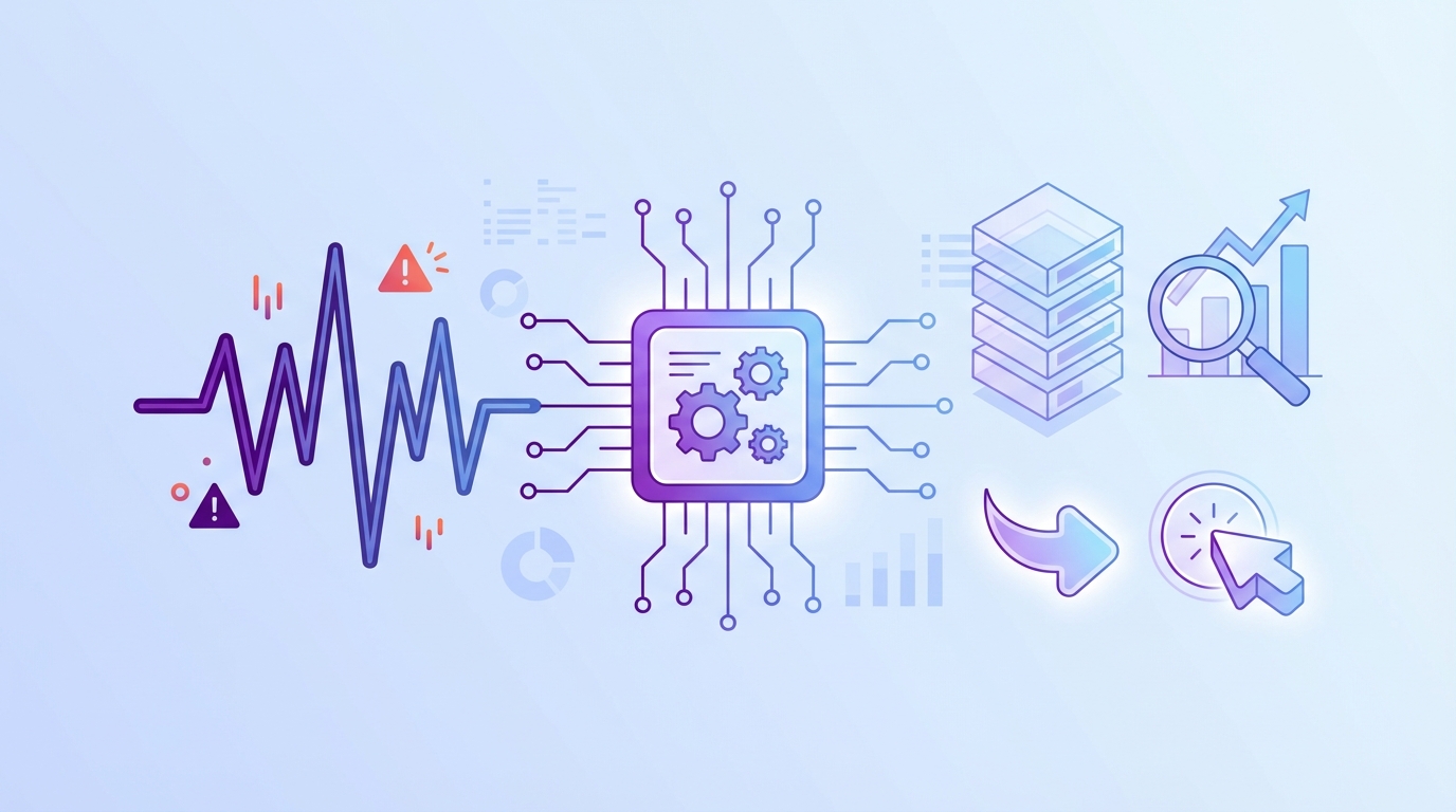
Identifying frustration signals in customer support conversations means turning raw transcripts into structured, defensible metrics that explain why customers struggle. The move is from anecdotes to drivers, from samples to coverage, and from black-box tags to traceable evidence. You need repeatability, speed, and proof, in that order.
From Symptoms To Drivers
Symptoms look like “tickets up 20%” or “NPS down 4 points.” Drivers answer why that moved. Think “password reset loop within SSO,” or “billing proration confusion on plan upgrades,” or “mobile push not received on Android 14.” Drivers live in conversation text, not in your dashboard tiles. So the job is to extract them consistently and roll them up with language your exec team knows.
You also need a taxonomy you can live with. Start simple, refine in the review. We’ve found the best taxonomies are opinionated but flexible. They match how your org already talks, then adapt as new raw tags appear. Otherwise, you create a pretty chart nobody trusts.
The big unlock is traceability. If every driver rolls up from exact tickets and quotes, skeptics lose their footing. They can click, read, and agree. That’s how momentum builds.
What You’re Really Fighting
You’re not fighting a data shortage. You’re fighting noise, latency, and the urge to overfit fixes to anecdotes. People latch onto the last painful escalation they saw. It feels urgent. It’s often wrong. The real mistake is treating conversation analysis like a one-off project instead of an always-on signal.
I’d argue your biggest risk is delay. Delay lets tiny product papercuts turn into revenue leaks. Delay keeps agents compensating with macros while the core issue lingers. Delay creates rework when teams ship band-aids that don’t move the metric. If you only remember one thing, remember this: the faster you can prove the driver, the faster the room aligns.
The Cost Of Missing Early Friction In Support
Missing early frustration signals wastes time, money, and credibility. A 10% manual sample of 1,000 tickets at three minutes each is five hours for a partial view, and you still argue about representativeness. Multiply by every spike, escalation, and board ask. It adds up fast, and you still might miss churn language hiding in quiet cohorts.
Time Cost You Can Measure
Let’s run the math. Five hours for a partial view, then another two to summarize, then another hour of back-and-forth to source quotes when leadership asks for proof. That’s eight hours minimum per review cycle. If you run this weekly, you’re burning a full day, and the signal is still soft.
Worse, your time lands where it helps least. Analysts copy, paste, and format. Managers debate which 100 tickets to read. Agents get pulled into ad-hoc pulls. None of that fixes a broken upgrade flow. It’s drift, not progress. You can feel it.
A better path routes effort to action. Automate the pass that turns raw text into structured drivers and metrics. Spend your human time on prioritization and shipping.
Hidden Revenue And Risk Cost
Frustration shows up before churn. Customers start with “I can’t log in,” then “I’ve tried three times,” then “just cancel it.” Without coverage, you catch the last sentence when it’s too late. That’s the cost you see. The cost you miss is the opportunity you could have saved.
There’s also brand cost. Confidence breaks when leaders find holes in your evidence. That’s why traceability matters. You want to zoom from chart to quote in one click, then back. It quiets the room. It protects your team. And it accelerates decisions.
If you want a technical framing on signal quality, even basic sentiment tooling acknowledges nuance. See AWS Comprehend documentation on sentiment and mixed results. The takeaway is simple, and practical: you need custom, driver-aware metrics, not generic labels.
What It Feels Like When The Queue Starts To Burn
You know the day. Queue spikes, Slack pings, leadership asks if something broke. You open dashboards and see volume, not causality. You DM an analyst. They say, “Give me an hour.” Two hours later, you’re staring at screenshots and hunches. It’s exhausting, and it repeats.
The 11 PM Rewrite
It’s 11 PM, and you’re rewriting a weekly update because the narrative doesn’t hold up under questions. Someone asks, “But which cohorts?” Someone else asks for quotes. You feel your credibility wobble. You promise a follow-up tomorrow. Now your team’s weekend is toast.
Honestly, we’ve all been there. The fix is boring, and powerful. Bring evidence to the first meeting, not the second. Show the driver, the segment, and one representative quote. End of debate.
The next time leadership asks for an update, you want to feel calm. You want to say, “Here’s the driver behind the dip, here’s the impact by segment, and here’s the exact language customers use.” That tone changes the room.
The Fire Drill That Repeats
Fire drills repeat because the system never changes. You sample, you guess, you patch, you move on. Then the same pattern returns with a new name. It’s usually onboarding. Sometimes it’s billing. Same thing with SSO loops. Different week, same root cause.
We’re not 100% sure why teams tolerate this cycle for so long. Habit, maybe. Tooling gaps, definitely. The cure is structure. Give people weekly, trusted signals with traceable proof. Fire drills turn into check-ins. That’s the goal.
You’ll know it’s working when the first five minutes of the meeting cover decisions, not data wrangling. People will still argue. They just argue about the right things.
A Better Way To Spot, Quantify, And Prove Frustration
The new approach measures frustration like any other KPI: defined, consistent, traceable. Start by agreeing on the signals you care about, then analyze 100% of conversations for those signals, then report by drivers and cohorts with links to exact tickets. When everyone can click into proof, the argument ends and work begins.
Define The Signals You Care About
Pick the frustration cues that matter to your business. Think “onboarding blocked,” “billing surprise,” “account access loop,” “cancel intent,” “agent handoff fatigue.” Keep the set small enough to manage, but clear enough to drive action. Name them in your language so executives connect dots without translation.
Then decide the unit of measure. Per ticket, per account, per cohort. Each tells a story. Leaders love trend lines. Product loves cohort splits. CX loves time-to-resolution overlays. You can present all three as long as the definition stays consistent.
Now write down your taxonomy rules. It feels tedious. It saves you later. Clarity upfront prevents weeks of rework.
Measure At 100 Percent Coverage
Coverage removes debate. When every ticket is analyzed for your defined signals, you stop sampling bias at the door. You can pivot by segment, timeframe, or product area without asking if the view is representative. That confidence accelerates prioritization. It also reduces the risk of solving the wrong problem.
A simple, durable workflow helps:
- Ingest all new tickets daily from your helpdesk or CSV imports.
- Apply raw tags to surface granular themes automatically.
- Map raw tags to canonical tags for reporting clarity.
- Aggregate by drivers and cohorts for leadership views.
- Keep everything clickable back to the source conversation.
You’ll rarely find a stronger antidote to opinion than coverage plus traceability. It lowers the temperature in the room.
Prove It With Traceability
Traceability is what makes the signal defensible. Every aggregate should link to the exact tickets and quotes that generated it. If someone questions the spike, you click into examples. If someone questions the mapping, you refine it and watch the change ripple forward.
One more benefit people overlook, it hardens your storytelling. Quarterly readouts land faster when you can show the metric, the driver, and the verbatim on one slide. Nobody asks for “more context.” They can see it.
If your team shares insights across Slack or docs, pull quotes straight from validated tickets. Confidence climbs. Action follows.
Stop missing early friction. Start measuring frustration in minutes with Revelir. See how Revelir AI works
How Revelir Turns Frustration Signals Into Evidence You Can Act On
Revelir processes 100% of your support conversations, turns them into structured drivers, tags, and AI metrics, and links every chart to the exact tickets and quotes behind it. That closes the trust gap that slows decisions. The net effect is simple, faster prioritization, fewer debates, and fixes that stick because everyone agrees on the cause.
Full-Coverage Processing Without Manual Tagging
Revelir ingests tickets from Zendesk or CSV and applies AI-generated raw tags and core AI metrics automatically, no upfront manual tagging. That means you get signal from day one, then refine the taxonomy over time. Full coverage eliminates the risk that your sample missed churn language or subtle onboarding friction hiding in a quiet segment.
When you quantify the earlier time cost, this matters. The eight-hour weekly review cycle drops because raw text becomes structured fields you can filter, group, and export. More important, you stop losing weeks shipping patches for the wrong driver. That’s where the real savings hide.
With evidence-backed traceability in place, you can move from “I think” to “here’s the proof” in one click. That’s the moment the room aligns.
From Drivers To Details In Data Explorer
The Data Explorer gives you a pivot-table-like view of every ticket, with columns for sentiment, churn risk, effort, drivers, raw and canonical tags, and any custom AI metrics you define. You can filter by cohort, group by driver, and sort by impact, then click straight into Conversation Insights to read the transcript and summary. It’s fast, and it holds up under questions.
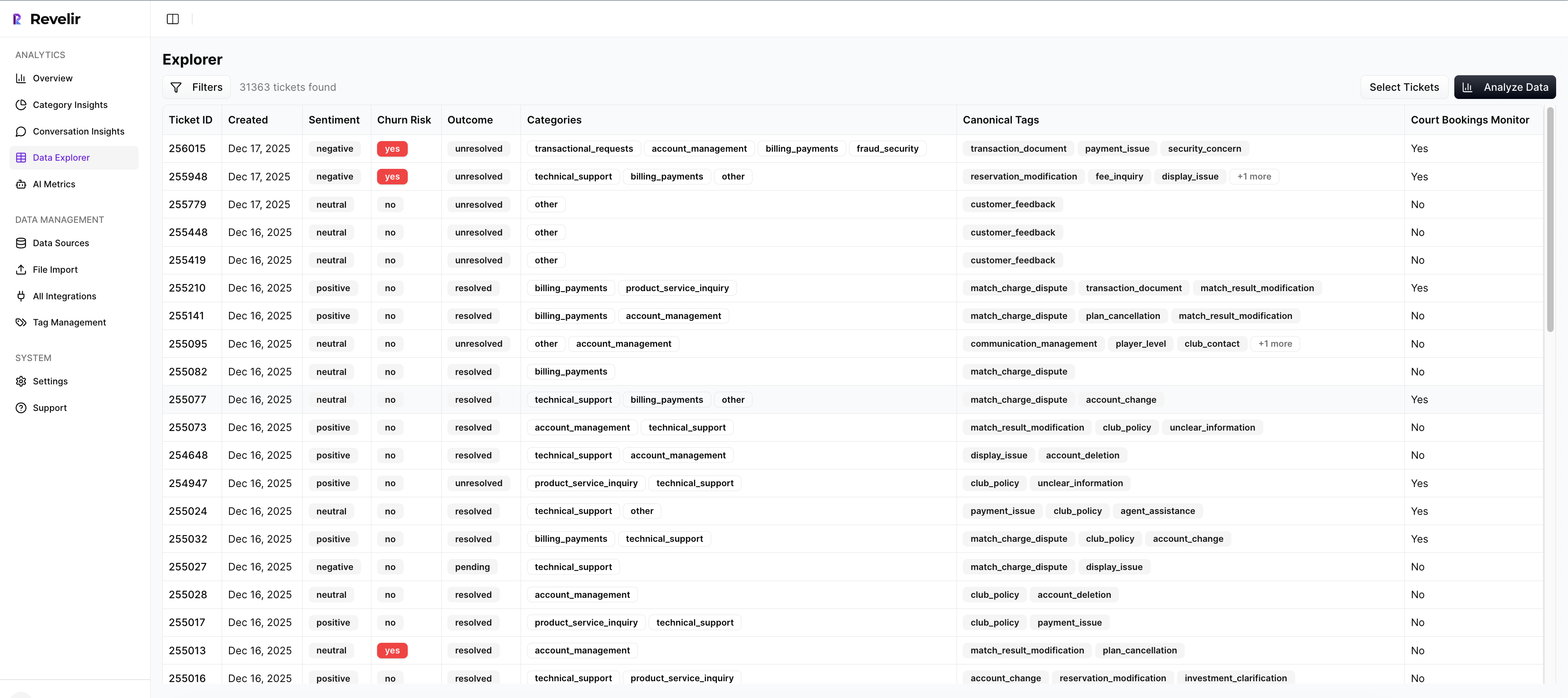
Analyze Data sits alongside it for grouped analysis. Summarize metrics by driver, canonical tag, or raw tag, then drill into outliers without leaving the table. That tight loop shortens the path from pattern to plan. And when leadership asks for quotes, you already have them.
You can bring structured outputs into existing BI with API Export later, but most teams find they need fewer one-off exports once they can explore and validate in one place.
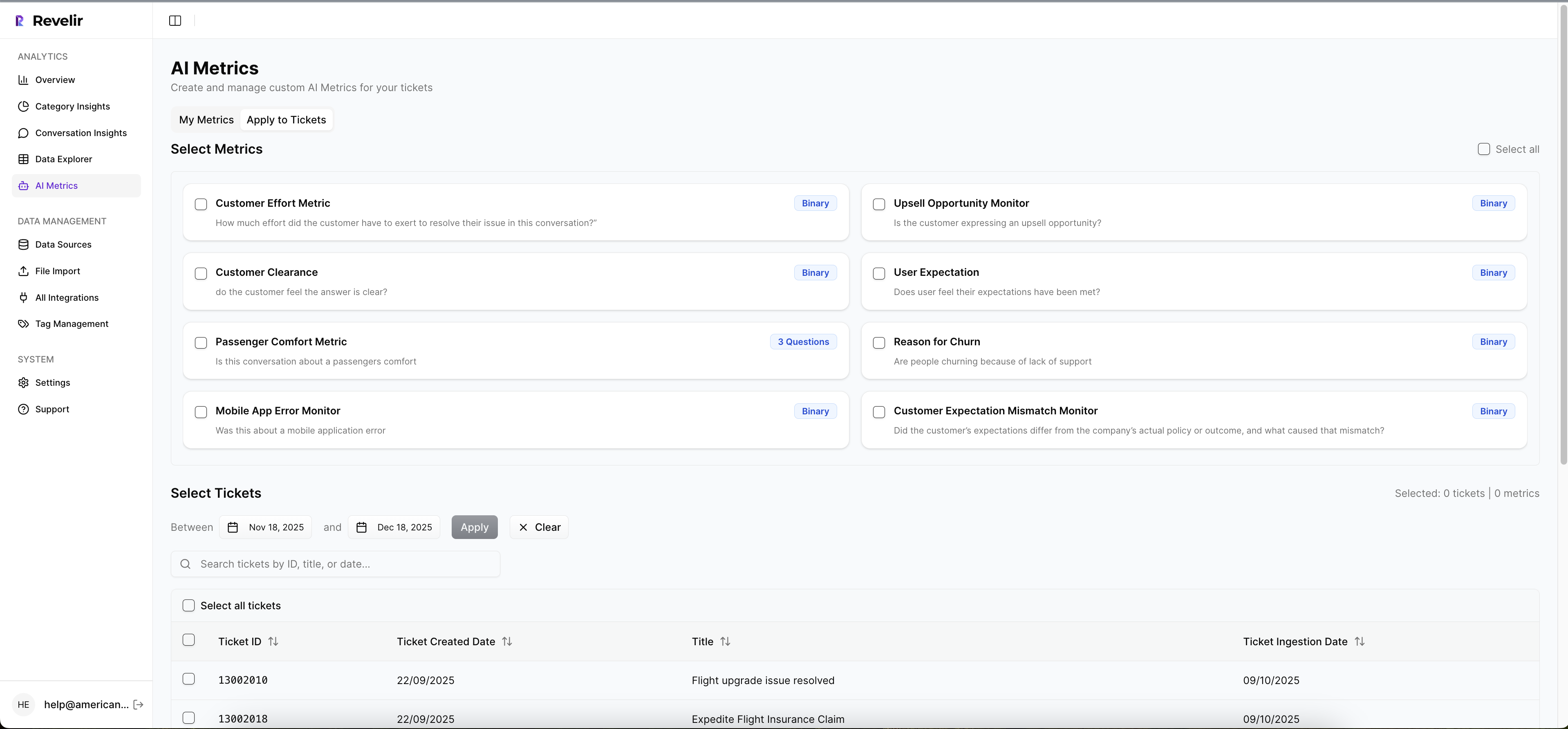
Custom AI Metrics You Can Defend
Every business has signals a generic model won’t catch. With Custom AI Metrics, you define classifiers in your language, like “cancel intent,” “upsell signal,” or “onboarding blocked.” Results become columns you can filter and trend, right next to sentiment, churn risk, and effort from the AI Metrics Engine. Now your review talks about drivers and outcomes, not just scores.
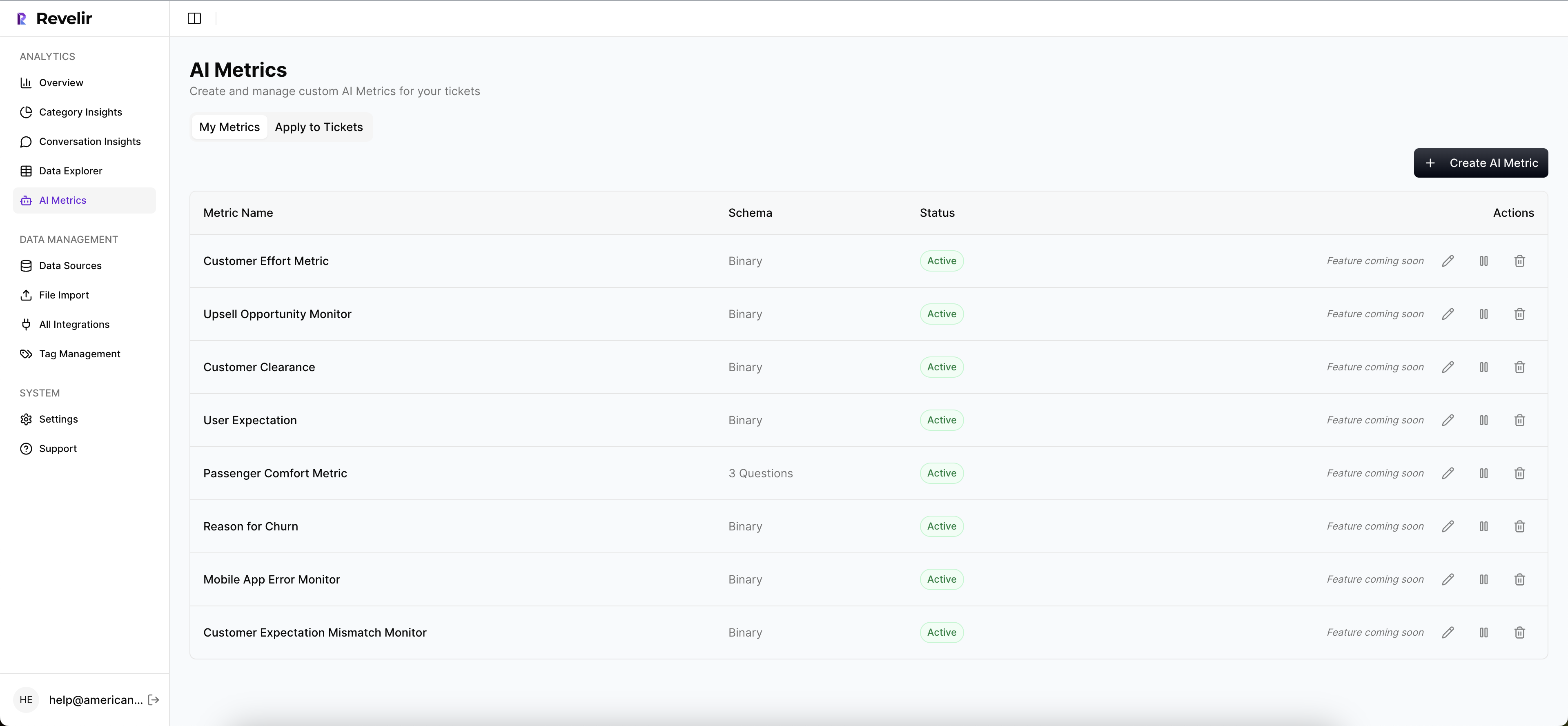
Hybrid Tagging ties it all together. Raw Tags surface emerging themes, Canonical Tags keep reporting clean, and Revelir learns mappings for future tickets as you refine. Drivers roll up the story for leadership. Evidence-Backed Traceability links every rollup to its source. That stack addresses the exact failure modes we quantified earlier, the time waste, the sampling bias, and the missing proof.
Capabilities that make the new workflow real:
- Full-Coverage Processing: analyze 100% of conversations without manual upfront tagging.
- Data Explorer and Analyze Data: filter, group, and summarize by drivers, tags, and metrics with instant drill-downs.
- Hybrid Tagging System: map raw tags to canonical tags and refine taxonomy as patterns emerge.
- AI Metrics Engine and Custom AI Metrics: track sentiment, churn risk, effort, outcomes, plus custom signals in your language.
- Evidence-Backed Traceability: click from any chart to exact tickets and quotes for audit-ready confidence.
3x faster prioritization in one review cycle. That’s what Revelir delivers. Learn More
Conclusion
Frustration signals live inside support conversations, not in the margins of a scorecard. When you define the signals, measure them across 100% of tickets, and make every chart traceable to quotes, your team stops guessing and starts shipping the right fixes. That’s how CX and product move in lockstep, week after week.
Want the fastest path to evidence you can defend in the room? Revelir’s Data Explorer and Analyze Data make it practical without changing your helpdesk. Get started with Revelir AI (Webflow)
Frequently Asked Questions
How do I analyze customer support tickets for frustration signals?
To analyze customer support tickets for frustration signals, you can use Revelir AI's Data Explorer. Start by ingesting all your support tickets, either through Zendesk integration or CSV uploads. Once your data is in, filter the tickets by key metrics like sentiment and churn risk. Look for patterns in the raw and canonical tags that indicate frustration, such as 'billing confusion' or 'account access issues.' This method allows you to see the bigger picture and address issues before they escalate.
What if I want to track specific customer frustration signals?
If you want to track specific customer frustration signals, you can define custom AI metrics in Revelir. Identify the signals that matter most to your business, like 'cancel intent' or 'onboarding blocked.' Set these up as custom classifiers, and Revelir will automatically categorize your support conversations accordingly. This way, you can easily filter and analyze the data to identify trends and take action based on solid evidence.
Can I measure the impact of frustration signals on customer retention?
Yes, you can measure the impact of frustration signals on customer retention using Revelir's Analyze Data feature. Start by aggregating your data by drivers and canonical tags to see which frustration signals correlate with churn risk. This will help you identify which issues need immediate attention. By linking these insights to specific tickets and quotes, you can present a clear case for improvements that could enhance retention.
When should I update my tagging taxonomy in Revelir?
You should update your tagging taxonomy in Revelir whenever you notice new patterns or emerging issues in your support conversations. As you analyze data, if certain raw tags consistently appear that don't fit your current canonical tags, it's time to refine your taxonomy. This ensures that your reporting remains relevant and accurate. Revelir's Hybrid Tagging System makes it easy to adjust and learn from these mappings over time.
Why does my team need evidence-backed insights from support tickets?
Your team needs evidence-backed insights from support tickets to make informed decisions based on real data, rather than assumptions. Revelir provides this by processing 100% of your support conversations and linking metrics directly to the source quotes. This level of traceability builds trust among stakeholders and helps prioritize actions that will have the most significant impact on customer experience.