

Most teams think score trends tell the churn story. They don’t. Identifying Churn Risk Factors in Customer Support starts inside the conversations themselves, not in a dashboard tile. If you want to know why customers leave, you have to measure what they say, when they say it, and what changed right before they said it.
It’s usually obvious after the fact. A new billing flow ships, tickets spike, sentiment drops, renewals slip. Yet nobody’s checking which issues hit which segments, or how often the same theme shows up across regions. Same thing with onboarding. One missing email, effort skyrockets, then account managers fight fires for months.
Key Takeaways:
- Churn risk hides in support conversations, not score tiles or small samples
- You need 100% coverage, consistent tagging, and custom metrics to see true drivers
- Traceability matters, because leaders ask for proof tied to real tickets and quotes
- Segment by customer value and lifecycle to spot costly patterns fast
- Fix order: high-impact drivers that combine negative sentiment and high effort
- Treat “why” as the product, not an afterthought in a BI export
Why Score-Watching Misses Churn Risk in Support
Score trends don’t reveal drivers, so churn risk hides in plain sight. A dip in CSAT or a red NPS quadrant tells you something is wrong, not what to fix or who is at risk. When you rely on scores alone, you risk chasing noise while the real problem grows.
Here’s the truth I see often. Score tiles push teams to ask, “What changed?” without the context to answer it. That gap invites anecdotes, not evidence. If you have 1,000 tickets this month and read 30, you are sampling 3 percent. You’ll miss the quiet, costly pattern that compounds over quarters.
I’ve watched teams stare at a flatline CSAT while premium users quietly fight billing errors. The score averages it all out, so urgency fades. Then renewals slip. The cost isn’t just one logo. It’s the referrals you lose and the roadmap bet you delay because the “signal” stayed fuzzy.
Sampling Creates False Confidence
Sampling feels efficient. It isn’t. A small subset creates a tidy story that rarely holds up under scrutiny. You walk into a review with five quotes and a hunch. Leadership pushes back. Now you are debating representativeness, not fixing a problem.
It’s usually not bad intent. It’s time pressure. People grab a handful of tickets because reading everything seems impossible. Then the sample overindexes on loud cases, or on the last week, or on a pet theory. Without full coverage, you’ll miss the subtle drivers that pile up into real churn.
If you want to avoid this mistake, measure all conversations and then slice. Start with drivers like Billing or Onboarding, then check segments like enterprise, region, or plan tier. The second you add coverage and segmentation, the false confidence cracks, and real patterns emerge.
Score Tiles Hide the "Why"
Scores compress messy reality into a single number. That’s useful until you need action. A red tile won’t tell you whether “password reset loops” or “invoice mismatch” is the culprit. Without drivers tied to quotes, you don’t know what to change.
I’ve sat in those meetings. People argue tactics while the underlying cause stays vague. Someone says “customers are unhappy.” Sure. Why? Which cohort? Which step? Without a clear driver stack and a path back to the exact tickets, you’re guessing.
The fix is simple to say, harder to do. Tie every number to a driver and link it to the actual conversations. When someone asks “show me,” you click, and the quote is right there. Debate ends. Priorities move.
The Real Cause: Hidden Drivers Behind Churn Signals
Churn spikes because hidden drivers go unmeasured, not because writers can’t craft better emails. The real causes are inconsistent tagging, missing coverage, and no shared taxonomy that rolls raw themes into clean categories. When that scaffolding is missing, risk hides.
If we’re honest, most teams inherited their tagging. A dozen similar tags mean the same thing, so counts fragment and insights blur. Then a new issue appears, and nobody adds a canonical category, so it sits as “other.” Momentum dies. Decisions stall because the data feels wrong.
Let’s pretend you had perfect coverage but messy tags. You’d still struggle. Why? There’s no single source of truth to roll thousands of raw phrases into leadership-ready drivers. Without that map, you can’t answer “why now” or “who’s affected” with confidence.
Inconsistent Tagging Breaks the Chain
Raw tickets arrive with inconsistent labels. Humans tag differently. AI-only tagging can drift or miss nuance. The result is a pile of near-duplicates that hide the scale of a real problem and exaggerate edge cases.
I’ve seen “billing-fee,” “billing_fee,” and “invoice fee confusion” live side by side for months. Same issue. Three tags. Counts split, charts lie, and leaders move on. That’s the cost of inconsistency. It’s not just messy data. It’s lost credibility.
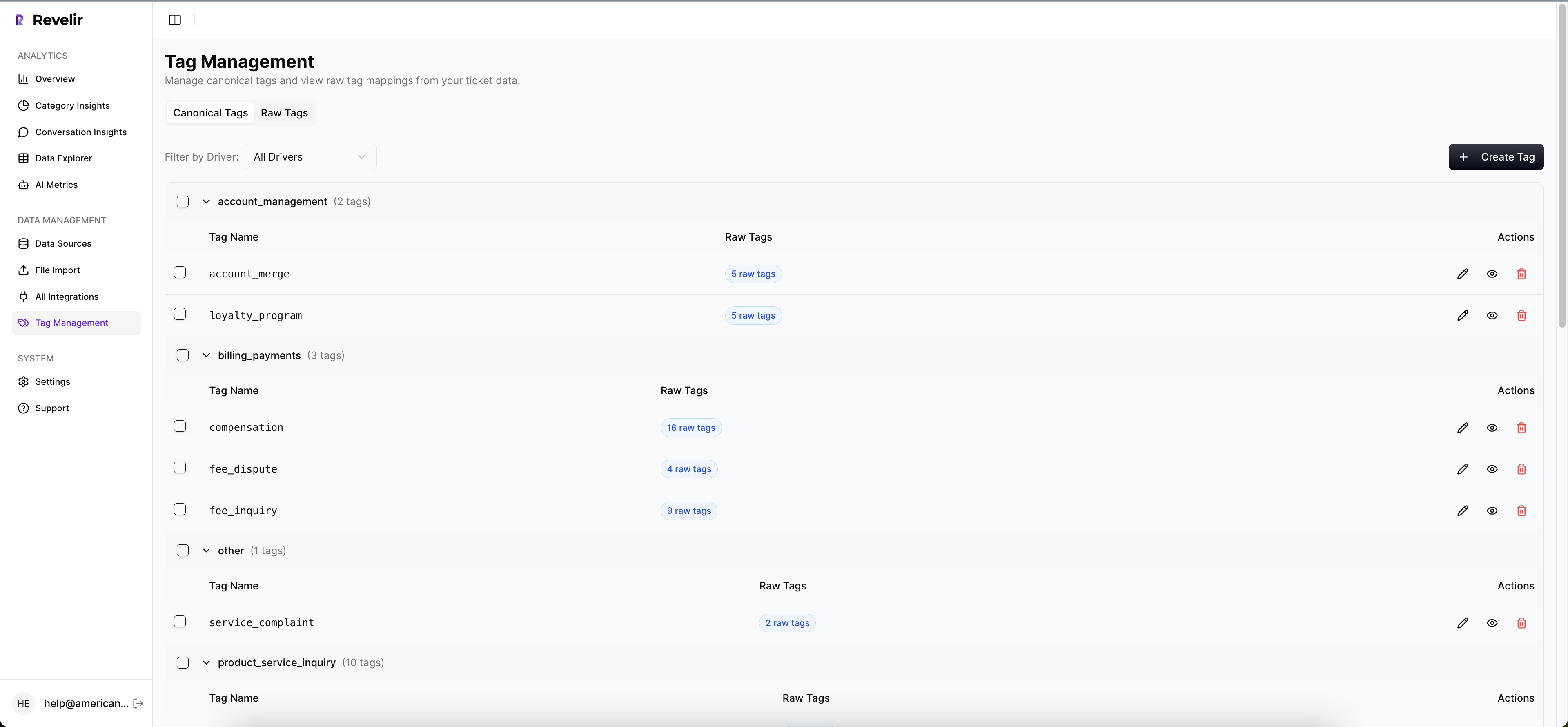
The fix is a hybrid system. Let AI surface granular raw tags, then map them to human-aligned canonical categories. Over time, the system should learn those mappings so future tickets roll up correctly. That’s how you keep nuance without losing clarity.
No Single Source of Truth
Even when teams do real work on tags, there’s no place to validate the rollups. Analysts export to spreadsheets. Product lifts numbers into slides. CX copies quotes into docs. Then the links break and nobody trusts the lineage.
This is where traceability pays for itself. Every aggregate should click through to the exact tickets and lines that created it. When data, tag, and quote stay connected, objections fade. People engage the problem, not the plumbing.
One more point. Drivers need to match your company’s language. If your customers don’t say “authentication,” but they do say “login,” use “Account Access,” not a lab term. Clean taxonomy, shared words, fewer fights.
The Cost of Missing Churn Risk Factors
Missing churn risk costs time, money, and trust. Time, because you argue anecdotes instead of fixing a root cause. Money, because at-risk accounts slip away quietly. Trust, because leadership keeps asking for proof you can’t produce on demand.
Retention economics are brutal. A 5 percent lift in retention can improve profit by 25 to 95 percent, which means each preventable churn event hurts far more than it looks on a weekly dashboard. That’s why missing drivers is so expensive in the long run.
You don’t need 50 metrics. You need a handful that predict risk reliably, tied to the exact tickets. Get that, and the rest of your pipeline gets faster. Product sprints align. Success plans make sense. Fire drills slow down.
Time Lost Arguing, Not Fixing
When data is shaky, meetings drag. Someone says “I don’t buy that,” and the room detours into methodology. Then the hour ends. No decision. The issue lives another week. Multiply that by a quarter and you’ve burned weeks of leadership time.
I’ve been in rooms where three versions of the same chart compete. None trace back to conversations. Everyone hedges. That’s a process problem, not a people problem. Without evidence you can click into, you’ll always stall right when stakes rise.
Switch the order. Show the evidence first. Then the chart. Then the decision. The moment people see the quote that explains the bar, momentum returns.
Revenue At Risk You Can't See
The worst churn is the churn you never saw coming. A handful of high-effort tickets pile up quietly among premium accounts. Sentiment turns negative. Then renewal calls get tough. By the time it hits the board deck, the fix is late and costly.
This isn’t hypothetical. It’s usually a pattern like “refund confusion for annual plan upgrades” that never got its own category. Or “two-factor emails not received” for a specific region. Without coverage and drivers, you won’t see the cluster early enough.
Quantify it. Tie negative sentiment, high effort, and a clear driver to the accounts that matter most. That’s the list your team needs Wednesday morning.
For a refresher on churn definitions and math, see this straight shot from Investopedia on churn rate. For broader retention economics, this summary from Harvard Business Review on retention economics is useful context.
What It Feels Like When Risk Hides in Tickets
It feels like whiplash. Numbers look fine until a big logo threatens to leave. Then everything is urgent. You’re building a case from screenshots at 11 PM because nobody can trace metrics to actual tickets. It’s exhausting.
I’ve watched smart teams burn weekends gathering quotes to defend a chart. That’s not analysis. That’s archaeology. The real problem is simple. Evidence wasn’t captured the first time, so you’re stuck rebuilding the past under pressure.
There’s a better way. Keep the evidence attached to the metric, always. Then when the tough question comes, you click and show. No scramble. No drama.
The 11 PM Fire Drill
You know the one. A leader wants “the top three reasons premium users are frustrated this quarter” for an 8 AM call. You have pieces. Nothing is linked. Now you’re hunting through exports, copying quotes into a doc, and hoping you didn’t miss the pattern that matters.
It’s not sustainable. It’s also avoidable. If every rollup connects to source tickets, answering that 8 AM question takes five minutes, not five hours. The risk isn’t just burnout. It’s the mistake you make at 2 AM that derails the story.
Honestly, this is where process beats heroics. Build traceability in. Save your team from the overnight grind.
Leaders Ask for Proof You Don't Have
Executives don’t hate your analysis. They hate making decisions without evidence. When you say “onboarding is broken,” they want “show me the tickets and the segment.” If you can’t, the conversation drifts. Decisions slip.
I’ve seen a single quote, perfectly representative, change a roadmap meeting. Not because it was dramatic. Because it was clearly tied to the chart in front of everyone. That’s the bar. When you hit it, the room moves.
If that feels hard, it’s because the system isn’t built for it. Fix the system. The work gets easier overnight.
A Better Way to Identify Churn Risk Factors in Customer Support
You identify churn risk factors by measuring 100 percent of conversations, rolling granular themes into clear drivers, and tying every number to the tickets and quotes behind it. Then segment by value and lifecycle to focus on impact. That’s the engine for faster, defensible decisions.
In my experience, the order matters. Define the signals first, before you build charts. Decide what “negative sentiment” and “high effort” mean in your world. Write them down. Then align on drivers and canonical categories that match your language. The clarity reduces noise.
Next, cover everything. No sampling. Let AI propose raw tags so you see emerging themes, then map them to your canonical set. Over a few weeks, the rollups stabilize, and your analysis moves from “what happened” to “why it happened.”
Define the Signals You Care About
Start with a short list of signals that predict risk for your business. Sentiment is obvious, but it’s not enough. Add effort, churn mentions, resolution outcome, and any domain-specific classifiers that capture your reality, like “shipping delay severity” or “billing adjustment requested.”
We’ve seen teams get stuck trying to perfect the list on day one. Don’t. Pick a solid starting set. Write crisp definitions. Calibrate against real tickets weekly. The goal is consistency, not perfection. Consistent signals beat clever ones you can’t reproduce.
Once defined, make them visible in your daily tools. If your team can’t see effort or churn risk next to each ticket, they won’t use them. Put the signals where work happens.
Measure 100% and Make It Traceable
Coverage is non-negotiable. If you measure 60 percent of tickets, you’ll miss patterns that matter. Full coverage prevents the quiet, compounding mistakes that fuel churn. It also ends the “is this representative” debate that stalls progress.
Then insist on traceability. Each aggregate view should link to the exact tickets and quotes behind it. That connection builds trust with leaders and product partners. It also speeds your own work, because validation is one click, not a scavenger hunt.
To put this into practice, follow this sequence after your definitions are set:
- Aggregate by drivers like Billing, Account Access, or Onboarding to find hotspots
- Layer in sentiment and effort to sort severity and urgency
- Segment by plan, region, lifecycle stage, or ARR to focus on impact
- Drill into representative tickets, then capture quotes for the brief
- Confirm the pattern holds over time, not just one week
Want a broader market read on shifting expectations? The annual Zendesk CX Trends report is a good pulse check across industries.
Ready to see this approach end the guessing? See how Revelir AI works.
How Revelir AI Makes Churn Risk Identification Trustworthy
Revelir turns messy support conversations into structured, evidence-backed metrics that reveal churn risk drivers fast. It processes 100 percent of tickets, computes core signals, and rolls granular themes into human-aligned categories you can defend. Every chart links to the exact tickets and quotes behind it.

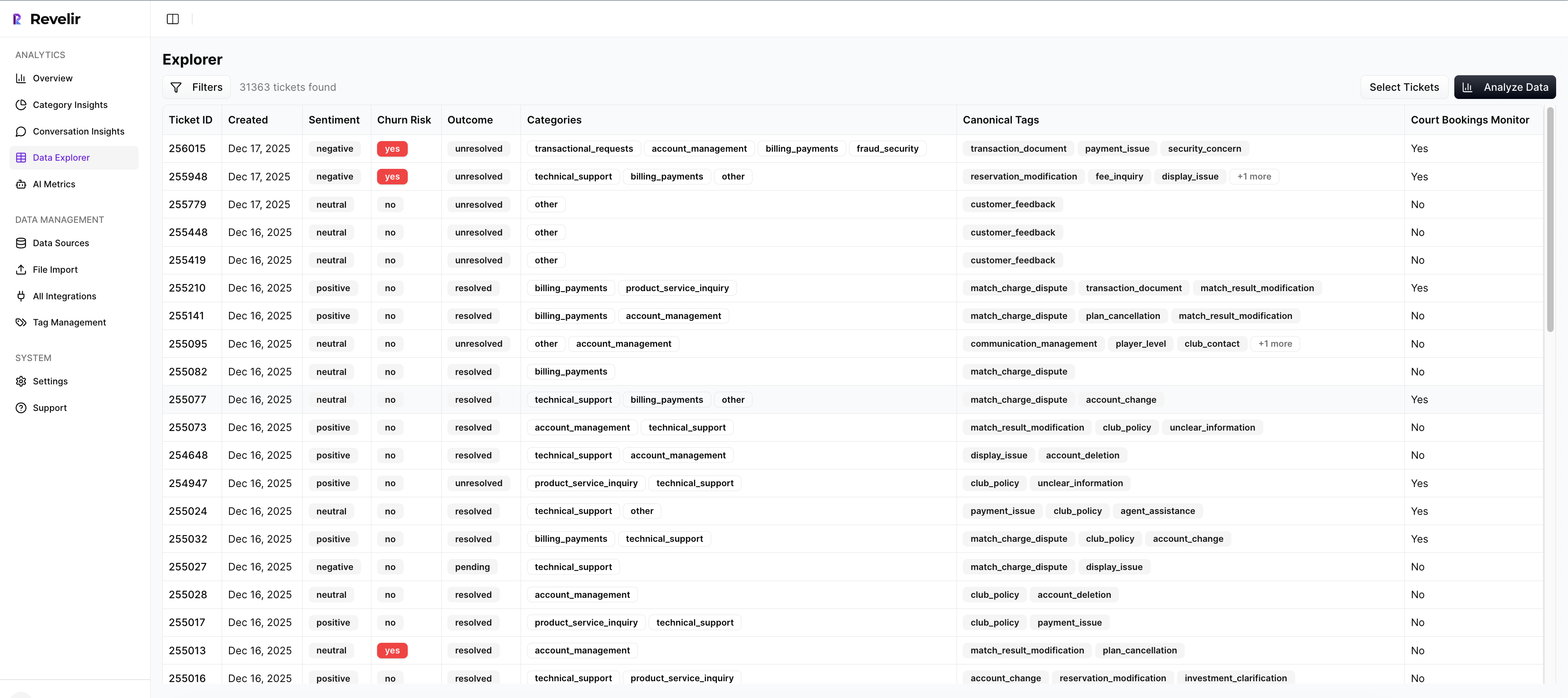
Here’s how it comes together in practice. The AI Metrics Engine adds sentiment, churn risk, effort, and outcome as fields you can filter instantly. The Hybrid Tagging System proposes granular raw tags that you map to canonical categories, so nuance survives and reporting stays clean. Then Data Explorer lets you slice like a pivot table, from drivers to segments, with ticket-level drilldowns for proof.
Analyze Data summarizes those signals across drivers or tags with interactive tables you can click through, while Conversation Insights keeps the full transcript and AI-generated summaries at your fingertips. You move from “we think” to “we know,” and you can show your work.
From Messy Tickets to Structured Signals
Revelir’s full-coverage processing ingests historical and ongoing tickets through the Zendesk integration or a simple CSV upload. No sampling. No upfront manual tagging. Every conversation gets AI Metrics, raw tags, and initial drivers applied, which means you start with a complete, structured view.
Then your team steers the taxonomy. Map raw tags to canonical tags, refine names, and let the system remember those choices. Over time, similar raw tags roll up correctly on their own. You keep the fine-grained signal without drowning in dozens of near-duplicates.
When you need to validate a pattern, open Conversation Insights. You’ll see the transcript, assigned tags, drivers, AI metrics, and an AI-generated summary to grab the right quotes fast. It’s all in one place, so you don’t waste hours cross-referencing exports.
Faster Answers Without Losing Evidence
Data Explorer gives you a row-level table with columns for sentiment, churn risk, effort, drivers, tags, and any Custom AI Metrics you define. Filter by enterprise customers this quarter, group by Billing versus Account Access, sort by negative sentiment and high effort, then click into the tickets behind the worst buckets.
Analyze Data adds grouped analysis that summarizes key metrics by driver or tag with stacked charts that link to source tickets. When a leader asks “why are premium users frustrated,” you can answer in minutes, backed by quotes, not slides. That speed reduces fire drills and builds trust.
Key capabilities you’ll rely on daily:
- Evidence-backed traceability, every chart links to the exact tickets and quotes
- Hybrid Tagging System, AI raw tags mapped to canonical categories your org understands
- AI Metrics Engine, sentiment, churn risk, effort, and outcome as structured fields
- Data Explorer and Analyze Data, pivot-like slicing plus grouped summaries with drilldowns
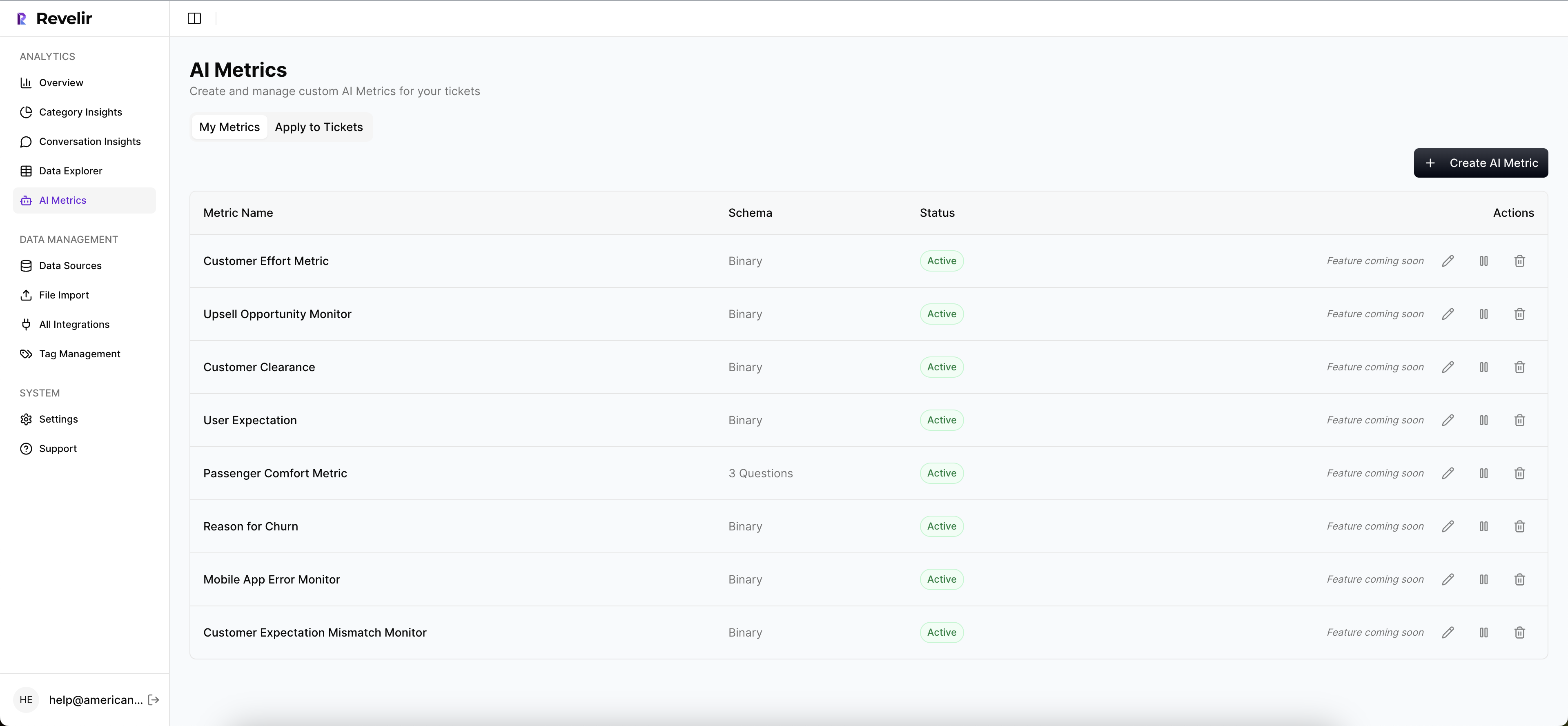
- Custom AI Metrics, domain-specific classifiers you can define and reuse across analyses
Three things tend to change first with Revelir. You stop sampling. You stop arguing about “is this real.” You start fixing high-impact drivers faster because everyone can see the same evidence in context.
Curious what this unlocks in month one? Learn More.
Before you wrap this up with your team, consider the compounding effect of small, targeted fixes. One driver removed from onboarding, across a key segment, often lifts renewal confidence faster than any new campaign. If you want to go from “we think” to “we know,” and you want proof on demand, it’s time to try the system that keeps the evidence attached. Get started with Revelir AI (Webflow)
Conclusion
Churn risk lives inside support conversations. Not in a score. When you measure 100 percent of tickets, define clear signals, and keep traceability intact, you stop guessing and start deciding. It feels calmer. It performs better.
If you do nothing else, fix coverage and drivers. Then tie every rollup to the ticket and the quote. The rest gets easier, and your roadmap gets clearer.
Frequently Asked Questions
How do I ensure full coverage of support tickets?
To ensure full coverage of support tickets, connect Revelir AI to your helpdesk system like Zendesk. This integration allows Revelir to automatically ingest all tickets, ensuring that no conversation is missed. You can also upload historical data using CSV files for a comprehensive analysis. By processing 100% of your tickets, you eliminate blind spots and get a complete view of customer sentiment and churn risk.
What if I want to analyze specific customer segments?
If you want to analyze specific customer segments, use the Data Explorer feature in Revelir AI. This tool allows you to filter and group tickets based on various dimensions like customer value, lifecycle stage, or region. By segmenting your data, you can identify patterns and churn risk factors that are unique to different customer groups, making your insights more actionable.
Can I customize the metrics I track in Revelir AI?
Yes, you can customize the metrics you track in Revelir AI by using the Custom AI Metrics feature. This allows you to define domain-specific classifiers that are relevant to your business needs. You can set up custom questions and value options, which will then be stored and usable across your analyses. This flexibility helps you focus on the specific signals that matter most to your organization.
When should I review my tagging system?
You should review your tagging system regularly, especially after significant changes in your support processes or customer feedback trends. Use the Hybrid Tagging System in Revelir AI to refine your tags. This system allows you to map raw tags to canonical categories, ensuring clarity and consistency. Regular reviews help maintain an accurate taxonomy, which is crucial for effective analysis and reporting.
Why does my team need traceability in metrics?
Your team needs traceability in metrics to build trust with stakeholders and make informed decisions. With Revelir AI's evidence-backed traceability, every aggregate number links directly to the source conversations and quotes. This connection allows your team to validate insights quickly and respond to leadership queries with confidence, reducing the time spent on debates and increasing focus on actionable solutions.