

You can stare at CSAT for 6 months and still miss the thing that's actually breaking your customer experience. If you're trying to effectively use data explorer workflows on top of sampled tickets, you're probably getting a cleaner dashboard and a worse decision.
Support teams don't usually have a data problem. They have a free-text problem. Thousands of tickets, tons of opinions, not enough proof. Same thing with product teams who keep hearing "customers are frustrated" but can't pin down why, how often, or which segment is getting hit hardest.
Key Takeaways:
- If you want to effectively use data explorer workflows, start with evidence, not summary scores.
- Sampling breaks the picture fast once you cross a few hundred tickets a month.
- The real job isn't spotting what happened. It's finding why it happened.
- A useful support analysis system needs three layers: row-level data, grouped patterns, and ticket-level proof.
- Custom metrics beat generic sentiment when your team needs answers in its own language.
- If a chart can't be traced back to actual tickets and quotes, expect debate instead of action.
Why Most Support Analysis Fails Before the Dashboard Even Opens
Support analysis fails because the input model is wrong. Most teams think the hard part is reporting. It's not. The hard part is turning messy conversations into something you can trust before you start filtering, grouping, and presenting it.

A lot of teams try to effectively use data explorer style analysis after they've already accepted bad source logic. They review a sample, export a spreadsheet, clean up tags by hand, then wonder why every leadership meeting turns into an argument about whether the pattern is real. That's not an analysis issue. That's a trust issue.
The hidden problem isn't visibility, it's evidence quality
A dashboard can show you a drop in sentiment. Fine. It can show ticket volume by week. Fine. But if it can't tell you which issue drove that shift, which customers were affected, and what those customers actually said, then you've got summary without substance.
Let's pretend you're a Head of CX reviewing 8,000 monthly tickets. Your team sampled 200 of them, found a spike in "billing frustration," and put it in a slide. Then product asks which billing issue. Finance asks how many enterprise accounts were affected. The COO asks whether this is new or seasonal. Nobody knows. Now the room is discussing confidence levels instead of next steps. That's the cost of weak evidence quality.
Here's the decision rule I use: if fewer than 80% of the people in the room would trust the chart without seeing backup, the metric isn't ready for prioritization. Harsh maybe. Still true.
Sampling creates false certainty faster than people realize
Sampling has one real advantage: it's familiar. You can do it with a spreadsheet, a rotating review process, and one sharp analyst. There's a case to be made for it when volume is low, say under 300 tickets a month, or when you're doing a one-time audit. Fair enough.
But once support volume climbs past 1,000 tickets a month, a 10% review sample means 900 conversations are invisible by default. That's where weird edge cases stop being edge cases. That's also where churn clues hide. Not in the loudest ticket. In the repeated one nobody's checking.
Manual review also introduces timing bias. Teams review more when something already feels wrong. So the sample gets shaped by stress, not by the full picture. That means the output looks analytical while still being reactive. Big difference.
One useful benchmark: if your manual review process takes more than 5 hours a week and still covers under 20% of tickets, stop expanding the review team. Fix the system.
Scoreboards don't answer why customers are upset
CSAT and NPS have their place. They can tell you something changed. They can't tell you what to fix on Monday. Same thing with basic sentiment tools. Positive, neutral, negative is a start, not an explanation.
What actually moves decisions is the why-layer. Drivers. Tag patterns. Effort signals. Churn risk flags. Custom measures that match the way your business talks. If you don't have that layer, every trend becomes a guess wrapped in a chart.
Honestly, this is where a lot of teams get stuck. They buy reporting, when what they needed was interpretation infrastructure. And that brings up the obvious question: if summary dashboards aren't enough, what should you build instead?
If you want to stop arguing with your own reporting, Learn More about what evidence-backed support analysis looks like in practice.
The Better Way to Effectively Use Data Explorer Workflows
To effectively use data explorer workflows, you need a three-layer system: structured ticket data at the row level, grouped pattern analysis for trend detection, and direct ticket traceability for proof. That order matters because insight without drill-down creates doubt, and drill-down without structure creates chaos.
Most teams jump straight to charts. I'd argue that's backwards. You need a system that lets you move from one ticket, to a pattern, to a decision, then back to the original ticket again. That's the loop. I think of it as the Evidence Ladder: rows, rollups, receipts.
Start with the row-level view, not the executive summary
The first step in effectively using data explorer setups is getting comfortable at the ticket row level. Not because executives want rows. They don't. Because pattern quality depends on row quality.
When each row carries fields like sentiment, churn risk, effort, drivers, tags, and custom metrics, you can stop treating conversations like blobs of text. Now they're analyzable records. You can filter by date, account segment, issue type, or risk state and know you're comparing like with like.
A practical maturity test helps here. Ask these four questions:
- Can you inspect any ticket as a row with consistent fields?
- Can you filter that dataset in under 30 seconds?
- Can you isolate a segment without exporting to CSV?
- Can you click from a metric back to the underlying conversation?
If the answer is no to two or more, you're not really in analysis mode yet. You're still in data cleanup mode.
The before-and-after difference is huge. Before, a support lead says, "customers seem frustrated about onboarding." After, they say, "high-effort onboarding tickets from new SMB accounts rose 18% this month, mostly tied to account access and setup confusion." One is a feeling. One is usable.
Use grouped analysis to move from what happened to why it happened
Once your ticket rows are structured, the next move is grouped analysis. This is where you effectively use data explorer plus analysis views to stop watching score changes in isolation. You group metrics by drivers, canonical tags, raw tags, or a custom metric that matches your business.
This is the move from symptom to cause. Sentiment dropped. Why? Churn risk increased. Why? Effort is high in one segment. Why? A driver like Billing or Account Access is spiking. That's the chain.
I use a simple rule called the 15-15 rule. If a segment shows a 15% negative movement in sentiment, effort, or churn risk, group it immediately by driver or canonical tag before you report it upward. Don't send raw trend lines into a leadership room. Bring the cause layer with you.
Some teams prefer to start with tags instead of drivers, and that's valid when they need more granularity. But drivers usually work better for leadership reviews because they compress noise into decision-ready themes. Tags help you inspect. Drivers help you prioritize.
Custom metrics are what make analysis usable across teams
Generic sentiment labels are too broad for real operating decisions. You need measures that match the way your company actually talks. That's usually the difference between a nice demo and a system the business keeps using.
Let's pretend your product team wants to track "setup blocker" while your retention team cares about "reason for churn" and sales leadership wants to see "upsell opportunity." A generic tool won't speak that language well enough. A custom metric will. That's why custom metrics matter more than most buyers realize.
My rule here is simple: if a business review repeatedly asks the same question three weeks in a row, turn that question into a metric. That's the Metric Conversion Rule. Repeated question becomes tracked field. If it doesn't become a tracked field, your team will keep re-arguing it from scratch.
And this is the surprising connection people miss: custom metrics aren't just an analytics feature. They're a political feature. They let different teams trust the same dataset because the labels reflect their world, not some vendor default vocabulary.
Traceability is the part that keeps insights from getting shot down
An insight is only as durable as the proof behind it. You can effectively use data explorer outputs all day, but if the chart can't be traced back to exact conversations and quotes, somebody will challenge it. Often the most senior person in the room. That's not cynicism. That's normal organizational behavior.
Traceability changes the conversation. Instead of saying, "we think billing confusion is rising," you can show the grouped pattern, then drill into the exact tickets, then pull the quotes. That closes the loop fast. Data to evidence. Evidence to action.
We were surprised how often this is the missing piece in teams that already consider themselves data-driven. They've got dashboards. They've got exports. They've even got analysts. What they don't have is a clean path from number to narrative to proof. Without that, insights stall out.
So use this threshold: every metric presented for prioritization should be traceable to at least 3 underlying ticket examples within 2 clicks. If it takes longer, the insight probably won't survive executive scrutiny.
If you're trying to answer common CX questions with grouped metrics and traceable tickets, See how Revelir AI works and look at the workflow, not just the chart.
How Revelir AI Turns Support Data Into Evidence You Can Defend
Revelir AI ingests conversations from Zendesk or CSV, structures them into metrics and tags, then lets teams explore patterns and trace every number back to the original ticket.
That matters because the job is insight. Revelir AI helps teams work with the support data they already have by turning transcripts into structured fields they can filter, analyze, and validate.
Data Explorer gives you the row-level control most teams never had
Revelir AI's Data Explorer is the working surface for analysis. Each ticket shows up with columns for sentiment, churn risk, effort, tags, drivers, and custom metrics, so you can filter, group, sort, and inspect without losing the underlying ticket context.
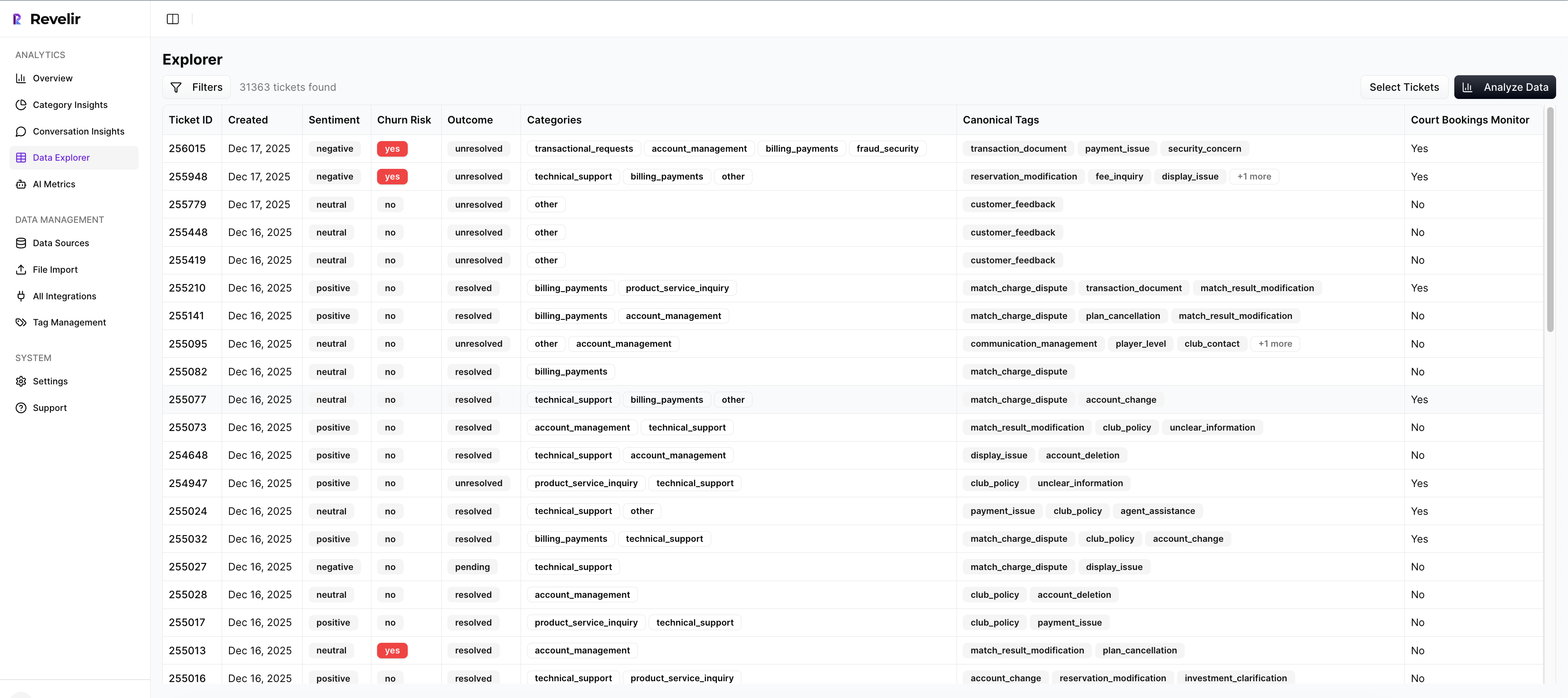
That matters for one very practical reason. Manual spreadsheet analysis gets messy fast when follow-up questions start piling up. Data Explorer gives teams a pivot-table-like workspace with column management, scrolling, and seamless drill-downs into specific tickets from the same view.
A lot of tools stop at summary output. Revelir AI keeps the row-level layer intact. That's why the system is useful in both operator reviews and leadership reviews.
Analyze Data, Drivers, and custom metrics give you the why-layer
Revelir AI's Analyze Data feature summarizes metrics by dimensions like Driver, Canonical Tag, or Raw Tag, with interactive tables and stacked bar charts that link back to underlying tickets. That makes it much easier to move from what happened to why it happened.
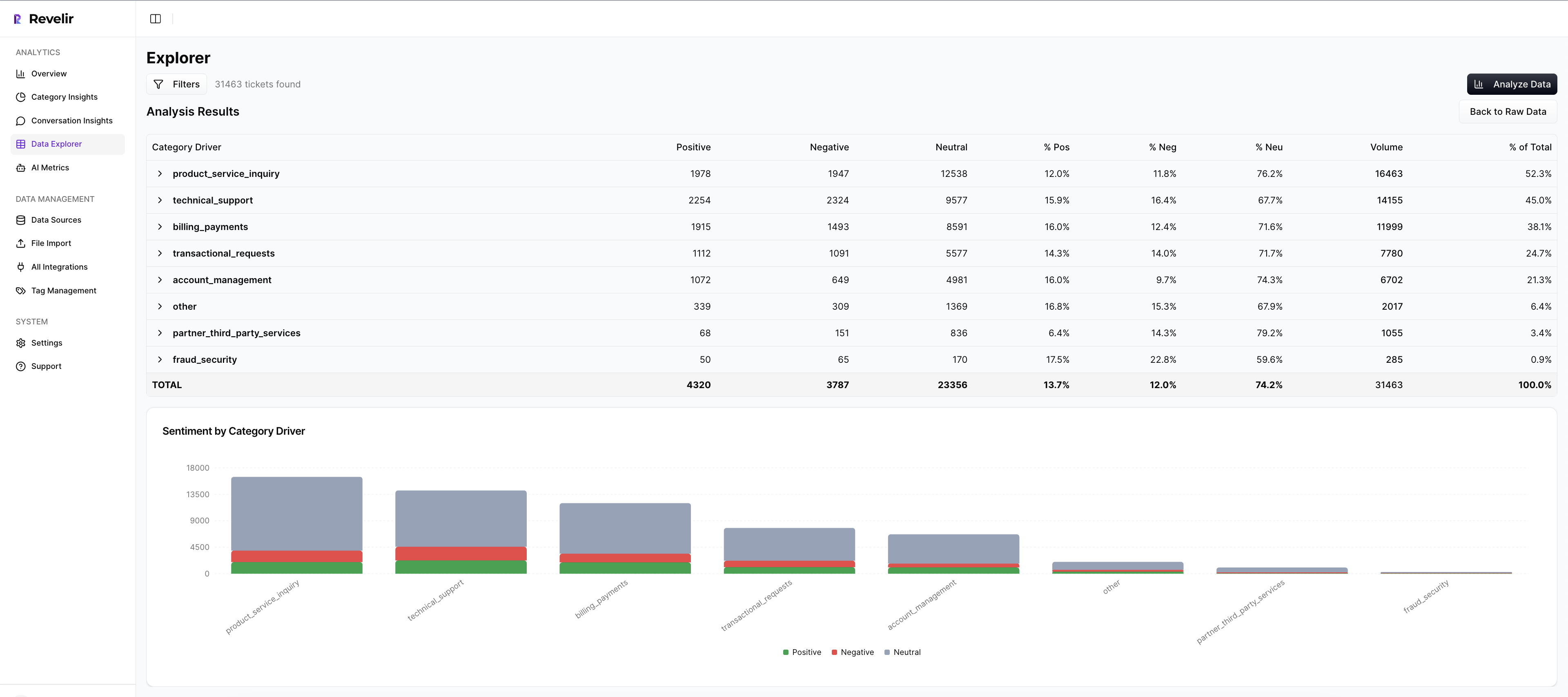
This is where Drivers and Custom AI Metrics do the heavy lifting. Drivers give you leadership-friendly themes like Billing, Onboarding, or Performance. Custom AI Metrics let you define business-specific classifiers with your own question and answer logic. So instead of relying only on broad sentiment, you can track things like reason for churn or a domain-specific issue pattern in language your team already uses.
That's a big deal. Because once your metrics sound like your business, cross-functional reviews get cleaner and more useful.
Evidence-backed traceability keeps the room honest
Revelir AI links aggregate numbers back to source conversations and quotes through Evidence-Backed Traceability and Conversation Insights. So when a metric stands out, your team can drill into the transcript, review the AI-generated summary, inspect the tags and drivers, and validate the story with real customer language.
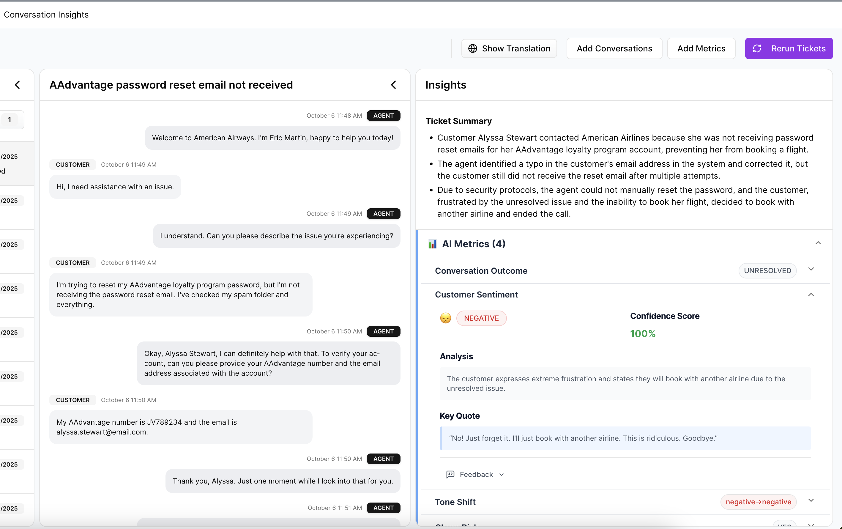
That's what makes the analysis defensible. Add Full-Coverage Processing on top of that, and now you're not debating whether the sample was representative either.
You can start with Zendesk Integration or CSV Ingestion, analyze 100% of conversations, and use API Export later to bring structured metrics into existing reporting and BI workflows.
If you're ready to stop sampling and start working from proof, Get started with Revelir AI (Webflow).
What Changes When You Stop Measuring Support Like It's a Survey Program
Using data explorer effectively isn't really about learning a screen. It's about changing the standard of evidence inside your company. When teams can move from row-level tickets to grouped patterns to exact quotes, they stop reporting symptoms and start explaining causes.
That's the shift. Less score-watching. More proof. Less sampling. More coverage. Less debate about whether the issue is real. More clarity on what to fix first. And if you're already sitting on thousands of support conversations, you probably don't need a new helpdesk. You need a better intelligence layer on top of the one you have.
Frequently Asked Questions
How do I analyze customer feedback trends over time?
To analyze customer feedback trends, start by using Revelir AI's Data Explorer. You can filter tickets by date ranges and group them by drivers or tags to see how sentiments change over time. This way, you can identify specific issues that may be affecting customer satisfaction and track their evolution. Additionally, leverage the Analyze Data feature to summarize metrics like sentiment and churn risk, which will help you pinpoint patterns in customer feedback more effectively.
What if I want to create custom metrics for my team?
You can create custom metrics in Revelir AI by using the Custom AI Metrics feature. This allows you to define specific classifiers that match your team's language and needs, such as tracking reasons for churn or upsell opportunities. Simply set up your custom questions and value options, and these metrics will be stored as columns for easy filtering and analysis. This ensures that your team can focus on the insights that matter most to them.
Can I integrate Revelir AI with my existing helpdesk?
Yes, Revelir AI can integrate directly with your helpdesk, such as Zendesk. This integration allows you to automatically ingest support conversations and ticket metadata, ensuring that you have all the necessary data for analysis without manual exports. Once set up, Revelir AI processes 100% of your tickets, providing a comprehensive view of customer interactions and insights.
When should I use grouped analysis in my reports?
You should use grouped analysis in your reports when you notice significant changes in metrics, like a 15% drop in sentiment or an increase in churn risk. By grouping these metrics by drivers or canonical tags, you can move from identifying symptoms to understanding the underlying causes. This approach not only strengthens your reports but also provides leadership with actionable insights that can guide decision-making.
Why does traceability matter in customer support analysis?
Traceability is crucial because it links aggregate metrics back to specific conversations and quotes, providing the evidence needed to support your insights. In Revelir AI, this is achieved through Evidence-Backed Traceability, which allows you to drill down from summary data to the original tickets. This transparency builds trust with stakeholders and ensures that your analysis can withstand scrutiny during discussions.