

Most support teams are still making million-dollar product and CX calls from 50 tickets and a vibes-based dashboard. If you had to effectively communicate customer insight to your product lead this week, you probably felt the gap: lots of anecdotes, not much proof.
You can tell a compelling story from support data. You just can't do it with sampling, loose tags, and a slide that says sentiment is down.
Key Takeaways:
- If you want to effectively communicate customer insight, start with full conversation coverage, not a sample.
- Scores tell you that something changed. Drivers and ticket evidence tell you what to fix.
- The fastest way to lose trust in a leadership meeting is to show a chart you can't trace back to real conversations.
- A useful customer insight system needs three layers: structured metrics, flexible analysis, and ticket-level proof.
- If your team still exports CSVs into a BI tool before asking basic questions, the workflow is the bottleneck.
- The strongest insight teams don't just report trends. They explain cause, impact, and affected segments.
Why Most Customer Insight Updates Fall Apart in the Room
Customer insight falls apart when the evidence chain is weak. You can effectively communicate customer insight only when the metric, the pattern, and the underlying ticket all connect cleanly. Without that, every chart turns into a debate.

At 8:14 AM on Tuesday, a support lead is in Google Slides pulling in ten Zendesk screenshots before a product review. She has 1,240 tickets from the last month, but she only read the 27 that looked loudest in Slack and the handful escalated by CSMs. Twenty minutes later, a PM asks whether the billing issue is isolated to self-serve accounts or spreading into enterprise. She doesn't know, the room goes soft, and a real customer problem gets treated like a maybe.
Manual review has a place. Fair point. If you handle 80 tickets a month and your founder still reads half of them, you can get away with it for a while. But the threshold is lower than most teams think. Once you're above roughly 500 tickets a month, the "read a sample and summarize it" method starts breaking because coverage drops, bias creeps in, and the loudest stories start steering the roadmap.
The real problem isn't communication skill
The real problem isn't that CX leaders can't present well. It's that most teams are trying to communicate insight from data that was never structured for decision-making in the first place. That's a different problem.
Same thing with dashboards. A dashboard can look polished and still be useless. If it shows ticket volume, CSAT, and a few manual tags, but can't answer why sentiment dropped for enterprise accounts in the last 30 days, it's not an insight layer. It's a reporting layer.
I've seen teams confuse confidence with formatting. A clean chart gets treated like evidence even when the source behind it is thin. That's risky. The room can feel it.
Sampling creates false certainty
Sampling feels responsible because it sounds analytical. Review 5%, spot patterns, report back. But sampling is a liability when you're trying to effectively communicate customer insight across teams that are already skeptical.
Here's a simple rule I like: if the decision affects roadmap priority, escalation policy, or churn risk, sampled tickets aren't enough. You need full-coverage evidence. If the decision is local and reversible, sampling may be fine for a first pass.
The hidden cost is political, not just analytical. Once one stakeholder questions the sample, the whole finding is now suspect. You stop talking about the customer problem and start talking about methodology. That's a bad trade.
The room needs proof, not just pattern language
Support data works like an audit trail. If you can't drill from the headline metric to the exact conversations behind it, trust leaks out fast. Product leaders want to know what's breaking. CX leaders want to know who feels it most. Ops wants to know whether this is getting worse. They all need the same thing: evidence they can inspect.
Think of it like a call center QA scorecard crossed with a finance close process. The chart is the summary line item. The tickets are the journal entries underneath. If the backup isn't there, nobody serious signs off. The next question is obvious: what does a usable system actually look like?
If you want to see what that kind of evidence chain looks like in practice, Learn More.
The Shift From Reporting Activity to Explaining Why Customers Struggle
To effectively communicate customer insight, you need to move from activity metrics to causality. That means less "tickets up 18%" and more "billing confusion drove a 2.3x rise in high-effort conversations for new accounts." One is reporting. The other is decision input.
Most teams stay trapped in what I call the Score-to-Story Gap. That's the space between a number changing and anyone knowing what the number means. CSAT dips. Sentiment turns negative. Volume spikes. Fine. But why? Which customer segment? Which issue cluster? Which product behavior triggered it? Without those links, your insight team becomes a narrator for symptoms.
The 3-Layer Proof Stack
The cleanest way to think about this is the 3-Layer Proof Stack:
- Signal layer: structured metrics like sentiment, churn risk, effort, or outcome
- Pattern layer: grouped trends by driver, tag, segment, or time window
- Proof layer: exact conversations and quotes behind the pattern
If one layer is missing, the communication breaks. No signal layer, and you have raw text chaos. No pattern layer, and you have isolated stories. No proof layer, and you're asking people to trust a black box.
That's why score-only tools disappoint smart teams. They give you the signal layer and stop there. Better than nothing, sure. But not enough for a roadmap argument.
Drivers beat generic themes
A VP does not fund a fix for "bad sentiment." They fund a fix for a named driver with a visible blast radius.
Scores aren't strategy. Drivers are closer to strategy because they explain why the score moved. A negative sentiment trend is interesting. A negative trend tied specifically to onboarding friction for self-serve customers is useful.
There's a case to be made for keeping things simple with top-line metrics, especially for exec reviews. I get that logic. Nobody wants a 40-minute taxonomy lecture. But simplicity only works when it sits on top of real structure. Otherwise the summary is just compressed ambiguity.
A good driver model gives you reporting language leadership can understand. Billing. Onboarding. Performance. Account access. That's how you effectively communicate customer insight without drowning everyone in ticket fragments. You abstract just enough, then keep the evidence one click away.
Metrics have to match the business language
What happens when the model is technically accurate but speaks a language your company never uses? Usually, nothing. The output dies in the meeting.
Let's pretend you're a travel company. Basic sentiment won't tell you much about passenger comfort issues, missed connection stress, or upgrade opportunity patterns. Same thing with a B2B SaaS team. You might care about implementation blockers, admin confusion, renewal risk, or escalation triggers. If the metric language doesn't map to those questions, nobody will use it.
That leads to a practical rule: if a metric can't be explained in the exact words your product or CX team already uses, it won't survive the meeting. That's why custom, domain-specific metrics matter. Not because custom is fancy. Because relevance beats generic every time.
Diagnosis comes before storytelling
Before you try to effectively communicate customer insight, diagnose what kind of insight system you actually have. Use this red-flag checklist and be honest:
- You report scores, but can't explain what drove the change
- You present quotes, but can't size the problem across the full ticket set
- Your BI report depends on manual exports every week
- Product asks for examples, and your team scrambles to find them
- Support has tags, but nobody trusts them consistently
- You can show trends, but not the customers most affected
If you checked three or more, the issue isn't presentation polish. It's system design. And once you see that, the fix becomes more concrete.
How High-Trust Teams Effectively Communicate Customer Insight
High-trust teams effectively communicate customer insight by separating discovery from proof, then reconnecting them in a repeatable workflow. They don't start with a deck. They start with a question, a structured dataset, and a way to validate the answer quickly.
This is the part most teams skip. They think the job is to summarize support themes for leadership. It isn't. The job is to create a chain from messy conversations to defensible decisions. That takes a workflow.
Start with the decision, not the dashboard
A better workflow starts with the decision you're trying to inform. That's the Decision-Backwards Method. If the question is "what should product fix first," your analysis should rank issues by severity, segment impact, and likely business risk. If the question is "why are escalations rising," you need patterns by driver, effort, and recent time windows.
When teams start with the dashboard instead, they wander. They click around, collect interesting charts, and end up with a presentation full of data but no answer. You've probably seen this. Maybe built it. Honestly, most of us have.
Use this rule: if the meeting agenda has one core decision, the insight pack should answer one core question. Everything else is supporting evidence.
Build around a 48-hour insight cycle
Forty-eight hours is a useful line in the sand. If it takes longer than that to answer a new support question well, your customer insight workflow is too slow to influence product decisions while they still matter.
A healthy 48-hour cycle looks like this:
- Define the question in plain English
- Segment the relevant ticket set by date, customer type, product area, or risk signal
- Group the issue by driver or tag pattern
- Validate the top pattern with real ticket reads and quotes
- Summarize impact, affected cohort, and likely next action
That cycle matters because speed changes influence. If support brings evidence two weeks after the problem peaks, product has already moved on. Timing is part of credibility.
Use the Before-After Brief
Before and after is a stronger executive format than insight dump and recommendation pile. It shows movement. More important, it shows why the team changed its mind.
One framework that works especially well is the Before-After Brief. It's simple.
Before:
- what the team believed
- what signal looked off
- where uncertainty was high
After:
- what the full conversation analysis showed
- which driver or pattern explained the change
- which customers were most affected
- what action now looks justified
This format works because it respects skepticism. It shows the team didn't just pull a conclusion out of nowhere. It shows movement from ambiguity to evidence. That's how you effectively communicate customer insight to executives who don't want a data science lecture and don't trust loose storytelling.
Quote selection needs a threshold
Here's where a lot of otherwise smart teams get sloppy: they pick the most vivid quote, not the most representative one.
Quotes matter. But random quotes are dangerous because they overstate edge cases. I like a simple threshold here: don't put a quote in an exec deck unless it represents a pattern affecting at least 5% of the filtered ticket set or ties directly to a high-risk cohort. That rule keeps the story honest.
Not everyone will agree with 5%, and that's fine. The number can move by business. The point is to set a threshold before the meeting, not during it. Otherwise every quote becomes a political object.
A quote should do one job: make the metric feel real. Not replace the metric.
Translate support language into product language
Support teams hear pain in human terms. Product teams prioritize in system terms. If you want to effectively communicate customer insight across that gap, translation is part of the work.
Customer says: "I had to click around forever just to find the invoice." Support summary says: billing confusion. Product framing says: invoice retrieval flow is creating high-effort contacts for active accounts.
That's the move. Raw frustration becomes a driver. The driver becomes a fixable product problem.
Why Revelir AI Makes This Workflow Credible at Scale
Revelir AI makes this workflow credible at scale by turning support conversations into evidence-backed metrics you can inspect, filter, group, and defend. It doesn't ask your team to guess from a sample, and it doesn't leave you stuck with a black-box score.
A better way to explore the full ticket set
Revelir AI's Data Explorer gives you a pivot-table-like workspace for support tickets. You can filter, group, sort, and inspect conversations with columns for sentiment, churn risk, effort, tags, drivers, and custom metrics. That's a big shift from static reporting because you can move from a top-line question to a narrowed cohort without rebuilding the analysis each time.
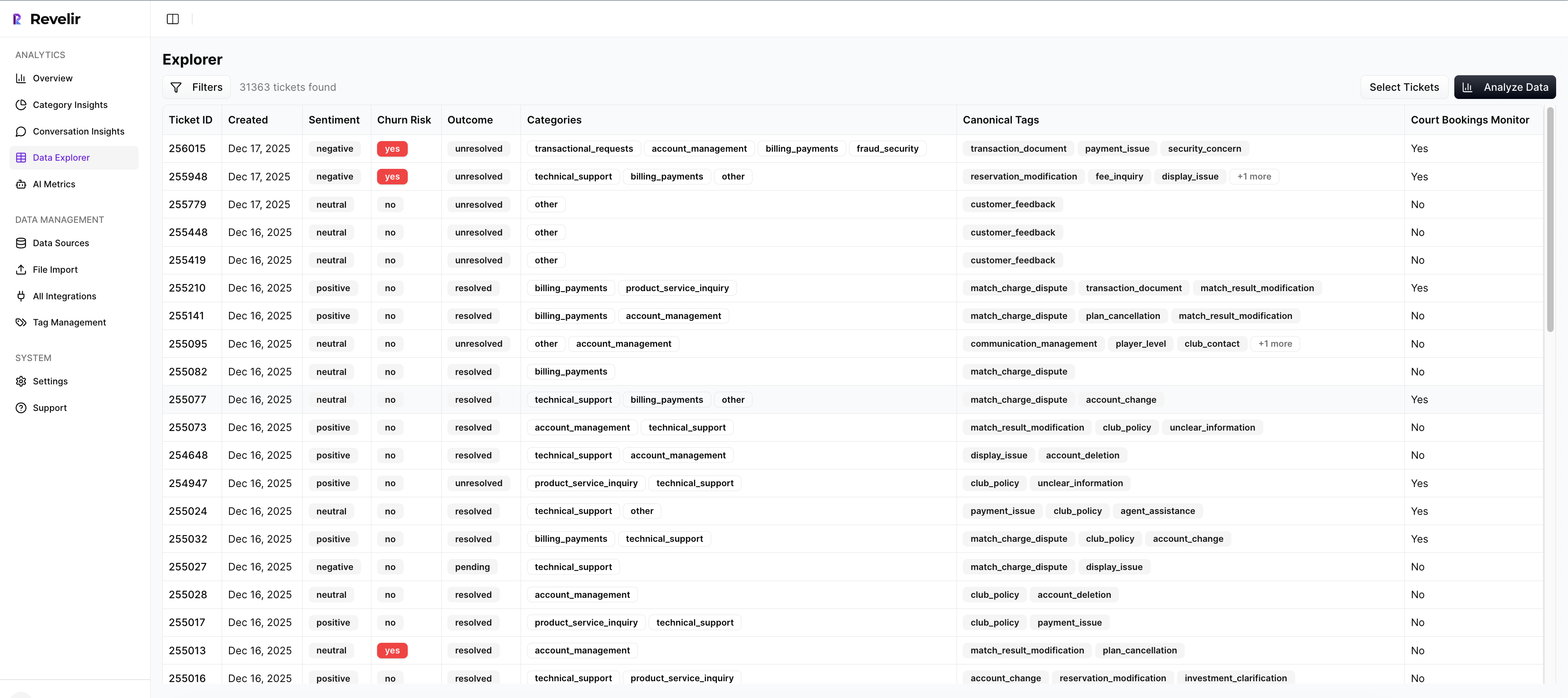
For teams trying to effectively communicate customer insight, that flexibility matters. You don't always know the final question before the meeting starts. Sometimes the leadership team asks about enterprise accounts, or a specific product area, or a date range around a launch. Revelir AI gives you a way to answer that without going back to exports and manual sorting.
Proof stays attached to the metric
This is the trust piece. Revelir AI provides evidence-backed traceability, so every aggregate number links back to source conversations and quotes. If a chart shows churn risk rising for a specific driver, you can inspect the underlying tickets. If a segment looks unusually high-effort, you can validate that pattern through conversation-level review.
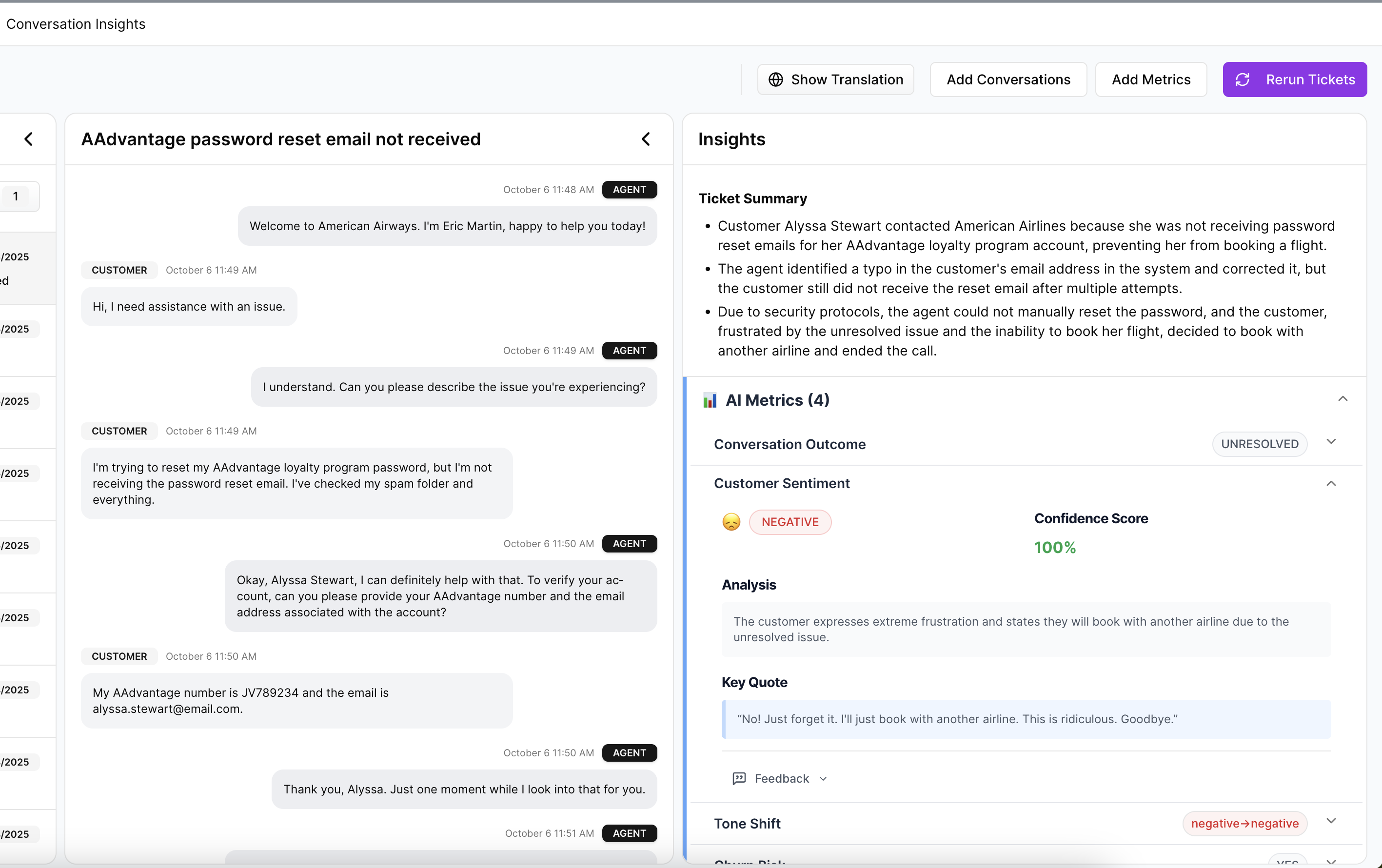
Conversation Insights helps here too. You can drill into full transcripts, AI-generated summaries, tags, drivers, and AI metrics to verify what's actually happening. That keeps the analysis honest. It also makes leadership conversations cleaner because you can move from "we think" to "here's the exact evidence."
Structure without losing nuance
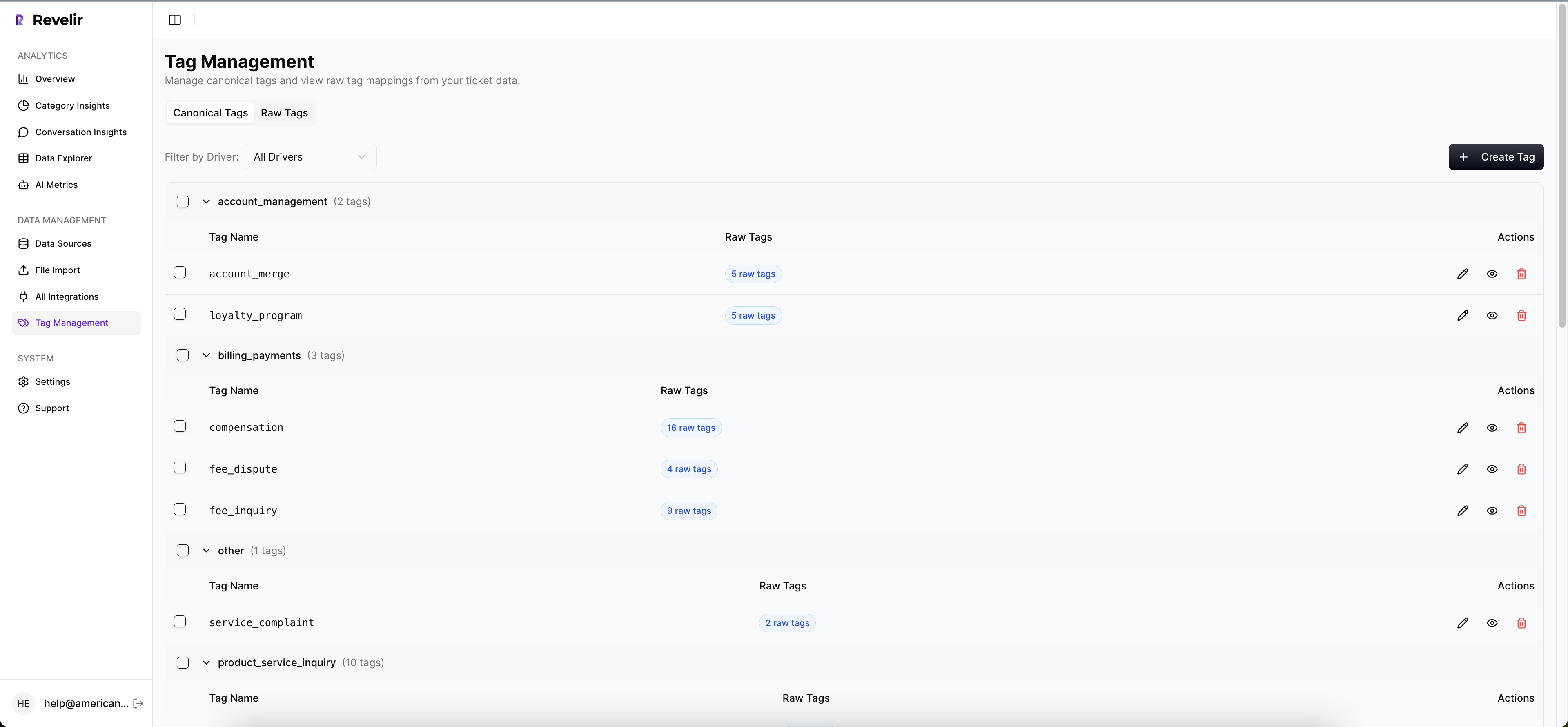
Revelir AI processes 100% of ingested tickets with no sampling, then applies a hybrid tagging system built around Raw Tags and Canonical Tags. Raw Tags surface specific, emerging themes. Canonical Tags give teams a cleaner reporting layer aligned to how the business talks. Drivers add one more level by grouping issues into themes that leadership can act on.
The AI Metrics Engine also computes core signals like Sentiment, Churn Risk, Customer Effort, and Conversation Outcome as structured fields you can filter and analyze. And if your business needs more specific language, Custom AI Metrics let you define your own classifiers and use them like any other analysis column. So instead of forcing your customer insight process into a generic model, Revelir AI lets the structure fit the questions your team actually asks.
Teams can plug Revelir AI into Zendesk directly, start with CSV Ingestion for a pilot or backfill, and use Analyze Data to summarize metrics by Driver, Canonical Tag, or Raw Tag with interactive tables and stacked bar charts tied back to the tickets underneath. If your reporting lives elsewhere, API Export can push structured metrics into existing BI workflows after analysis.
That's the practical shift: less sampling, less guessing, more proof.
The Teams That Win Trust Are the Ones That Can Prove the Pattern
To effectively communicate customer insight, you need more than a good presenter. You need a system that can show the pattern, explain the cause, and prove it with real conversations.
Sampling still has defenders, and sure, in tiny environments or early-stage teams it can be enough for a quick read. That's fair. The tradeoff is real: full coverage takes better tooling and cleaner structure. But once support volume grows, sampled insight becomes expensive guesswork dressed up as analysis.
The better model is straightforward. Analyze 100% of conversations. Organize them into metrics your business actually uses. Keep every chart tied to the original ticket evidence. Then the story gets easier to tell because it's actually true.
Frequently Asked Questions
How do I ensure my insights are credible?
To ensure your insights are credible, start by using Revelir AI's full-coverage processing feature. This means analyzing 100% of your support tickets instead of relying on sampling. This way, you eliminate bias and blind spots. Use the Data Explorer to filter and group tickets by key metrics like sentiment and churn risk. Finally, always link your aggregate numbers back to the source conversations for transparency. This evidence-backed traceability builds trust with stakeholders and supports your insights.
What if my team struggles with defining customer pain points?
If your team struggles to define customer pain points, leverage Revelir AI's AI Metrics Engine. It automatically computes signals like sentiment and churn risk, helping you identify where customers are experiencing issues. Use the Data Explorer to drill down into specific tickets related to these signals. This way, you can gather concrete examples and quotes that illustrate the pain points clearly, making it easier to communicate these insights to leadership.
Can I customize metrics to fit my business language?
Yes, you can customize metrics in Revelir AI using the Custom AI Metrics feature. This allows you to define domain-specific classifiers that align with your business language, such as 'Upsell Opportunity' or 'Implementation Blockers.' Once set up, these custom metrics can be used across your analyses, ensuring that the insights you present resonate with your team and stakeholders. This relevance can make a significant difference in how your insights are received.
When should I use the Before-After Brief format?
You should use the Before-After Brief format when you want to clearly demonstrate the impact of your findings over time. This format is effective in executive meetings where you need to show movement from uncertainty to evidence. Start with what the team believed before your analysis, then present the signals that seemed off. Finally, conclude with what the analysis revealed, including the affected customers and justified actions. This structured approach helps build credibility and clarity.
Why does my team need to avoid sampling support tickets?
Avoiding sampling is crucial because it can lead to a false sense of certainty. When you sample support tickets, you risk missing critical patterns and insights that are only visible when analyzing the full dataset. Revelir AI's full-coverage processing ensures that every conversation is analyzed, allowing you to pivot and filter data with confidence. This comprehensive approach helps you present more accurate insights that can drive real change in your product and customer experience.