

Most CX and product teams want better insight from support. The mistake is assuming a sample or a score is enough. You only create evidence-backed metrics from support conversations when every ticket is processed and every number ties to the exact quotes behind it. That is the only way to stop arguing anecdotes and start prioritizing fixes with confidence.
If you have felt that weird gap between a dashboard and what the customers actually say, you are not imagining it. It's usually a coverage problem. Same thing with tags that drift month to month, nobody's checking how they map, so the truth moves under your feet.
Key Takeaways:
- Samples and scores hide the “why,” so teams miss root causes and waste cycles
- You create evidence-backed metrics from support by analyzing 100% of conversations with traceable links to tickets and quotes
- Hybrid tagging fixes label drift, so drivers stay stable and reporting stays honest
- Define custom metrics in your language to measure the outcomes that matter to your business
- Build traceability into every chart, or you will keep debating whether the number is real
- Run a weekly analysis loop that quantifies change and closes the proof gap with product and leadership
- Leave your helpdesk alone, add an intelligence layer that reads and structures the conversations
Why Sampling Breaks Your Ability to Create Evidence-Backed Metrics From Support
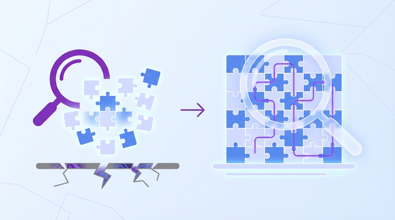
Sampling breaks evidence because it hides rare but costly patterns, and score watching adds false certainty without the drivers that explain change. Teams need full coverage and traceability to see what is breaking, who is affected, and what to fix first. A sample shows symptoms, while 100% coverage shows causes with proof you can defend.
Sampling bias is not subtle. You miss low-frequency, high-impact issues that hit churn risk and enterprise accounts, which means roadmaps skew to loud anecdotes. Manual tagging drifts, so month-over-month comparisons become a guess. Score-only views, like CSAT and net sentiment, tell you something moved, but not why it moved or what to do next. Research on sampling bias backs this up, and even vendor trend reports warn that conversational context matters more than ever for CX decisions, as in the Zendesk CX Trends 2024.
It is exhausting to chase numbers you do not trust. Late-night scrambles happen because a single angry ticket from a big customer hijacks the plan, while quieter but common friction keeps burning time. You feel like you are steering with fogged glass.
Sampling hides risk where it hurts
Teams often take a 5 to 10 percent read, then generalize. That is a classic sampling error. Enterprise accounts and specific product areas can be underrepresented, so the patterns that drive churn get missed. When a spike appears, the conversation shifts to “is this representative” instead of “what broke.” That delay costs weeks.
Coverage fixes that fight. When every ticket is structured into tags, drivers, and metrics, you can isolate issues by cohort, plan tier, or region. Suddenly a vague “billing went up” turns into “invoice line-items confused EU customers after last release.” You get to action faster because the evidence is complete and narrow.
Manual tags drift, so your truth drifts
Manual tagging sounds simple until volume grows. Different agents tag the same thing differently, categories expand unchecked, and quarterly cleanups never happen. The result is a noisy taxonomy that changes just enough to break trend analysis.
A hybrid approach is the antidote. Let granular, machine-generated tags surface what is actually in the text, then map them to stable, human-aligned categories. When that mapping learns over time, your rollups stay consistent. You can compare June to August without wondering if “login problem” became “account access.”
Scores without drivers stall decisions
Scores are a start. They are not a strategy. A downward trend tells you a problem exists, not why it exists, or what to fix. You still need to know which driver moved, which customers felt it, and which messages inside the tickets prove the point.
Leaders want proof. Product wants tickets. Without drivers tied to quotes, meetings devolve into opinion versus opinion. When you attach drivers to every conversation and link charts to the exact tickets and lines, you close the argument. You leave the room with a decision instead of a new spreadsheet.
How to Create Evidence-Backed Metrics From 100% of Conversations
You create evidence-backed metrics from support when you process every ticket, define the signals you care about, and design stable categories that map raw text to business language. Then you make every chart clickable back to the source. That combination turns free-text into trusted, repeatable metrics your org will actually use.
The new way is simple on paper. Process everything, not a sample. Use a hybrid tagging model, so discovery stays flexible and reporting stays stable. Add custom metrics in your terms, not generic labels. Link every number to the ticket it came from. Run a weekly analysis loop, and publish the proof. I know, it sounds like work. It is less work than arguing about dashboards.
Decide the signals that really matter to your org
Start by naming the outcomes you want to measure. Not the generic stuff, the signals your team actually needs to run the business. Think churn risk flags, onboarding friction severity, refund likelihood, upsell opportunities, promise-break keywords, or effort hotspots in specific flows.
You might be tempted to let default labels drive the plan. Resist that. Build a short list of custom questions in plain language that match how your executives talk. If your COO asks “which issues block revenue this quarter,” you need a classifier that marks revenue-blocking issues across tickets, not a stack of sentiment charts. Keep the first batch tight, then expand once the loop is working. A small set you trust beats a library nobody reads.
Use a hybrid tagging model that can evolve
Raw text is messy, and teams rarely agree on one perfect taxonomy. Let granular, machine-suggested tags show you what is actually present in conversations. Then roll those up into canonical categories you maintain for reporting and leadership updates. Discovery stays wide, reporting stays clear, especially when evaluating create evidence-backed metrics from.
As your mapping matures, your categories become an internal language with memory. Raw tags that look novel will keep rolling into the right buckets, and you will not lose the long arc of your trends. In my experience, this prevents the classic mistake of fighting over category names instead of fixing customer problems. The taxonomy should serve the work, not the other way around.
Measure coverage first, then precision
You do not get evidence from a subset. You get evidence from coverage. The first goal is simple, analyze all tickets, then harden the definitions. Precision improves over time, and you do not lose the forest to edge-case debates.
A practical rollout looks like this:
- Process every ticket to ensure nothing is missed
- Apply baseline metrics and raw tags automatically
- Map raw tags to stable categories, then review samples
- Tune definitions with examples from tickets and quotes
The cost of waiting for a perfect schema is lost months. The cost of full coverage with an 80 percent starting point is low, because the iteration loop is visible and fast.
Build traceability into every chart
A metric that cannot be traced is a metric people will fight. Every rollup should click into cohorts, then into tickets, then into exact quotes that prove the point. That is how you replace “I am not sure” with “here are the seven conversations from enterprise customers that mention the same bug.”
Traceability is also how you teach the org to trust the numbers. Product will ask for proof. Sales will ask for proof. Finance will ask for proof. When the proof lives one click away, the questions fade and the fixes ship. You will feel the tone of meetings shift from doubt to momentum. I have seen it happen, and it never gets old.
Run a weekly analysis loop that closes the proof gap
Insights die without cadence. Pick a weekly slot, process the new tickets, update your rollups, and publish a short briefing that answers three questions. What moved. Why it moved. What you recommend.
A simple loop works best:
- Refresh the data and confirm full coverage for the period
- Compare drivers week over week and by segment
- Click into tickets, capture quotes, validate the story This is particularly relevant for create evidence-backed metrics from.
- Share a one-pager with charts, counts, and links to evidence
You will stop missing slow-burn issues, because the loop forces you to look. You will also avoid whiplash decisions caused by loud one-offs, because the data speaks weekly, with receipts. A broader view on drivers and journeys lines up with what firms like McKinsey highlight about experience impact, and coverage keeps the story honest. For a primer on sampling bias pitfalls, IBM’s overview is a good refresher on why partial reads fail in practice, see IBM on sampling bias.
Ready to stop guessing from samples and start using traceable metrics your execs will trust? See how Revelir AI works
How Revelir AI Turns Conversations Into Evidence You Can Defend
Revelir AI operationalizes the approach above by processing 100 percent of your tickets, computing signals, and making every aggregate number clickable to exact quotes and transcripts. You still teach the system your language, but the heavy lifting happens instantly. What used to be weeks of exports and spreadsheets turns into a daily, defensible read on what is breaking and who is affected.
Revelir starts by ingesting conversations through a direct Zendesk connection or CSV uploads, then applies the AI Metrics Engine to compute sentiment, churn risk, effort, and outcomes. A hybrid tagging system assigns granular raw tags and lets you map them into stable canonical categories and drivers. Data Explorer and Analyze Data give you a pivot-table-like view to filter, group, and drill down to tickets and AI-generated summaries, with evidence-backed traceability on every chart.
Full coverage, custom signals, and transparent proof
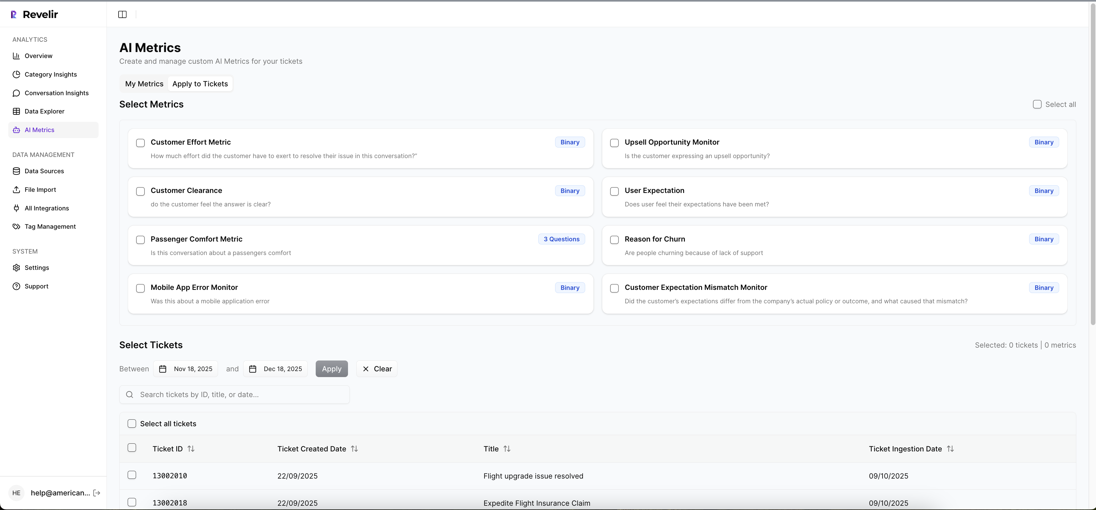
Revelir processes 100 percent of ingested tickets with no manual tagging up front, so you do not miss rare but costly problems. The AI Metrics Engine computes core signals as structured fields, and Custom AI Metrics let you define domain-specific classifiers in your business language. Conversation Insights provide full transcripts and AI-generated summaries for fast validation and quoting, so recommendations stand up in leadership and product reviews.
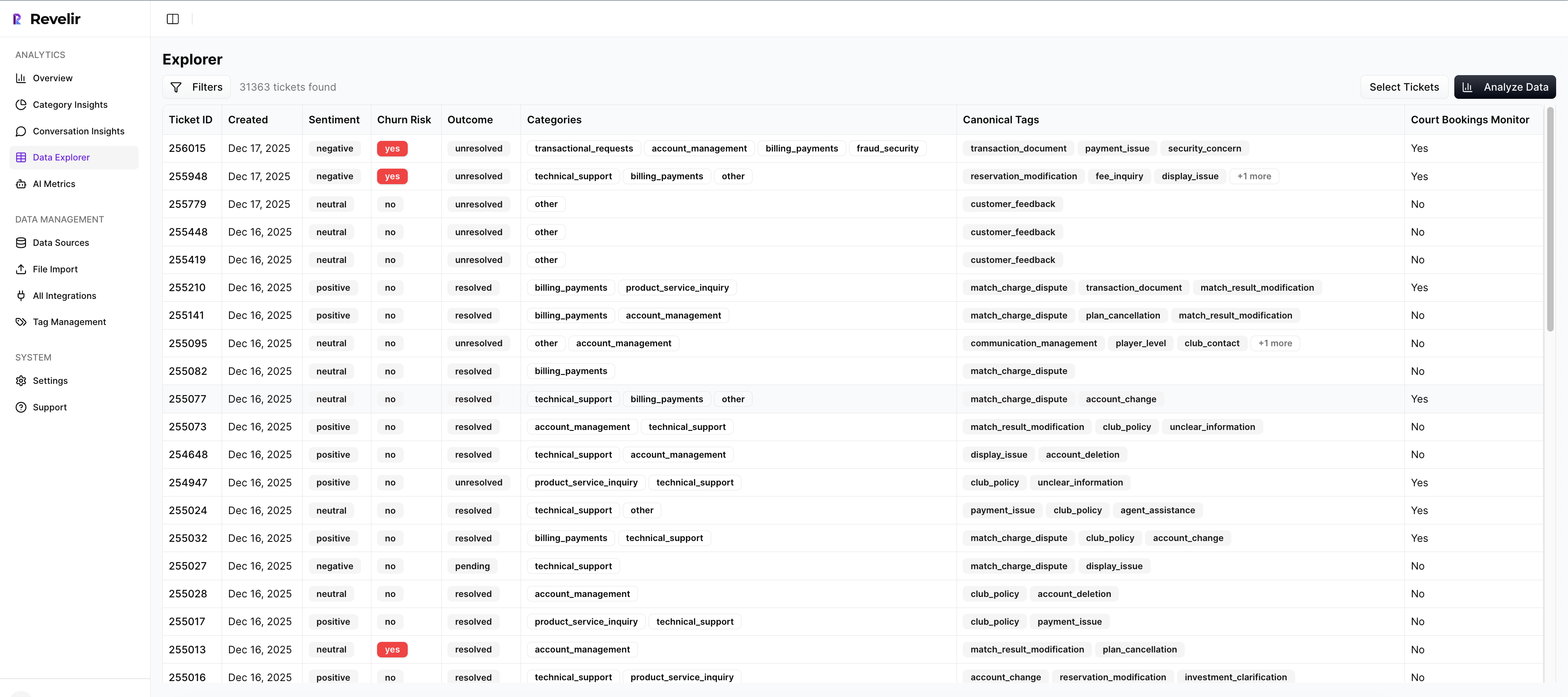
Evidence-backed traceability links every chart to the underlying tickets and lines, which kills the “is this real” debate. Drivers aggregate categories to explain the why behind changes, so score shifts finally come with a cause. That combination replaces the 23-minute manual review cycle per ticket with a few clicks, which means weeks saved and cleaner decisions across CX and product.
You can expect three concrete benefits:
- Full-Coverage Processing catches quiet, high-impact issues that samples miss, so you do not lose accounts to slow-burn friction
- Custom AI Metrics and Drivers quantify the why in your language, so roadmaps move on facts, not vibes
- Evidence-Backed Traceability makes every chart auditable, so stakeholders accept the call and you get to execution faster
Exploration that answers why in minutes
Data Explorer gives you a row-level table with columns for sentiment, churn risk, effort, tags, drivers, and custom metrics. You can filter by segment, group by driver or canonical tag, and click straight into tickets to validate patterns. Analyze Data runs grouped summaries that tie directly to the underlying conversations, so you move from spike to root cause without leaving the screen.
Integrations keep the loop clean. Zendesk Integration brings in historical and ongoing tickets. CSV Ingestion supports pilots and backfills when you want a fast start. API Export pushes structured metrics into your BI stack once you are ready to centralize reporting. You get a stable flow from raw text to analysis to executive-ready proof without new headcount or a helpdesk swap.
Want to see those drivers, tags, and quotes in a single place instead of ten tabs? Get started with Revelir AI
Faster prioritization across product and CX, with numbers that stand up in the room. That is what Revelir delivers. Learn More
The Path Forward: Evidence First, Every Time for Create evidence-backed metrics from
If you want fewer fire drills and more fixes that stick, stop sampling and start measuring every conversation with traceable proof. Define the signals that matter to your org, adopt a hybrid tagging model, make every chart clickable back to tickets, and run the weekly loop. You will feel the noise drop and the decisions speed up.
Let’s pretend you do nothing. Next quarter looks like the last one, just louder. Or you create evidence-backed metrics from the support conversations you already own and use them to drive the roadmap with confidence. Your call.
Frequently Asked Questions
How do I ensure all tickets are processed in Revelir AI?
To ensure all tickets are processed in Revelir AI, start by integrating your support platform, like Zendesk, with Revelir. This connection allows Revelir to automatically ingest every ticket without manual tagging. Once set up, check the ingestion settings regularly to confirm that new and updated tickets are being captured continuously. You can also use the CSV ingestion feature for historical data or one-off analyses, ensuring you don’t miss any critical conversations.
What if I want to create custom metrics in Revelir AI?
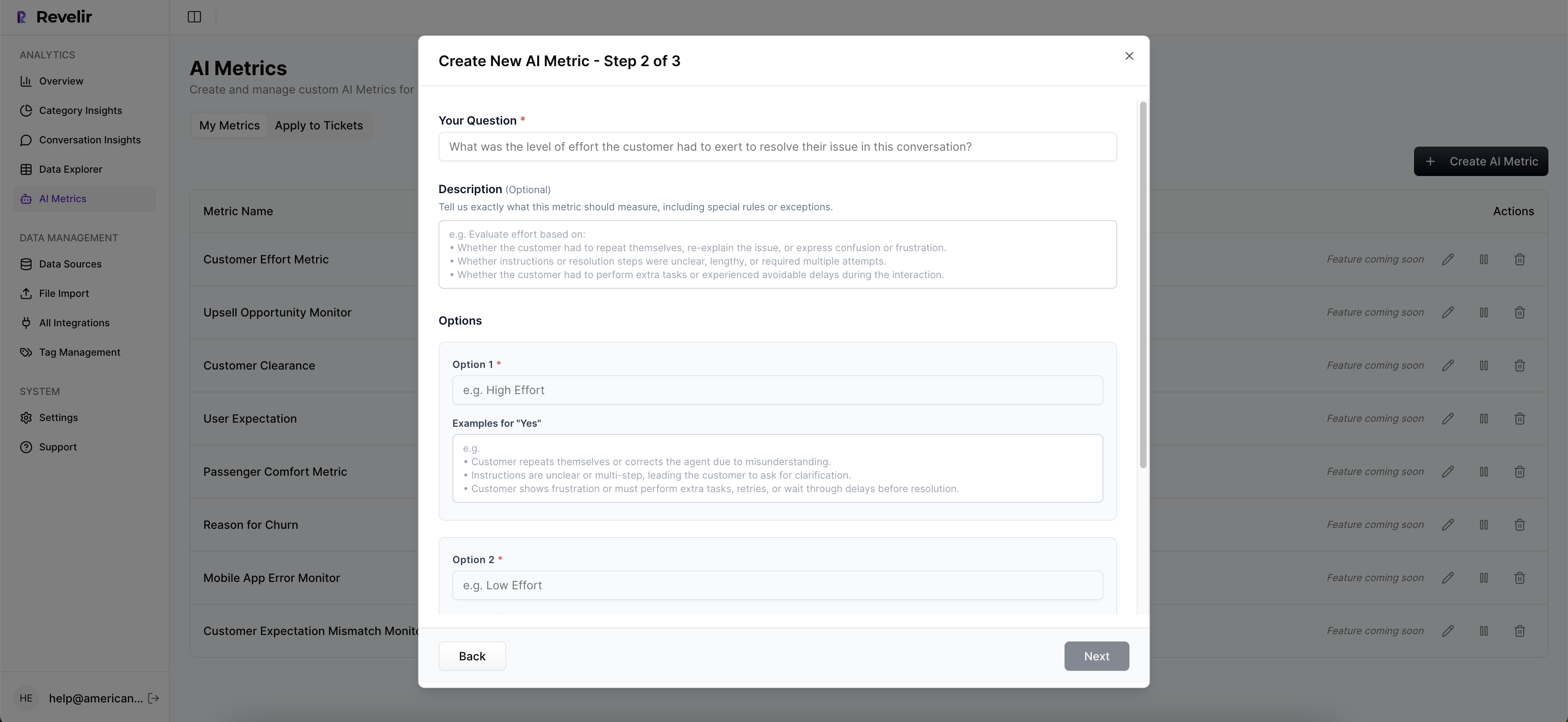
Creating custom metrics in Revelir AI is straightforward. Use the Custom AI Metrics feature to define specific classifiers that reflect your business needs, such as 'Upsell Opportunity' or 'Churn Risk.' First, identify the key outcomes you want to measure. Then, set up your custom questions and value options in the system. These metrics will be stored as columns, allowing you to filter and analyze them across your datasets easily.
Can I track changes in customer sentiment over time?
Yes, you can track changes in customer sentiment over time using Revelir AI. The AI Metrics Engine automatically computes sentiment for each ticket, categorizing it as Positive, Neutral, or Negative. To analyze trends, utilize the Data Explorer to filter and group tickets by date range or specific metrics. This way, you can visualize shifts in sentiment and correlate them with specific events or changes in your product or service.
When should I run my weekly analysis loop?
You should run your weekly analysis loop at a consistent time each week to maintain a rhythm in your insights process. Typically, choose a time when your team can review the updates together, such as Monday mornings or Friday afternoons. During this loop, process new tickets, update your rollups, and publish a brief that highlights what moved, why it moved, and your recommendations. This regular cadence helps keep your team aligned and responsive to customer needs.
Why does traceability matter in my metrics?
Traceability is crucial in your metrics because it builds trust with stakeholders. When every aggregate number in Revelir AI links directly to the source conversations and quotes, it eliminates doubt about the validity of your data. This transparency allows your team to confidently present findings and recommendations, ensuring that decisions are based on solid evidence rather than assumptions. Additionally, it helps you quickly address any questions or concerns raised during discussions.