

You want a forecast, not a fire drill. If you need to forecast churn with customer effort, stop waiting for lagging surveys and partial samples that spark debate instead of action. The richer signal is already in the queue. It is in the back-and-forth, the rework, the blocked steps. That is where risk shows up first.
We have seen teams chase CSAT curves for weeks while a spike in customer effort was already flashing red inside support conversations. When you treat effort as a leading indicator, segment it by meaningful cohorts, and keep evidence attached, you catch issues early and avoid the late-stage scramble. Fewer escalations. Less rework before renewals. Real lead time.
Key Takeaways:
- Treat conversation-level Customer Effort as a leading indicator and measure its lead time to churn at 7, 14, and 21 days.
- Define High Effort with observable cues, then validate with transcript drill-downs before any rollups.
- Aggregate by lifecycle cohorts, not calendar months, to avoid dilution and timing bias.
- Engineer simple time-series features that capture both raw spikes and persistent pressure without hiding change points.
- Start with clear classification labels and trustworthy baselines, then evaluate precision, recall, and lift with explicit false-positive costs.
- Operationalize the loop: build cohorts and features in your analysis layer, export signals to alerts, and tie every metric back to real conversations.
Forecast Churn With Customer Effort, Not Lagging Surveys
Customer effort inside conversations leads churn risk because it captures friction in real time. CSAT and NPS often arrive late or under-sample, which hides early signals and inflates debate. Treat effort as a leading signal, quantify its lead time to churn at 7, 14, and 21 days, and you buy weeks of runway.

Why Effort Leads Your Risk Clock
Effort shows up when customers get stuck, repeat themselves, or bounce between agents. That friction maps to future behavior, not just a mood score. Surveys, by contrast, select for who replies and when they feel like it, which skews the sample and delays the read. You need coverage and immediacy to avoid a costly miss.
The pattern is consistent. A bump in High Effort among new accounts predicts downstream escalations and cancellations more reliably than a late CSAT dip. In our experience, when you can trace a metric to the exact quotes behind it, the room stops arguing. You shift from “is this real” to “what do we fix first.” That is the entire point.
Quantify The Lead Time, Not Just The Score
Scores summarize the moment. Lead time tells you what to do next. Take your account-level churn outcomes, compute effort rates by day or week, then test cross-correlation to see where effort spikes precede churn flags by 7, 14, or 21 days. Keep the window that sustains precision with acceptable recall. It will not be perfect. It will be useful.
If you want background on the broader measure behind effort, the Customer Effort Score is a common reference point. Qualtrics offers a clear overview of how organizations implement CES and where it fits in a measurement stack, see the Customer Effort Score guide. Use it as context, not a replacement for conversation-level signals.
Fix The Unit Of Analysis To Forecast Churn With Customer Effort
Forecasts break when the unit of analysis is wrong. Start with conversation-level definitions of Customer Effort, then move carefully to account-level features. Always keep drill-downs a click away so you can audit the label before it pollutes an aggregate.

Define High Effort With Observable Cues
Write your rulebook in plain English. High Effort can mean loops, repeat contacts within a short window, multi-step handoffs, unresolved steps that carry over, or customers using frustration language. Document thresholding examples so reviewers can audit edge calls and align on what “hard to resolve” actually looks like in transcripts.
If the dataset lacks enough back-and-forth to support a trustworthy judgment, leave effort empty. Forcing labels into sparse conversations creates noise that spreads through your models and wastes analyst time. This safeguard is built into Revelir’s metric behavior for a reason. Empty beats wrong when the downstream cost is real.
Handle Edge Cases Without Polluting Labels
Edge cases appear constantly. A short chat with heavy frustration can be High Effort even if it ends fast. A long thread that resolves smoothly can still be Low Effort if there is no rework or confusion. When in doubt, prioritize frustration cues, blocked tasks, and rework over message count.
Spot-check a sample in drill-down. Read the transcripts that contribute to your High Effort clusters, compare human judgment to labels, then refine tie-breakers. Two cycles of this work is cheaper than weeks of noisy features. And it protects trust when you present results to product and leadership.
For more background on CES framing and pitfalls, MeasuringU covers common approaches and limitations in their Customer Effort Score overview.
Cohort Alignment And Aggregation To Forecast Churn With Customer Effort
Cohort alignment turns noisy per-ticket data into a signal you can act on. Aggregate effort by lifecycle windows that match customer moments, not arbitrary calendar cuts. This avoids mixing onboarding pain with renewal stress, which can hide risk until it is too late.
Sessionize By Lifecycle, Not Calendar
Define windows that matter for your business, like first 30 days, post-onboarding stabilization, and pre-renewal. Sessionize tickets by account within each window, then compute weekly High Effort rate per cohort. The goal is comparability. You want to compare like with like, or you risk the wrong diagnosis.
Calendar months cut through journeys mid-stream. A week three spike in onboarding friction can disappear inside a month-end average, which delays fixes and invites churn. Cohorts fix that by holding context constant. Gainsight’s guidance on cohort-based CX metrics is helpful if you need an executive-friendly primer, see their CX metrics and cohort thinking.
The Price Of Misalignment
Let’s pretend a new-customer cohort shows a 12 percent High Effort spike in week three. Monthly averages flatten it. You miss the spike. Two renewals slip, worth 40k in annual value, and now you are firefighting. Misalignment wastes attention, hides root problems, and turns a small fix into an expensive project.
What should have been a quick onboarding tweak becomes a cross-team escalation with reputational cost. That is the hidden bill of averaging away pain. Keep raw examples close, validate with transcripts, and preserve traceability so no one can argue the pattern is a mirage.
Time-Series Features That Actually Predict Retention
Time-series features should capture both abrupt jumps and persistent pressure without smearing signal into noise. Keep a raw rate, a smoothed rate, and a change measure. Then confirm change points with simple rules instead of exotic algorithms that few people trust.
Stabilize Rates Without Hiding Spikes
Use rolling 7 and 14 day High Effort rates to stabilize day-to-day noise, then compare each to a short baseline like the prior two weeks. Keep a raw weekly rate alongside the smoothed view so you can see real spikes. Over-smoothing is a mistake that hides the very change you need to act on.
A simple setup usually wins:
- Track raw weekly High Effort percent for each cohort.
- Track a rolling 7 or 14 day average for stability.
- Track week-over-week delta to measure acceleration.
If you want more context on CES trends in service teams, Salesforce explains where CES fits among top metrics and adoption patterns, see their note on Customer Effort Score ranking context.
Detect Change Points With Simple Rules
You do not need a PhD to catch a real shift. Compute z-scored residuals from a short baseline and set a threshold. Require a second confirmation, for example, two consecutive days over threshold or two out of three days. Combine this with driver-level agreement so a single category spike does not flood alerts.
This reduces false positives and keeps CSM focus on real risk. Precision beats volume when your team is the one answering the pager.
Lead Indicators From Effort To Churn
Estimate lead by testing how effort spikes line up with churn outcomes. Start with 7, 14, and 21 day windows. Label whether churn occurs within each window, then measure which window gives you the highest precision at acceptable recall. The goal is a reliable early-warning band, not a theoretical optimum that collapses in production.
If you need a plain-English primer on time-series framing for business teams, Conjointly’s writeup on time series in market research is a solid reference. Use it to explain the why before you defend the how.
Models And Metrics For Early Warning
Start simple. Build labels that reflect real action windows, add a few stable features, and set evaluation targets that mirror how your team works. Then backtest across cohorts to catch drift before you roll anything into production.
Classification Labels With 7, 14, And 21 Day Horizons
Create labels like churn_in_next_7d, 14d, and 21d per account. Feed models with recent High Effort levels, week-over-week deltas, and driver mix features. Use time-aware sampling to avoid leakage when you balance classes. Optimize for precision at the recall you can staff because false positives have a real cost.
You can always add complexity later. What matters first is a model you can explain in a room full of busy leaders who want to know why a red flag appeared on a specific cohort.
Trustworthy Baselines For Reviews
Fit simple univariate baselines like ETS or a low-order autoregressive model on cohort High Effort rates. Flag periods where residuals exceed thresholds. These methods are fast to explain and hard to overfit, which helps when reviewers push on assumptions. Use them as guardrails next to classification so the two systems can cross-check each other.
If you are introducing CES and effort concepts to a broader team, Delighted’s guide to What Is Customer Effort Score offers more context for non-analysts.
Evaluate Precision, Recall, And Lift
Report precision, recall, F1, and lift over a random alerting policy. Make false positive cost explicit, for example, hours per alert times hourly CSM cost. Run rolling backtests by cohort and month to catch drift. Promote only what sustains precision with stable coverage. If a model misses important spikes, do not ship it.
Ready to turn effort into an early-warning system your team can trust? Learn More
How Revelir AI Operationalizes Forecasts In Your CX Workflow
Revelir processes 100 percent of support conversations and assigns AI Metrics like Customer Effort, Churn Risk, and Sentiment with traceable links to source transcripts. That gives you audit-ready inputs for feature engineering and protects trust in every review. When coverage is insufficient, metrics stay empty instead of misleading.
From Tickets To Audit-Ready Metrics Fast
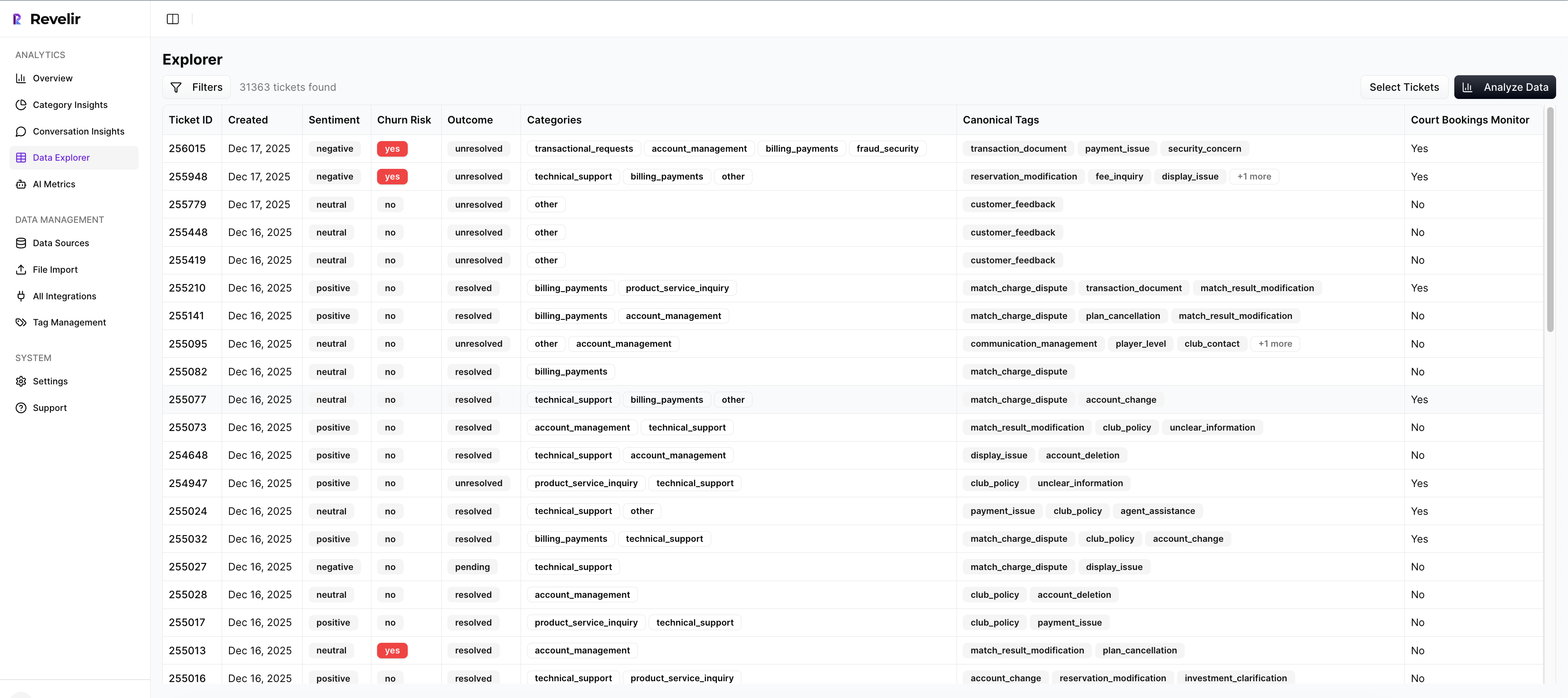
Upload historical tickets or connect your helpdesk. Revelir turns raw conversations into structured fields, including Sentiment, Churn Risk, and Customer Effort, plus tags that roll up under canonical categories and drivers. Every aggregate is one click from real examples, which keeps everyone honest when stakes are high.
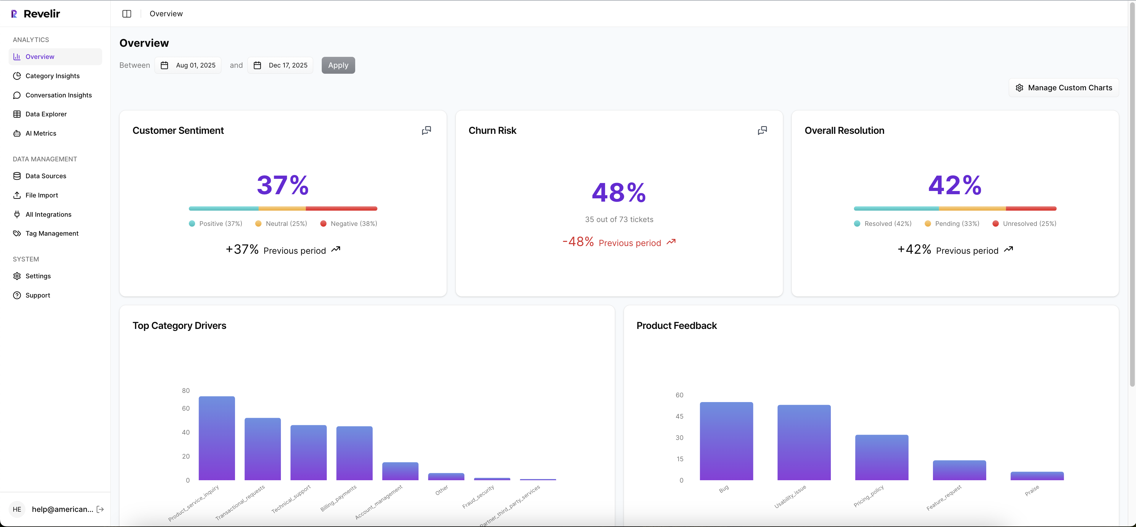
The practical benefit is simple. You do not waste time building classifiers from scratch or second-guessing labels without context. You start from a complete, structured dataset that matches how leaders think and how analysts work.
Cohorts And Drivers In Data Explorer
Data Explorer is where you slice and investigate. Filter by lifecycle stage, segment, or plan tier. Group High Effort by canonical tags and drivers to see where friction concentrates. Use Analyze Data to pivot metrics by driver, then drill down to transcripts to validate that patterns match real quotes. That is how you prevent a costly wrong turn.
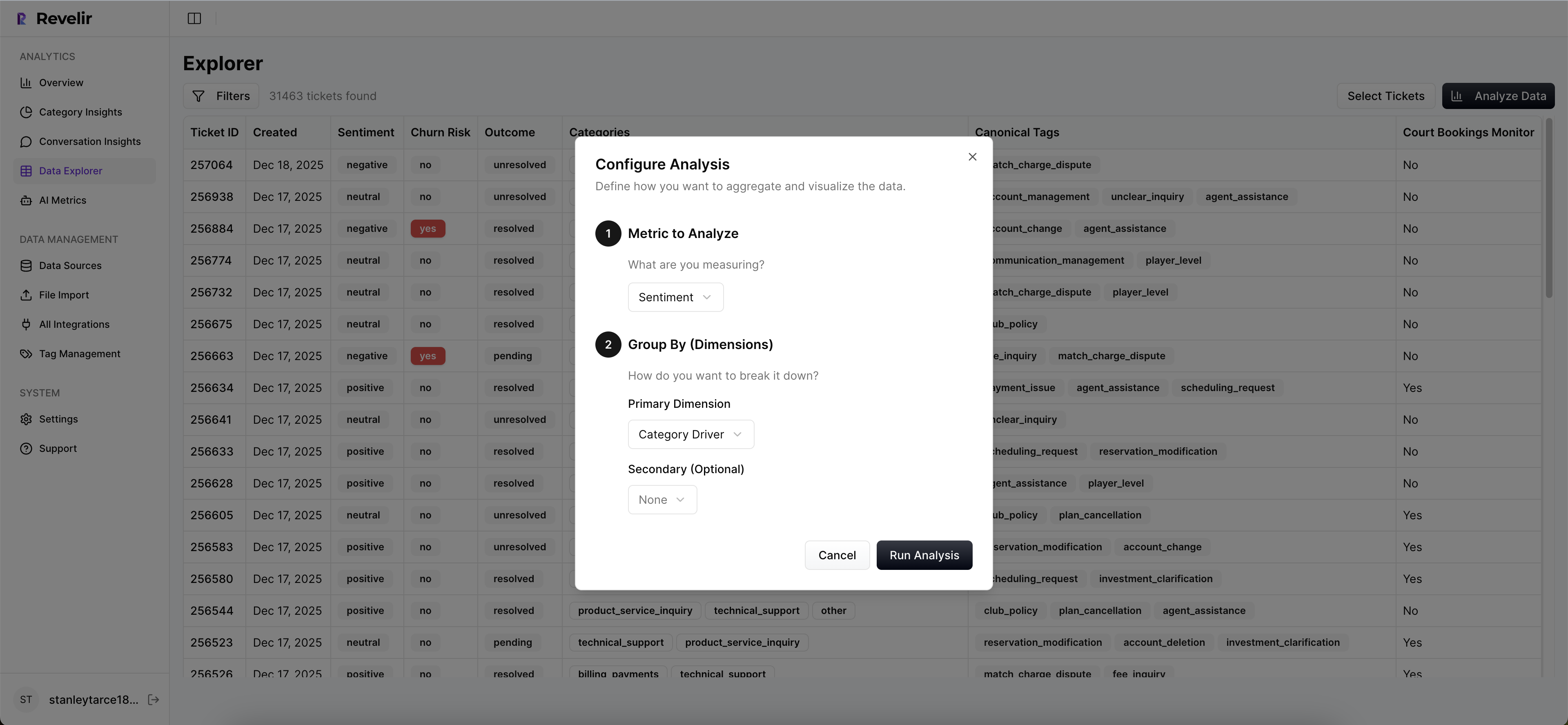
When you present a spike in onboarding friction for a specific cohort, you can immediately show three representative conversations that illustrate the issue. No one has to take it on faith. That is the difference between a debate and a decision.
Make Alerts Part Of The Workflow
Export effort, churn risk, and driver summaries to your BI or CRM. Pair risk levels with your existing playbooks so CSMs know exactly what to do when a cohort crosses a threshold. The transformation is direct: fewer late escalations, faster root-cause fixes, and clearer accountability you can measure.
In short, Revelir provides the measurement layer and the day-to-day analysis surface you need to forecast churn with effort, then act on it. Want to see it on your data end to end? See how Revelir AI works
Before you wrap, if you are ready to pilot with last month’s tickets and validate the signal inside a week, skip the theory and get a hands-on run. Get Started With Revelir AI
Conclusion
Effort leads, surveys lag. That is the pattern. If you define High Effort clearly, validate with transcripts, align cohorts to real journeys, and build simple features with trustworthy baselines, you can forecast churn one to three weeks earlier without flooding your team. The cost of getting this wrong is real. The fix is practical, measurable, and repeatable.
When every metric can be traced to a quote, you stop arguing about whether the signal exists. You decide what to fix first, and you do it before renewals are at risk. That is the whole goal.
Frequently Asked Questions
How do I analyze customer effort metrics with Revelir AI?
To analyze customer effort metrics using Revelir AI, start by navigating to the Data Explorer. From there, apply filters to isolate tickets with 'High Effort' ratings. Next, click on 'Analyze Data' and select 'Customer Effort' as your metric. Group the results by 'Category Driver' to see which areas are causing the most friction. This approach helps you identify workflows that may need improvement and allows you to drill down into specific tickets for more context.
What if I want to track churn risk over time?
To track churn risk over time with Revelir AI, utilize the 'Analyze Data' feature. First, filter your dataset by 'Churn Risk' to focus on tickets that indicate potential churn. Then, select 'Churn Risk' as your metric and group by 'Date' to visualize trends over time. This will help you identify patterns and potential spikes in churn risk, enabling you to take proactive measures before issues escalate.
Can I create custom metrics in Revelir AI?
Yes, you can create custom metrics in Revelir AI that align with your business needs. Navigate to the settings where you can define new AI Metrics. For example, you might want to create a metric for 'Upsell Opportunity' or 'Reason for Churn.' Once defined, these metrics will be applied consistently across your dataset, allowing you to analyze specific areas of interest alongside standard metrics like sentiment and churn risk.
When should I validate insights from Revelir AI?
You should validate insights from Revelir AI whenever you notice significant trends or anomalies in your data. After running an analysis, click into specific segments to review the underlying tickets in Conversation Insights. This allows you to read the actual conversations, ensuring that the metrics align with real customer experiences. Regular validation helps maintain trust in your data and ensures your findings are actionable.
Why does Revelir AI emphasize full coverage of conversations?
Revelir AI emphasizes full coverage of conversations to ensure that no critical signals are missed. By analyzing 100% of support tickets, you avoid the biases and delays associated with sampling. This comprehensive approach allows you to capture early indicators of churn risk and customer effort, providing a more accurate picture of customer sentiment and operational issues. It’s about turning every conversation into actionable insights.