

72% of support teams still rely on sampling or score watching to decide what matters, and that's exactly why categorization breaks when the stakes get real. If you were in a review this week trying to defend a chart without the ticket receipts behind it, you already felt the problem.
Effective ways to categorize support conversations aren't really about making neater dashboards. It's usually about making your numbers defensible enough that product, CX, and leadership stop arguing over whether the pattern is real.
Key Takeaways:
- Effective ways to categorize support data start with coverage, not labels. If you sample, your categories inherit the bias.
- A usable category system needs three layers: raw signals, reporting categories, and executive themes.
- If a category can't link back to real tickets and quotes, it won't survive a hard product review.
- Basic sentiment is too thin for most teams. Custom AI metrics let you categorize in your own business language.
- The fastest test for whether your taxonomy works: can a PM answer "what's breaking, for whom, and how often?" in under 10 minutes.
- Good categorization should reduce debate, not create more of it.
If you want the short version, the win isn't "better tagging." The win is trusted categorization you can actually act on. You can Learn More once you see the model, but the model comes first.
Why Most Support Categorization Fails Before It Even Starts
Support categorization usually fails because teams start with labels instead of evidence. They build a taxonomy first, then try to force messy conversations into it later, which is backwards.

At 8:14 AM on a Monday, a support operations manager is flipping between Zendesk, a Google Sheet, and a slide deck ten minutes before the weekly product review. She exported 400 tickets on Friday, reviewed 30 by hand, and grouped them into six tidy buckets that looked fine over the weekend. Then the VP asks which customer segment drove the spike, a PM asks for five verbatim examples, and suddenly the chart has no spine. That is what broken categorization feels like in real life: not abstract confusion, but a meeting where everyone can sense the evidence is thinner than the bar chart.
That's the hidden cost. You don't just risk bad labels. You risk bad prioritization. Once leaders see one unsupported claim, every chart after that gets treated like a guess.
Sampling corrupts the category system at the source
If you categorize only 10% of tickets, you're not just reducing volume. You're changing the story. That's the Coverage Rule: if coverage drops below 80%, category confidence drops faster than most teams expect.
Let's pretend you process 5,000 tickets a month and manually review 250. That sounds like a lot. It isn't. A low-frequency issue hitting 3% of customers won't reliably show up with enough weight to trigger action, even if it's driving churn risk in a valuable segment. Same thing with subtle onboarding friction. Loud complaints get seen. Quiet but costly patterns get missed.
Manual review still has value. Fair point. Humans catch nuance that models can miss, especially in regulated or highly technical queues. But once ticket volume crosses roughly 1,000 conversations per month, sampling becomes a liability more than a method. You stop measuring reality and start measuring whatever happened to land in the sample.
Score-only systems flatten important differences
A sentiment trend can tell you something is off. It can't tell you why. That's a problem if your goal is action rather than observation.
This is where the Score-to-Driver Gap shows up. If your system gives you a number but not the driver behind the number, then your next step is still manual investigation. And manual investigation is where timelines slip, narratives drift, and people cherry-pick examples. A dip in satisfaction could mean refund confusion, account access failures, shipping delays, or a broken onboarding flow. Those are not the same issue, and they should never live inside one generic "negative" bucket.
Honestly, this is the part most dashboards hide. They look clean because they've stripped out the messy part. But the messy part is the signal.
Categories break when nobody can audit them
A category is only useful if you can defend it under pressure. The Traceability Test is simple: can you click from the chart to the exact ticket and quote that created the category?
If the answer is no, the category is fragile. It might still be directionally right. That's valid. But it won't hold up in a leadership meeting, product review, or board prep when someone asks, "What customers are actually saying?" According to the Nielsen Norman Group's work on qualitative evidence in decision-making, trust in findings rises when teams can inspect source artifacts, not just summaries. Same thing here. Without that evidence chain, you end up rebuilding the same deck every month with new anecdotes attached to the same old bars.
The real issue isn't that teams don't know effective ways to categorize. It's that they built a reporting habit with no evidence chain. So what does a category system look like when it's designed to survive scrutiny?
A Better Way to Categorize Support Conversations
Effective ways to categorize support conversations follow a layered model, not a single-tag model. You need granular signals for discovery, stable categories for reporting, and broader themes for decision-making.
I call this the Three-Lens Model. Lens one finds what's emerging. Lens two normalizes it for repeat reporting. Lens three turns it into something leadership can use. If you skip any layer, the system gets weird fast. Too much detail and nobody can read it. Too much abstraction and you lose the actual customer story.
Start with raw signals, not polished categories
A growing support queue gives you more than volume. It gives you language. That's why the first layer should capture specific issue signals before you force them into a clean taxonomy.
Raw issue labels work because customers rarely complain in neat executive terms. They say "charged twice," "can't reset password," "flight got canceled," "setup screen froze," "why is my invoice wrong." Those signals matter. If you collapse them too early into broad buckets like "billing" or "technical issue," you lose the nuance that tells you what to fix. The Discovery-First Rule is straightforward: if you're seeing a new complaint pattern at least 20 times a month, keep it visible as its own raw category until you've proven it belongs rolled up elsewhere.
There's a case to be made for starting broad because it keeps reporting cleaner. True. It also reduces maintenance overhead for a lean team. But clean too early usually means blind. I'd rather deal with a slightly messy first pass than hide a pattern that turns into an escalation next month.
The practical move is to let the system surface granular themes first, then decide what deserves consolidation. Not the other way around.
Build canonical categories for consistency over time
A B2B SaaS team might hear "SSO failed," "can't log in through Okta," "admin lockout," and "invite expired" in the same week. Different phrasing. Same underlying business problem.
Canonical categories are the stable reporting layer. They answer the question, "What do we want this organization to call this issue every month, every quarter, across every team?" Maybe raw labels include "refund_request," "duplicate_charge," and "billing_fee_confusion." Canonically, those might roll up into "Billing Issues." That's not just tidier. It's how you avoid taxonomy drift. If five analysts review the same pattern and create five slightly different labels, your dashboards become a language problem instead of an insight system.
Use the 5-to-1 Rule here: if five or more raw issue labels point to one underlying business problem, create a canonical category. If fewer than five recur and they don't affect a major metric, leave them raw until they prove they're durable. Before, an analyst might create three near-duplicate labels in one week. After canonical mapping, the trend line stabilizes and leadership can compare periods without relitigating vocabulary.
What works best, in my view, is reviewing canonical categories monthly, not weekly. Weekly changes create reporting chaos. Monthly review gives enough signal without turning taxonomy maintenance into a full-time job.
Add drivers so leadership can see the why
What does leadership actually need from categorization? Not 47 labels. A reason to fund a fix.
Drivers are the executive layer. Think Billing, Onboarding, Performance, Account Access. This is where the taxonomy becomes useful outside the support team. If a PM asks what's driving churn risk for new users, you don't want to hand them 47 issue labels. You want to show that Onboarding is driving 38% of high-effort negative conversations this month, then drill into the categories beneath it. That's the Ladder Rule: every issue should ladder from raw signal to canonical category to driver. If it can't ladder up cleanly, the taxonomy needs work.
Picture it like air-traffic control for customer pain. Raw signals are the radar pings, canonical categories are the flight paths, and drivers are the runway assignments that tell the airport where to send resources. Ignore one layer and planes still appear on screen, sure, but nobody can land them safely.
Same thing with quarterly planning. Leaders don't fund "misc refund weirdness." They fund reducing Billing friction, fixing Account Access, or improving Performance. Drivers translate support detail into decision language without losing the path back to the source.
Add custom metrics when the business language matters
Generic sentiment and generic tags get you generic decisions. That's the hard truth.
Basic categorization isn't enough when the real question is domain-specific. That's where most teams stall. They can sort tickets by sentiment or maybe effort, but the business still wants answers like "Which tickets show onboarding confusion for enterprise admins?" or "Which interactions hint at churn because the promised feature isn't there?"
That's why custom metrics belong inside the categorization system, not outside it. The Business Language Rule is simple: if leadership asks the same classification question at least twice in a quarter, turn it into a structured metric. Don't keep re-answering it manually. A travel company might need "Passenger Comfort" as a metric. A SaaS team might need "Reason for Churn" or "Implementation Blocker." A marketplace might need "Seller Fraud Concern." Those aren't generic support labels. They're business-specific decision lenses.
We were surprised how often teams think they need a giant taxonomy when they really need two or three custom classifications tied to the decisions they already make. Smaller. Smarter. Easier to defend.
Diagnose whether your current categorization system is broken
You can tell pretty quickly whether your setup is working. You don't need a full audit to spot the red flags.
Ask these five questions:
- Can you explain a category spike with exact tickets in under 5 minutes?
- Are more than 15% of tickets landing in "other" or an equivalent junk drawer?
- Do two reviewers routinely disagree on what category a ticket belongs in?
- Can product connect your categories to a fix owner without a second translation step?
- Are you still sampling instead of categorizing 100% of conversations?
If you answered no to question one, or yes to three or more of the others, the system is already costing you time. That's the Red Flag Checklist I use because it gets past the fake comfort of "we do have tags." Sure. Plenty of teams have tags. The question is whether those tags reduce ambiguity or create it.
If you want to see what this looks like in practice, this is a good point to See how Revelir AI works. Not because software magically fixes taxonomy. It doesn't. But the right structure makes good categorization much easier to maintain.
The layered model gives you the structure. The next problem is operational: how do effective ways to categorize turn into actual decisions instead of prettier reporting?
How High-Trust Teams Turn Categories Into Decisions
Effective ways to categorize only matter if the categories survive contact with real decision-making. The best teams treat categorization as an operating system for prioritization, not a reporting exercise.
This section is where a lot of people expect a long process map. You can build one. But high-trust teams usually run a tighter loop than that. They ask what happened, why it happened, who it hit, and what changed. Then they move.
Tie every category to a reviewable unit of evidence
A category should always have a proof trail. That's the Evidence Chain: metric to segment to ticket to quote. Break the chain anywhere and confidence drops.
Picture a product review. CX says Billing confusion is rising among new customers. A weak system stops there. A stronger system shows the count, the affected segment, the top subcategories, and three representative quotes. Now the discussion changes. You're no longer debating whether the pattern exists. You're debating what to do about it. Huge difference.
That shift matters more than most teams realize. When evidence is easy to pull, meetings get shorter. Escalations get clearer. Roadmap debates get less political. Frankly, that's the payoff people want, even if they say they want "better reporting."
Use thresholds so categories trigger action automatically
3%, 10%, and 20% are not magic numbers. They are decision brakes, and most teams need them.
Not every category deserves attention. Some deserve observation. Some deserve action. Some deserve executive escalation. You need thresholds for that.
Try the 3-10-20 rule. If a category affects under 3% of tickets, monitor it unless the severity is extreme. If it hits 10% of negative tickets in a high-value segment, assign an owner. If it crosses 20% for two straight review periods, escalate it into a cross-functional fix. Before this rule, every meeting becomes a negotiation. After it, the category itself tells you what happens next.
One exception. If churn risk is attached to the pattern, lower the threshold. I'd move on 5% in a high-value cohort before I'd wait for 10% in the general population. The point isn't rigid math. The point is deciding before the meeting so the meeting doesn't become the decision framework.
Review category health, not just ticket volume
Counts can rise while taxonomy quality quietly collapses. That's why category health deserves its own review.
Category health means watching for taxonomy drift, overgrown "other" buckets, redundant labels, and stale definitions. If "login issue," "account access," and "can't sign in" are all trending separately, you've got a category problem before you have a product insight problem. The 10% Drift Rule works well here: if more than 10% of your top issue labels appear semantically overlapping in a monthly review, consolidate them. If a canonical category goes unused for 60 days, retire it or merge it.
Nobody loves taxonomy cleanup. I get it. It feels administrative, and yes, it competes with more visible work. But the category system is like a chart of accounts for customer pain. Leave duplicate line items sitting there long enough and the finance report still looks organized right up until you try to make a budget decision from it.
Segment before you summarize
Broad category counts can hide the thing that actually matters. Segment first, summarize second.
If Billing issues are up 12%, who cares unless you know where? New customers? Enterprise accounts? Customers on one plan? One region? One product line? The Segment-First Rule says you should never report a category trend without at least one meaningful slice: customer type, plan, lifecycle stage, channel, or time period. If the category behaves differently across segments, the aggregate can point you in the wrong direction.
Let's pretend negative sentiment on onboarding is flat overall. Fine. But among first-week customers on the new plan, it doubled. That's a completely different story. Same thing with churn risk. Broad averages hide concentrated pain all the time.
Once categories can trigger, segment, and prove a pattern, the practical question changes again: what system makes those effective ways to categorize possible without an analyst doing heroics every week?
How Revelir AI Makes Categorization Defensible
Revelir AI makes support categorization defensible by combining full-coverage processing, custom AI metrics, and direct traceability back to the original conversations. The result isn't just organized data. It's evidence you can use in leadership and product reviews without hand-waving.
This matters because the old workflow usually means exports, partial reviews, inconsistent tags, and one more slide trying to summarize what customers "seem to be saying." Revelir AI replaces that with structured metrics linked to the source tickets, so your categorization system doesn't fall apart when someone asks for proof.
From raw conversations to categories you can actually trust
Revelir AI processes 100% of ingested tickets, either through the Zendesk Integration or CSV Ingestion, so you aren't building categories from a sample. That's a big shift. Sampling is where blind spots creep in.
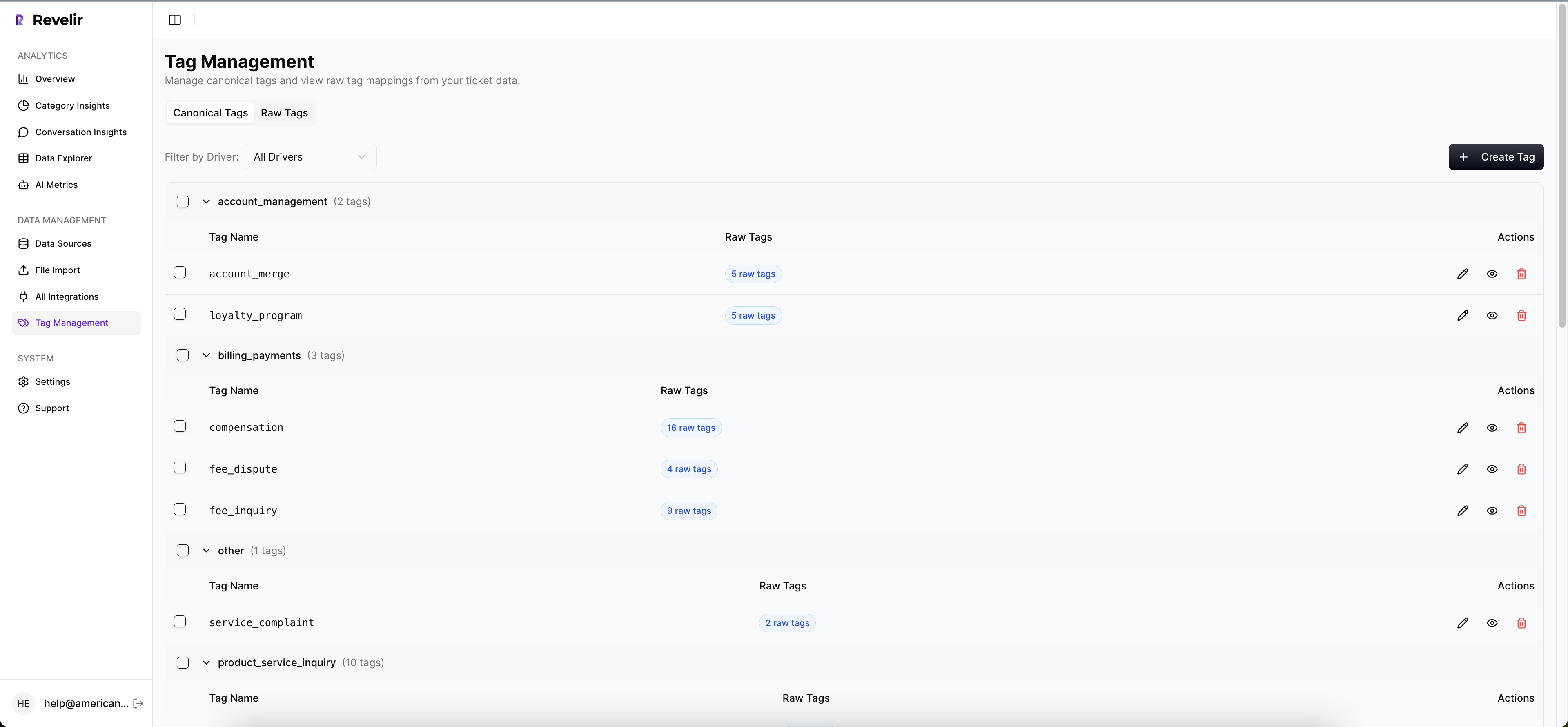
From there, the Hybrid Tagging System creates AI-generated Raw Tags to surface specific patterns, while Canonical Tags give you the stable reporting layer most teams need. Users can refine those mappings over time, and Revelir learns those mappings for future tickets. Same thing with Drivers. They give you the higher-level themes that make reporting usable for leadership without stripping away detail.
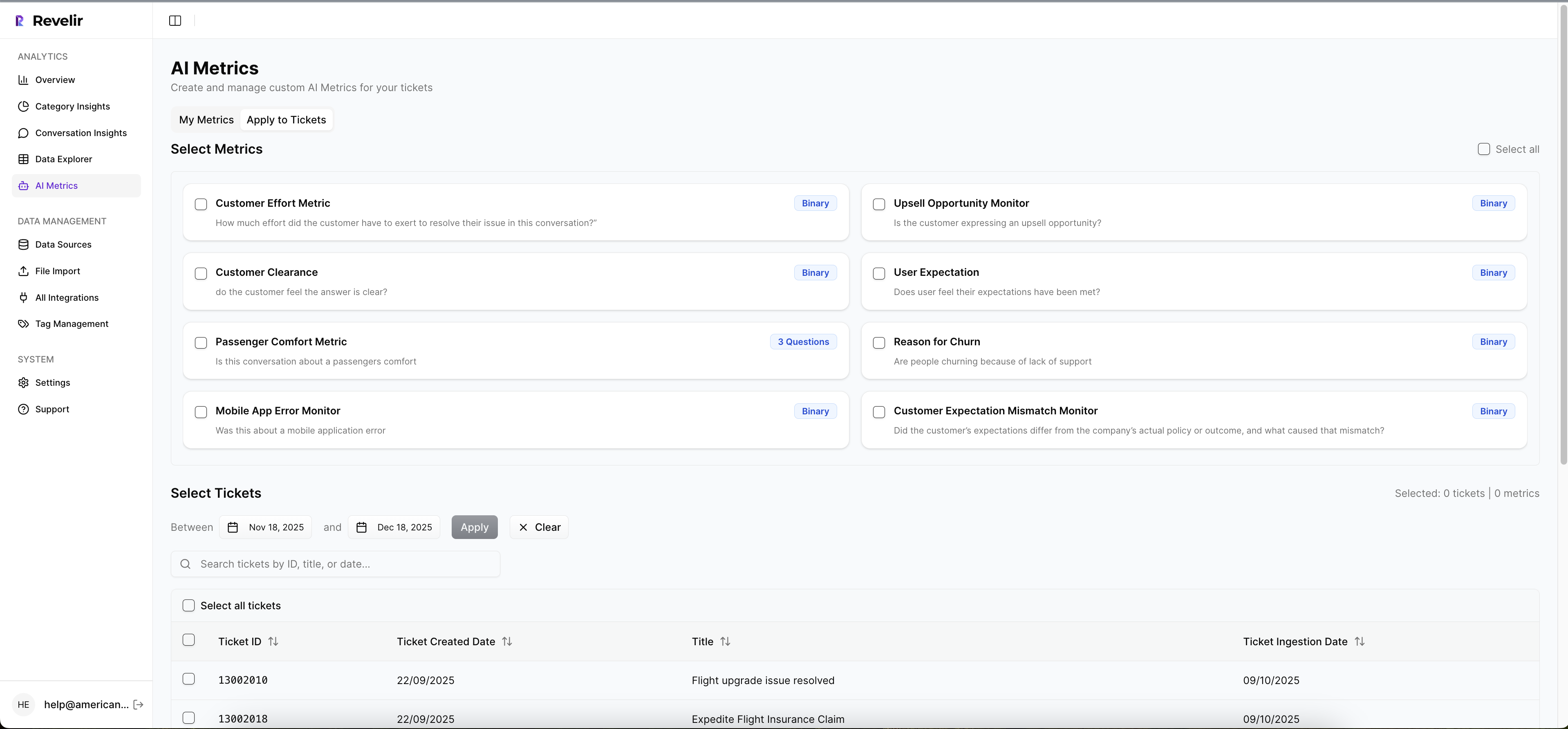
If your business needs more than generic sentiment, Custom AI Metrics let you define classifications in your own language. So instead of stopping at positive or negative, you can categorize for questions like reason for churn, upsell opportunity, or any domain-specific issue your team actually tracks.
Every chart can lead back to tickets and quotes
This is the part that changes the room. Revelir AI gives you Evidence-Backed Traceability, so every aggregate number can link back to the source conversations and quotes behind it.
Inside Data Explorer, teams can filter, group, and inspect tickets with columns for sentiment, churn risk, effort, tags, drivers, and custom metrics. Analyze Data summarizes those metrics by dimensions like Driver, Canonical Tag, or Raw Tag, then links the results back to underlying tickets. And Conversation Insights gives you ticket-level drill-down with full transcripts, AI-generated summaries, tags, drivers, and metrics for validation.
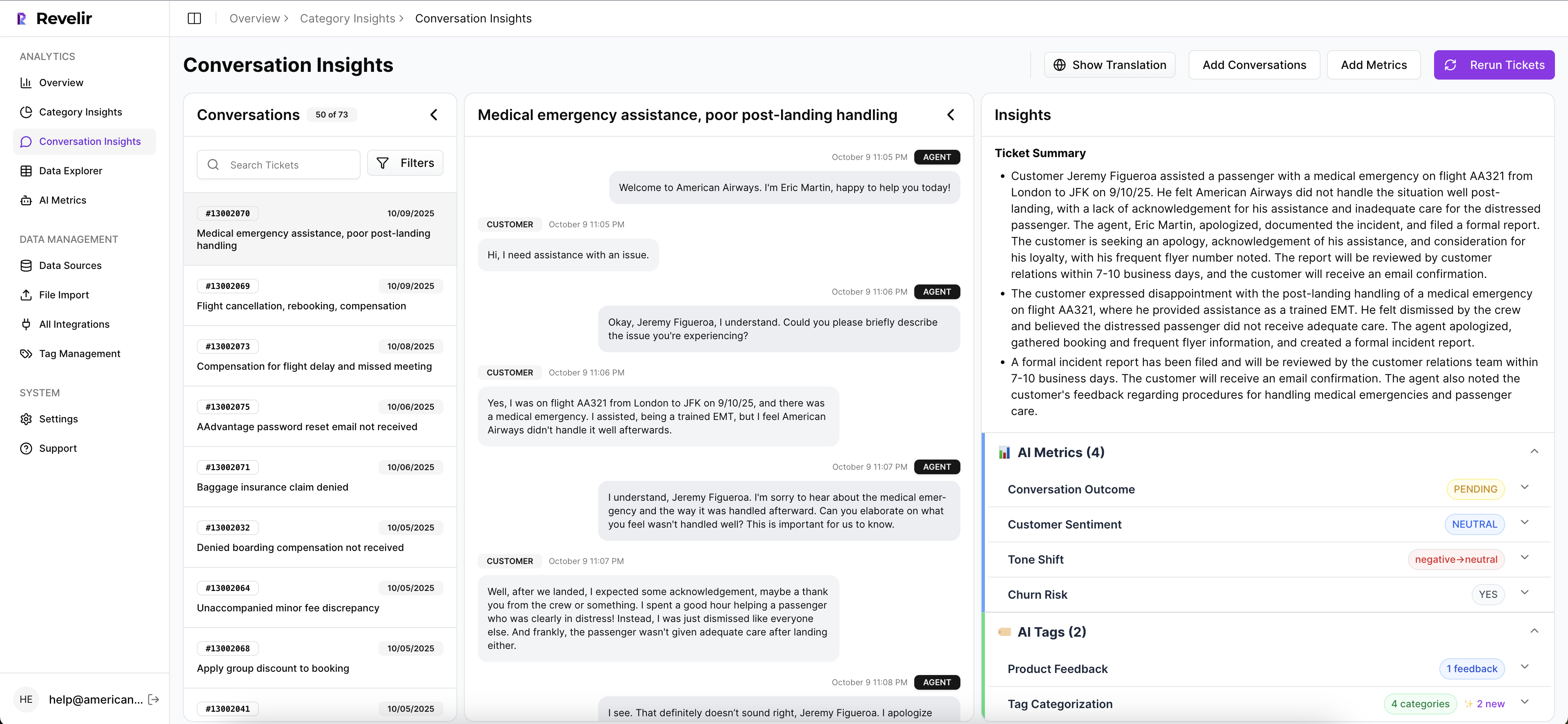
So if a product leader asks why a category spiked, you don't need a separate research sprint. You can move from chart to transcript, pull representative quotes, and show the evidence chain directly. That's what makes the categorization defensible.
If you want to put this on top of your existing workflow instead of replacing it, Get started with Revelir AI (Webflow) and see how it fits.
Tools can make effective ways to categorize easier. They still can't save a weak operating model. So what does good look like once the system and the habits finally line up?
What Effective Categorization Looks Like When It Finally Works
Effective ways to categorize support conversations come down to one thing: categories have to be accurate enough to guide action and solid enough to survive scrutiny. If they can't do both, they're just labels.
The teams that get this right don't obsess over making the taxonomy perfect on day one. They focus on coverage, layering, traceability, and business language. Raw signals first. Canonical categories second. Drivers on top. Custom metrics where the business needs sharper answers. That's the system.
And once you have that, support data stops being a pile of text and starts acting like a decision asset. Which is the whole point.
Frequently Asked Questions
How do I categorize support tickets effectively?
To categorize support tickets effectively, start by using Revelir AI's Hybrid Tagging System. First, let the AI generate Raw Tags that capture specific signals from your conversations, like 'billing_fee_confusion' or 'refund_request.' Then, create Canonical Tags to normalize these into broader categories for reporting. This layered approach helps you maintain clarity and consistency over time. Regularly review your categories to ensure they reflect current issues and adjust as necessary.
What if my team disagrees on ticket categorization?
If your team disagrees on ticket categorization, use Revelir AI's Evidence-Backed Traceability feature. This allows you to link each category back to the original tickets and quotes, providing a clear proof trail. Encourage team members to review the underlying conversations together to reach a consensus based on actual customer feedback. This can help clarify any confusion and ensure everyone is on the same page regarding categorization.
Can I define custom metrics for my support tickets?
Yes, you can define custom metrics in Revelir AI. Use the Custom AI Metrics feature to create domain-specific classifiers tailored to your business needs, such as 'Reason for Churn' or 'Upsell Opportunity.' This allows you to categorize tickets in a way that aligns with your team's goals and provides actionable insights. Make sure to regularly assess these metrics to ensure they remain relevant and useful.
When should I review my categorization system?
You should review your categorization system regularly, ideally on a monthly basis. This helps you catch any taxonomy drift or redundant labels before they become problematic. Use Revelir AI's Analyze Data feature to summarize your metrics and identify any categories that are underperforming or overlapping. By staying proactive, you can ensure your categorization remains effective and aligned with your team's needs.