
57% of support teams say ticket volumes rose in 2025, but rising volume isn't the real problem. You felt the bigger one this week: you had more customer data than ever, and still couldn't answer a basic question like why churn risk spiked for one segment and not another.
It's usually not a data shortage. It's a translation shortage. Support is full of signal, but most of it is trapped in free text, scattered tags, and scoreboards that tell you something moved without telling you why.
Key Takeaways:
- Common challenges in customer support analysis usually come from missing structure, not missing volume.
- If you're sampling tickets, you're probably missing the exact conversations that explain churn risk, effort, or product friction.
- CSAT, NPS, and sentiment can show that something changed, but they rarely explain why it changed.
- The fastest way to improve customer support decisions is to move from score-watching to driver-based analysis.
- If a chart can't link back to the original ticket and quote, it won't hold up in a product or leadership review.
- Teams with significant support volume need full-conversation coverage before they need another dashboard.
- If you want to see what that looks like in practice, Learn More.
Why Common Challenges in Customer Support Keep Repeating
Common challenges in customer support keep repeating because most teams measure outputs, not causes. They track ticket count, SLA, and survey scores, then wonder why the same issues come back next month. What they're missing is a way to quantify the why inside the conversations themselves.
The real bottleneck isn't ticket volume
A lot of leaders assume support gets hard when ticket volume gets high. That's partly true. More tickets do create pressure. But high volume is only dangerous when your team has no system for turning messy conversations into structured evidence.
Let's pretend you're running support at a SaaS company with 18,000 tickets a month. Monday morning, somebody drops a slide into the exec deck saying negative sentiment is up 9%, CSAT is down 4 points, and billing complaints are "probably" part of it. Probably. That's the word that causes all the trouble. Now product wants examples, finance wants impact, and CX wants to know whether this is widespread or just a noisy week. Nobody's checking the whole picture because nobody can.
That's why common challenges in customer support analysis don't start in the queue. They start in the gap between raw conversations and usable metrics. Same thing with reporting. If the report can't survive one skeptical question from a product lead, it isn't a report. It's a guess with formatting.
Sampling creates false certainty
Sampling feels responsible because it looks disciplined. Read 50 tickets. Pull a few themes. Share the top issues. Move on. Fair point, manual review does catch nuance. But if you handle 1,000 tickets a month and review 10%, you're still making decisions from a partial slice. And at even three minutes per ticket, that's about five hours for an incomplete view.
The Coverage Confidence Rule is simple: if the issue could affect churn, onboarding, billing, or product usage, sampling isn't enough. You need 100% conversation coverage. Otherwise you aren't measuring the customer experience. You're measuring whichever tickets happened to get looked at.
I've seen teams burn whole meetings debating whether a sample was representative. That's lost time. Worse, it pushes the room toward anecdotes. The loudest story wins. The quieter pattern loses.
Scoreboards hide the mechanism
CSAT, NPS, and basic sentiment aren't useless. They just get promoted too far. They belong at the symptom layer. Once you ask why a score changed, they stop being enough.
A support leader might know churn risk went up among enterprise accounts this quarter. Good. But was the issue onboarding friction, account permissions, billing confusion, or unresolved bugs? Without drivers and traceable evidence, all four explanations sound plausible. And plausible is expensive.
What this means for common challenges in customer support is pretty direct: the deeper problem isn't that teams lack dashboards. It's that most dashboards don't explain causality. The next section is where that breaks open.
The Hidden Reason Customer Support Insights Fall Apart
Customer support insights fall apart when teams confuse labeling with understanding. A negative score is a label. A driver is an explanation. The jump from one to the other is where most organizations get stuck.
Tags without taxonomy become noise
Raw tags are useful because they catch specific signals humans miss. billing_fee_confusion. refund_request. flight_cancellation. account_lockout. That's good. But raw tags alone create a sprawl problem. After a while, you have hundreds of fragments and no clean way to report upward.
So teams swing to the other extreme. They force everything into a tiny fixed taxonomy too early. That creates clarity, but it kills discovery. New themes get buried because the framework is too rigid to notice them.
The better way is what I think of as the Two-Layer Signal Model. Layer one captures emerging detail. Layer two rolls that detail into reporting categories people can actually use. If you're seeing more than 50 recurring raw tags per month, you need canonical categories or your reporting will drift. If you only use canonical categories, you'll miss the emerging edge cases before they become systemic problems.
That's the hidden reason common challenges in customer support reporting feel so persistent. Teams are either drowning in detail or flattening nuance. Both choices break trust.
Basic sentiment is too shallow for decisions
Sentiment has one job: give you directional signal. Positive. Neutral. Negative. Helpful. But shallow. If that's all you have, every review meeting turns into interpretive dance.
Picture a product review on Thursday afternoon. CX brings a chart showing sentiment dropped in the onboarding flow. Product asks which customers. Ops asks how severe. The PM asks whether the issue is setup friction or login confusion. Then someone says, "We'll pull some examples after the meeting." That's the giveaway. The analysis wasn't finished. The meeting just exposed it.
A useful metric has to answer one of three questions: what happened, why it happened, or what to fix first. Sentiment only handles the first one. If you want the second and third, you need drivers, effort, churn risk, and domain-specific metrics in your own business language.
Traceability is the trust threshold
If a chart can't link back to the original conversation, trust drops fast. That's not cynicism. That's self-defense. Leaders have been burned by black-box summaries enough times that they now ask for receipts.
The Traceability Threshold is straightforward: if an insight will influence roadmap, staffing, or retention decisions, it must link to exact tickets and quotes. No exceptions. Not everyone agrees with this standard because it does expose weak analysis faster. That's valid. It also saves you from acting on fiction.
Honestly, this is the part most teams underestimate. They think the hard part is producing the metric. It isn't. The hard part is producing a metric that survives scrutiny. And if you're dealing with common challenges in customer support, scrutiny is the whole game.
What the Best Teams Do Instead
The best teams don't start with dashboards. They start with a system that turns every conversation into structured evidence, then use that system to move from what happened to why it happened. That's the shift.
Start with a diagnostic, not a report
Before you build anything new, run the Four-Question Audit. It sounds simple because it is.
- Can you analyze 100% of support conversations, not just a sample?
- Can you trace any aggregate metric back to exact tickets and quotes?
- Can you separate surface labels from root-cause drivers?
- Can you segment by customer type, issue type, and business impact without manual exports?
If you answered no to two or more, your insight stack is diagnostic-light and debate-heavy. That's the bucket most teams are in. And that's why common challenges in customer support don't stay small. They get argued over until they get expensive.
In my experience, the audit matters more than the tool shortlist. Plenty of teams buy analytics software before they define the trust standard. Then they end up with prettier uncertainty.
Build around drivers, not just scores
Scores tell you where to look. Drivers tell you what to do. That's a big difference. The Driver Ladder is a useful way to think about it.
At the bottom, you have raw conversation detail. Above that, issue tags. Above that, drivers that group patterns into leadership-level themes like Billing, Onboarding, Account Access, or Performance. If your analysis stops below the driver level, product and ops won't know how to prioritize. If it starts at the driver level without ticket evidence underneath, people won't trust it.
So the rule is: use scores to detect change, use drivers to explain change, and use ticket evidence to validate change. If churn risk rises but no driver shifts with it, the classification probably needs work. If a driver spikes but you can't pull representative quotes in two minutes, the system isn't decision-ready yet.
This caught us off guard the first time we saw it in practice. Teams don't usually fail because they're careless. They fail because their analytics stack was built for monitoring, not diagnosis.
Use the 3-Lens Review model
Most support analysis gets flattened into one lens. Usually sentiment. That's too narrow. A better review uses three lenses at once: volume, severity, and business consequence.
Volume asks how often an issue appears. Severity asks how painful the issue is, usually through effort or negative sentiment. Business consequence asks what it threatens, like churn risk, expansion, or unresolved outcomes. If a problem scores high on all three, fix it first. If it scores high on one but low on the others, monitor before escalating.
Here's a concrete version. Say onboarding tickets represent only 8% of monthly volume, but 42% of those tickets show high effort and 19% flag churn risk. That's not a support problem. That's a product priority hiding in the queue.
This is where common challenges in customer support become cross-functional opportunities. Support stops being the place where complaints go to die. It becomes the place where product priorities get evidence.
Keep the system flexible enough to learn
Rigid taxonomies age badly. What your team called a "login issue" six months ago may now be three different problems: SSO setup, permission syncing, and password reset loops. If your classification system can't evolve, you end up measuring old categories against new customer behavior.
That's why the Maturity Loop matters. Capture emerging patterns. Normalize them into a cleaner taxonomy. Revisit mappings monthly if ticket volume is above 5,000 a month, quarterly if it's below that. If a raw tag appears across at least 2% of tickets for two straight review periods, promote it into a canonical reporting category.
Some teams prefer static categories because they make dashboards cleaner. Fair point. Clean dashboards are nice. But static categories also hide drift. And drift is how common challenges in customer support stay invisible until the escalation pile gets loud.
Turn analysis into operating rhythm
The last step is boring. Which is why it works. You need a repeatable review loop that turns support signals into decisions. Not random deep dives. Not emergency screenshot archaeology.
A weekly cadence works for most teams with meaningful ticket volume:
- Review movement in sentiment, effort, churn risk, and outcomes.
- Check the top drivers behind the movement.
- Pull ticket evidence for the top one to three shifts.
- Assign action by function: support, product, ops, or leadership.
- Revisit the same metrics next week to confirm whether the fix changed anything.
If you can't complete that cycle in under 45 minutes, your workflow still has too much manual stitching in it. That's the threshold I'd use. Because once the review takes longer than the decision, people stop doing it.
If you want a practical look at how to structure that kind of workflow, See how Revelir AI works.
How Revelir AI Makes This Easier
Revelir AI makes this easier by turning messy ticket data into structured, evidence-backed metrics you can actually inspect. It doesn't ask your team to rip out the helpdesk. It sits on top of existing support data, processes 100% of conversations, and gives you a way to move from scores to drivers to source evidence.
Full coverage first, evidence second
Revelir AI starts with the two trust conditions most teams are missing. First, Full-Coverage Processing handles 100% of ingested tickets, so you aren't relying on sampling or manual upfront tagging. That matters because common challenges in customer support often hide in the long tail, not just the obvious spikes.
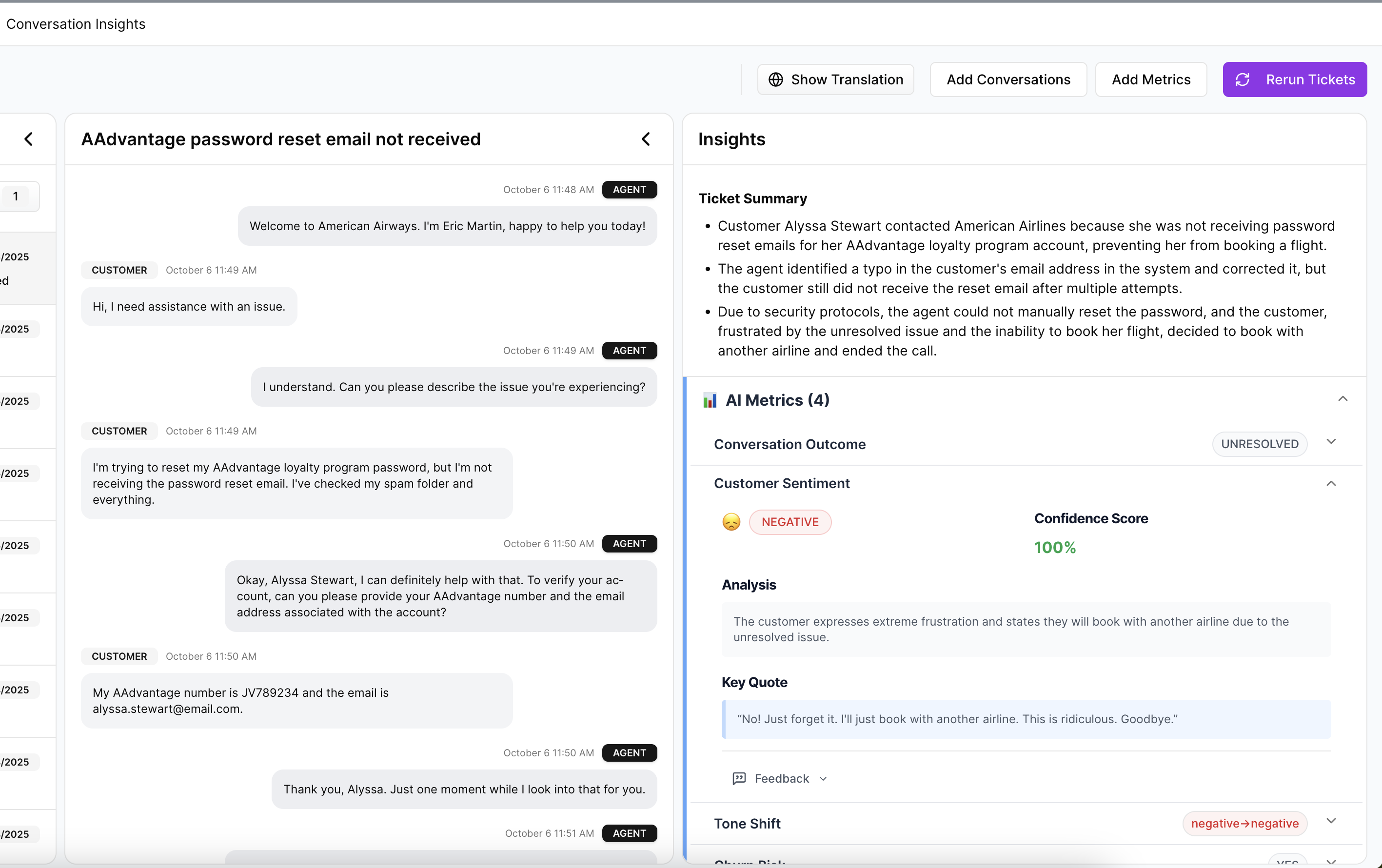
Second, Evidence-Backed Traceability links aggregate numbers back to the exact conversations and quotes behind them. So when a leader asks why churn risk moved or which tickets sit behind a driver trend, you can actually show them. Not later. In the meeting.
That pairing changes the conversation. You stop defending the sample. You start discussing the fix.
Drivers, metrics, and drill-downs in one workflow
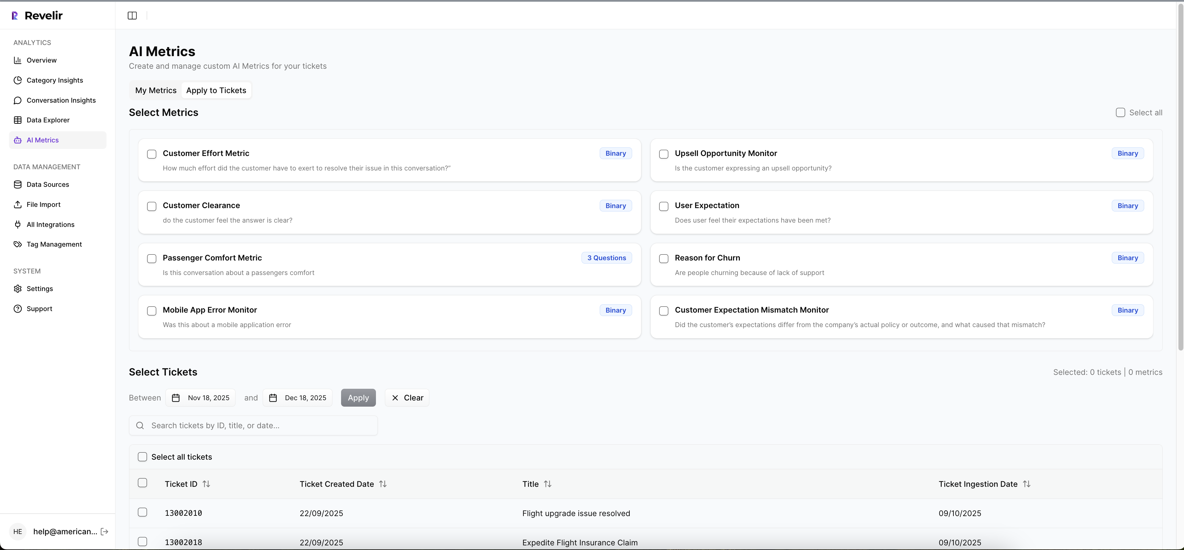
Revelir AI also gives teams a practical way to answer the "why." The AI Metrics Engine computes structured signals like Sentiment, Churn Risk, Customer Effort, and Conversation Outcome. Custom AI Metrics let teams define business-specific classifiers in their own language, which is a big deal if generic sentiment has been too shallow for your use case.
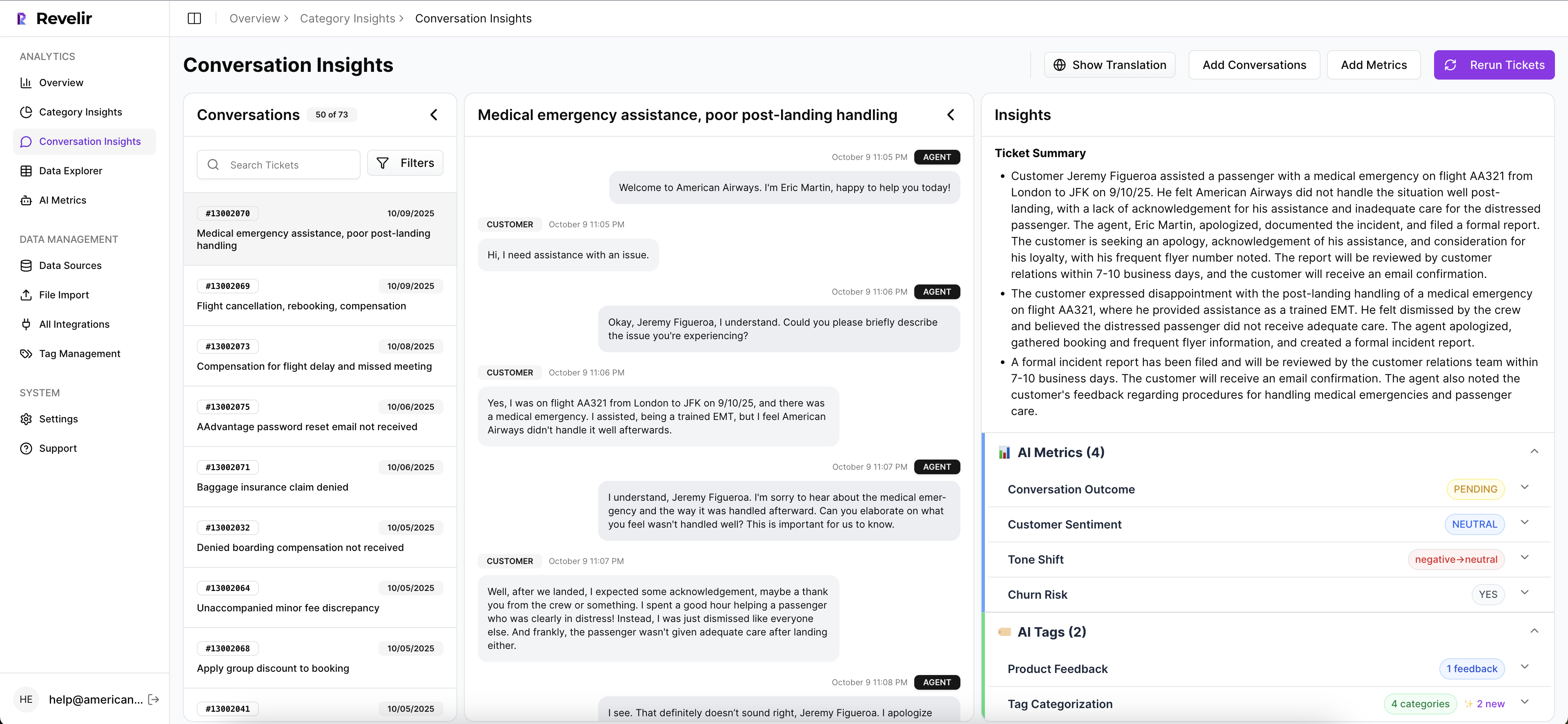
Then the Hybrid Tagging System combines AI-generated Raw Tags with Canonical Tags your team can shape over time. Drivers roll those patterns up into higher-level themes for reporting. Inside Data Explorer, teams can filter, group, sort, and inspect ticket-level data across those columns. Analyze Data adds grouped analysis by dimensions like Driver, Canonical Tag, or Raw Tag, with tables and charts that link back to underlying tickets. And Conversation Insights gives you the drill-down view with transcripts, summaries, tags, drivers, and metrics so you can validate what the aggregate view is saying.
If you're in Zendesk, Revelir AI can ingest historical and ongoing tickets through the Zendesk Integration. If you're testing or backfilling, CSV Ingestion handles exported files from systems like Zendesk, Intercom, or Freshdesk. And if you need to carry structured metrics into existing reporting, API Export is there for that.
That's the real payoff. Common challenges in customer support stop looking vague once the analysis has full coverage, driver logic, and ticket-level proof. If you want to put that kind of evidence layer on top of your current workflow, Get started with Revelir AI (Webflow).
A Better Way to Handle Common Challenges in Customer Support
Common challenges in customer support don't come from having too few dashboards. They come from having too little evidence behind the dashboards you already trust. Scores can point at motion. Drivers and traceable ticket evidence tell you what the motion means.
It's usually that simple. If you can analyze 100% of conversations, group them into drivers, and trace every metric back to a real quote, your team gets out of guesswork fast. And once that happens, support becomes less of a reporting function and more of a decision engine.
Frequently Asked Questions
How do I ensure full coverage of support tickets?
To ensure full coverage, use Revelir AI's Full-Coverage Processing feature. This processes 100% of your ingested tickets without relying on sampling, which means you won’t miss critical insights hidden in conversations. Start by integrating Revelir AI with your helpdesk, like Zendesk, to automatically ingest all historical and ongoing tickets. This way, you can analyze every conversation and get a complete view of customer issues.
What if I need to analyze specific customer segments?
You can analyze specific customer segments using Revelir AI's Data Explorer. This feature allows you to filter and group tickets based on various dimensions like customer type and issue type. Just select the relevant filters in Data Explorer to isolate the segment you want to analyze. This helps you understand the unique challenges faced by different customer groups and tailor your support strategies accordingly.
Can I track the reasons behind customer churn?
Yes, you can track reasons behind customer churn using Revelir AI's AI Metrics Engine. This engine computes structured signals like Churn Risk, which you can filter and analyze in the Data Explorer. By drilling down into specific tickets linked to churn risk, you can identify patterns and root causes that contribute to customer dissatisfaction, allowing you to address those issues proactively.
When should I update my tagging system?
You should update your tagging system when you notice that certain raw tags are recurring or when new themes emerge in customer conversations. Revelir AI's Hybrid Tagging System allows you to create and refine canonical tags over time. If a raw tag appears across at least 2% of tickets for two consecutive review periods, consider promoting it to a canonical category to ensure your reporting remains relevant and effective.
Why does my analysis need to link back to original tickets?
Linking your analysis back to original tickets is crucial for building trust with stakeholders. Revelir AI's Evidence-Backed Traceability feature provides this capability, allowing you to show exactly which conversations support your metrics. This transparency helps validate your findings during meetings and ensures that decisions are based on solid evidence rather than assumptions.