
Support leaders read 50 tickets and call it insight. Then they walk into a product review and get asked the one question those 50 tickets can’t answer: is this actually happening across the whole customer base?
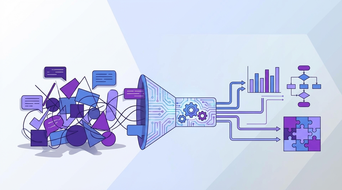
The common challenges in analyzing support conversations usually aren't about having too little data. It's usually the opposite. You have too much text, not enough structure, and almost no clean way to prove why a number moved.
Key Takeaways:
- The common challenges in analyzing support conversations start with sampling, not AI
- Score dashboards tell you what happened, but rarely why it happened
- If you can't trace a chart back to real tickets and quotes, leadership won't trust it
- A useful analysis system needs 100% conversation coverage, drivers, and drill-down evidence
- Custom metrics matter when your business language doesn't fit generic sentiment labels
- You don't need a new helpdesk to fix this problem, you need an intelligence layer on top
- Teams that can move from score-watching to evidence-backed analysis prioritize fixes faster
Most Analysis Problems Start Before the Analysis
Analyzing support conversations breaks down when the input model is broken. Most teams aren't actually analyzing support data at scale. They're reviewing fragments, exporting spreadsheets, checking CSAT, and hoping the pattern they saw on Tuesday still holds by Friday. That's one of the most common challenges in analyzing any support dataset with confidence.
Sampling feels responsible, until it distorts the whole picture
A sampled review process looks sensible on paper. You pull 100 tickets, tag themes by hand, write up takeaways, and move on. The problem is that support volume doesn't behave nicely enough for that model. Rare but expensive issues hide in the edges, and edges are exactly what small samples miss.
At 8:14 AM on a Monday, a support ops manager opens Zendesk, exports last week’s tickets to CSV, and starts hand-tagging the first 120 rows in Google Sheets. By 10:07, they’ve found three billing complaints and one login spike, so the slide draft starts leaning billing-heavy. By Friday, enterprise escalations reveal a separate SSO issue affecting 46 accounts that never showed up in the sample. The meeting still happens. The wrong issue gets airtime.
Let's pretend your team handles 8,000 tickets a month. A 5% sample gives you 400 conversations. That sounds like a lot until you split by region, plan tier, product line, and week. Now the pattern you're trying to validate may be resting on 12 tickets. Maybe 7. That's not analysis. That's inference dressed up as confidence.
There is a case to be made for sampling when volume is low or when you're doing a fast directional pass. That's fair. But once you're using ticket analysis to guide roadmap decisions, staffing, or escalation policy, sampled reads become a liability. The Sample Collapse Rule is simple: if the result will change spend, headcount, or product priority, analyze the full set, not a subset.
Scores flatten the story you actually need
Scores are useful. They are not enough. CSAT, NPS, and simple sentiment can tell you that something changed, but they don't tell you what broke, who got hit first, or which issue is driving the damage.
Same thing with basic dashboards in a helpdesk. Ticket volume goes up 18%. Negative sentiment ticks up. Escalations rise. Okay. Now what? Nobody's checking whether the increase is tied to billing confusion, onboarding friction, account access, or a specific release. The chart is real. The action path isn't.
This is where a lot of common challenges in analyzing support conversations get mislabeled as reporting problems. They're not reporting problems. They're causality problems. If your analysis layer can't connect outcomes to drivers, you're left narrating the business from the surface.
Trust disappears when nobody can inspect the evidence
A chart without traceability creates argument, not alignment. You bring a slide into a leadership meeting showing churn risk increased among enterprise customers. Product asks for examples. CX asks whether the model overreacted to a rough week. Ops asks how big the segment is. If you can't move from aggregate to ticket-level proof in under two minutes, the room stops trusting the conclusion.
That part matters more than vendors admit. Black-box analysis dies in cross-functional review because the standard isn't "interesting." The standard is "show me the evidence." And when you can't, your team ends up back in manual review mode, pasting quotes into docs to defend the dashboard.
It wears people out. You know this feeling if you've ever had a strong read on a customer issue and still spent half the meeting defending the methodology. The real challenge isn't finding signals. It's building signals people will believe. And once trust breaks, the next question is obvious: if volume isn’t the real blocker, what is?
The Real Bottleneck Isn't Ticket Volume, It's Missing Causality
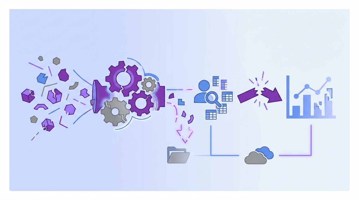
The core problem is simple: most systems tell you what happened after the fact, but not why it happened. That's the real bottleneck behind a lot of common challenges in analyzing support conversations. Free-text data stays messy, manual tags drift, and the business never gets a stable language for cause.
Support text needs a translation layer before it becomes useful
Support tickets are full of signal, but raw text doesn't walk itself into a clean metric. One customer says "billing is weird." Another says "charged twice." A third says "invoice doesn't match plan." Humans can see the family resemblance. Most dashboards can't.
So teams create tags. Then another team creates slightly different tags. Then agents stop using them consistently because they're busy, which is understandable. A quarter later you have six labels for the same issue and one giant reporting mess. The Tag Drift Trap is brutal: once manual taxonomy passes 20% inconsistency, trend lines start lying faster than teams realize.
What you need is a translation layer that can keep nuance at the edge and clarity at the reporting level. In plain English, that means one system for granular observations and another for stable categories. Without that split, you either lose detail or lose consistency. Usually both.
Root cause lives in drivers, not isolated ticket labels
A label tells you what showed up in one conversation. A driver tells you why a broader pattern exists. That distinction sounds small, but it changes the whole operating model.
Think about a month of tickets that mention refunds, duplicate charges, promo confusion, and missing invoices. If those all roll into a driver like Billing, leadership can see a coherent problem area. If they stay as disconnected tags, the business sees noise. The Driver Ladder is useful here: raw issue, canonical category, executive driver. If you can't move up that ladder, you can't move from ticket review to decision-making.
Some teams prefer to stay close to verbatim detail because they're worried higher-level groupings hide nuance. That's a valid concern. But the answer isn't to reject grouping. It's to make grouping traceable. Keep the nuance, then roll it up in a way people can report on.
Generic metrics break the moment your business gets specific
This is another one of the common challenges in analyzing support conversations that gets ignored until late. Generic sentiment might work as a starting layer. It won't answer the business-specific questions that actually matter.
A travel company may care about passenger comfort. A SaaS product may care about onboarding friction. A marketplace may care about fraud suspicion or seller payout confusion. None of that lives neatly inside positive, neutral, or negative. So teams either force custom business questions into generic categories or they go back to spreadsheets.
We're not 100% sure why some teams wait so long to fix this, but I think it's because generic metrics look complete from a distance. They aren't. If your metric model can't reflect the language your team actually uses in planning, the analysis never becomes operational. It stays interesting. It doesn't become useful. And if the model stays surface-level, the cost shows up everywhere else.
What the Cost Looks Like When Analysis Stays Surface-Level
Surface-level analysis creates measurable waste. It slows prioritization, weakens trust, and keeps teams arguing about interpretation when they should be fixing the issue. That's why the common challenges in analyzing support conversations aren't just data problems. They're operating problems.
Manual review burns time faster than teams estimate
Most teams undercount the time cost because they only count review time. They don't count prep, exports, retagging, slide creation, follow-up questions, and the second round of "can you pull examples for this segment?" That's where the work really spreads.
Picture a support lead on Thursday afternoon. They export Zendesk data, filter for angry tickets, read 60 conversations, paste quotes into a sheet, then build three slides for Monday's product sync. Monday comes, leadership asks whether the pattern is new or persistent, whether it's worse for enterprise accounts, and whether it connects to effort or churn risk. Back to the tickets they go.
If one analysis cycle takes 4 to 6 hours and happens weekly, you're looking at 200 to 300 hours a year from one person just to keep the narrative alive. Add product ops, CX, and insights time, and the number gets ugly fast. The Review Drag Threshold I use is 3 hours. If a recurring question takes more than 3 hours to answer and comes up twice a month, it should be systematized.
Weak evidence slows product decisions
When the evidence is thin, priority debates drag on. Not because people are stubborn. Because the proof isn't strong enough to close the loop.
A PM hears "customers are frustrated with onboarding." Reasonable response: how many customers, which step, what segment, what changed, and can we see examples? If the answer is a handful of screenshots and a trend line from sampled tickets, the decision stalls. That's not a leadership failure. It's a data confidence failure.
According to the Nielsen Norman Group's work on customer journey evidence and the broader push toward triangulating qualitative and quantitative sources, teams make better decisions when evidence is structured and inspectable, not anecdotal. Support analysis should work the same way. If you can't quantify and validate the pattern, the organization hesitates.
The loudest anecdote starts winning
This is the part nobody wants to admit. When the system can't produce trustworthy analysis, the room defaults to story power. The biggest customer, the angriest ticket, the most recent escalation, the exec-forwarded complaint. Those stories matter. They just shouldn't be your reporting model.
Support analysis becomes a lot like airport operations when the tower radar is partial. Everyone starts reacting to the plane they can see, not the traffic pattern they should be managing. That's how small but widespread friction gets ignored while dramatic one-offs take over the roadmap discussion.
The emotional cost is real too. Teams start feeling like they know what's wrong but can't prove it cleanly. That gap creates hesitation, second-guessing, and rework. You don't just lose time. You lose conviction. So what does a system look like when it actually answers the why, not just the what?
A Better Way to Analyze Support Conversations
A better model starts with coverage, then adds structure, then insists on proof. That's how you get past the common challenges in analyzing support conversations without replacing your helpdesk or building a side analytics project that nobody maintains.
Start with 100% coverage, not a prettier sample
If you're trying to understand support patterns, full coverage should be the default. Not eventually. Up front. Coverage changes the quality of every question you ask after that point.
The rule is simple. If a pattern affects customer retention, product quality, or support cost, partial visibility isn't enough. Analyze every conversation. This removes the constant debate about whether the sample was representative, whether a spike was fluky, or whether one reviewer tagged differently than another.
Before, a team reads 100 tickets and argues about whether billing confusion is really rising. After, they can inspect the entire month, filter by segment, and verify whether the issue is concentrated in new users, specific plans, or a recent time window. That's a different class of answer.
Separate discovery from reporting with the Two-Layer Taxonomy
The best framework here is what I'd call the Two-Layer Taxonomy. Layer one captures emerging detail. Layer two creates reporting discipline. You need both.
At the discovery layer, you want granular patterns to surface without forcing humans to predict every issue in advance. At the reporting layer, you want stable categories leaders can actually use in reviews. Raw observations feed normalized categories, then categories can roll into broader drivers. That's how you move from text to action without flattening reality.
This is where a lot of analysis projects fail. They choose one side. All discovery, no consistency. Or all consistency, no nuance. If raw themes never get normalized, reporting becomes chaos. If everything is forced into rigid buckets too early, you miss what's new.
Diagnose by driver first, metric second
Before you build another dashboard, run this quick diagnostic. Can your team answer these four questions in one meeting without opening three tools: which driver is rising, which segment is hit, which metric shows impact, and which tickets prove it? If the answer is no on two or more, you're still in surface analysis. That's one of the common challenges in analyzing support conversations, and it usually hides behind pretty charts.
Ask questions like:
- Which driver is creating the most negative sentiment?
- Which driver shows the highest customer effort?
- Which driver is overrepresented in churn-risk conversations?
- Which segment is getting hit hardest by that driver?
That sequence matters. Metrics without drivers tell you intensity without cause. Drivers without metrics tell you topic without impact. Put them together and you finally get an answer to the question leaders actually ask: what should we fix first?
The 2x2 Priority Grid works well here. One axis is frequency. The other is severity, measured through signals like sentiment, effort, or churn risk. High frequency and high severity goes first. Low frequency and high severity gets monitored. High frequency and low severity may be operational, not product. That kind of sort order cuts through a lot of noise.
Build one or two custom metrics before you build ten
Custom metrics are where analysis becomes business-specific. They are also where teams can overcomplicate things fast. Start narrower than your instincts want.
Pick one or two questions that would materially change decisions if answered well. Maybe it's "reason for churn risk." Maybe it's "setup blocker." Maybe it's "upgrade opportunity." If a custom metric won't affect prioritization, don't build it yet.
Honestly, this surprised us more than anything else when looking at how teams operationalize insight. The first custom metric usually creates more internal clarity than the next five combined. That's because it forces agreement on business language. Once you get that language right, the rest of the model gets easier.
Make every aggregate answer inspectable
A trustworthy analysis system has to let you jump from chart to evidence. No exceptions. If a grouped analysis says Billing drove 28% of negative conversations this month, you should be able to inspect the underlying tickets, read the quotes, and see whether the pattern is real.
This is the Audit Trail Rule: if a metric influences a meeting, it needs a ticket path. Without that, you're asking stakeholders to trust a number they can't interrogate. That's a tough sell, and frankly it should be.
For a practical model of structured qualitative analysis, the Dovetail guide to thematic analysis is useful because it shows the same core principle: patterns only become decision-ready when themes and evidence stay connected. Support ticket analysis isn't special here. Same logic. That sounds demanding, and it is, which raises the next practical question: can a real tool make this workable without creating another system to maintain?
How Revelir AI Makes This Model Practical
Revelir AI fits this approach because it doesn't ask you to swap out your helpdesk. It connects to the support conversations you already have, then makes the analysis traceable enough to survive real decision meetings.
Full coverage and traceability change the trust equation
Revelir AI processes 100% of ingested tickets through Full-Coverage Processing, so you're not starting from a sample or asking agents to do manual upfront tagging. That alone removes one of the biggest common challenges in analyzing support conversations: blind spots created by partial review.
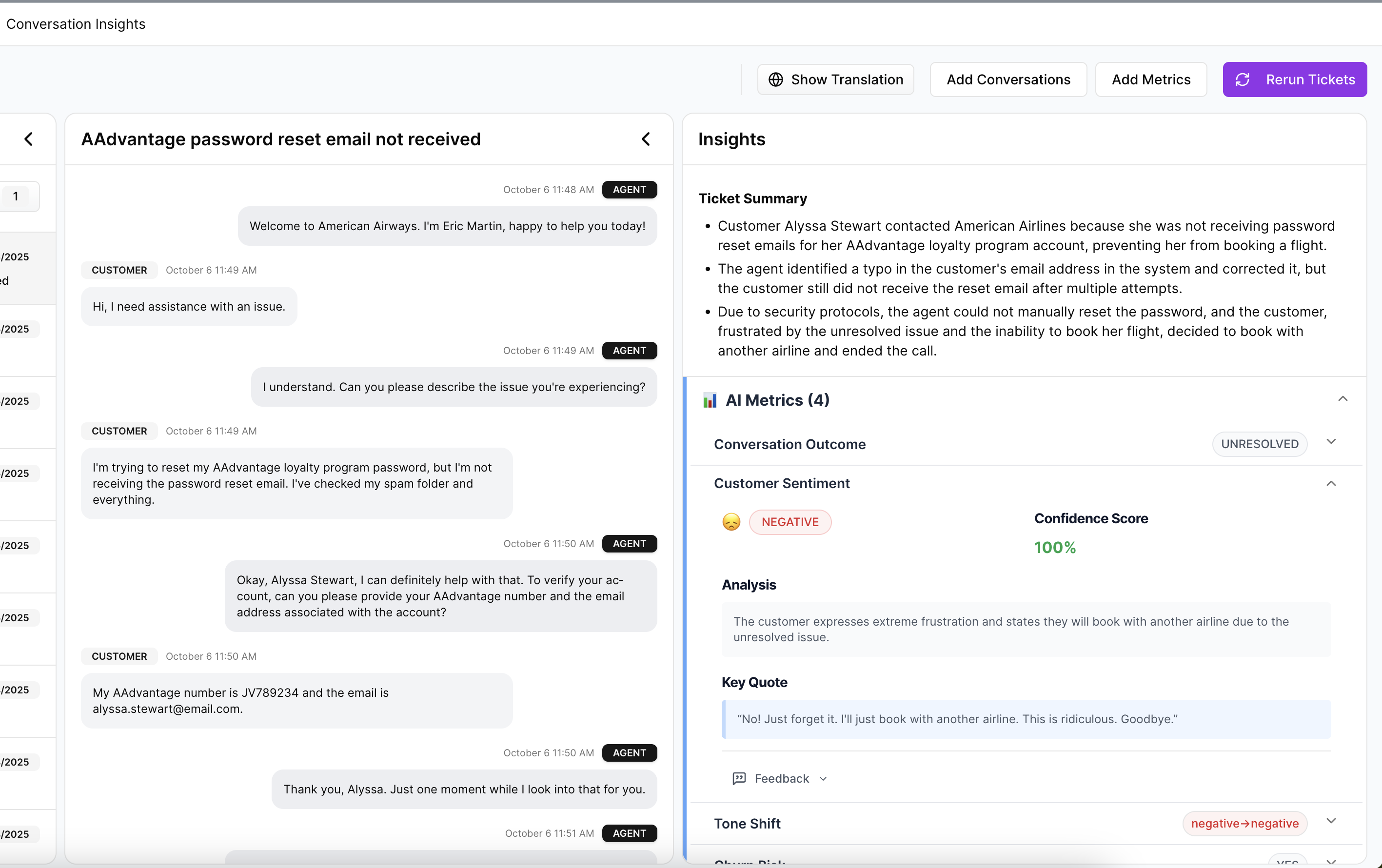
Then the second piece kicks in. Evidence-Backed Traceability links aggregate numbers back to the original tickets and quotes. So when analysis shows churn risk, effort, or sentiment tied to drivers like onboarding or billing, you're not stuck defending a black box. You can go straight to the underlying conversations and validate the pattern.
That matters in leadership review. Revelir AI gives you a cleaner answer to the question every exec eventually asks: can you show me the actual customer evidence behind this?
Drivers, tags, and custom metrics help you get to why
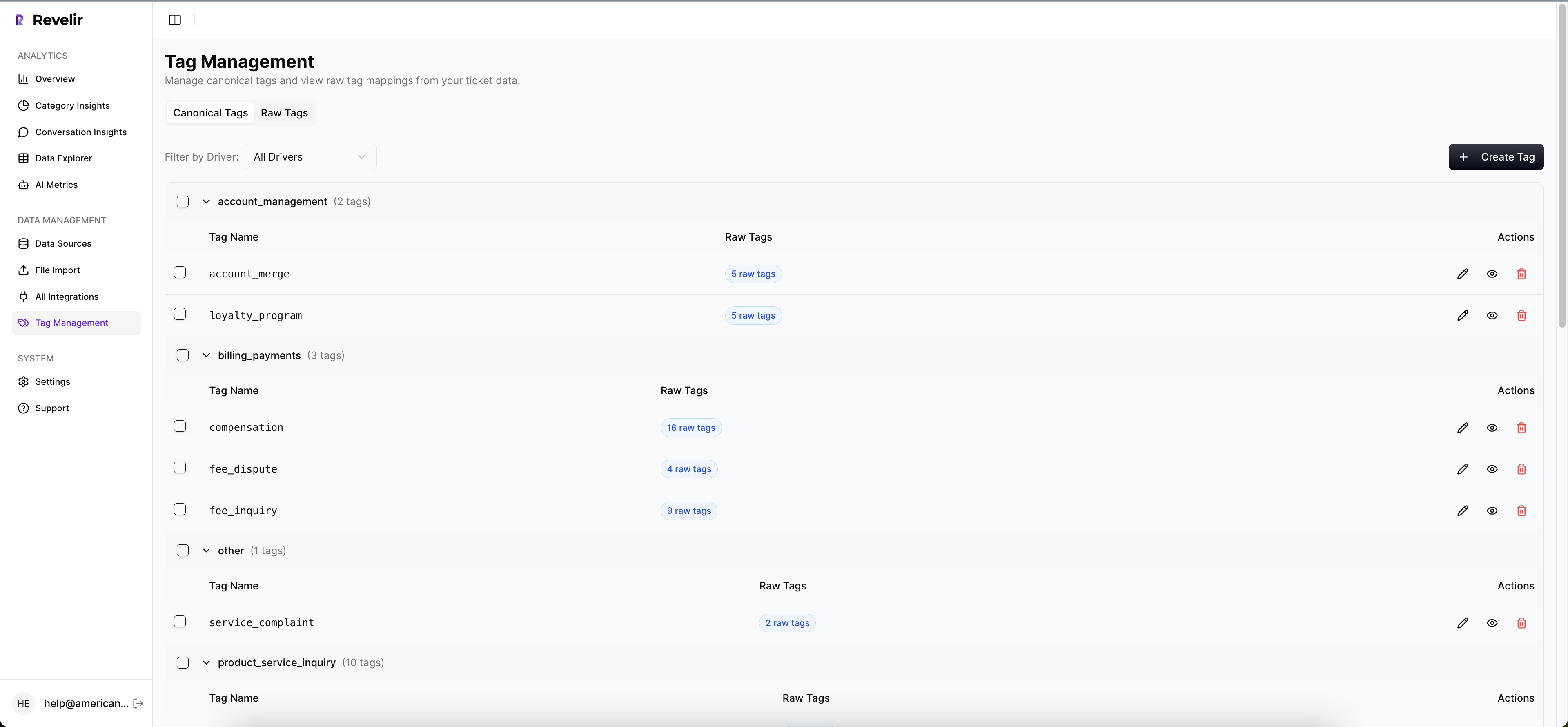
Revelir AI doesn't stop at surface labels. The Hybrid Tagging System uses AI-generated Raw Tags to surface specific themes, then lets teams map those into Canonical Tags that match how the business talks. Drivers add the higher-level grouping layer so you can report on the why, not just the wording inside one ticket.
On top of that, the AI Metrics Engine structures core signals like Sentiment, Churn Risk, Customer Effort, and Conversation Outcome into usable fields. And when generic fields aren't enough, Custom AI Metrics let you define business-specific classifiers with your own questions and values.
That makes it easier to move from "something feels off" to a clearer view of which drivers, tags, or metrics are showing up across your support data.
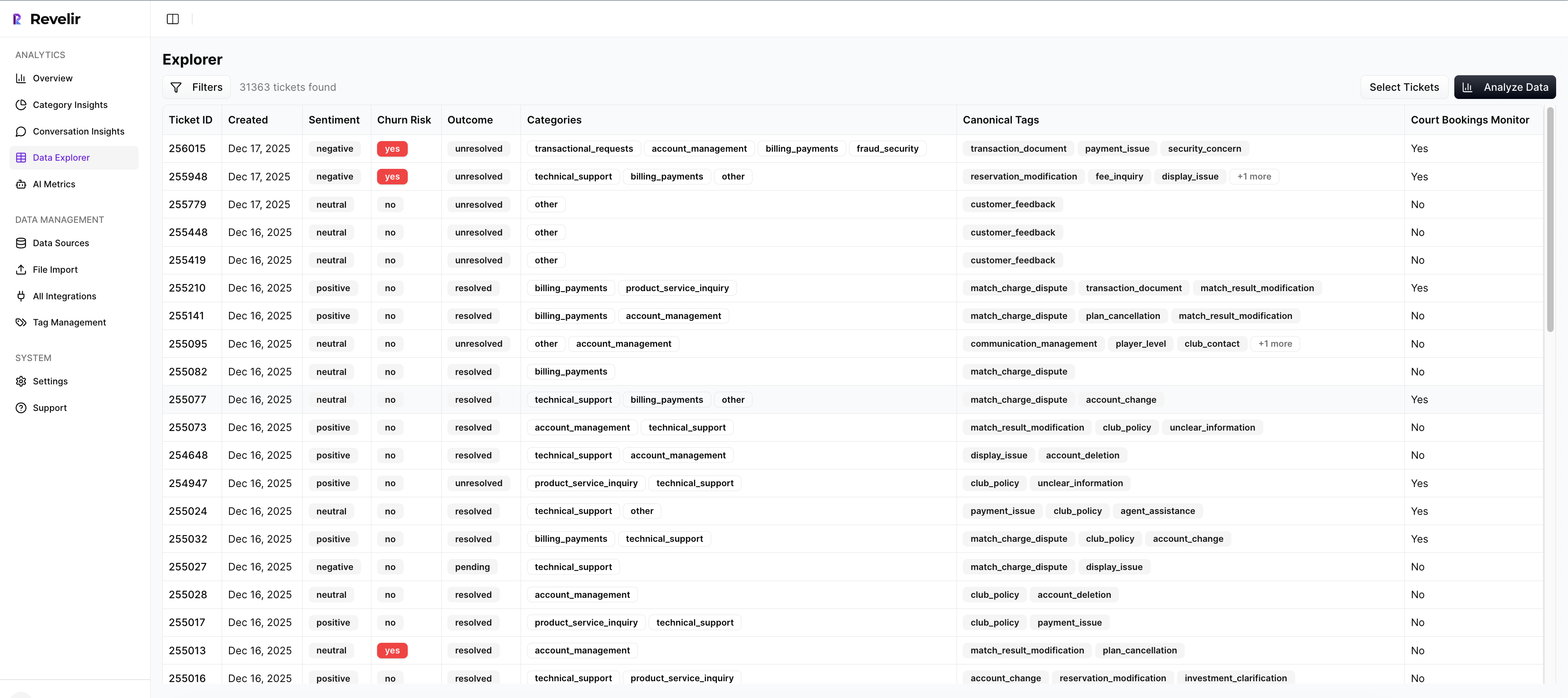
Data Explorer and Analyze Data keep the workflow usable
A lot of tools can classify text. Fewer can make the analysis usable day to day. Revelir AI does that with Data Explorer and Analyze Data.
Data Explorer gives teams a row-level workspace to filter, group, sort, and inspect tickets with columns for sentiment, churn risk, effort, tags, drivers, and custom metrics. Analyze Data lets you summarize those metrics by dimensions like Driver, Canonical Tag, or Raw Tag, then drill back to the underlying conversations. Conversation Insights adds the ticket-level view with full transcripts, summaries, tags, drivers, and metrics when you need to validate what the grouped view is showing.
If your tickets already live in Zendesk, Revelir AI can ingest them through the Zendesk Integration. If you want to start with an export, CSV Ingestion handles that path. And if the next step is bringing structured metrics into existing reporting and BI workflows, API Export is there too.
Get started with Revelir AI (Webflow)
Why Better Support Analysis Changes What Gets Fixed
The common challenges in analyzing support conversations aren't really about dashboards. They're about trust, causality, and speed. When you only have samples, score trends, or loose anecdotes, decisions slow down and the wrong issues win attention.
A better system does three things. It covers all conversations, organizes signals into drivers and business-specific metrics, and ties every conclusion back to evidence. That's the standard now. If you can answer what happened and why it happened, with proof, support stops being a reporting function and starts becoming an operating signal.
Frequently Asked Questions
How do I analyze customer support tickets efficiently?
To analyze customer support tickets efficiently, start by using Revelir AI’s Data Explorer. This tool allows you to filter, group, and sort tickets easily, giving you a row-level view of all conversations. You can add columns for sentiment, churn risk, and tags to get a clearer picture of the issues at hand. Additionally, make use of the Analyze Data feature to summarize metrics by dimensions like Driver or Canonical Tag, which helps in identifying patterns quickly.
What if I need to track specific customer issues over time?
If you want to track specific customer issues, consider setting up Custom AI Metrics in Revelir AI. This feature allows you to define your own questions and value options tailored to your business needs. For example, you could track metrics related to onboarding challenges or billing inquiries. By doing this, you can monitor trends over time and gain insights that are directly relevant to your customer experience.
Can I integrate Revelir AI with my existing helpdesk?
Yes, Revelir AI can integrate directly with your existing helpdesk, such as Zendesk. This integration allows you to automatically ingest historical and ongoing tickets, including all relevant metadata and conversation text. This means you won't have to worry about manual exports or tagging, as Revelir AI processes 100% of your tickets, ensuring comprehensive coverage and eliminating blind spots in your analysis.
When should I use evidence-backed analysis?
You should use evidence-backed analysis whenever you're making decisions that impact customer retention, product development, or support resources. Revelir AI’s Evidence-Backed Traceability feature allows you to link aggregate metrics back to the original support tickets and quotes. This transparency builds trust with stakeholders and ensures that your decisions are based on solid evidence rather than assumptions or anecdotal reports.
Why does my analysis need to connect metrics to specific tickets?
Connecting metrics to specific tickets is crucial because it enhances the credibility of your analysis. When you can trace back findings to actual conversations, it allows stakeholders to validate the data and understand the context behind the numbers. Revelir AI’s Conversation Insights feature provides ticket-level drill-downs, enabling you to see full transcripts and summaries, which helps in substantiating your conclusions during discussions.