
Support teams with 1,000 tickets a month can burn 5 hours reviewing a 10% sample and still miss the pattern that actually matters. If you're looking for best practices for reducing churn, escalation volume, or repeat support issues, scorecards alone usually point you to the smoke, not the fire.
You can watch this happen in a normal CX meeting. A dashboard says sentiment dipped. Someone read 12 angry tickets in Zendesk. Product asks whether it's real, support says it feels real, and nobody's checking the full conversation set. That's not evidence. That's a room full of smart people arguing from partial receipts.
Key Takeaways:
- Best practices for reducing repeat support problems start with full conversation coverage, not sampling.
- CSAT, NPS, and basic sentiment can tell you what happened, but rarely why it happened.
- If you can't trace a metric back to actual tickets and quotes, leadership won't trust it for hard decisions.
- Drivers, canonical tags, and custom metrics turn messy ticket text into something teams can act on.
- Black-box AI creates a trust problem fast, especially when product and CX need to defend priorities.
- The fastest way to reduce waste in support analysis is to stop rebuilding the story in spreadsheets every week.
If you want to see what that looks like in practice, Learn More.
Why Most “Best Practices for Reducing” Support Problems Miss the Real Issue
A lot of best practices for reducing support pain fail for one boring reason: they optimize reporting outputs before they fix the analysis model underneath. Teams watch scores, sample a few tickets, then try to infer what the broader customer base is feeling. Reasonable? Sure. Reliable? Not really.
The symptom looks obvious, but the root cause isn't
What looks like a dashboard problem is usually a data-structure problem. Support conversations are packed with signals, but those signals live inside free text, so the team keeps reconstructing the story after the week is already over.
At 8:14 AM on Monday, a head of CX opens Zendesk, stars six ugly tickets, and drops screenshots into Slack. By 11:30, ops has exported last week's data into Google Sheets, and product is already comparing that export to CSAT trends in Looker. By Wednesday afternoon, there are three different versions of the same issue, each with a different conclusion about severity. Same tickets. Different story. That's what happens when summaries outrun structure.
Manual review does have a real upside. Humans catch nuance, sarcasm, and the weird one-off edge case a model can miss. Fair. But once volume rises above roughly 800 to 1,000 tickets a month, the review method starts acting like an expensive spotlight: bright on whatever it hits, blind to everything else.
Sampling creates false certainty
Read 50 tickets and you feel informed; analyze 5,000 and you find out whether you were wrong. That's the trap.
Sampling gets treated like discipline because it feels organized. Pull a batch. Find themes. Share takeaways. Move on. But if your sample misses a high-friction onboarding issue hitting a smaller enterprise segment, the team still walks away feeling productive while the problem compounds in the background. If ticket volume is rising and the affected segment is high-value, then best practices for reducing churn or effort cannot start with "read a handful and estimate"; they have to start with coverage.
The mechanism matters here. Sampling overweights what is loud, recent, or emotionally memorable. Full-coverage analysis catches what is repeated, segment-specific, and economically expensive. Different method, different truth.
Think of it like queue management in a busy support center. If you only inspect the calls that got escalated to tier two, you're listening to the alarms, not the system. The quieter failures stay in the queue, stacking up call by call, until they finally show up as churn three weeks later.
Black-box outputs make the trust problem worse
Fast AI without traceability usually makes support analysis worse, not better. Harsh, maybe. Still true.
Plenty of tools can classify tickets at scale and generate tidy charts. The problem shows up one meeting later. A product lead asks, "What exactly is driving this?" If the answer is basically "the model says so," the room stops trusting the output right there.
There's a fair counterpoint. For early exploration, directional AI can absolutely save time. If you're scanning for rough themes or triaging where to look first, speed matters. But once insights enter roadmap prioritization, escalation reviews, or retention planning, the standard changes. At that point, a black-box metric is like submitting an expense report with no receipts: maybe the number is right, but nobody serious wants to approve it.
That trust gap is usually the real blocker. Not lack of data. Lack of proof. So the obvious next question is this: what does a support analysis system look like when it can survive scrutiny?
What Reliable Support Analysis Actually Requires
Reliable support analysis turns unstructured conversations into traceable, decision-ready signals. For teams asking about best practices for reducing repeat issues, the answer is usually three-part: cover the full conversation set, classify issues consistently, and connect every movement back to evidence. Miss one of those, and reporting stays descriptive instead of useful.
Start with the Coverage Ladder
Before you prescribe fixes, diagnose your stage. The Coverage Ladder is a simple maturity model: Level 1 is anecdote, Level 2 is sample, Level 3 is score-only reporting, and Level 4 is full-coverage analysis with traceability. Ask yourself three questions: Are at least 80% of tickets analyzed in a structured way? Can you explain a score movement with source quotes? Can two leaders from different teams reach the same conclusion from the same dataset? If the answer is no to two of the three, you're below Level 4 and still guessing more than you think.
Before, the workflow looked like this: export, sample, summarize, debate. After Level 4, it changes: ingest, classify, inspect drivers, validate against tickets, decide. Cleaner. Faster. Less political.
Smaller teams can absolutely live below Level 4 for a while. If you're handling 100 tickets a month, manual review may be perfectly efficient. But once volume grows or multiple functions need one shared version of reality, partial coverage becomes expensive in two currencies at once: analyst time and organizational trust.
Separate signals into score, driver, and evidence
What happens when one number has to do three jobs? It fails all three.
This is where the SDE Stack helps: Score, Driver, Evidence. A score tells you magnitude. A driver explains cause. Evidence proves the cause is real. If you only have one layer, you're observing movement. If you have two, you're interpreting movement. If you have all three, you're ready to act.
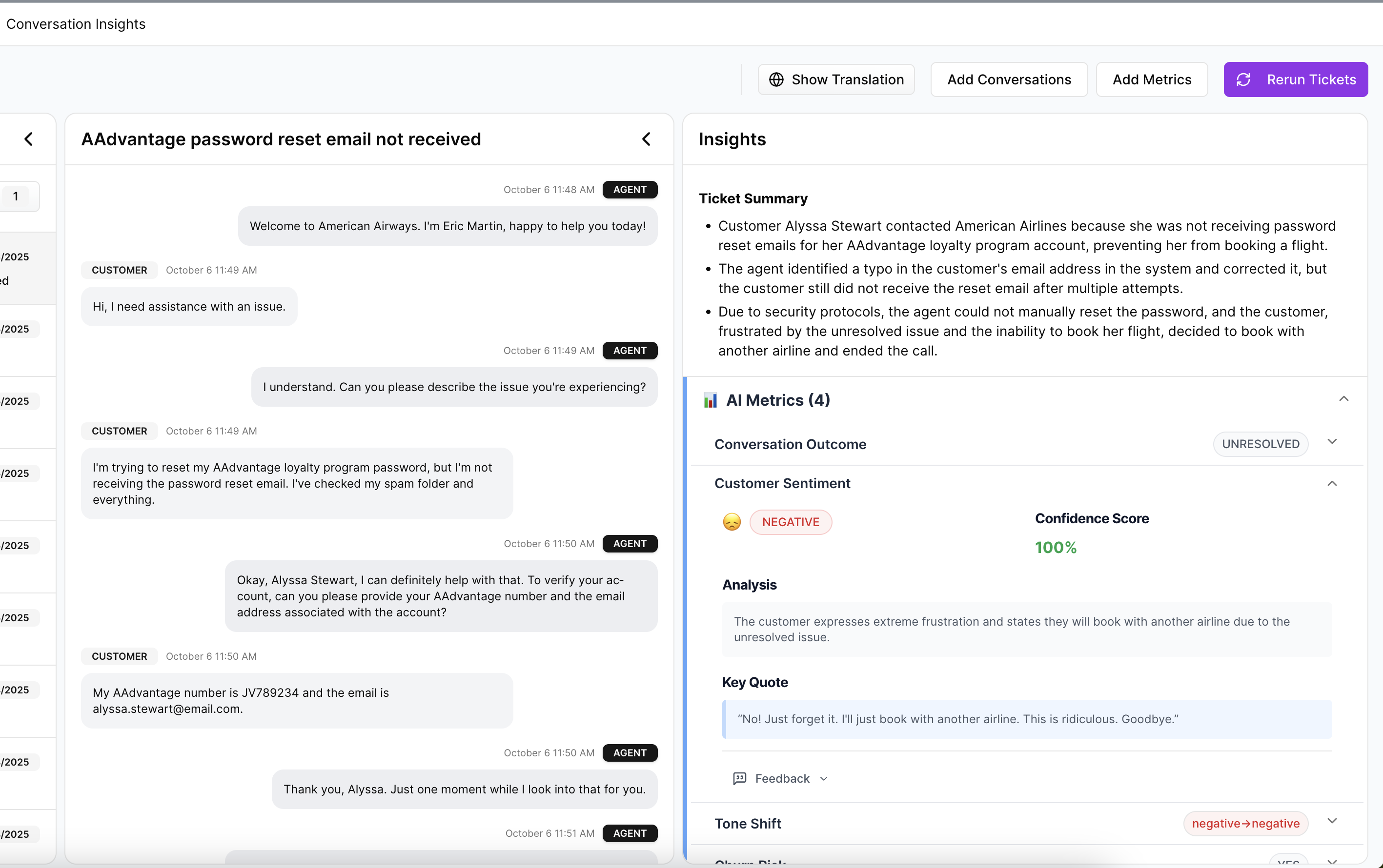
Say sentiment drops 12% week over week. That's the score. The driver might be onboarding friction tied to one identity-verification step. The evidence is the exact ticket language showing new customers getting stuck after upload and before approval. Now support knows what to deflect, product knows where to inspect, and leadership knows this isn't somebody's hunch dressed up as insight.
Same thing with churn risk. A red flag by itself is interesting. A churn-risk signal linked to a driver, then backed by source quotes from enterprise accounts, is something else entirely. That's when best practices for reducing churn start looking operational rather than performative.
Use a two-layer taxonomy or you'll drown in labels
Billing_fee_confusion and unexpected_charge sound different in a spreadsheet; operationally, they're often the same fire. That's why one-layer tagging falls apart.
The better model is a two-layer taxonomy. Raw themes capture the customer's exact language. Canonical categories normalize those themes into a stable reporting layer. Then drivers sit above both and answer the bigger why. If raw tags include "billing_fee_confusion," "unexpected_charge," and "invoice_mismatch," your canonical category may be Billing Issues, while the driver is Pricing Transparency Failure.
Here's the practical threshold: if more than 15% of your weekly issue categories change names from one review to the next, your taxonomy is unstable. Fix that before building another dashboard. Otherwise, trend lines drift for reasons that have nothing to do with customers and everything to do with naming chaos.
There is a downside here, and it's worth saying out loud. More structure means more setup work up front. True. But the tradeoff is brutal in the other direction: skip the taxonomy work, and you'll keep paying the tax in every single review meeting.
Diagnose maturity before you prescribe fixes
Three red flags usually show up before teams admit their analysis model is broken. First, score movement gets explained differently by support and product. Second, every deep-dive request turns into a custom spreadsheet project. Third, the team can describe what went up or down, but not which customer segment actually caused the change.
Call this the Hand-Built Insight Test. If answers depend on one analyst rebuilding the logic each week, you do not have a system; you have a heroic person. Useful for a quarter, maybe. Fragile for a year.
Before, the org says, "We'll pull that for next week's review." After diagnosis, the better move is sharper: "We can't make a roadmap claim from this because the evidence chain is incomplete." That sentence saves more bad prioritization than another summary chart ever will.
Build around decisions, not dashboards
Dashboards are not the product. Better decisions are the product.
Start with the recurring decision, then reverse-engineer the analysis around it. What should product fix first? Which issue is driving high customer effort? Which segment is showing churn risk? Which support problem is rising even though volume looks flat? Once the decision is clear, the reporting structure gets simpler fast.
A useful operating rule is the 1-1-1 Review Frame: every review should contain one movement signal, one driver explanation, and one piece of source evidence. Before that frame, meetings wander. After it, they compress. You stop spending 25 minutes on whether the trend is real because the proof is attached before the meeting starts.
And that's the pivot. Once you know the structure, the next problem is execution: how do teams run these best practices for reducing repeat issues inside real weekly workflows without creating a new admin job?
How Teams Put Better Practices Into Daily CX and Product Reviews
The right operating rhythm is simple enough to repeat and strong enough to survive scrutiny. That's the bar. For teams hunting for best practices for reducing escalations, churn, and rework, the win is not a prettier dashboard. It's a review process that turns the same messy ticket stream into the same answer every week.
Run the 30-60-10 review model
Thirty percent on movement, 60% on drivers, 10% on source validation. That's the review split. Most teams do the reverse.
Before, a Tuesday support-product sync spends 35 minutes on charts and five rushed minutes on what caused the shift. After the 30-60-10 model, the team starts with the movement signal, spends most of its time on the likely drivers, then validates against real conversations before assigning action. Same meeting length. Better outcome.
Picture it. A support manager walks into the weekly review with a spike in negative sentiment among new customers. Instead of stopping there, the team breaks the change down by driver and sees one onboarding theme accelerating. They open the underlying tickets, find the same failure point repeated in plain language, and assign ownership on the spot. The conversation moves from "is this real?" to "who fixes it by Friday?"
Segment before you summarize
What looks stable in aggregate can be on fire in one customer segment. That's why averages cause so much expensive calm.
If you support multiple tiers, product lines, regions, or queues, segment first and summarize second. Not the other way around. The practical rule is this: if a metric moves more than 8% overall, break it down by at least two business dimensions before presenting it upward. New users and mature accounts rarely break for the same reasons. Same thing with enterprise customers versus self-serve.
Here's the surprising connection: segmentation is not just an analytics habit; it's a political risk-control tool. Once the data is split correctly, teams stop arguing over whose anecdote wins. The argument gets smaller because the segment tells you where the issue actually lives.
Treat quotes like evidence, not decoration
A quote in a deck should behave like a receipt, not a mood board.
That means a quote must do one of two jobs. It either validates the driver you've identified, or it challenges your interpretation and forces a correction. If it does neither, cut it. Not because quotes are bad. Because decoration masquerading as evidence is how weak analysis sneaks into executive decisions.
Before, teams paste the loudest complaint into a slide and let it stand in for the trend. After, they select quotes from inside the measured pattern and label them against the driver. Cleaner chain of reasoning. Much less hand-waving.
Create custom metrics in business language
Generic sentiment is useful right up until the moment you need it to answer a business-specific question. Then it runs out of road.
One of the most practical best practices for reducing noise in support analysis is to define metrics in the language your business actually uses. Upgrade blocker. Onboarding confusion. Policy friction. Churn reason. If a recurring decision depends on that concept, measure it directly rather than hoping a generic label captures it by accident.
There is a legitimate reason teams delay this. Custom metrics require sharper definitions, and sharper definitions force alignment work. That's annoying. It is also exactly why they create trust. Once the metric maps cleanly to a real operating decision, support, CX, and product stop translating the output in three different ways.
Now the obvious question is tooling. If this process sounds right, how do you run it without stitching exports, tags, and source quotes together by hand every single week?
How Revelir AI Makes This Approach Easier to Run
This is where the process becomes operational. Revelir AI turns best practices for reducing support waste into a repeatable system by structuring the conversations you already have, preserving traceability, and letting teams move from what happened to why it happened without rebuilding the story from scratch each week.
Full coverage and traceability change the quality of the conversation
One shift changes almost everything: move from partial review to full-coverage analysis.
Revelir AI processes 100% of ingested tickets through Full-Coverage Processing, so the team is not building conclusions from a thin sample. That changes the first five minutes of the meeting right away. Instead of debating whether 40 or 50 tickets are representative, people can work from the full conversation set.
Then Evidence-Backed Traceability closes the trust gap. Aggregate numbers can link back to source conversations and quotes. So when leadership asks why churn risk rose or why customer effort is climbing in one segment, the answer doesn't stop at the chart. The team can inspect the underlying tickets, validate the pattern, and defend the recommendation.
Drivers, tags, and metrics turn free text into something teams can act on
Free text becomes operational only after it gets structured in layers. That's the job.
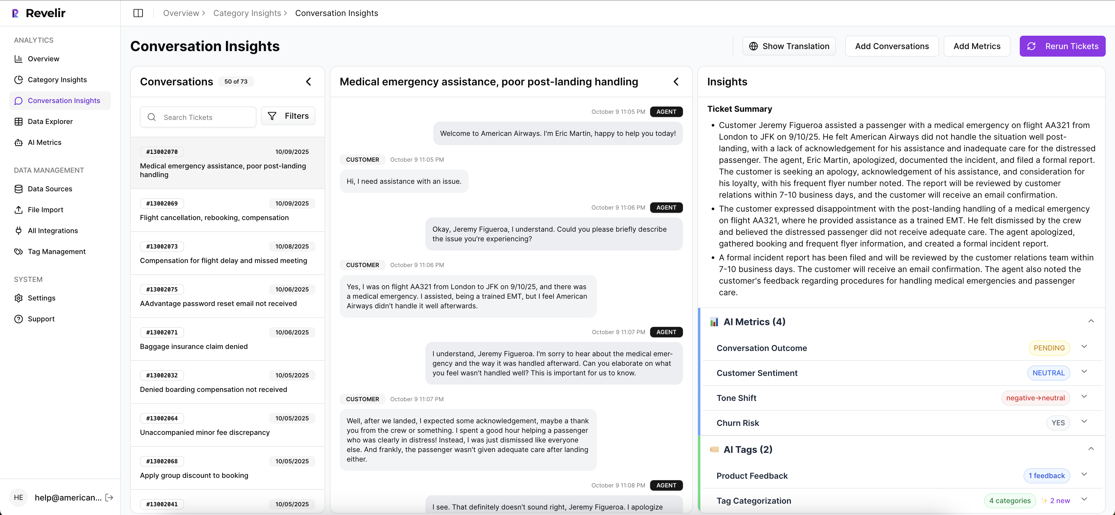
Revelir AI uses a Hybrid Tagging System to surface granular Raw Tags and organize them into Canonical Tags that match how the team actually talks. Drivers then group those issues at a higher level so review meetings can answer the real question: why is this happening?
The AI Metrics Engine adds structured fields like Sentiment, Churn Risk, Customer Effort, and Conversation Outcome. If those signals are too generic for the decisions you make, Custom AI Metrics let you define classifiers in your own business language. That matters for teams tracking upgrade blockers, onboarding confusion, or churn reasons without trying to force every issue through a one-size-fits-all label.
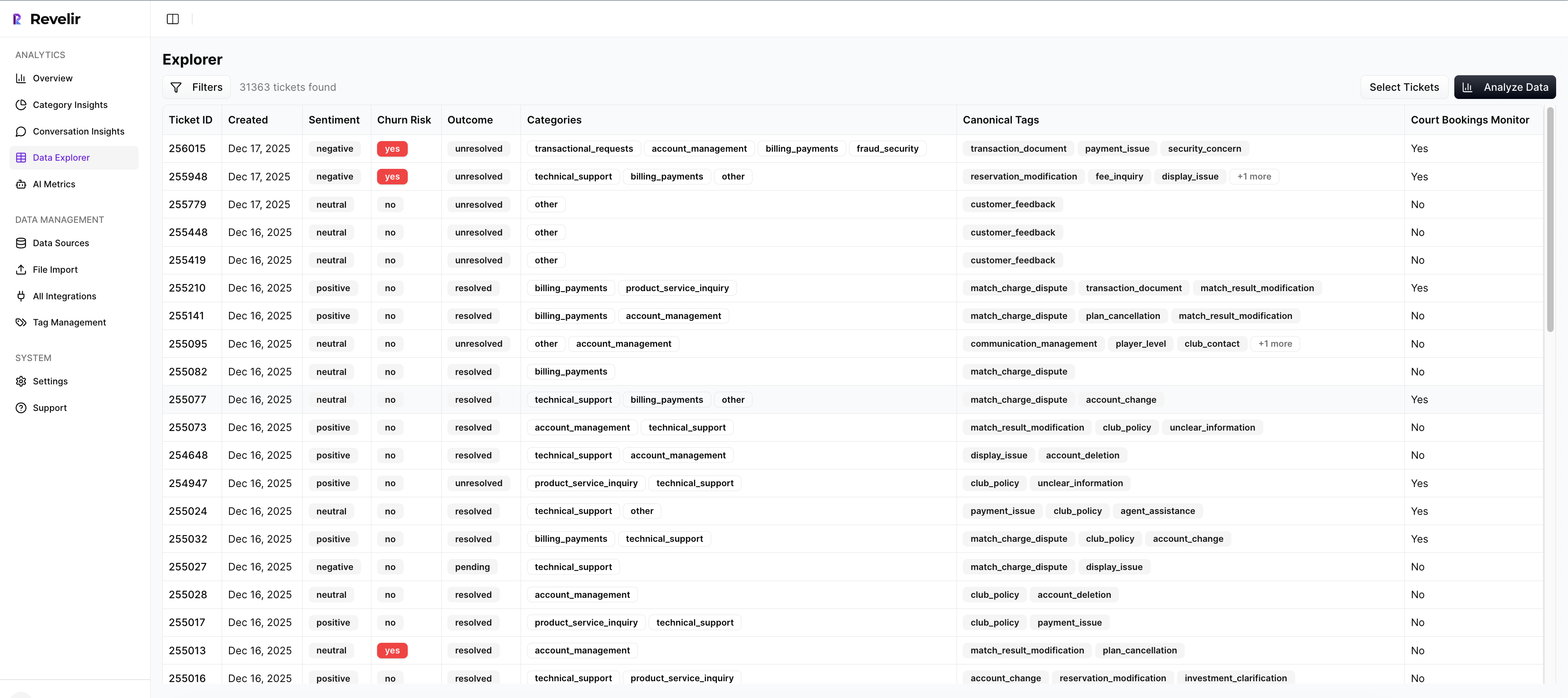
Once that structure exists, Data Explorer gives teams a row-level workspace to filter, sort, and inspect tickets across those fields. Analyze Data summarizes those metrics by Driver, Canonical Tag, or Raw Tag, with grouped views that lead back to the tickets underneath. Conversation Insights gives the drill-down into transcripts, summaries, tags, drivers, and metrics when somebody needs to validate a finding before action gets assigned.
You can plug it into the workflow you already have
Nobody wants a six-month migration just to test whether the analysis model is better. Fair enough.
Revelir AI connects through Zendesk Integration for ongoing ticket import, and teams can also use CSV Ingestion for pilots, backfills, or one-off analysis. That lowers the switching cost at the exact moment most teams are skeptical. If you need to move structured outputs into an existing reporting environment, API Export gives you a path to carry those metrics into the rest of your stack after analysis is done.
If your current process still depends on sampled reviews, spreadsheet stitching, and endless "can we trust this?" debates, this is the handoff worth making. Ready to see the system in context? Get started with Revelir AI
Why Better Support Decisions Start With Better Evidence
Best practices for reducing churn, effort, and repeat support issues are not really about dashboards. They're about evidence quality. See 100% of conversations, structure the why behind the signal, and trace every claim back to the actual tickets; once you do that, decisions get faster, cleaner, and a lot harder to argue with.
It's usually that simple. Stop sampling. Stop treating scores like answers. Build around coverage, drivers, and proof. Better support decisions don't start with louder opinions. They start with better receipts.
Frequently Asked Questions
How do I analyze customer sentiment effectively?
To analyze customer sentiment effectively, start by using Revelir AI's AI Metrics Engine, which automatically computes sentiment scores for each ticket. You can then utilize the Data Explorer to filter and group tickets by sentiment, allowing you to identify patterns and trends. Make sure to drill down into specific tickets to validate findings with actual customer conversations, ensuring you understand the context behind the sentiment shifts.
What if I want to track specific churn reasons?
If you want to track specific churn reasons, you can use Revelir AI's Custom AI Metrics feature. This allows you to define classifiers that align with your business language, such as 'Onboarding Confusion' or 'Upgrade Blocker'. Once set up, you can analyze these metrics in the Data Explorer to see how they correlate with churn risk and customer effort, helping you pinpoint areas for improvement.
Can I integrate Revelir AI with my existing systems?
Yes, you can easily integrate Revelir AI with your existing systems. It offers a Zendesk Integration that allows for direct import of historical and ongoing tickets, ensuring your analysis stays current. Additionally, if you need to run a one-off analysis, you can use the CSV Ingestion feature to upload ticket data from other platforms, making it simple to get started without a lengthy migration process.
When should I use the Analyze Data feature?
You should use the Analyze Data feature when you need to run grouped analyses on your ticket data. This tool allows you to summarize metrics like sentiment and churn risk by dimensions such as drivers and canonical tags. It's particularly useful during review meetings to provide a clear overview of trends and insights, helping your team make informed decisions based on structured data rather than anecdotal evidence.
Why does my team struggle with consistent tagging?
Your team may struggle with consistent tagging due to a lack of a structured taxonomy. To address this, consider using Revelir AI's Hybrid Tagging System, which combines AI-generated Raw Tags with human-aligned Canonical Tags. This system allows you to refine your tagging process over time, ensuring that similar issues are categorized consistently. Regularly reviewing and updating your tagging strategy can help stabilize your taxonomy and improve reporting accuracy.