

Sampling 10% of support tickets doesn't give you 10% of the truth. It usually gives you the loudest 10%, which is a very different thing if you're trying to decide what to fix first.
If you've had a meeting this week where one person brought three angry tickets, another person brought a CSAT slide, and nobody could prove what was actually happening across the whole queue, this is for you.
Key Takeaways:
- Sampling is a liability when you're trying to quantify customer issues across support conversations.
- Basic sentiment and survey scores can show motion, but they rarely explain the driver behind the motion.
- A useful quantification system needs 100% coverage, clear metric definitions, and traceability back to real tickets.
- Custom metrics matter because every business has its own language for risk, effort, and product pain.
- If you can't drill from a chart to the exact conversation behind it, you don't have evidence. You have a summary.
- The best practices for quantifying support issues start with structure, not more dashboards.
You can keep building exports and defending anecdotes if you want. But if you'd rather see what evidence-backed support analysis looks like, Learn More.
Why Most Quantification Efforts Break Before They Help
Best practices for quantifying support issues sound obvious on paper. Track trends. Review tickets. Measure sentiment. Report findings. Same thing with CSAT dashboards. They look clean right up until someone asks a harder question, like which issue is driving churn risk for enterprise customers this month.
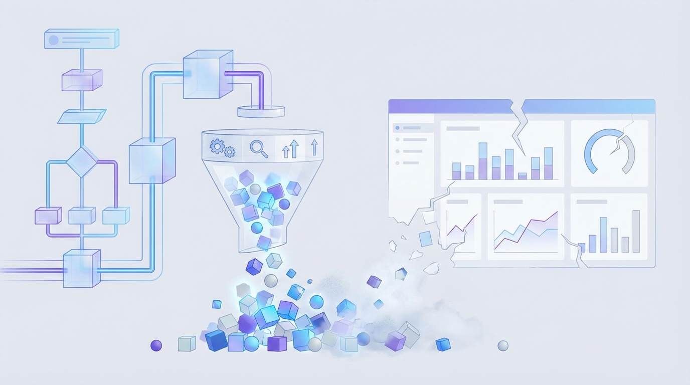
That's where most teams realize the system was never built to quantify the real thing. It was built to summarize what was easy to count.
A support leader pulls 200 tickets from a month with 8,000 conversations. An analyst tags a slice manually in a spreadsheet. Product gets a deck with five themes, two quotes, and one red arrow pointing down. Then leadership asks whether onboarding friction is actually worse than billing confusion, whether the issue is isolated to one segment, and whether this is noise or a trend. Nobody's checking the full dataset, so the room falls back to opinion. That part is painful because everybody knows the conversation is weak, but nobody has the evidence to tighten it up.
The Sampling Trap Creates False Confidence
Sampling feels responsible because it looks disciplined. You review a subset, you categorize what you find, and you move on. But the Coverage Confidence Rule is simple: if fewer than 80% of conversations are analyzed, don't treat the result as prioritization input. Treat it as directional only.
That's a hard line, I know. And yes, manual review has one real advantage: humans catch nuance. Fair point. But nuance without coverage creates theater. You end up with high-confidence commentary on low-confidence evidence.
The math gets ugly fast. If your team handles 1,000 tickets a month and reviews 10%, you're making decisions from 100 conversations while 900 go untouched. Quiet patterns disappear in that gap. Early churn signals disappear in that gap. Segment-specific friction disappears in that gap. What survives is whatever happened to get sampled.
Score Watching Misses the Driver
Scores tell you something changed. They rarely tell you why. That's the difference between reporting and quantifying.
A drop in CSAT can come from slow resolution, broken onboarding, refund friction, or a billing bug hitting one customer cohort. Basic sentiment can tell you conversations feel more negative. Useful, sure. But if you can't connect that movement to drivers, tags, and actual examples, the metric stalls out in the meeting where decisions need to happen.
I call this the Why Gap. You know the temperature. You don't know the cause. And cause is what gets fixed.
The Real Cost Is Decision Latency
The visible cost is time. The hidden cost is delay. Best practices for quantifying only matter if they help you prioritize faster.
Let's pretend your product team has room for two fixes next sprint. Support says billing confusion is on fire. CX says onboarding effort is climbing. Leadership asks which issue is bigger, which segment is most affected, and what's tied to churn risk. If your answer depends on another export, another sample, or another week of manual review, you've already lost the timing advantage. The backlog doesn't wait for clean evidence. Neither do frustrated customers.
The question isn't whether you have customer data. You do. The question is whether your way of quantifying it can survive contact with a real decision.
What You're Really Trying to Quantify
Quantifying support issues means turning messy conversation data into repeatable, defensible signals that tell you what is breaking, who feels it most, and what deserves action first. The mistake is thinking the unit of analysis is the score. It isn't. The unit is the pattern.
That's why the best practices for quantifying support issues need a better model than scoreboards and hand-tagged samples.
Use the SIGNAL Stack, Not a Single Metric
The framework I like here is the SIGNAL Stack: Signal, Impact, Group, Narrative, Audit, Loop. If one layer is missing, your quantification is weak.
- Signal: what happened in the conversation
- Impact: how severe it was, using effort, churn risk, or sentiment
- Group: which segment, product area, or time window it affects
- Narrative: the plain-English explanation of the pattern
- Audit: the ticket-level evidence behind the claim
- Loop: whether the team can use it again next week without rebuilding the process
Most teams stop at Signal. Some get to Impact. Very few get all the way to Audit.
A better quantification system doesn't just say "billing complaints increased." It says negative sentiment tied to billing confusion rose from one customer segment, carried high effort, and appears in enough conversations to justify escalation. That's different. That's a decision input.
Quantify Drivers Before You Quantify Performance
Performance metrics without driver metrics are fragile. That sounds small, but it changes the whole setup.
If you measure only outcomes like CSAT, you're measuring after the damage. If you quantify drivers like onboarding friction, login failures, refund confusion, or missing product expectations, you can act earlier. The Driver-First Rule is simple: if a metric can't point to a driver category, it belongs in monitoring, not prioritization.
Some teams will push back here. They'll say executive reporting needs clean top-line numbers, not taxonomy debates. That's true to a point. You do need clean reporting. But the top line without drivers creates a weird loop where everybody agrees something is wrong and nobody agrees what to do. That's not clarity. That's delay dressed up as alignment.
Your Business Language Matters More Than Generic Labels
Custom metrics are where quantification starts to get real. Basic sentiment is too broad for most operational decisions.
A travel company may need to track passenger comfort, disruption severity, or missed connection risk. A SaaS company may care about onboarding breakdown, admin friction, or expansion opportunity. A fintech team might need to isolate trust risk, fraud anxiety, or fee confusion. Same thing with churn risk. The label matters less than whether the metric matches how your team actually talks.
The Language Match Test is practical: if your head of CX wouldn't use the metric name in a weekly review, it's the wrong metric. Rename it or rebuild it.
Honestly, this is where a lot of analytics projects die. The model might be technically fine. The language is wrong, so nobody adopts it.
Every Metric Needs an Evidence Chain
If you can't click from the aggregate number to the underlying conversations, the metric won't hold up under pressure. Someone will challenge the definition, challenge the sample, or challenge the interpretation. And they should.
Best practices for quantifying support issues always include an evidence chain. That means:
- a metric definition
- a clear grouping logic
- a segment or time filter
- the underlying tickets and quotes
Think of it like accounting. You don't trust a topline revenue number because it looks tidy. You trust it because there's a ledger behind it. Support quantification works the same way. No ledger, no trust.
That's also why black-box outputs create so much friction. They may be fast. They aren't defensible.
The Operating Model That Actually Works
A useful operating model for quantifying support issues has four parts: full coverage, a layered taxonomy, custom metrics, and review loops tied to action. It's not fancy. It just holds up better than exports and opinions.
Start With Full Coverage, Then Segment Hard
Quantifying from 100% of conversations gives you a baseline you can actually trust. Then you segment. That's the order.
The 100/5 Rule is a good benchmark: analyze 100% of conversations, then review the top 5 segments or drivers by negative sentiment, effort, or churn risk each week. Without full coverage, segmentation amplifies sampling error. With full coverage, segmentation becomes useful.
Picture a CX lead looking at monthly support data across SMB, mid-market, and enterprise customers. In a sampled workflow, enterprise pain might look small because the sample size is thin. In a full-coverage workflow, you can see that a lower-volume segment carries much higher churn risk or effort. That's the kind of pattern that changes roadmap priorities.
And yes, full coverage sounds heavy if you're used to manual review. It isn't, if the system is built for it. That's the point.
Build a Two-Layer Taxonomy
Raw detail and executive clarity are not the same thing. You need both. I think this is where teams either overcomplicate everything or oversimplify too early.
The best structure is a Two-Layer Taxonomy:
- Layer 1: raw issue signals for discoverability
- Layer 2: canonical reporting categories for consistency
Raw labels catch the weird stuff early. Canonical categories keep reporting stable. If you only use broad categories, you miss emerging issues. If you only use raw labels, reporting turns into chaos by month three.
Then add a third organizing lens above both: drivers. Drivers answer the "why" question at a leadership level. Billing. Onboarding. Performance. Account access. Stuff people can actually discuss in a meeting without reading 200 tickets first.
Review Leading Indicators, Not Just Outcome Metrics
A lot of teams quantify after the quarter is already slipping. They wait for retention signals or survey drops, then go hunting through support. Backwards.
The Lead-Lag Pairing Model works better:
- Pair one lagging metric with one leading support metric
- Review them together
- Escalate when both move in the same direction
Example:
- Lagging metric: CSAT down
- Leading support metric: onboarding-related high-effort conversations up 25%
Or:
- Lagging metric: churn concern from account team
- Leading support metric: billing-driver tickets with negative sentiment rising across high-value accounts
This doesn't give you certainty. Nothing does. But it gives you a much earlier read on where the fire actually is.
Put a Weekly Proof Loop in Place
Quantification fails when it becomes an analyst-only ritual. The fix is a simple Weekly Proof Loop:
- identify the top changed driver or metric
- break it by segment
- pull 5 to 10 representative conversations
- confirm the pattern
- assign an owner and next action
This part matters more than people think. You need a rhythm where the numbers and the evidence meet. Otherwise the dashboard becomes a museum. Looks nice. Doesn't move anything.
If your weekly review can't answer "what changed, for whom, and what do we do next," the quantification process is too loose.
What makes this operational instead of theoretical is tooling. Not more dashboards. The right structure under the dashboard.
If you want to see what that looks like in practice, See how Revelir AI works.
How Revelir AI Makes This Practical
Revelir AI makes best practices for quantifying support issues usable because it starts with full coverage and ends with evidence. Not sampled summaries. Not one-size-fits-all scoring. Actual support intelligence you can inspect.
Full coverage and custom metrics change the quality of the signal
Revelir AI processes 100% of ingested tickets with Full-Coverage Processing, so you're not building prioritization on a thin sample. That alone changes the conversation. Instead of asking whether a pattern is representative, you can focus on whether it's important.
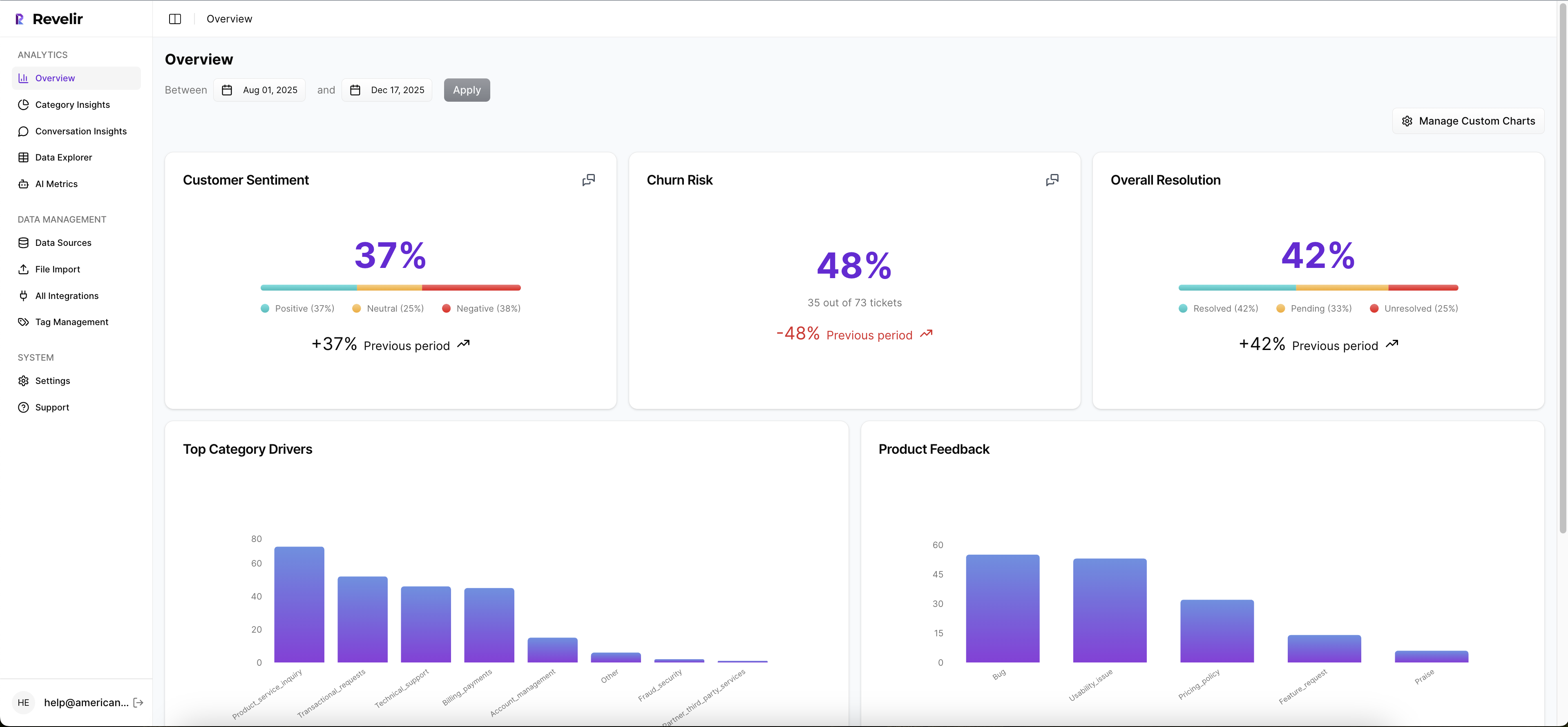
Then Revelir AI layers on the AI Metrics Engine and Custom AI Metrics. So yes, you can look at sentiment, churn risk, customer effort, and outcome. But you can also define metrics in your own business language. That's the real unlock for CX and product teams. You stop forcing your questions into generic labels and start measuring what your business actually cares about.
Drivers, tags, and drill-downs make the "why" visible
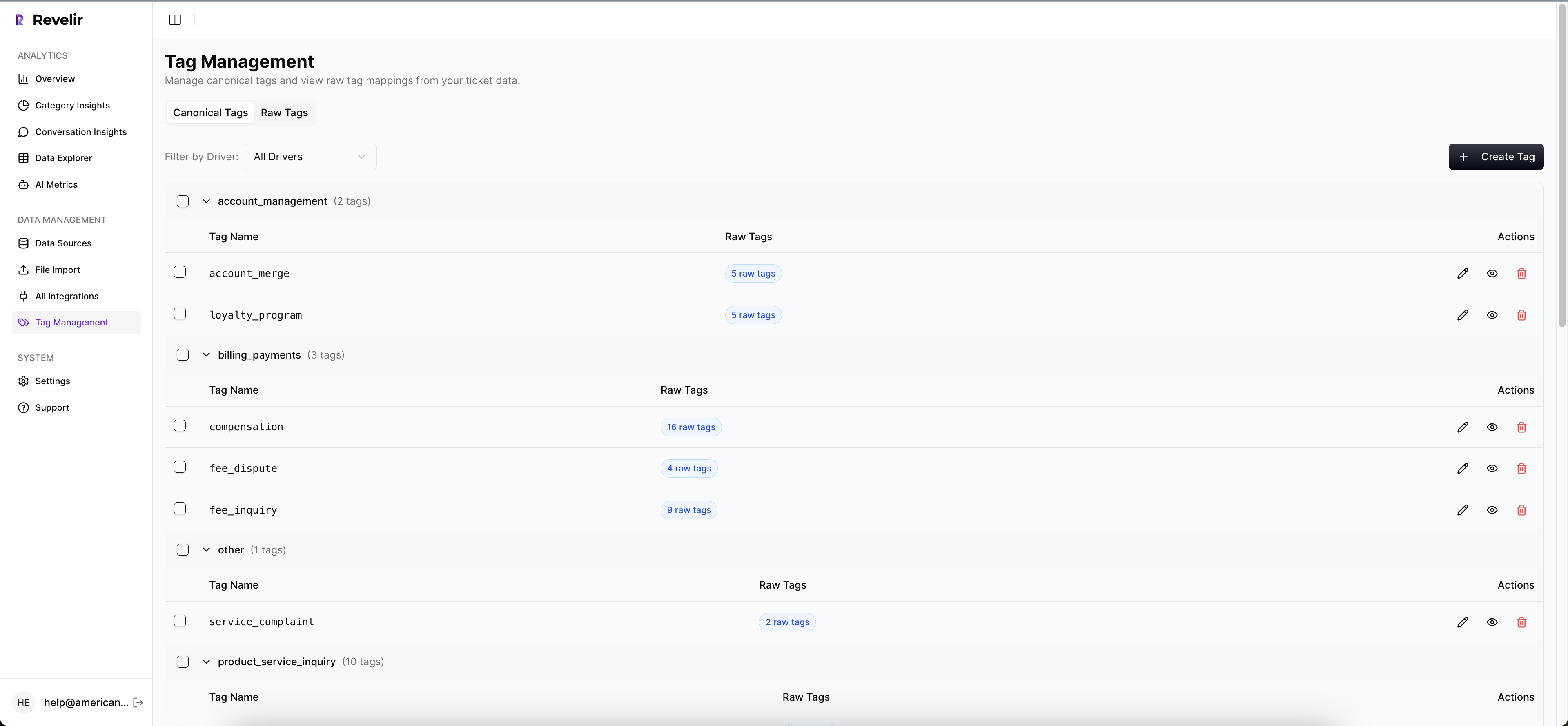
Revelir AI doesn't stop at top-line scoring. The Hybrid Tagging System combines raw tags with canonical tags, which means you get both emerging detail and stable reporting categories. Add Drivers on top, and the pattern becomes easier to explain in product and leadership reviews.
From there, the Data Explorer and Analyze Data views give teams a way to filter, group, and inspect tickets across sentiment, churn risk, effort, tags, drivers, and custom metrics. If a number moves, you can follow it. If a segment looks bad, you can isolate it. If someone challenges the claim, you can go deeper instead of arguing from memory.
Traceability is what makes the metric credible
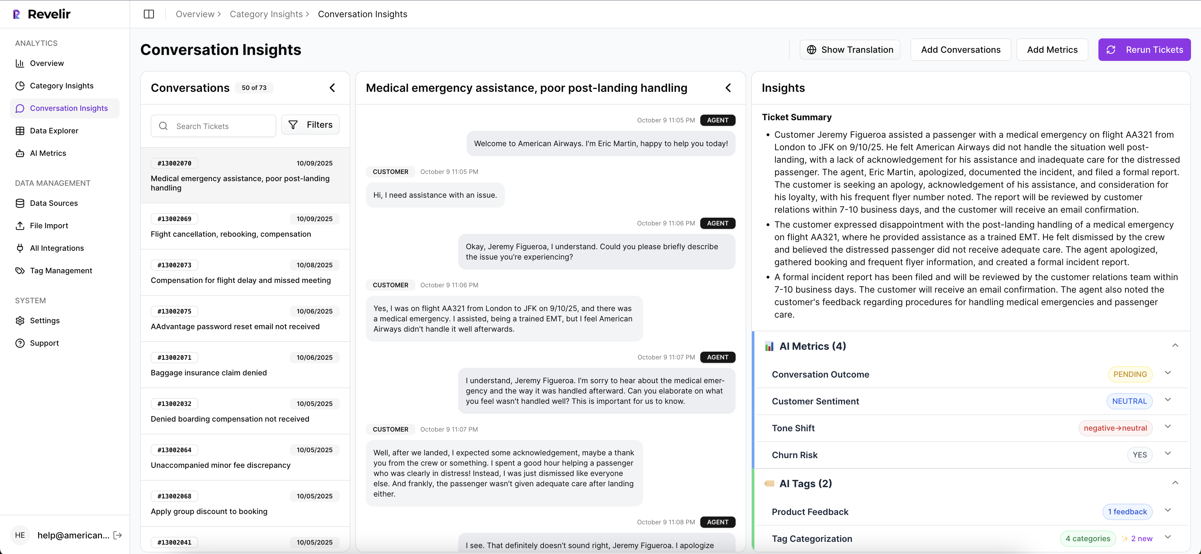
This might be the biggest difference. Revelir AI ties every aggregate number back to source conversations through Evidence-Backed Traceability and Conversation Insights. You can drill into ticket-level detail, review transcripts, use AI-generated summaries to move faster, and pull supporting quotes when you need to explain a pattern.
That's how you shorten decision latency. The hours that used to go into exports, manual tagging, and proof gathering shrink because the evidence is already attached to the metric. Revelir AI can ingest data through the Zendesk Integration or CSV Ingestion, and teams can use API Export after analysis if they want those structured metrics in existing reporting workflows.
If your current process still relies on a sampled spreadsheet and a debate-heavy meeting, this is the cleaner path: Get started with Revelir AI (Webflow).
Best Practices for Quantifying Start With Better Evidence
Best practices for quantifying support issues aren't really about reporting discipline. They're about evidence discipline. Quantify from full coverage. Use metrics that match your language. Group issues into drivers people can act on. And never trust a number you can't trace back to the ticket behind it.
It's usually that simple. Not easy. But simple.
Teams that fix this stop arguing about what's real and start deciding what matters. That's a much better place to run CX, product, or ops from.
Frequently Asked Questions
How do I analyze customer feedback trends over time?
To analyze customer feedback trends using Revelir AI, start by accessing the Data Explorer. Here, you can filter tickets by date range to focus on specific periods. Use the AI Metrics Engine to view sentiment and churn risk over time. This will help you identify patterns in customer feedback. Additionally, consider utilizing the Analyze Data feature to summarize metrics by dimensions like drivers and tags, which can provide deeper insights into how customer sentiment evolves.
What if I need to define custom metrics for my team?
You can define custom metrics in Revelir AI using the Custom AI Metrics feature. Start by identifying the specific areas your team wants to track, such as onboarding issues or customer satisfaction levels. Create classifiers with tailored questions and value options that align with your business language. Once set up, these metrics will be stored as columns in your dataset, making them available for filtering and analysis in the Data Explorer.
Can I drill down into specific support tickets for more context?
Yes, Revelir AI allows you to drill down into specific support tickets for detailed context. In the Data Explorer, you can click on any ticket to access its full transcript and associated AI-generated metrics, such as sentiment and churn risk. This feature helps you validate patterns and gather insights directly from the conversations, ensuring that your analysis is backed by concrete evidence.
When should I use the Hybrid Tagging System?
You should use the Hybrid Tagging System when you want to balance detailed insights with stable reporting. This system combines AI-generated raw tags that capture emerging themes with canonical tags that provide clear categories for reporting. By mapping raw tags to canonical tags, you can refine your taxonomy over time, ensuring that your analysis remains both comprehensive and understandable for stakeholders.
Why does full coverage matter in customer feedback analysis?
Full coverage is crucial because it ensures that you analyze 100% of your support conversations, eliminating blind spots that can occur with sampling. Revelir AI's Full-Coverage Processing means you won't miss critical insights or patterns hidden in unreviewed tickets. This comprehensive approach allows you to make informed decisions based on complete data, rather than relying on potentially biased samples.