

Most support orgs think the problem is “not enough data.” It’s not. You’re drowning in conversations and starving for structure. When a renewal is on the line, a bar chart and a few verbatims won’t cut it. You need evidence you can defend in the room, fast.
Here’s the core idea. If every ticket becomes a set of explainable metrics that connect back to the exact quotes, you stop arguing anecdotes and start prioritizing fixes. It’s mundane work, done right: full coverage, consistent tags, drivers that match your business language, and proof baked in.
Key Takeaways:
- Stop sampling. Process 100% of conversations and link every chart to real quotes.
- Replace score-watching with explainable metrics: drivers, effort, churn risk, and custom fields you define.
- Use grouped analysis to rank fixes by volume × severity × churn density.
- Build a hybrid taxonomy from raw AI tags → canonical tags → leadership-ready drivers.
- Make validation a click away so stakeholders trust the data and move faster.
- Run the playbook weekly: filter, analyze, drill down, capture quotes, and prioritize.
Sampling and Score Watching Create False Confidence
Sampling and score-watching look objective but routinely miss root causes hiding in transcripts. Most signal lives in frustration cues, churn mentions, and unsolicited product feedback, not surveys. When every ticket is measured with traceable metrics, you see what’s spiking, why it’s happening, and you can prove it with quotes in seconds.
What Changes When You Measure 100 Percent of Conversations?
Coverage changes the conversation—literally. Instead of debating if your 10% sample was “representative,” you’re looking at patterns across all tickets and cohorts. The room stops asking, “Is this real?” because every number links to the source. It’s usually the difference between months of drift and one clean decision.
We’ve seen this play out during spikes. A team samples 50 tickets, blames “support quality,” and ships a coaching plan. Same week, the actual driver—payment webhooks timing out—continues to burn. Full coverage exposed the real culprit: a narrow error condition hitting a specific plan tier. The fix shipped, tickets dropped, and everyone got their weekends back.
If you want a broader view of how teams are using AI to triage faster, skim this primer on modern triage patterns in support: From Tickets to Triage: How AI Is Reshaping Support Prioritization. Different tooling, same theme: coverage + clarity beats guesswork.
The Metrics That Matter Are Explainable, Not Just Scores
Scores point to problems; explainable metrics point to fixes. Drivers tell you “where and why,” effort reveals friction, and churn risk highlights who you can’t afford to ignore. Nobody’s checking your NPS curve in a war room. They’re asking, “Which issues, in which accounts, with which quotes?”
Make a simple rule: no aggregate without a drill-down. When sentiment dips among new customers, you should be able to pivot by driver, open five conversations, and read the phrases that describe the friction. “Setup wizard stalls on Step 3” is the kind of evidence that gets prioritized, funded, and fixed.
Use custom metrics when you need business language. If “Expectation Mismatch” or “Refund Friction” is how your execs think, codify it. Then slice by plan tier or channel. The point is consistency. Once you can repeat the same view next week, the story stops changing and trust increases.
Why You Keep Debating Anecdotes
When data is partial or labels are thin, the loudest ticket wins. That’s why meetings stall and roadmaps drift. Someone waves a spreadsheet with twelve examples; someone else has a Slack thread with three different ones; nobody knows what to believe.
A measurement layer across 100% of tickets resets the room. The pattern is visible across time windows and cohorts, and the quotes are right there. You get to say, “Here’s the slice. Here are the three representative conversations. Let’s decide.” Short. Clear. Defensible.
The surprise benefit? It cools the temperature. You don’t need to convince anyone. The evidence does the heavy lifting, and alignment follows.
The Real Bottleneck Is Unstructured Conversations, Not Lack of Data
The bottleneck isn’t data volume. It’s that transcripts are unstructured, and black-box outputs aren’t trusted. Manual reviews don’t scale, sentiment-only tools skip root causes, and BI dashboards need clean inputs. The missing layer is structured tags, drivers, and explainable metrics you can pivot and audit.

What Do Traditional Approaches Miss?
Manual reviews catch nuance but collapse under volume. Surveys standardize scores but skip unsolicited product feedback. Sentiment-only tools label tone while ignoring “why”—the actual drivers. BI dashboards look great once data is structured, but raw transcripts don’t magically become reliable fields without heavy lifting.
The practical gap is obvious: you need a tidy dataset before you can analyze anything. Raw tags (discovery) → canonical tags (consistency) → drivers (leadership language). Then metrics—sentiment, effort, churn risk, and any custom fields you define—so you can group, compare, and drill down with confidence. Not flashy. Just the work that makes decisions easier.
If you’re mapping prioritization frameworks, this overview of proven ticket prioritization approaches gives helpful context: Ticket Prioritization Strategies for Customer Support Teams. Then apply them to your now-structured dataset.
Where Do Tags and Drivers Fit Into Prioritization?
Raw AI tags surface new themes quickly—useful when an edge case starts growing. Canonical tags translate that sprawl into stable categories your team can report on. Drivers elevate the story to leadership-ready lines like Billing, Onboarding, and Performance.
Together, they make grouped analysis work. You can run Sentiment by Driver to see where pain concentrates, then Churn Risk by Canonical Tag to understand renewal exposure. The narrative becomes stable across weeks, so you measure change, not noise. Same thing with weekly updates: the labels persist, so progress is obvious.
Why Trust Erodes Without Drill-Down Evidence
If a chart can’t be traced to conversations, skepticism is rational. People ask, “Show me where this came from,” and the room stalls. Build drill-downs into everything. Any slice—by driver, sentiment, or custom metric—should jump straight to a list of actual conversations with quotes.
That single design choice changes behavior. You keep velocity without sacrificing rigor. When findings are uncomfortable, they still hold up, because the evidence is visible in one click. Decision friction drops. Execution speeds up.
The Hidden Costs Draining Your CX and Product Time
The costs of partial views are compounding: missed churn signals, escalations, backlog growth, and credibility hits in leadership meetings. Sampling five or ten percent feels efficient, but it buries the real signals. Full coverage with traceable metrics prevents rework and aligns teams around fixes faster.
Let’s Pretend You Sample 10 Percent
You process 1,000 tickets a month and read 100 at roughly three minutes each. That’s five hours for a partial view that can easily miss the real churn signal sitting in the other 900. Next month, escalations grow, because the root cause never made the list.
This is where the math gets ugly. Suppose the missed issue affects 40 enterprise accounts. You’ll feel it in renewal calls. You’ll also feel it in ops load—more reopens, more “any update?” pings. The fix? Coverage-first metrics that make blind spots impossible. Then the weekly review is about trade-offs, not detective work.
If you need benchmarks on how volume trends shape strategy, here’s a quick primer on framing support volume for planning: Support Ticket Volume — The Critical Metric. Use it to set expectations while you improve detection.
The Backlog and Burnout Loop
When you can’t explain root causes, teams ship generic fixes: help articles, broad policy changes, more “we’re sorry” macros. Volume stays high. Escalations persist. Burnout creeps in, quality dips, sentiment worsens. You’re paying twice—once in time, again in credibility.
A coverage-first, traceable measurement layer breaks the loop. You know exactly which issues drive negative sentiment and which ones show churn risk. Prioritization gets sharper. Engineering spends cycles where it matters. Support feels the relief quickly because the right work is finally happening.
How Much Engineering Time Does Misprioritization Waste?
Consider two P1s. One drives negative sentiment but almost no churn signals. The other is lower volume but saturated with churn risk among enterprise accounts. Without evidence, the louder one wins the sprint. Weeks of engineering time go to the wrong problem, and renewal risk grows.
Evidence-backed ranking flips the decision. You invest where severity and risk converge. Simple matrix: volume × severity × churn density. Then validate with quotes. You’ll claw back weeks per quarter and protect revenue while you’re at it.
The Moment You Need Proof and Do Not Have It
This is the moment that decides budgets and roadmaps. Leadership asks “why” and “what first.” If your answer is a stitched spreadsheet and a few anecdotes, confidence drops. With traceable metrics and quotes, alignment happens fast. Decisions stick because the evidence is visible.
When Your Largest Customer Threatens to Churn
A renewal is on the line. You’re asked, “Why does this keep happening, and what do we fix first?” If all you have is a trend chart and a couple of stories, you’ll be relitigating this next week.
With explainable metrics, you show drivers, quotes, and counts for enterprise accounts. “Forty percent of high-risk conversations tie to billing retries after card updates. Here are three examples.” The room aligns in minutes. You avoid another cycle of “let’s gather more input.”
The 3 A.M. Incident No One Saw Coming
Production wobbles. Tickets spike. Without grouped analysis and drill-downs, teams rip through logs and Slack threads, hoping to triangulate the issue. It’s chaos.
With a repeatable workflow, you filter by negative sentiment and suspected driver, run a grouped analysis, and open five representative tickets. Within the hour, ops and product know where to start and who is most affected. Not perfect. Just fast enough and clear enough to be useful.
An Evidence-Backed, End-to-End CX Playbook You Can Run This Week
Run a simple, repeatable cadence: ingest with coverage, structure with a hybrid taxonomy, define explainable metrics, and use grouped analyses to rank fixes. Validate patterns with quotes before you ask for engineering. The result is a tighter loop from signal to decision to shipped change.
Prepare and Ingest Your Data With Coverage Guarantees
Decide on a CSV export for a pilot or connect your helpdesk for ongoing sync. Verify key fields—transcript, timestamps, tags, plan tier, and any channel metadata. Aim for 100% conversation coverage so early churn signals don’t slip by unnoticed. One more thing: validate nulls, field lengths, and date ranges before ingest to prevent downstream gaps.
Then set a standing view for the last 30 days. You’re not hunting; you’re watching. When a pattern moves, you’ll see it and drill down immediately. This is how you avoid ad-hoc fire drills that overwhelm your team.
How Do You Design a Hybrid Taxonomy That Stays Consistent?
Start with AI-generated raw tags to discover themes quickly. Group them into canonical tags that reflect your business language. Assign each canonical tag to a driver like Billing, Onboarding, or Performance. Keep a change log so shifts don’t break historical comparability.
Governance matters. Set naming conventions, merge rules, a deprecation policy, and a monthly review cadence. Small discipline, big payoff: cleaner reporting and fewer debates about “what belongs where.”
Define AI Metrics You Can Defend, Including Two Custom Ones
Enable core metrics—Sentiment, Churn Risk, Customer Effort, and Conversation Outcome. Add two business-specific metrics that matter to you, like Expectation Mismatch or Refund Friction. Document label sets and examples so reviewers calibrate quickly.
Set acceptance criteria at the slice level. You don’t need perfection; you need a trustworthy threshold where patterns hold up. Keep a short list of edge cases to monitor, and revisit them in your monthly taxonomy review. Want to see this methodology in a working product? See How Revelir AI Works.
How Revelir AI Automates the Evidence-Backed Workflow
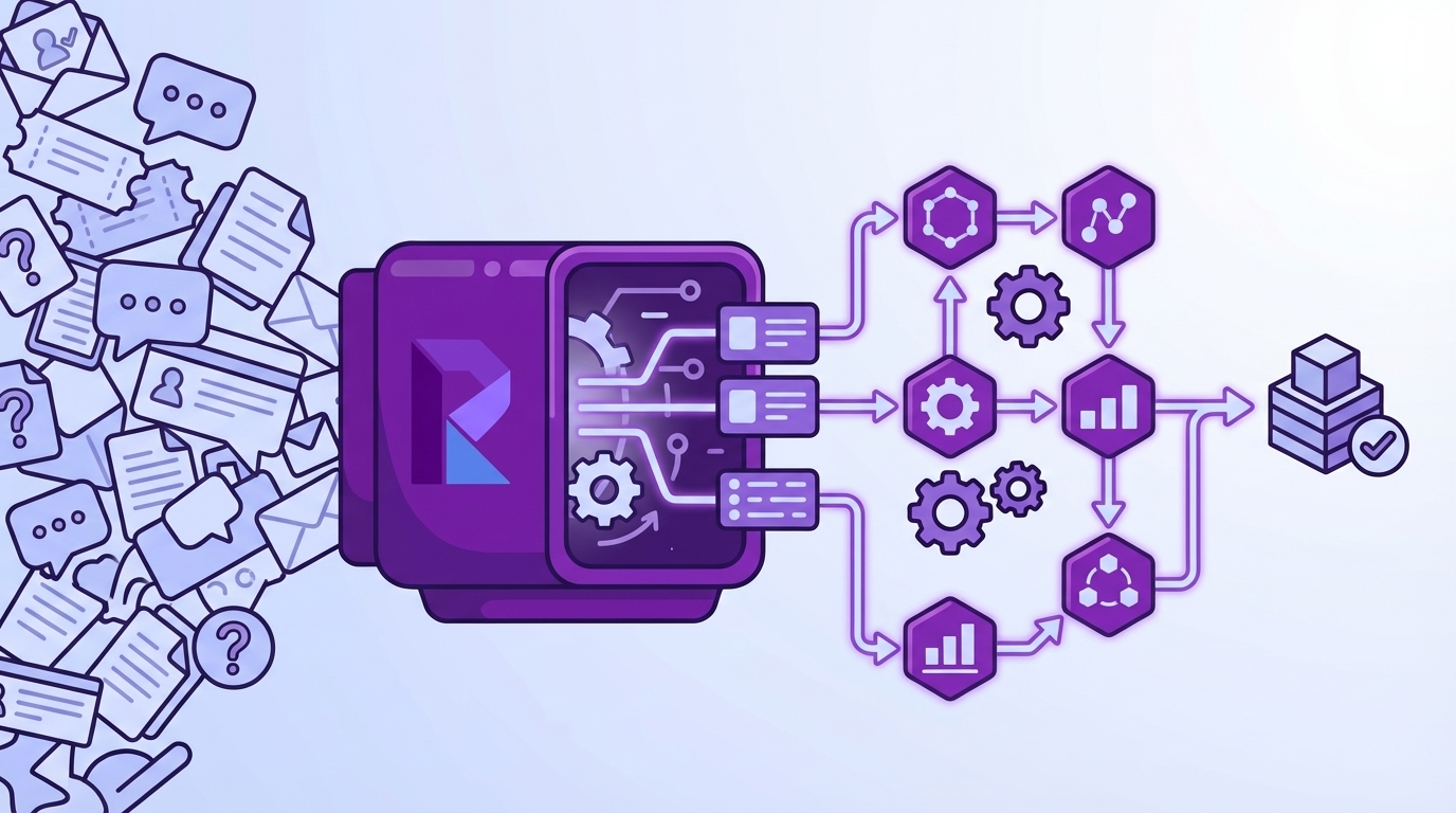
Revelir AI turns unstructured support conversations into explainable, traceable metrics across 100% of tickets. It processes historical and ongoing data, applies AI metrics and tags, and lets you pivot, group, and drill down in seconds. The result is decisions backed by quotes, not guesses, and a faster path from pattern to prioritized fix.
Full Coverage Processing With Traceability
Revelir AI analyzes 100% of uploaded or synced tickets—no sampling—then links every aggregate back to the exact conversations and quotes. That single capability preserves trust in cross-functional meetings and kills the “is this representative?” debate. You can defend priorities with verifiable examples and keep decisions moving instead of stalling.
This directly addresses the costs we walked through—missed churn signals, rework, and credibility hits. When leaders ask “show me,” Conversation Insights opens the transcript, summary, tags, and metrics behind any number on the chart. The evidence is always one click away.
Hybrid Taxonomy You Can Evolve Without Rework
Revelir AI uses raw AI tags for discovery, then lets you maintain canonical tags and drivers that match your business language. Revelir remembers mappings, so future tickets roll up consistently without manual retagging. Reports stay clean; trend lines stay stable; leadership sees the same categories month after month.
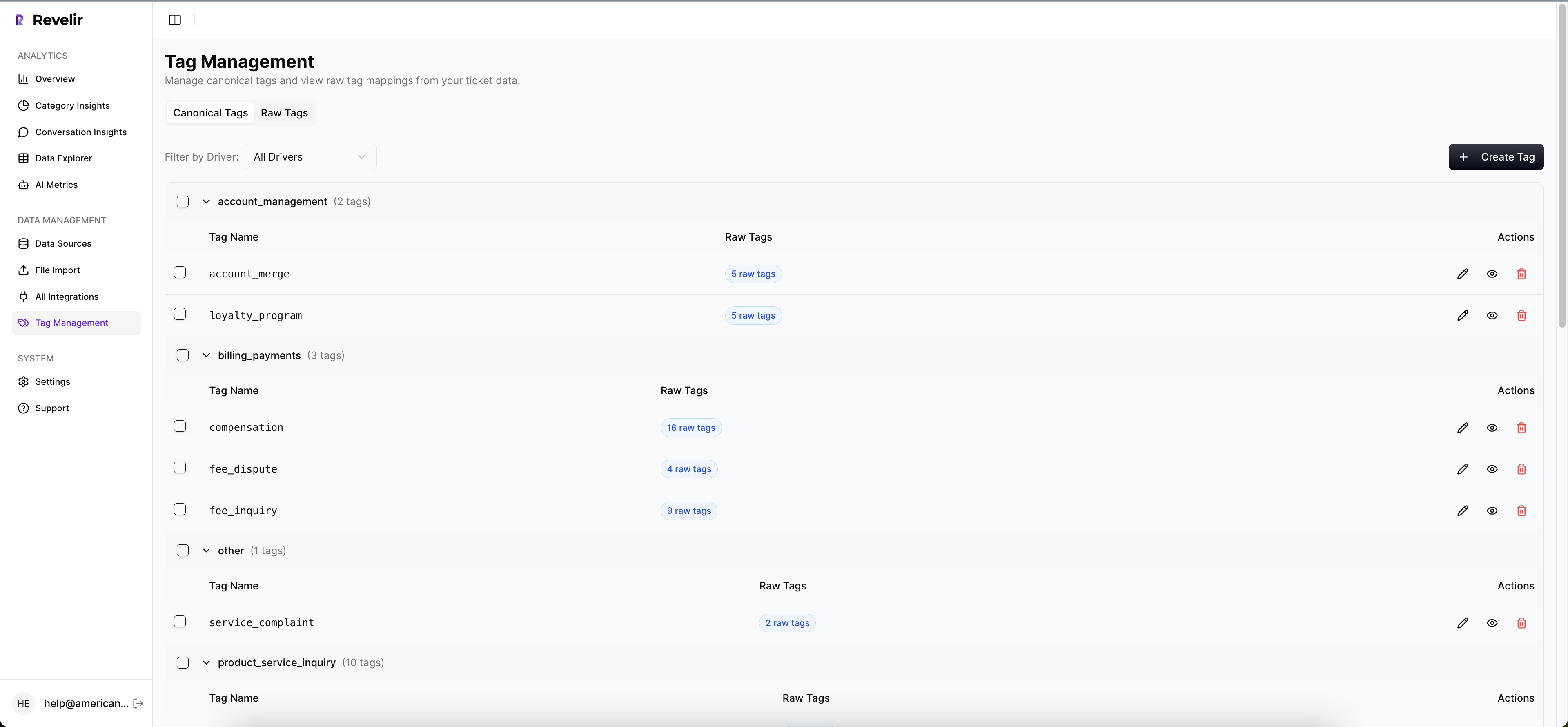
As patterns shift, you adjust mappings and keep a simple change log. The system adapts, and your analysis stays comparable over time. That’s how you avoid taxonomy thrash and keep everyone aligned.
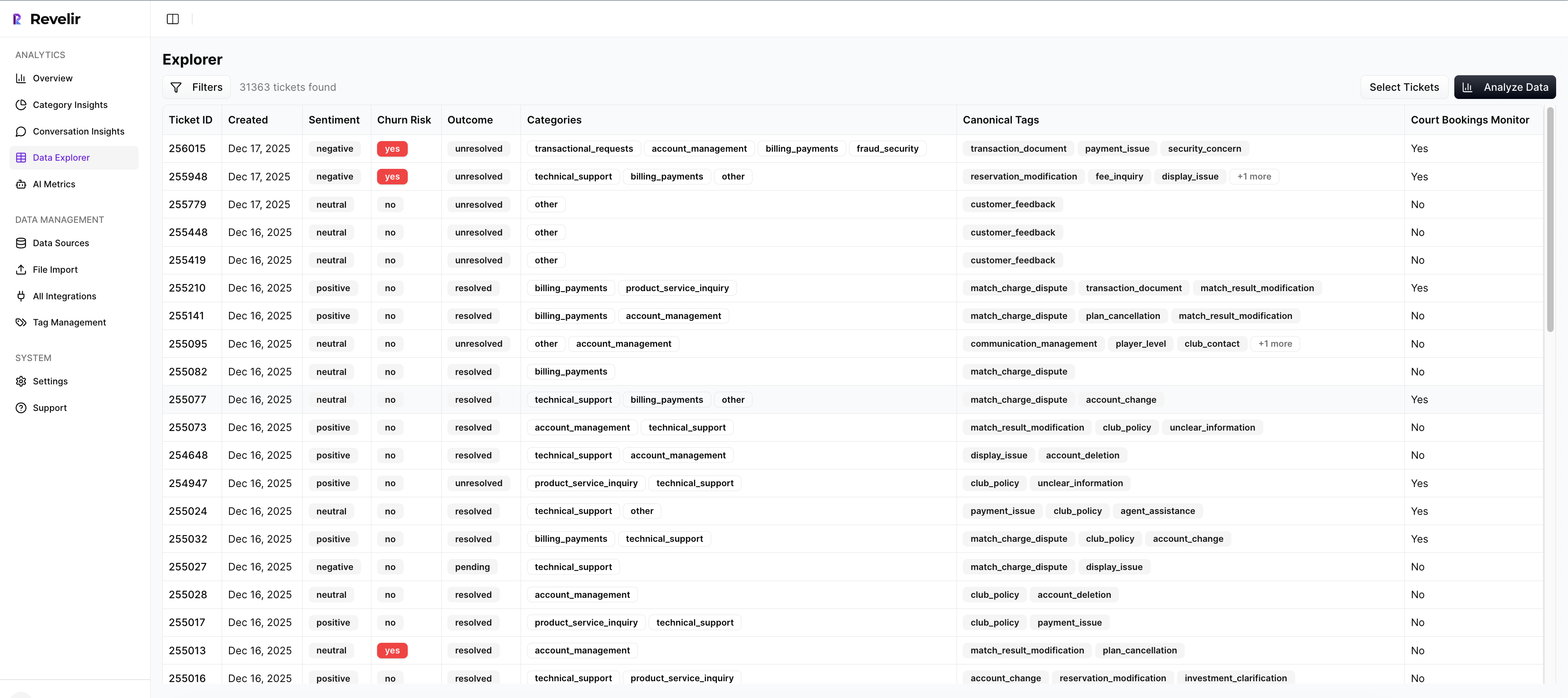
Data Explorer, Analyze Data, and Custom Metrics for Grouped Insight
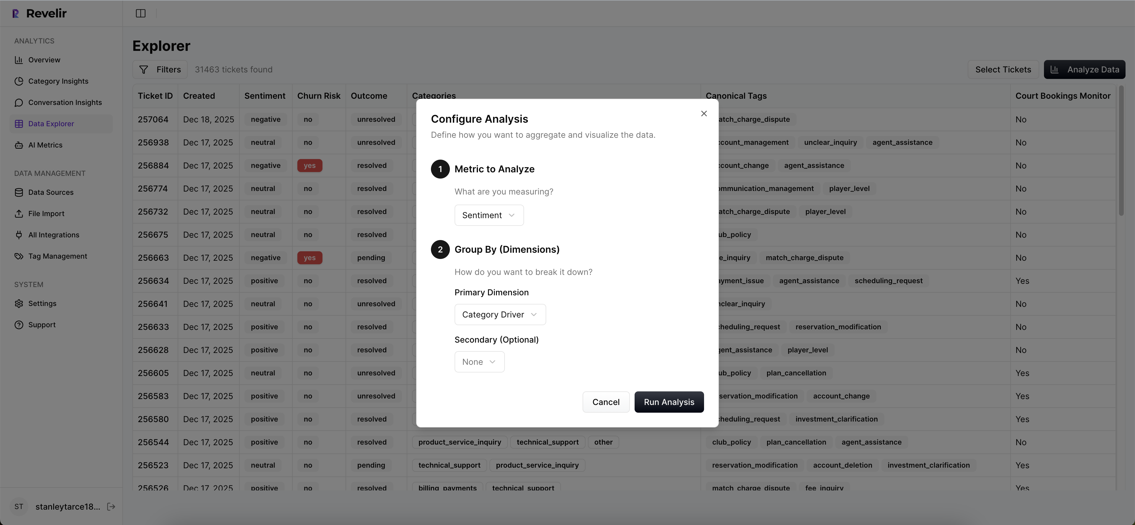
The primary workspace, Data Explorer, feels like a pivot table for tickets. You can filter by sentiment, churn risk, effort, drivers, canonical tags, plan tier—then run grouped analyses with Analyze Data to surface patterns fast. From any slice, click straight into Conversation Insights to validate with real quotes.
Revelir AI also supports custom AI metrics—things like Reason for Churn or Expectation Mismatch—so your dashboards speak your language. Need to pipe structured outputs elsewhere? Export via API and enrich your existing reporting. It’s coverage, structure, and auditability in one workflow.
Revelir AI is built to eliminate the exact failure modes we discussed: sampling traps, score myopia, and trust erosion. It helps you rank fixes by volume × severity × churn risk, and it gives you the quotes to defend those calls in the room. If you’re ready to move from anecdotes to evidence-backed decisions, Learn More.
Conclusion
You don’t need more dashboards. You need every conversation turned into explainable, traceable metrics that anyone can audit in seconds. When coverage is 100% and the evidence is visible, prioritization gets easier, meetings get shorter, and fixes land where they matter. That’s the shift—from debate to decision, from noise to proof.
Frequently Asked Questions
How do I connect Revelir AI to my helpdesk?
To connect Revelir AI to your helpdesk, you can either integrate directly with Zendesk or upload CSV files. If you're using Zendesk, simply follow the integration prompts in Revelir to sync historical tickets and ongoing updates. If you prefer CSV uploads, export your tickets from your helpdesk and upload them via the Data Management section in Revelir. This allows you to start analyzing your support conversations quickly and efficiently.
What if I want to customize metrics in Revelir AI?
You can customize metrics in Revelir AI by defining your own AI Metrics that reflect your business language. For instance, you can create metrics like 'Upsell Opportunity' or 'Reason for Churn'. To do this, navigate to the metrics configuration section in Revelir, select the type of metric you want to create, and specify the canonical tags and raw tags it should be associated with. This customization helps ensure that the insights you gain are relevant to your specific business needs.
How do I analyze churn risk using Revelir AI?
To analyze churn risk in Revelir AI, start by filtering your ticket data for conversations that indicate 'Churn Risk = Yes'. Then, click on the 'Analyze Data' feature and choose 'Churn Risk' as the metric to analyze. You can group the results by category driver to see which issues are contributing most to churn risk. This process allows you to identify high-risk accounts and prioritize follow-ups effectively.
When should I validate insights with Conversation Insights?
You should validate insights with Conversation Insights whenever you identify significant trends or metrics that require deeper understanding. For example, if you see a spike in negative sentiment linked to a specific driver, click into the Conversation Insights to review the actual conversations behind that data. This validation step is crucial for ensuring that the metrics align with real customer experiences and for making informed decisions based on evidence.
Why does Revelir AI emphasize full coverage of conversations?
Revelir AI emphasizes full coverage of conversations because sampling can lead to biased insights and missed critical signals. By processing 100% of your support tickets, Revelir ensures that every conversation is analyzed, allowing you to detect early signs of churn and understand customer sentiment comprehensively. This approach provides a more accurate and trustworthy dataset, enabling you to make better-informed decisions based on complete evidence.