

Most teams say they want to prioritize with data. Then they watch CSAT move a few points and hope that’s enough to steer engineering. It isn’t. The truth lives in transcripts, where frustration cues, churn mentions, and unsolicited feedback show up days before survey curves do.
We’ve seen this play out in every exec room: someone asks “what’s actually causing the dip?” and the answers are a mix of anecdotes and partial exports. Debates drag. Confidence drops. When every ticket becomes a structured metric tied to a quote, that argument disappears. You move.
Key Takeaways:
- Stop sampling; use 100% conversation coverage with traceable quotes to make prioritization defensible
- Normalize raw tags into canonical tags and drivers so volume × severity is apples-to-apples
- Quantify severity with negative sentiment, churn risk density, and high-effort percentages
- Validate every top segment by drilling into real tickets before committing engineering time
- Package evidence with each fix: top metrics, three quotes, and who’s affected
- Make the process repeatable with saved views and a weekly review rhythm
Why Score Watching Keeps You Reactive
Score watching keeps teams reactive because it hides the “why” you need for weekly engineering decisions. CSAT and NPS are lagging signals and often sampled; the real drivers sit in transcripts across 100% of tickets. For example, onboarding friction can spike among new users long before any survey dips or dashboards flag it.

The Signals You Need Are Inside Conversations
If you’re reading only scores, you’re missing the story. Sentiment trends hint at pain, but drivers, churn risk cues, and effort tell you which problems to fix first and who’s feeling them. That’s the difference between “sentiment down” and “new customers are hitting a login loop and threatening to churn.” One is a headline. The other is a plan.
Most teams don’t lack data; they lack structure and traceability. It’s usually a handful of CSVs, a few ad-hoc read-throughs, and a debate about representativeness. Nobody’s checking whether the three examples in a deck actually reflect the bulk of conversations. When you measure every ticket and link the metric to the quotes, you stop arguing and start sequencing work.
Scores aren’t useless. They’re just not strategy on their own. Use them as context, then pivot to the conversation-derived metrics that move engineering: negative sentiment by driver, churn risk density by cohort, high-effort percentages by category. If you need a refresher on why CSAT alone can mislead, skim Zendesk’s overview of CSAT. Helpful, but incomplete for prioritization.
Ready to skip theory and see a live slice of your tickets? See how Revelir AI works.
The Real Bottleneck Is Unstructured Support Data
The real bottleneck is unstructured support data that’s hard to trust and harder to explain. Raw tags are messy, manual tags drift, and sampled views invite arguments about what’s representative. A hybrid tagging system, raw discovery, canonical categories, and drivers, turns free text into stable lenses you can defend in leadership reviews.

What Is A Driver, A Canonical Tag, And Why Do They Matter?
Raw tags are the AI’s first pass, granular and numerous by design. They surface emerging themes and weird edge cases you didn’t know to look for. Useful for discovery. Hard for reporting. Canonical tags clean that up into categories your business actually uses, Billing & Payments, Account Access, Performance. Drivers sit above both and group related categories like Billing or Onboarding so leadership can absorb patterns quickly.
This stack matters because it reconciles nuance with clarity. You keep the detail (raw tags) for investigation while presenting a consistent view (canonical tags and drivers) for decisions. Same thing with trend reporting: drivers make it obvious that “Billing” and “Refunds” are rising together, while canonical tags pinpoint “billing_fee_confusion” versus “payment_failed.” Clean rollups without losing signal.
The payoff is consistency across teams. Support speaks in the same categories that product prioritizes. Finance hears drivers that map to cost centers or revenue risk. And because the mappings learn and improve over time, your analysis gets sharper each month without reworking agent workflows.
Why Traditional Tagging Misses Root Causes
Manual tagging sounds simple until you try to keep it consistent quarter over quarter. People interpret categories differently. Tags duplicate. Language drifts. Volume counts get noisy. Leadership loses trust. Without a canonicalization layer and drivers, you end up chasing the loudest anecdote or a score without the “why.”
A hybrid system fixes this. Let AI generate rich raw tags from transcripts. Then normalize into canonical tags and drivers your organization recognizes. That way, the same login loop shows up the same way, every time, regardless of who tagged what or how the customer phrased it. It’s structure that survives scrutiny.
If you need a sanity check on turning call themes into prioritization inputs, articles like Sentry’s guide to prioritizing issues show why frequency and impact (your volume × severity) beat gut feel. Different domain, same principle: consistent categories, reliable counts, and a clear sense of consequence.
The Cost Of Guesswork When Prioritizing Fixes
Guesswork is expensive because it compounds. You choose a fix based on a loud thread, not the dataset. Two sprints later, ticket volume holds steady and sentiment among new users slides. Meanwhile, the onboarding bug you missed keeps burning hours. That’s frustrating rework, escalations, and a worried VP asking for proof you don’t have.
Let’s Pretend You Ship The Wrong Fix
Let’s pretend you greenlight a visible but low-severity bug because everyone’s annoyed by it. After two weeks, the board is flat: no drop in related tickets, no lift in sentiment. Worse, new users are still stuck in a multi-step setup loop that didn’t get attention. Now you’re explaining why “fix shipped” didn’t equal “customers happier.”
A simple grouped view would have flagged this. Negative sentiment and high-effort among “Onboarding” drivers outpaced the noisy bug 3:1. And churn risk density was higher in that segment. The fix that didn’t ship cost you two sprints and likely a renewal. This is where volume × severity beats vibe every time.
When you can click from the aggregated metric into three real conversations, the pattern gets vivid fast. You hear the same friction in different words. You see the time sinks and the stalled outcomes. Engineers don’t argue with that. They fix it.
When Partial Views Inflate Backlog And Burnout
Sampling 10% of tickets feels efficient, until the churn signal is hiding in the other 90%. It’s usually there. You miss it. Escalations rise. Backlog balloons. And your team spends more time wrangling CSVs and debating edge cases than making decisions.
The operational tax is real. Each manual review pass burns hours. Each meeting without evidence erodes trust. Over a quarter, this becomes burnout: late detection creates escalations; escalations inflate backlog; backlog drives rework; rework tanks sentiment. You can break that loop by measuring all tickets, grouping by drivers, and validating with quotes. Simple. Not easy. Worth it.
If you’re still patching together exports, an article like Intercom’s RICE prioritization framework is a good reminder: use structured inputs you can defend. Here, your “RICE-lite” is volume × severity, where severity blends negative sentiment, churn risk, and effort. That’s credible in any room.
Tired of guessing from samples and surveys? Learn More.
What It Feels Like When Evidence Is Missing
When evidence is missing, momentum dies. You present a chart, someone says “show me,” and there’s no clean path from metric to quotes. The room cools. Traceable metrics change that dynamic. If you can jump from “Onboarding high-effort is spiking” to three representative transcripts, people stop arguing and start sequencing work.
Why Leadership Asks For Proof
Executives ask for proof because score slides don’t explain root causes. They want to know which cohort, which workflow, which driver. And they want to hear it in the customer’s words. If you can’t connect the dots, metric to driver to quotes, you’ll end up with “let’s study this more” instead of “let’s fix it now.”
Evidence-backed metrics create an audit trail. You don’t just say “churn risk is up in Account Access.” You click the segment, open a few transcripts, and show customers in their own language threatening to leave unless account verification steps change. The proof is embedded, not bolted on.
The culture shifts too. People come to the review knowing they’ll be able to validate with a click. Skeptics become allies when the data holds up to their spot checks. That’s how you compress decision cycles without forcing consensus.
How Do You Keep Priorities Aligned Across Teams?
Alignment breaks when teams speak different dialects of the same problem. Support wants relief. Product wants focus. Finance wants justification. Fix that by using the same slices everywhere: drivers and canonical tags, scored with the same severity inputs, tied to the same quotes.
Standardize the packet you share: top drivers with counts, negative sentiment percentage, churn risk density, high-effort percentage, and three quotes. Then keep those slices stable over time so trends are obvious. You’ll spend less time re-explaining and more time deciding.
And yes, keep the language plain. “Billing fees are causing 34% of negative sentiment among new customers this month” is better than any composite KPI. It tells you what to fix and who to fix it for. Quickly.
The Volume × Severity Playbook You Can Run This Week
A volume × severity playbook prioritizes product fixes by combining counts with impact signals from transcripts. You group tickets by canonical tag or driver, compute negative sentiment, churn risk density, and high-effort percentages, then multiply by volume. Validate by drilling into real conversations. Ship the fix with an evidence packet attached.
Define The Signals And Mapping Rules
Start with the dataset you care about, say, the last 30 days. Make sure columns for sentiment, churn risk, and effort are visible. Then clean the language. Normalize raw tags into canonical tags, and map those into drivers like Billing, Onboarding, and Performance. Document the mapping so everyone uses the same categories next week.
This isn’t a taxonomy science project. Keep it pragmatic. Focus on the 10–15 canonical tags that explain the majority of volume and pain. Map the rest later. The point is to create lenses you can reuse without rework.
Now lock in your severity inputs. We’ll use three: percent negative sentiment, churn risk density, and percent high-effort. That gives engineering a clear view of impact, not just noise.
Calculate A Volume × Severity Score
Here’s a simple, transparent model teams adopt fast. Score = Volume × Severity Index. And Severity Index = (w1 × % Negative Sentiment) + (w2 × Churn Risk Density) + (w3 × % High Effort). Pick weights that reflect your tolerance for churn versus friction. Write them down. No hidden assumptions.
Run a grouped analysis by canonical tag or driver. For each group, compute the three percentages and the total volume. Multiply to get your score. Then rank. You’ll get a list that makes sense at a glance, high-volume annoyances fall below lower-volume but higher-severity issues that put revenue at risk.
One more thing: don’t chase false precision. The value here is relative ordering you can explain in a sentence. Tight enough to drive a sprint. Loose enough to refine next week.
How Do You Validate Before You Prioritize?
Top-down first, bottom-up next. Take your top scoring segments and open the tickets behind them. Read a handful. Do the quotes actually match the driver? Are effort and churn signals plausible? If not, adjust your mappings or weights and rerun the analysis.
You’re looking for narrative consistency. The same friction should appear in different words. If the segment feels noisy, it probably is. Clean the canonical mapping. Merge or split where needed. Rerun. This loop takes minutes once the structure’s in place.
When it “makes sense” on read-through, capture the quotes. You’ll need them for the review. And for the record: nobody’s checking every ticket. They’re spot-checking the slice.
Turn Scores Into Engineering Tickets
Translate your ranked list into a light rubric. High = act this sprint. Medium = next cycle. Low = monitor. For each item, attach an evidence packet: the metric slice (volume and severity inputs), three representative quotes, and a note on affected cohorts. Keep it tight.
This is RICE-lite for support-derived fixes. Call it whatever you want. The point is speed with accountability. Engineers pick up a ticket and see exactly why it matters and who it helps. Product doesn’t have to translate every time. Leadership gets a clean line from customer pain to roadmap.
If you want more background on validating qualitative patterns before they hit the backlog, the same principles appear in guides on using call themes to prioritize work, just remember to keep the math transparent and the quotes handy.
How Revelir AI Powers An Evidence-Backed Prioritization Loop
Revelir AI turns 100% of your support conversations into structured, traceable metrics you can trust. It processes every ticket, groups insights by canonical tags and drivers, and lets you quantify severity with negative sentiment, churn risk, and effort. Then it links every chart back to the exact conversations for fast validation and sign-off.
Full Coverage Processing That Ends Sampling Debates
Revelir AI processes 100% of tickets automatically, no sampling, so you don’t miss early churn signals or subtle onboarding friction. Full-population metrics remove the “is this representative?” debate and shorten the path from pattern to plan. Teams move faster because every slice is defensible.
Under the hood, each conversation gets AI-generated raw tags, then rolls up to canonical tags and drivers you control. That hybrid layer keeps discovery flexible and reporting consistent. The result is stable categories that reflect how your business talks about problems.
Complete coverage also reduces rework. You catch the real drivers the first time instead of revisiting the same issue after a loud anecdote derails focus. It’s efficient, not flashy.
Analyze Data By Drivers To Generate Scoring Inputs
Use Revelir’s Analyze Data to group by driver or canonical tag and surface volume, percent negative sentiment, churn risk density, and percent high-effort. Those are your severity inputs. The results table is interactive, so clicking any count jumps straight to the underlying conversations. You compute your volume × severity score with confidence because the numbers are auditable.
This is where Data Explorer becomes your day-to-day workspace. Filter to the period and cohort you care about, add the metrics as columns, and run grouped analyses that mirror your playbook. No new tags for agents. No custom SQL to maintain. Just fast, repeatable analysis.
Want to see this flow on your own data? See how Revelir AI works.
Evidence-Backed Drill-Downs For Rapid Sign-Off
Conversation Insights makes the evidence visible by default. Every aggregate links to transcripts, AI summaries, and the exact quotes behind the metric. In practice, that means you can package three representative quotes with the metric slice in minutes. Reviews get shorter. Objections get fewer. Sign-off comes quicker.
Traceability also builds trust over time. When stakeholders can audit the path from dashboard to dialogue with a click, they stop challenging the method and start engaging the solution. That’s the cultural shift you need for sustained prioritization.
Saved Views And Repeatable Reviews
Revelir AI lets you create saved views for the slices you revisit every week, New Customers, Enterprise Plans, Billing, Performance. Hand them off across CX and Product without losing context. Over time, refine canonical mappings and, if you choose, add custom AI Metrics that fit your business language. The scoring stays stable; the taxonomy gets smarter.
Put simply: Revelir AI handles the structure and traceability so your teams can focus on decisions, not plumbing. When you’re ready to operationalize this loop, Learn More.
Conclusion
You don’t need more dashboards. You need evidence you can defend in the room. Turn every support conversation into structured, traceable metrics, rank fixes by volume × severity, then validate with quotes. Do that weekly and the noise drops. Priorities hold. And engineering time goes where it matters most.
Frequently Asked Questions
How do I prioritize product fixes using Revelir AI?
To prioritize product fixes with Revelir AI, start by using the Analyze Data feature. 1) Filter for high churn risk or negative sentiment tickets. 2) Group the results by canonical tags to see which issues are most pressing. 3) Drill down into the specific tickets to validate the patterns you've identified. This way, you can make informed decisions about what to tackle first, ensuring that you focus on the most impactful issues. Revelir AI provides structured, evidence-backed insights that help you prioritize effectively.
What if I need to validate insights before acting?
If you want to validate insights before making changes, use the Conversation Insights feature in Revelir AI. 1) After identifying a trend in the Data Explorer, click on the metric to view the underlying tickets. 2) Read through the transcripts to ensure the insights align with what customers are saying. 3) Collect quotes that represent the issues to share with your team. This process helps ensure that your decisions are based on solid evidence and not just assumptions.
Can I customize the metrics in Revelir AI?
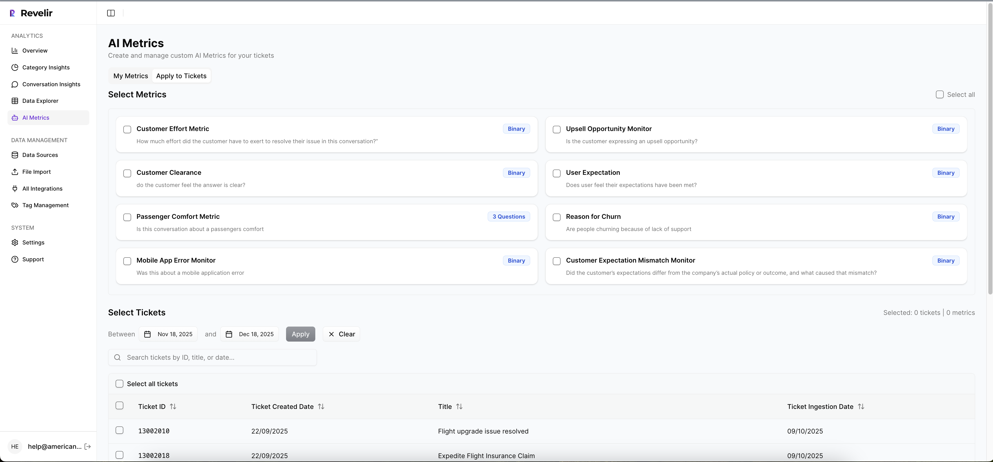
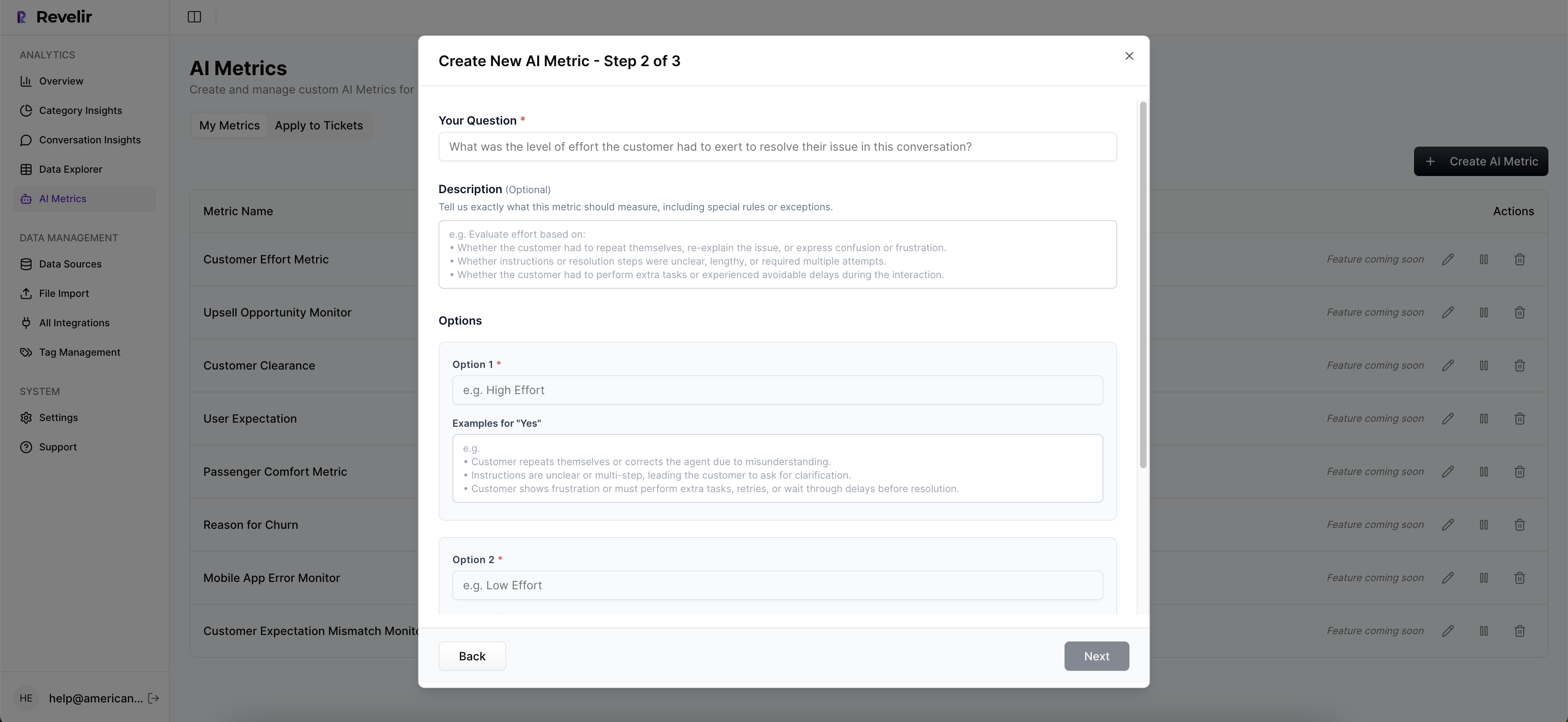
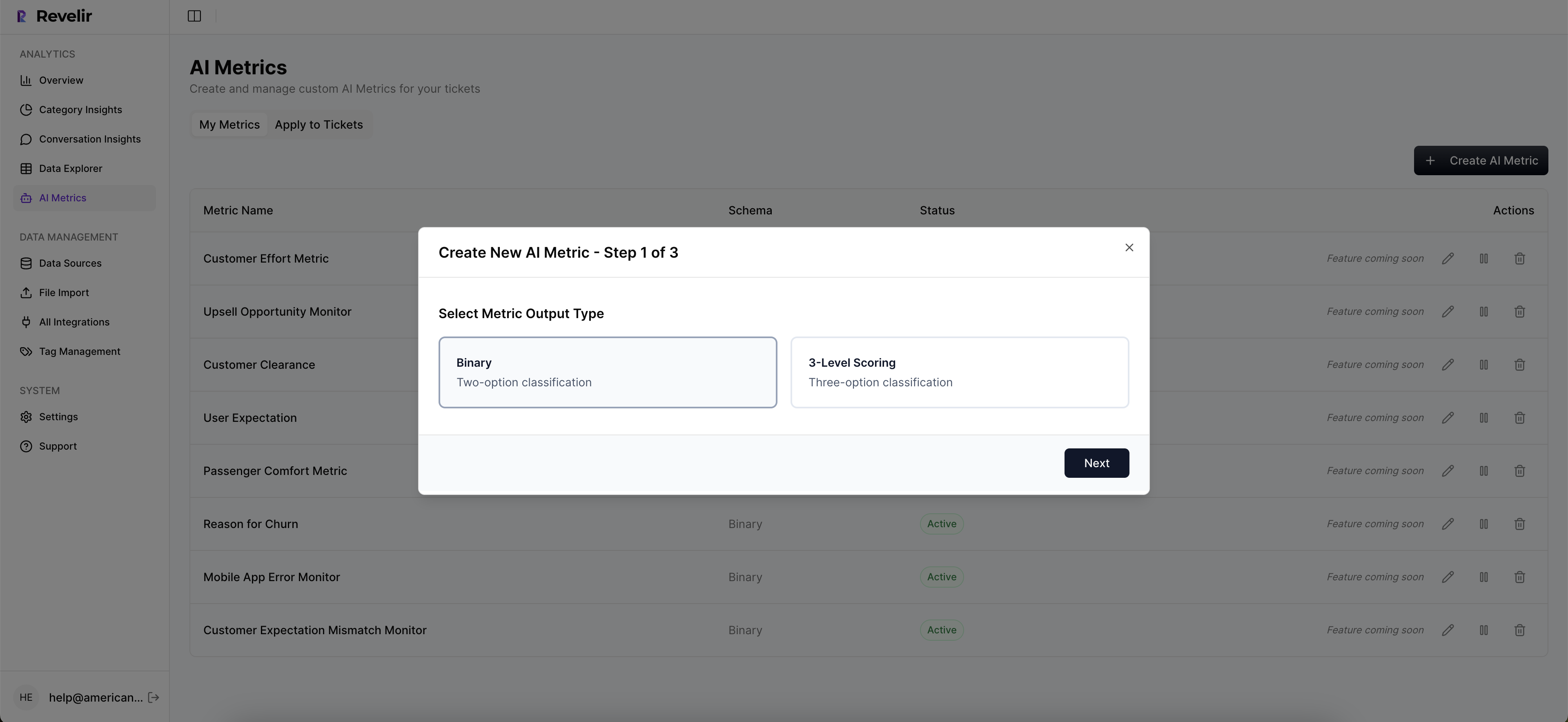
Yes, you can customize metrics in Revelir AI to better fit your business needs. 1) Go to the settings in the Data Explorer to define custom AI metrics that reflect your specific terminology, like 'Upsell Opportunity' or 'Reason for Churn.' 2) Ensure that these metrics are consistently applied across your dataset. 3) Use these custom metrics in your analyses to gain deeper insights tailored to your organization. This flexibility allows you to align the insights with your strategic goals.
When should I run analyses in Revelir AI?
You should run analyses in Revelir AI regularly, especially after major product updates or when you notice shifts in customer sentiment. 1) Set a routine, such as weekly or monthly, to review key metrics like churn risk and customer effort. 2) After significant changes, run an analysis to see how those changes impacted customer feedback. 3) Use the insights to inform your product roadmap and customer experience strategies. Regular analysis helps you stay proactive rather than reactive.
Why does Revelir AI focus on 100% conversation coverage?
Revelir AI emphasizes 100% conversation coverage to eliminate bias and ensure comprehensive insights. 1) By analyzing every ticket, you capture all relevant signals, including frustration cues and churn mentions, that might be missed with sampling. 2) This approach allows you to make data-driven decisions backed by complete evidence, rather than relying on partial views. 3) It helps you identify patterns and trends early, enabling proactive measures to improve customer experience.