

Most teams look at sentiment graphs and breathe a little easier. “Green is up, we’re fine.” It’s comforting. It’s also how you miss the real story. The truth lives in drivers, segments, and the actual words customers used when they were frustrated at 11:43 pm on a Sunday.
Here’s the rub. A score without evidence is an argument starter, not a decision. When you click from a trend to the tickets behind it, the debate ends quickly. You see what customers said, who they are, and what to fix first. That’s operational validation. Not a dashboard. A discipline.
Key Takeaways:
- Treat sentiment as a measurement system, not a single score
- Aim for trustworthy thresholds, then prove patterns with clickable evidence
- Map raw tags to canonical categories and drivers your leaders recognize
- Quantify costs of mislabeling (hours, escalations, rework) to build urgency
- Monitor for drift with daily distributions and targeted re-validation on edge slices
Why Sentiment Trends Mislead Without Operational Validation
Sentiment trends mislead when they aren’t tied to full coverage and traceability. A reliable system links every chart to underlying tickets and examples, so you can validate in seconds, not weeks. Think “click the number, open the transcript, confirm the driver” while the room is watching.
What “Operational” Validation Actually Means
Operational validation isn’t a QA ritual at quarter-end. It’s the day-to-day habit of verifying that what your charts say matches the conversations they summarize. You start with 100% coverage, because sampling hides inconvenient truths. Then you make traceability the default: every aggregate links to tickets and transcripts, so nobody’s guessing.
It’s usually not the labels that kill trust, it’s the absence of receipts. A leader asks, “Show me where this came from,” and you can either stall or click. If you can jump from “Negative Sentiment: Up 12% in Billing” to three representative transcripts, the debate collapses into action. This is the trust contract. Evidence on click, or the meeting turns into a detective story.
And yes, the measurement folks have been here for decades. Validity rests on linking measures to constructs and demonstrating use-case fitness, not just a clean number. If you need a quick primer to keep your governance honest, skim this validity overview in Frontiers in Psychology. Same principle, modernized for support data.
What Actually Breaks Label Reliability In Support Data
Label reliability breaks when teams stack basic sentiment on messy tags with no canonical mapping, no error targets, and no drift checks. The fix is a hybrid tagging system, defined accuracy thresholds, and traceable aggregates connected to real tickets. That’s how you move from hunches to decisions.

Hybrid Tagging, Not Hope
Most teams inherit helpdesk tags that made sense three reorganizations ago. Then someone adds sentiment on top and calls it a day. Same thing with “custom fields.” Useful, until they aren’t. The result is brittle labels that wobble under scrutiny, especially when you slice by plan tier or product area.
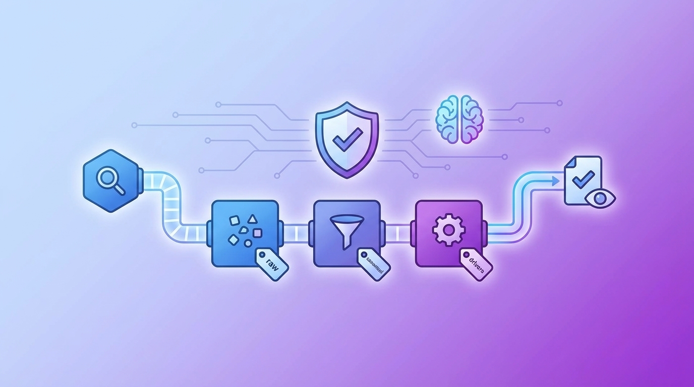
Shift to a two-layer model: raw tags for discovery, canonical tags and drivers for clarity. Raw tags capture granular language customers actually use; canonical tags consolidate that detail into categories leadership understands. Drivers sit above both to reflect business-level reasons, Billing, Onboarding, Performance. This hybrid is how you stabilize trends and keep reports readable without losing the nuance that surfaces new issues.
What’s “good enough” accuracy? Not perfection. You want a trustworthy threshold where aggregates hold up and outliers are easy to validate. Define precision and recall targets by severity zone and segment. Document agreement rates with human reviewers on edge slices. If you need a sanity check on measurement rigor, the perspectives from SAGE on validity and reliability are a useful lens.
The Compounding Cost Of Noisy Labels
Noisy labels burn engineering hours, stall decisions, and erode confidence. The costs stack: misprioritized sprints, rework, escalations, and weekends spent rebuilding decks. Quantify it once and you’ll never tolerate “score-only” views again.
Engineering And Roadmap Waste
Let’s pretend you handle 5,000 tickets monthly. If 10% of negative Billing conversations are mislabeled as neutral, leaders underestimate severity. Two sprints go to low-impact tasks while refunds keep spiking. That’s dozens of engineering hours, frustrating rework, and a roadmap that drifts from real customer pain.
This isn’t theoretical hand-wringing. Reliability problems translate directly into effort that doesn’t move outcomes. Misclassification reduces signal-to-noise just enough to make the “fix list” look balanced when it isn’t. And once those sprints ship, reversing decisions takes twice the energy. Measurement reliability’s downstream impacts are well-documented in research; see this review on reliability implications and decision-making.
The Monthly Re-Litigation Tax
You’ve felt this one. A board readout lands. Someone challenges the numbers. Now the team re-pulls data, reads tickets by hand, and rebuilds slides. The month ends; the backlog grows. That cycle isn’t about curiosity, it’s about a lack of traceability.
End the relitigation loop with clickable evidence and defined acceptance criteria. When every aggregate links to real tickets and you’ve documented acceptable error bands by use case (e.g., higher precision on negative sentiment for Enterprise Billing), conversations move fast. People align on “what happened,” then decide “what we’ll do.”
The Moment Trust Breaks In The Room
Trust breaks the second you can’t show your work. An incident hits, the chart says “neutral,” and the transcripts say “frustrated.” If you can’t open the exact tickets behind the chart, the room’s confidence evaporates. You need receipts, not rhetoric.
When The Room Asks For Receipts
Picture the 3 am incident. By 9, you’re in a standing with product and execs. The slide shows neutral sentiment in the driver everyone’s watching. The VP asks, “Examples?” You freeze. Nobody’s checking your SQL; they’re checking whether your measurement reflects reality in the transcripts.
The better moment goes differently. You open your analysis workspace, filter by driver + sentiment + plan tier, and click the count. Conversation Insights shows three representative transcripts, with summaries and tags. Heads nod. The ask becomes obvious: fix these flows first, monitor shifts next week. That cultural shift, debate to decision, comes from traceability and full coverage.
If you’re building review hygiene across the org, this synthesis on human factors and decision quality is a useful reminder: people trust what they can audit.
A 7-Step Workflow To Validate And Fix Sentiment Labels
A practical workflow starts with goals and ends with a living changelog. You define acceptable error, validate with full coverage, map tags, tighten thresholds, and monitor drift. Each step keeps measurement aligned to decisions, not just dashboards.
Step 1: Establish Validation Goals And Acceptable Error Rates
Start by deciding what “good enough” means for each decision. If you’re prioritizing refunds, precision on negative Billing matters more than global accuracy. For churn outreach, recall on risk signals might take priority. Write this down. Measure by segment and severity, not just overall.
Create a shared rubric for humans and LLM judges. Spell out edge cases, ambiguity handling, and tie-breakers. Document your acceptance bands and review cadence. Keep it visible to leadership, so the bar is agreed, not invented mid-meeting. This is your guardrail against endless debates.
Step 2: Run Full Coverage And A Quick Sample Sanity Scan
Run the model on 100% of conversations first. Sampling early introduces bias right when you’re calibrating trust. Then do a fast smell test: group sentiment by canonical tags or drivers and skim top segments. You’re looking for obvious contradictions between aggregates and transcripts.
Don’t over-annotate at this stage. The point is alignment, not a science project. If “Onboarding” shows neutral while transcripts read frustrated, tag the slice for targeted review. Want a structured way to pivot fast? That’s where a purpose-built Data Explorer and a grouped analysis tool make the first pass quick.
Step 3: Map Raw Tags To Canonical Sentiment Drivers
Raw tags are your discovery engine. Canonical tags and drivers make insights legible to leadership. Consolidate noisy raw tags into business-ready categories. Merge duplicates. Retire legacy tags that sneak back in through imports. Confirm that negative sentiment reliably rolls up under the right drivers.
This mapping reduces false positives and stabilizes trends so they don’t wobble every time phrasing changes. Over time, as the system learns your mappings, your reports calm down. Less “Why did Billing spike?” and more “Which Billing sub-issues are rising?” That’s the language product can act on.
Step 4: Create A Human-In-The-Loop Review Loop For Edge Cases
Design a targeted review process that focuses on risky slices: Enterprise, high ARR accounts, or product-critical workflows. Small, frequent reviews beat big, rare batches. Capture disagreement explicitly, it’s a feature, not a bug, because semantic work has gray areas even among humans.
Store resolved examples as a gold set. Use them to calibrate future reviewers and to regression-test your model. Keep the loop lightweight: a few minutes weekly yields more stability than a once-a-quarter overhaul. The goal is steady confidence, not a perfect label on every ticket.
Step 5: Tune Thresholds And Rules With Multi‑Signal Heuristics
Set confidence cutoffs for sentiment, then combine signals where appropriate: negative sentiment + high effort, or negative sentiment + churn risk. That’s how you reduce false positives without burying true issues. Test counterexamples deliberately, so rules don’t suppress the exact pain you need to see.
Re-run grouped analyses and compare precision/recall on your gold slices. If the tuned system improves precision in Billing without tanking recall in Enterprise, ship the change. For rigor on instrument design choices, this instrument development guidance is a helpful backdrop. Want to see these patterns on your own data? When you’re ready, See How Revelir AI Works.
Step 6: Automate Monitoring, Alerts, And Regression Checks
You need a daily operating picture. Track sentiment distributions by driver and segment. Add lightweight alerts for shifts beyond expected variance. Maintain a small regression suite with your gold examples and representative edge cases. When distributions drift, triage with examples, not speculation.
Don’t turn it into an ops burden. Keep the playbook simple: check the dashboard, review flagged slices, decide whether to adjust thresholds or re-validate. The point is to catch change early, new flows, policy shifts, vocabulary, before stale labels mislead a roadmap review.
Step 7: Close The Loop With Retraining And Taxonomy Documentation
Periodically refresh your model with curated examples from recent edge cases. Update canonical mappings as new patterns emerge. Most importantly, document changes, what you adjusted, why, and the expected impact on trends. This protects continuity and helps new team members avoid repeating old mistakes.
A simple changelog lowers anxiety during leadership reviews. “Yes, you’re seeing a step change in Onboarding because we merged legacy tags and raised the confidence threshold.” Clear, honest, fast. That’s what keeps the narrative tight and the decisions moving. If you want a measurement lens for your governance notes, the Frontiers validity framework is a solid reference.
How Revelir AI Operationalizes Validation And Monitoring You Can Trust
Revelir AI delivers full-coverage processing with clickable traceability from every aggregate to the exact transcripts. It pairs a hybrid tagging system (raw → canonical → drivers) with AI metrics like Sentiment, Churn Risk, and Customer Effort. You get fast analysis, drill-downs, and a stable taxonomy leaders trust.
Full-Coverage + Clickable Evidence
Revelir AI processes 100% of your conversations, no sampling, so early signals don’t slip through the cracks. Anywhere you see a number, you can click into the underlying tickets via Conversation Insights to read the transcript, skim the AI summary, and verify tags and metrics. Evidence on click is how you end relitigation and move to action.
This is the operational validation loop, always on. Show a trend, open examples, align on the driver, decide on a fix. The effect is practical: fewer escalations, fewer “rebuild the deck” moments, and less frustrating rework in engineering. Want a quick walkthrough with your team? Learn More.
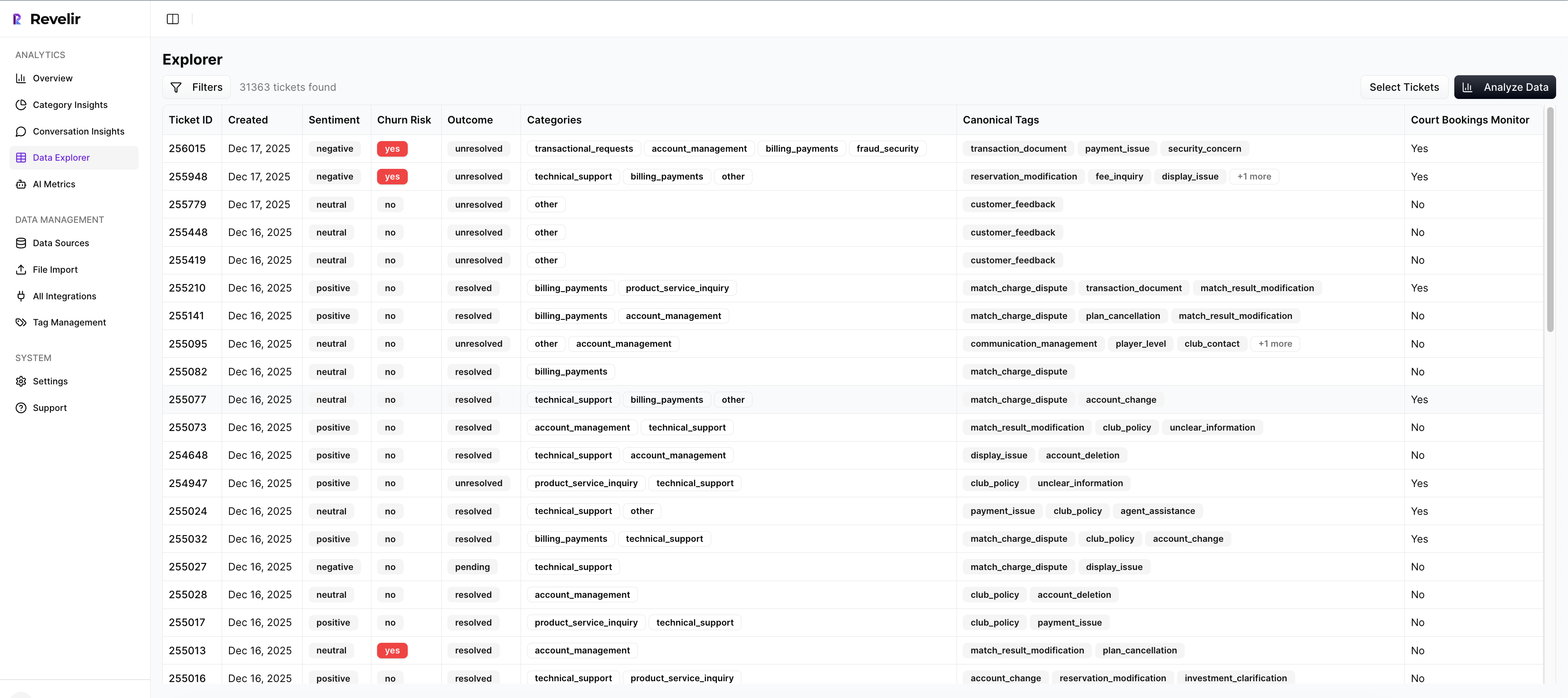
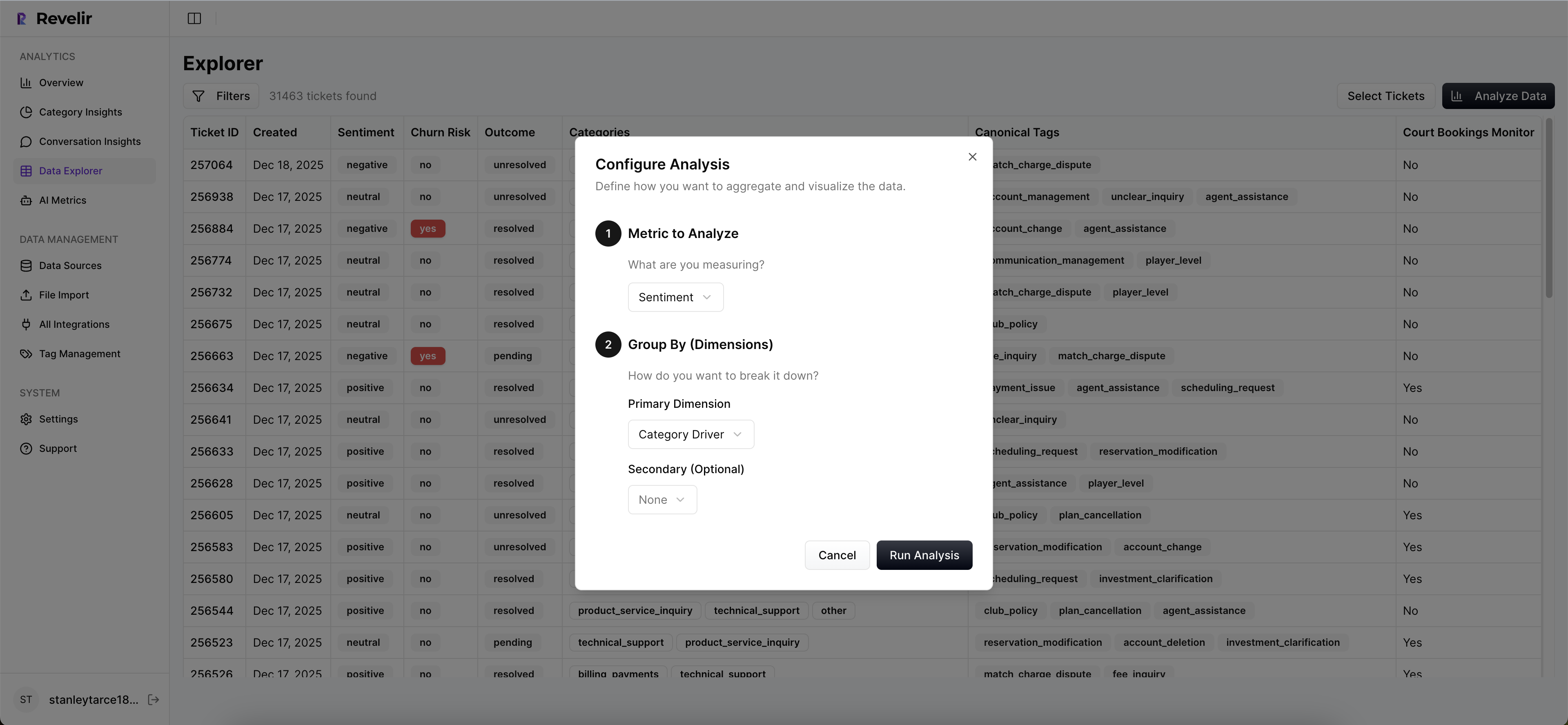
Data Explorer + Analyze Data For Monitoring
Day to day, you work in Data Explorer to filter by date range, driver, sentiment, churn risk, plan tier, and any custom AI metrics. Add or remove columns as needed, then pivot into Analyze Data to group metrics by canonical tag or driver. In a minute, you can answer “What’s driving negative sentiment this week among Enterprise accounts?”
Click the counts to jump straight into Conversation Insights for real tickets. That traceability keeps reviews honest and fast. When distributions shift, you’ll see it in the grouped view, then validate in a couple of transcripts. No more guessing, no more “maybe it’s a tagging issue” detours.
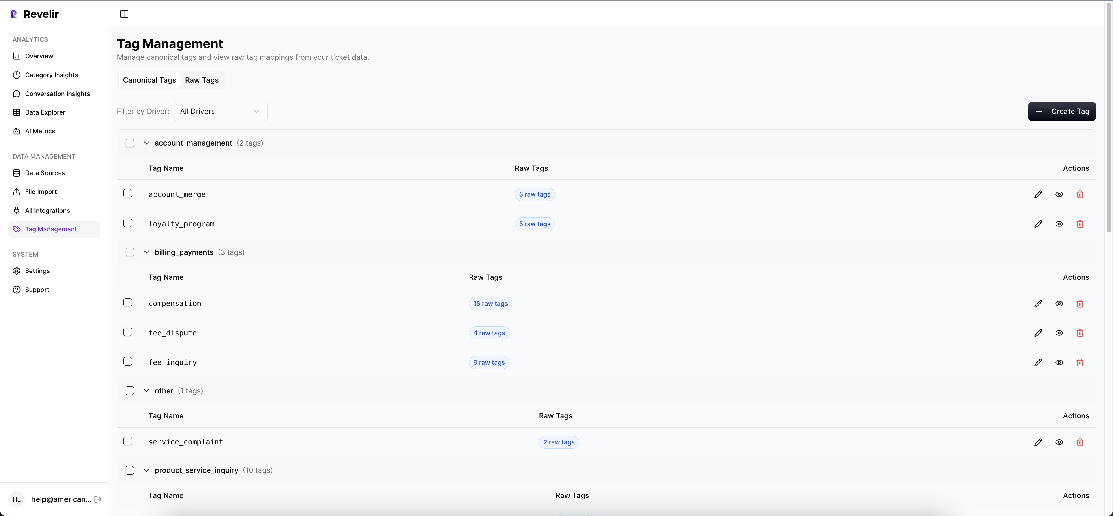
Hybrid Tagging That Learns Your Business
Revelir generates raw tags to capture granular themes, then helps you map them into canonical tags and drivers that match your business language. Over time, those mappings stabilize categories so trends don’t jitter every time phrasing changes. Leadership sees Billing, Onboarding, Performance; analysts still have the raw detail when needed.
This hybrid structure is what makes sentiment insights stick in the room. You’re not arguing about model internals, you’re showing “Billing → Refunds → Negative Sentiment” with linked examples. It’s clear, defensible, and repeatable. Still wrestling with samples and score-only dashboards? It’s usually fixable in days, not months, once the structure is in place.
Revelir AI is built for this exact workflow: full coverage, AI metrics, hybrid tagging, fast pivoting, and conversation-level validation. It’s the intelligence layer over your existing helpdesk, not a replacement for it. If you want to pressure-test it on your own data, we’ll load a recent CSV or connect Zendesk and show you the top drivers in minutes. Ready to see it live? See How Revelir AI Works. Prefer to move now? Get Started With Revelir AI. Also visit https://Learn More
Conclusion
You can’t steer with a single score. Treat sentiment like a system: full coverage, hybrid tags, explicit error targets, and evidence on click. That’s how you stop debating methodology, quantify real costs, and focus your team on fixes that matter. Fewer surprises, fewer do-overs, more decisions that stick.
Frequently Asked Questions
How do I validate sentiment trends in Revelir AI?
To validate sentiment trends in Revelir AI, start by using the Data Explorer. First, filter your dataset by the desired date range and sentiment category. Then, click 'Analyze Data' to group by sentiment and view the distribution. This will show you how many tickets fall under each sentiment category. To ensure accuracy, click on the numbers in the results to drill down into Conversation Insights, where you can read the actual transcripts related to those sentiment scores. This process helps confirm that the trends you're seeing are backed by real customer conversations.
What if I notice a spike in negative sentiment?
If you notice a spike in negative sentiment, use Revelir AI's Data Explorer to investigate further. Begin by filtering for negative sentiment tickets within the timeframe of the spike. Next, analyze the data by grouping it according to drivers or canonical tags. This will help you identify the specific issues causing the negative sentiment. After pinpointing the problem areas, drill down into the Conversation Insights for those tickets to gather context and quotes from customers. This evidence can inform your next steps in addressing the issues.
Can I track changes in customer effort over time?
Yes, you can track changes in customer effort over time using Revelir AI. Start by setting up your Data Explorer to filter tickets based on the Customer Effort Metric. You can analyze data over different periods to see how customer effort levels fluctuate. By grouping the data by relevant categories or drivers, you can identify trends and specific areas where customers are experiencing high effort. This insight allows you to prioritize improvements in those areas, ultimately enhancing the customer experience.
When should I refine my canonical tags?
You should consider refining your canonical tags when you notice inconsistencies in reporting or when new themes emerge from your support tickets. Regularly reviewing the tags in Revelir AI helps ensure they align with your current business needs. To refine them, access the tagging settings in Revelir, where you can merge similar tags, create new ones, or adjust existing mappings. This ongoing maintenance helps maintain clarity and ensures that your reporting accurately reflects the issues your customers are facing.
Why does my analysis need 100% coverage?
Your analysis needs 100% coverage because relying on samples can lead to biased insights and missed critical signals. With Revelir AI, processing all conversations ensures that you capture every customer sentiment, frustration cue, and feedback without the risk of overlooking important patterns. This complete coverage allows you to make data-driven decisions based on a full view of customer interactions, rather than a partial or skewed perspective that might arise from sampling.