

Most CX teams already know they’re flying blind. They can feel it. The dashboard shows volume and CSAT moving, but not why it’s moving. And when someone asks for examples, the room goes quiet. Not because there aren’t any, because nobody can pull them up, traceable, in the moment.
Here’s the thing. You don’t fix this with more surveys or a weekly “let’s read 25 tickets” ritual. You fix it by insisting on evidence-backed metrics from 100% of conversations, metrics you can pivot by drivers, tags, and segments, then click down to the exact quotes. That’s the standard. Anything less invites debate.
Key Takeaways:
- Replace sampling and score-watching with 100% conversation coverage and traceable metrics
- Build a lightweight taxonomy (raw → canonical → drivers) so insights match your business language
- Quantify cost of inaction: delayed detection, rework, escalations, and leadership mistrust
- Validate every pattern by drilling into real tickets before you present it
- Adopt a 7-step workflow that ties decisions to metrics, not anecdotes
- Use Data Explorer and Analyze Data to answer priority CX questions in minutes
- Make traceability non-negotiable, every chart should link to quotes
Why Score Watching And Sampling Keep You In The Dark
Score watching and sampling hide the real drivers of customer pain because they ignore the conversation layer. Scores flag direction, not diagnosis; samples miss subtle but compounding issues. Evidence-backed analysis connects every metric to quotes so you can show, not tell, for example, linking a churn-risk spike to “billing fee confusion” with three representative tickets.
What Is Evidence Backed Analysis And Why Does It Matter?
Evidence-backed analysis means every aggregate can be traced to the exact conversations behind it. No hand-waving, no stitched screenshots, no “trust me.” You pivot sentiment, effort, or churn risk across all tickets, then click directly into the transcripts and quotes that shaped the number. That traceability changes the political math in the room.
It’s usually the difference between a motion that stalls and a decision that ships. A score dip is interesting; a driver-level chart plus three precise quotes is persuasive. You eliminate the “is this representative?” debate because coverage is 100%. That’s the standard in rigorous programs and the reason teams move faster when they connect metrics to real words, not just tallies. For context on strong research habits, see Five9’s Customer Experience Research guide.
Ready to see this in a real workflow? See how Revelir AI works.
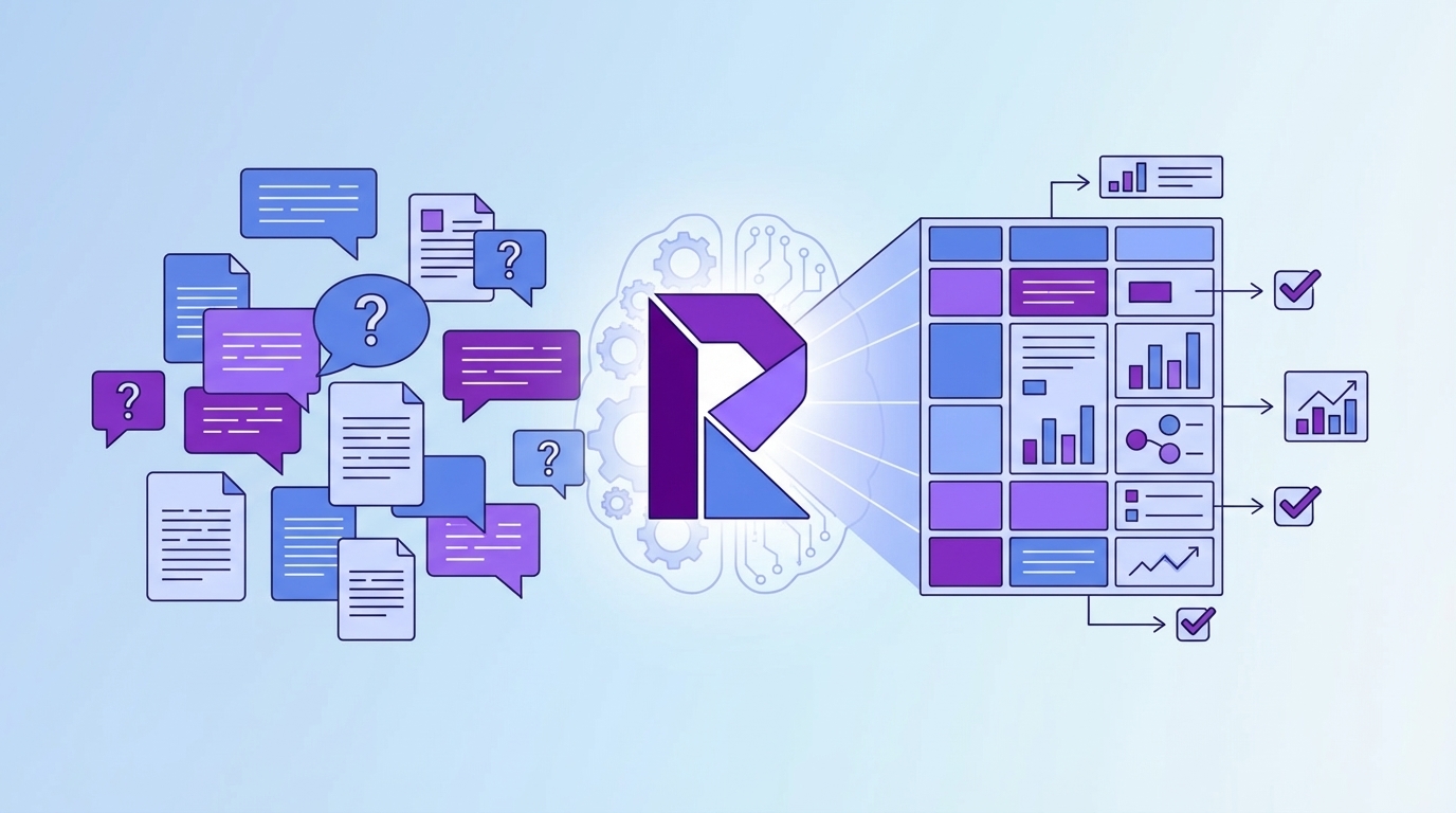
The Real Bottleneck Is Unstructured Conversations
The real bottleneck isn’t a lack of dashboards; it’s unstructured text that leadership can’t consume. Volume, CSAT, and basic sentiment show motion, not causes. Without a mapping from raw tags to canonical categories and drivers, you’re translating on the fly, and losing trust in the process when definitions shift meeting to meeting.

The Hidden Complexity Behind Raw Conversations
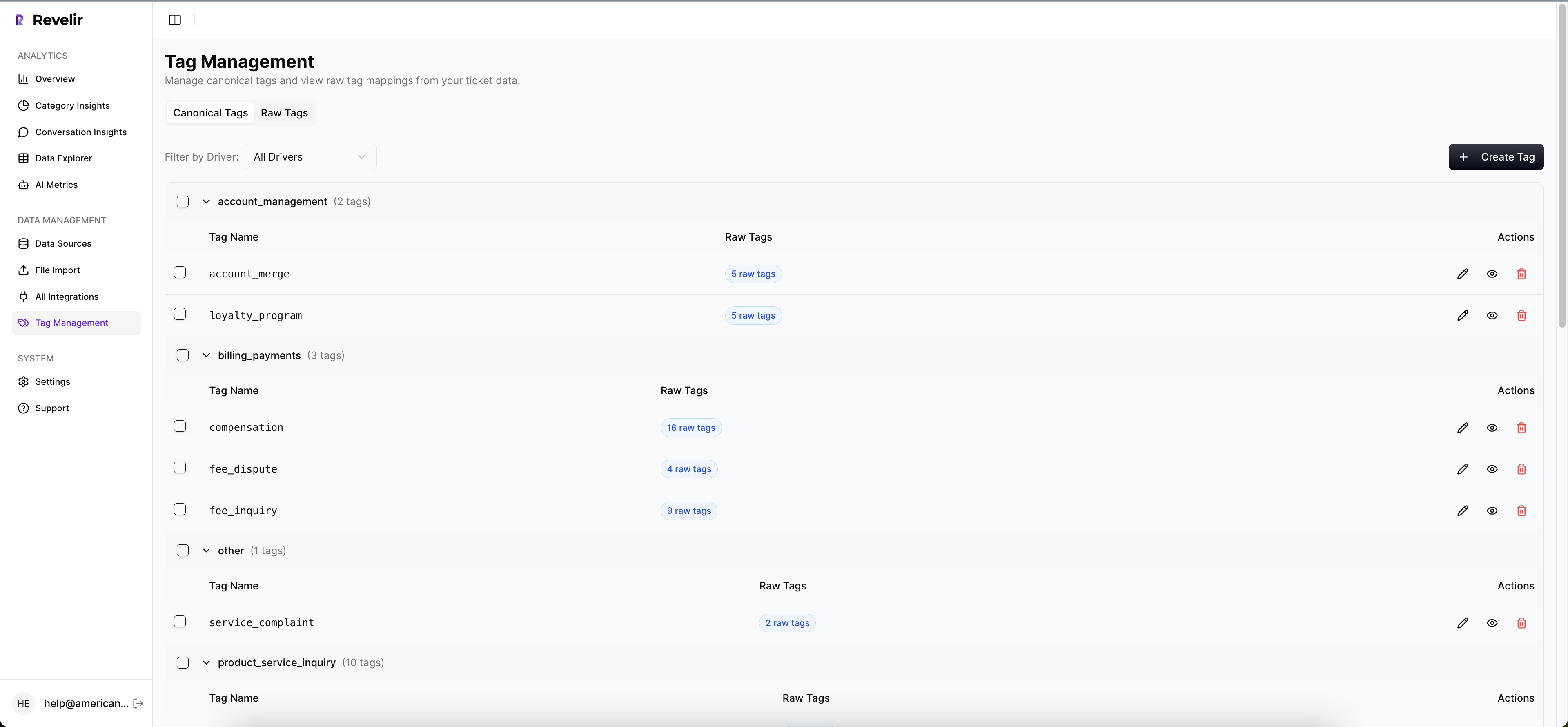
Support data arrives as messy free text, multiple channels, and inconsistent tags. Raw tags are noisy but useful for discovery, they surface granular themes you didn’t expect. Canonical tags bring order, creating stable categories the business recognizes. Drivers sit above both as the strategic “why,” letting you prioritize at the theme level (Billing, Onboarding, Performance).
The work is stitching these layers together so your analysis speaks human. When you can ask “negative sentiment by driver” or “churn risk within Account Access,” you stop squinting at transcripts and start measuring patterns. And because definitions stabilize, the same view is repeatable next month. For a simple way to organize the program cadence around these structures, see CustomerGauge’s CX management framework.
The Costs You Pay When Coverage And Hygiene Slip
Coverage gaps and messy taxonomy multiply costs you don’t have line items for. You spend hours sampling, still miss the quiet-but-dangerous patterns, and only discover churn signals after they bite. That delay turns into frustrated rework, escalations, and leadership skepticism that slows real fixes.
Let’s Pretend Your Team Handles 1,000 Tickets A Month
Let’s pretend your team handles 1,000 tickets a month. Sample 10% at three minutes each and you’ve burned five hours for a partial view. Scale that to 100% and you’re at 50 hours, so it never happens. Sampling introduces bias, delays detection, and guarantees debate about representativeness.
Here’s the bill you actually pay. You miss the early churn-risk signals. Those customers escalate. Escalations inflate backlog and burn time. The firefighting drains morale, which nudges quality down, which worsens sentiment, feeding the loop. Meanwhile, product keeps asking for proof stronger than “we saw some complaints,” and finance delays reallocating capacity because the evidence isn’t defensible enough.
Still exporting CSVs just to get to square one? Learn More.
When Insights Fail In The Room
Insights fail right after someone says, “Show me an example.” If you can’t click from a chart to real tickets, the room cools and anecdotes win. Trust erodes fast. The fix is simple to say, hard to do: anchor every metric to quotes and make validation a habit, not an exception.
When Do Leaders Stop Trusting Your Charts?
They stop trusting the moment the chain from metric to conversation breaks. A stacked bar chart without a path to transcripts invites “but we heard…” and resets priorities. If you can click the count, open Conversation Insights, and show the three quotes that define the driver, the debate shifts from “Is this real?” to “What’s the plan?”
We’ve all lived the 3 a.m. incident. A spike in negative sentiment was lurking inside Account Access, but the sample was too thin and the tags were messy. The escalation hits overnight. By morning, you’re in reactive triage. With consistent tagging, drivers, and visible churn-risk flags on every ticket, that pattern would’ve been obvious last week, and the fix could’ve been in motion.
A 7-Step Evidence-Backed Workflow For CX Teams
A repeatable workflow turns conversations into decisions you can defend. Start from decisions, enforce ingest hygiene, stabilize your taxonomy, and validate every insight with real tickets. Then rank fixes by volume and severity so cross-functional teams stop re-arguing the same points and start shipping the right work.
Step 1: Define The Decisions And Metrics You Need
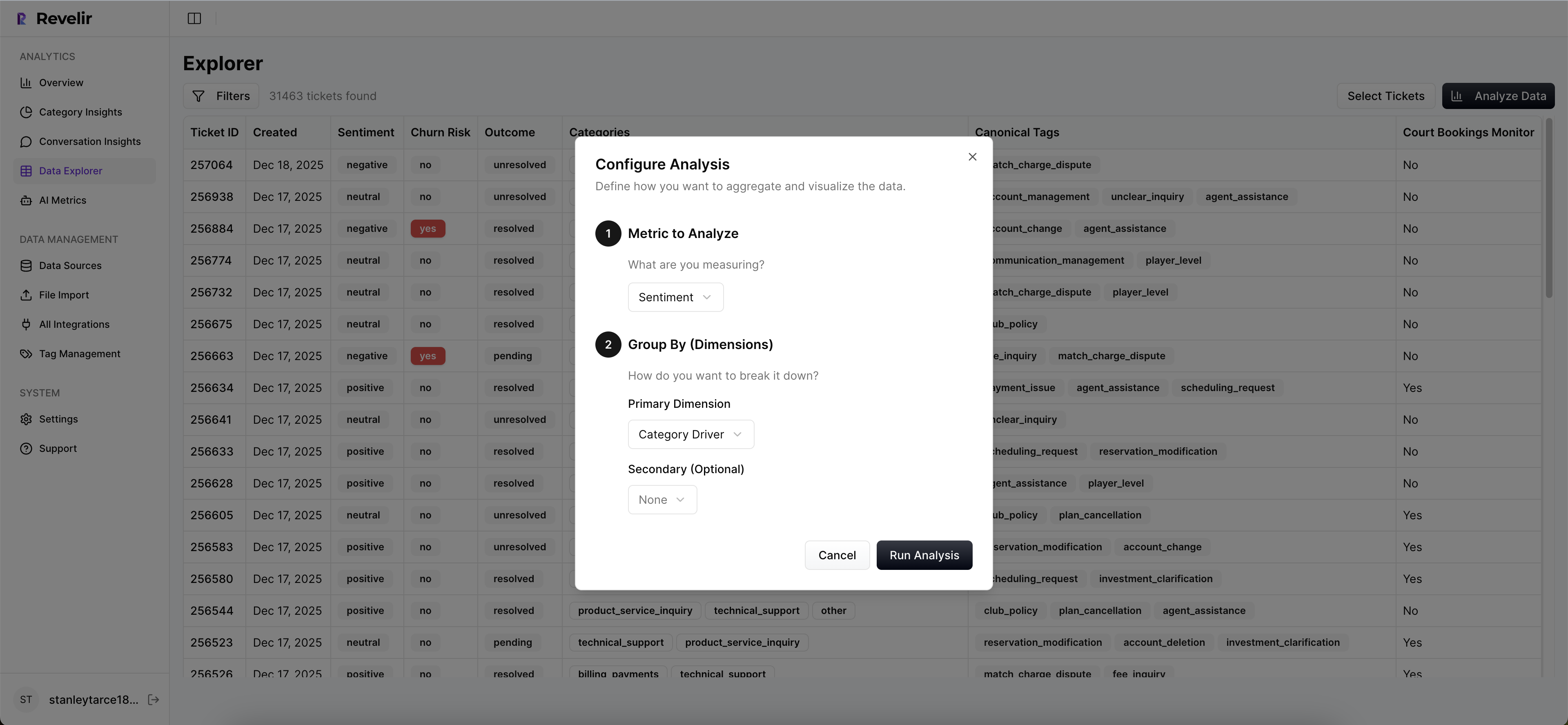
Start with decisions, not dashboards. What do you need to answer this month? It’s usually some variant of “what’s driving negative sentiment?” or “which issues are hurting high-value accounts?” Map each decision to a metric and a dimension, sentiment by driver, churn risk by canonical tag, effort by category.
This creates your analysis checklist. If a decision doesn’t map cleanly to a metric and slice, you’ll wander. Write the mappings down; they become the saved views you’ll reuse. And make space for one “let’s pretend” scenario in leadership updates so people see the logic: metric → slice → example → next step.
Step 2: Ensure Ingest Hygiene And Full Coverage
Your insights are only as good as your ingest hygiene. Confirm sources, time windows, and required fields. If you use Zendesk, connect it for ongoing sync so data stays fresh without manual exports. If you start with CSV, include transcripts, timestamps, plan tier, and any key metadata you’ll filter on.
Strive for 100% coverage. Partial feeds create doubt, and doubt kills momentum. If you must begin with CSVs, set a weekly cadence until the integration is live. Doing this well removes the “nobody’s checking…” feeling because everyone knows the dataset is complete and current.
Step 3: Build Raw To Canonical Mapping And Initial Drivers
Raw tags are your discovery layer. Let them be messy. Then group them into canonical tags that mirror your business language so stakeholders don’t have to translate. Add a small set of drivers, Billing, Onboarding, Performance, to roll patterns up into leadership-ready themes.
Keep the first pass light. As patterns stabilize, refine mappings, merge duplicative categories, and document the rules. The goal isn’t a perfect taxonomy on day one; it’s a consistent roll-up that makes “Analyze by Driver” meaningful and repeatable month to month.
Step 4: Enable Core AI Metrics And 1 To 2 Custom Metrics
Turn on sentiment, churn risk, and customer effort. These three give you direction, risk, and friction in one view. Add one or two custom AI metrics that reflect your domain, reason for churn or expectation mismatch, so your analysis speaks your language without overload.
Be pragmatic about effort: if there isn’t enough back-and-forth in the data, expect empty values. That safeguard prevents misleading results. Better an honest blank than a confident wrong. The point is a trustworthy threshold where patterns make sense whenever you audit them.
Step 5: Build Repeatable Data Explorer Views
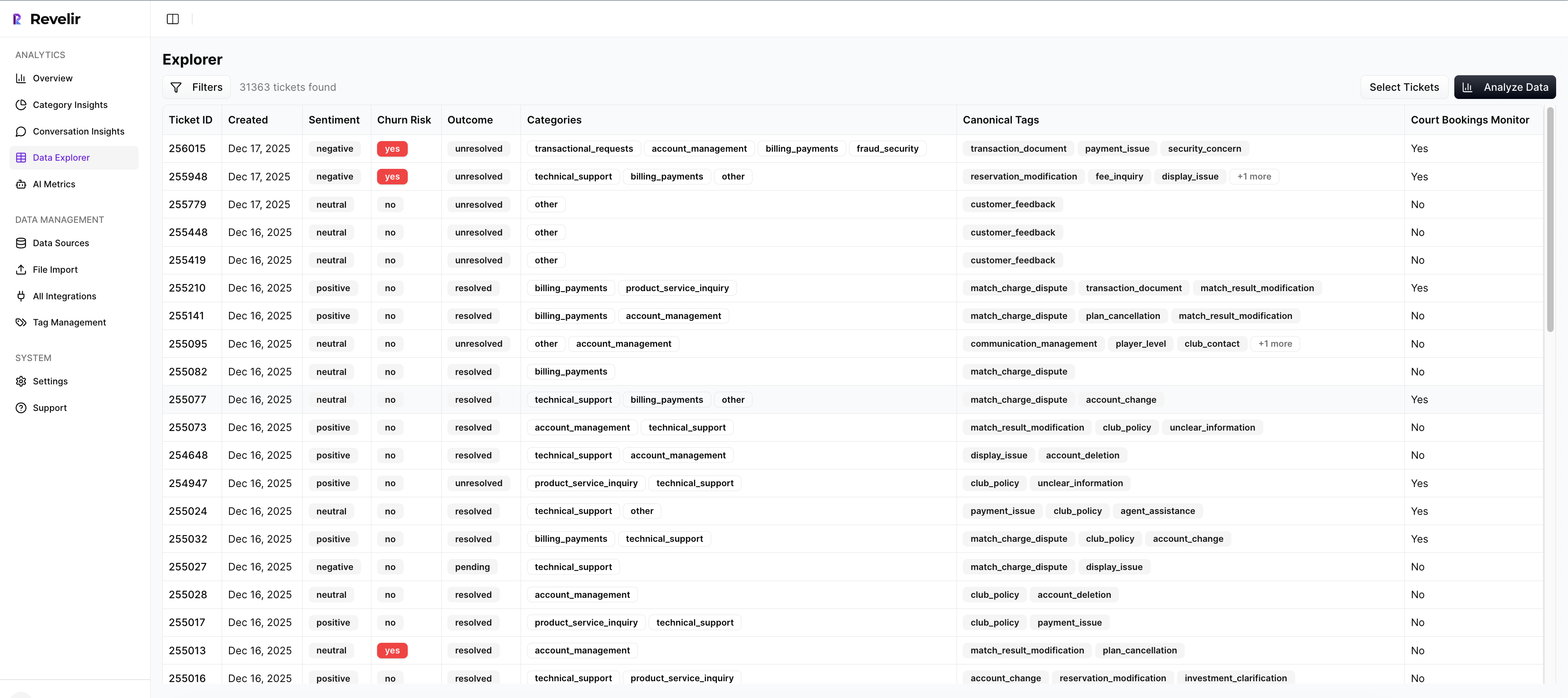
Create saved views for your top questions. Examples: “negative sentiment this month grouped by driver,” “churn risk = Yes for Enterprise,” “high effort grouped by canonical tag.” Use Analyze Data to generate grouped tables and charts, then click counts to inspect examples and sanity-check the patterns.
These views become your monthly operating rhythm. The same slices, updated data. Your team stops reinventing the query every time and starts comparing apples to apples. If you’re codifying a broader operating cadence, frameworks like Harvard’s guide to creating positive customer experiences help align practices around the views you now trust.
Step 6: Validate With Conversation Drill-Downs
Every pattern earns trust through examples. For each finding, open Conversation Insights and read a handful of tickets. Do the examples match the label? Are the key phrases present? Does the driver assignment make sense? Note edge cases and feed them back into your taxonomy rules.
This takes minutes, not hours, when the click-path is direct. And it’s where culture shifts. Instead of pitting dashboards against anecdotes, you join them, aggregate first, quotes second. Validation becomes a habit, not a special project, and your recommendations stop getting stuck in review.
Step 7: Prioritize Fixes With Volume And Severity
Rank issues by the combination of volume and severity: percent negative, percent high effort, percent churn risk. Build a simple matrix, sort, and pick the top three. Then assemble an evidence pack: a trend chart, the grouped table, and three representative quotes that make the problem vivid.
That package moves work across product, CX, and leadership without re-argument. Everyone can see the “why” and the impact. For cadence and stakeholder alignment, borrow rituals from mature CX programs such as those outlined in CustomerGauge’s CX management framework, but keep the evidence pack front and center.
How Revelir AI Automates Evidence-Backed Support Analysis
Revelir AI turns unstructured support conversations into evidence-backed metrics you can defend. It ingests 100% of tickets, applies AI tagging and metrics, and gives you a pivot-table-like workspace to answer questions in minutes. Every metric links to the exact conversations and quotes, so trust survives the “show me an example” moment.
Full Coverage Ingestion Without Workflow Disruption
Connect Zendesk for ongoing sync or upload CSVs to start quickly, no agent workflow changes required. Revelir AI processes 100% of conversations, including transcripts and metadata, so you eliminate sampling debates and blind spots. Fresh data stays available without manual exports, which cuts the busywork that usually precedes any real analysis.
This is the foundation for everything else. When the dataset is complete, teams stop arguing about representativeness and start asking better questions. Coverage buys you speed and confidence because the answers aren’t hiding in the 90% you didn’t read.
AI Tagging, Drivers, And Metrics You Can Trust
Revelir AI auto-assigns raw tags for discovery, rolls them into canonical tags for clarity, and lets you define drivers for strategic prioritization. It computes core AI metrics, Sentiment, Churn Risk, and Customer Effort, plus Custom AI Metrics that reflect your business language. You get structure without losing nuance.
The benefit is practical: you can say “negative sentiment by driver” and mean something precise, then click to examples. Clean groupings hold up in product reviews because they mirror how leadership talks about the business. That’s how you move from “we think” to “here’s the evidence.”
Data Explorer, Analyze Data, And Traceability For Repeatable Answers
Revelir AI’s Data Explorer works like a pivot table for tickets, filter by segments, group by drivers or tags, and run Analyze Data to summarize patterns in seconds. Click any count to jump into Conversation Insights and read the transcripts behind the metric. Two clicks from chart to quote.
This end-to-end traceability is the confidence layer. When someone asks for examples, you already have them. Teams spend less time exporting and reconciling spreadsheets, and more time deciding what to fix. Ready to move from sampling to evidence? Get Started With Revelir AI (Webflow).
Conclusion
You can’t steer with a dashboard that only shows totals and scores. The support queue already contains the “why,” frustration cues, churn mentions, unsolicited product feedback, if you measure every conversation and keep the evidence a click away. Shift to 100% coverage, stabilize your taxonomy, validate every pattern with real tickets, and rank fixes by volume and severity. That’s how you stop re-arguing anecdotes and start shipping decisions the room can stand behind.
Frequently Asked Questions
How do I analyze customer sentiment effectively?
To analyze customer sentiment effectively, start by using Revelir's Data Explorer. First, filter your tickets by sentiment, selecting 'Negative' to focus on areas needing improvement. Next, click 'Analyze Data' and choose 'Sentiment' as your metric, grouping by 'Category Driver' to see which issues are driving negative feedback. Finally, drill down into specific tickets to validate the insights with real customer quotes. This approach ensures your analysis is grounded in actual conversations, providing a clear path for addressing customer concerns.
What if I need to prioritize issues for high-value customers?
If you need to prioritize issues affecting high-value customers, use Revelir's filtering capabilities in Data Explorer. Filter tickets by customer segment, such as 'Plan = Enterprise', and then analyze the data focusing on sentiment and churn risk. After running the analysis, review the results to identify which issues are most prevalent among high-value customers. This targeted approach allows you to address the most critical pain points efficiently, ensuring that your efforts align with your business's strategic priorities.
Can I track the impact of product changes on customer sentiment?
Yes, you can track the impact of product changes on customer sentiment using Revelir. After implementing a change, utilize the Data Explorer to filter tickets by date range to capture feedback post-implementation. Analyze sentiment metrics to see if there's an improvement or decline. Additionally, you can group by specific drivers to pinpoint which aspects of the product change are resonating positively or negatively with customers. This method helps you measure the effectiveness of your changes in real-time.
When should I validate insights with conversation examples?
You should validate insights with conversation examples whenever you notice significant trends in your data, such as spikes in negative sentiment or churn risk. Using Revelir's Conversation Insights, you can click into specific metrics to view the underlying tickets that contribute to those trends. This step is crucial for ensuring that your interpretations align with customer experiences, allowing you to address issues accurately and effectively. Regular validation helps maintain trust in your metrics and supports informed decision-making.
Why does using 100% conversation coverage matter?
Using 100% conversation coverage matters because it eliminates the biases and blind spots associated with sampling. With Revelir, every ticket is analyzed, providing a complete view of customer interactions. This comprehensive approach allows you to identify subtle patterns and emerging issues that might be missed with partial data. By ensuring that your insights are based on all available conversations, you can make more informed decisions that truly reflect customer sentiment and needs.