Most roadmaps get built from dashboards and gut feel. Volume spikes here, CSAT dips there, a few loud tickets make it into a slide. It’s usually enough to fill a sprint plan. But it’s not enough to pick the right work. The strongest signal is sitting in your support conversations, unstructured, underused, and hard to defend in the room.
Here’s the uncomfortable truth. If you’re sampling tickets and watching scores, you’re flying blind on “why.” You ship fixes that soothe a number instead of removing root friction. Then you wonder why ticket volume doesn’t move. The shift isn’t more dashboards. It’s evidence-backed metrics from 100% of conversations, with quotes you can open on the spot.
Key Takeaways:
- Prioritize with evidence: drivers, severity, and churn concentration from 100% of conversations
- Replace sampling with full-coverage AI metrics and traceable quotes
- Map raw tags into canonical tags and drivers that align to owners
- Use a simple, explainable scoring model (volume × severity × churn weight × effort)
- Validate with 10–20 representative tickets and three quotes per recommendation
- Re-run the same views post-release to verify sentiment, effort, and churn movement
Why Most Roadmaps Ignore The Strongest Signal
Most roadmaps miss the strongest signal because teams rely on sampling and score trends instead of full conversation coverage. Scores hint at problems but don’t surface drivers or evidence. You get debate, not decisions. When metrics are computed from every ticket and linked to quotes, prioritization moves faster with fewer arguments.

Sampling and score watching create false confidence
Sampling feels responsible. It’s quick, repeatable, and it gives you a number. But you’re optimizing for speed, not truth. The churn cue you needed is in the 90% you didn’t read. Same thing with CSAT/NPS curves: they say “down,” not “why.” Without drivers and quotes, you end up fixing the dashboard, not the product.
Teams that shift from score-watching to evidence-backed drivers see a different picture. Patterns emerge across segments: onboarding friction for new users, performance issues in a specific region, billing confusion for enterprise plans. Those are roadmap items. If you want a primer on connecting customer evidence directly to roadmaps, the approach behind evidence-based roadmaps is directionally aligned.
What is the signal hiding in plain sight?
It’s not a single metric. It’s the pattern of drivers across cohorts, tied to severity and churn risk, backed by actual quotes. Inside tickets you’ll see frustration cues (“tried three times”), explicit churn mentions, and unsolicited product feedback. Those show up before revenue moves. When you measure all of it, debates shrink and decisions accelerate.
You don’t need more surveys. You need full-coverage analysis so you can pivot by plan tier, product area, and time window. Then you can say: “New customers in Enterprise show a spike in onboarding friction; here are three quotes.” That combination changes the meeting dynamic completely.
Evidence that moves the room
Executives ask for proof. Bring a clean read: volume, severity, churn concentration, plus representative quotes. One number for scale, one for risk, and a link to the source transcript. The second someone asks “show me where this came from,” you click and open the exact conversation. That’s what earns engineering attention without five meetings.
If you’re building a practice where research steers the roadmap, it rhymes with how UX researchers influence product priorities: drivers, evidence, and repeatability. Not anecdotes. Not vibes.
The Real Reason Ticket Data Fails To Drive Priority
Ticket data fails to drive priority because it’s unstructured and untraceable. Raw transcripts don’t become leadership-ready metrics on their own, and black-box summaries erode trust. Without a maintained tagging and metrics layer that maps to real work, you spend hours digging and still walk into meetings with soft recommendations.

Unstructured text taxes your process
Raw conversations don’t fit into BI on their own. Somebody has to design a schema, tag consistently, and maintain it. Nobody’s checking that at scale. Manual tagging is slow and uneven; exporting to spreadsheets burns your most scarce resource, attention. The operational tax compounds and discovery arrives late.
Here’s the pattern. You get a spike, so someone samples a few tickets and writes a short “insights” doc. It’s usually a decent narrative. But the next week, you’re doing it again. Without a reusable tagging and metrics layer, you’re paying the same tax repeatedly, and still arguing representativeness instead of deciding.
Why confidence collapses without traceability
If you can’t click a chart and open the exact tickets behind it, trust evaporates. People ask for examples because they should. Black-box outputs get challenged, and the meeting shifts from “what do we do?” to “should we trust this?” Traceability fixes that. When every aggregate links to source conversations, teams audit the reasoning in seconds and stay aligned.
And it’s not just convenience. Transparent, inspectable evidence is what survives scrutiny. Mining user feedback into requirements works when you can move from aggregate to quote and back. That’s exactly what the research on extracting requirements from user feedback emphasizes: structure plus traceable context.
How do you tie metrics to fixable units?
Scores don’t map to backlog items. Engineers can’t ship “+8% CSAT.” You need categories that translate into owned work. Raw tags are great for discovery. Canonical tags and drivers create clarity for leadership. Group granular signals into canonical categories, then roll them up into drivers like Billing or Onboarding. Now you’ve got fixable units, owners, and a shared language.
A clean taxonomy also makes reporting durable. When the same issues recur, you’re not reinventing the slide, you’re updating the counts.
The Hidden Costs Of Anecdote Driven Decisions
Anecdote-driven decisions cost teams time, trust, and revenue. You chase symptoms, miss churn cues, and burn cycles on rework. The math isn’t subtle: sampling adds bias, manual reviews add delay, and both reduce the odds you pick the right fix. Evidence-backed scoring flips that risk profile.
Engineering hours lost to rework
Let’s pretend you greenlight a fix based on a few loud tickets. Two sprints later, sentiment barely moves because the driver was something else. Rework consumes engineering hours, product loses trust, and the roadmap slips. It’s a familiar headache. A simple priority score, volume × severity × churn concentration × effort, forces the trade-offs onto the table upfront.
This isn’t about being “data perfect.” It’s about being defensible. When a team asks, “Why this now?” you can show the pattern, the quotes, and the expected lift. That shifts the conversation from opinion to decision.
The churn risk that sneaks up
Churn cues show up first in conversations. Miss them, and renewal surprises multiply. Escalations go up, agents burn out, and quality dips, feeding more negatives into the queue. It’s a loop you can’t afford. Full coverage with churn signals lets CX intervene early and gives product a prevention plan tied to real workflows.
Evidence-based decision-making reduces bias and speeds action. There’s plenty of literature on this; one overview on evidence-based decisions and bias reduction is instructive. The takeaway for product: make the evidence visible early, and fewer bad bets get through.
Still dealing with partial views and late surprises? Give your team a defensible foundation. Learn More.
When Trust Breaks In The Room, Everything Slows
Momentum dies when stakeholders don’t trust the insight. If you can’t show the pattern and the quotes, people stall. Meetings drift into “do we believe this?” instead of “what’s the fastest fix?” Bringing evidence everyone can audit keeps the agenda moving and the roadmap protected.
The 3 pm review that derails
You present a trend. Someone asks for examples. You scramble. Confidence dips. The backlog debate restarts next week. Avoidable, right? Bring the pattern, three quotes, and a clear path to the exact tickets. When everyone can read the same words the customer wrote, the debate shifts to “what’s the smallest fix that removes this friction?”
A small habit makes a big difference: every recommendation ships with evidence you can open on the spot. No more fishing for screenshots mid-call.
When your biggest customer is on the agenda
Leadership cares about accounts that matter most. If you can segment by plan tier or cohort and show where churn risk and effort concentrate, you get attention, fast. Better yet, you calm worried stakeholders because the plan is grounded in evidence, not finger-pointing. That tone change matters under renewal pressure.
If you prefer structured alignment patterns, the way teams build a research-backed roadmap echoes this: show where the evidence clusters, then tie it to specific, owned fixes.
A Repeatable Workflow To Turn Conversations Into Priorities
Turning conversations into priorities requires a repeatable workflow: define outcome signals, map tags to fixable units, and score candidates transparently. Validate before shipping, then re-run the same views after release. Keep the math simple and the evidence visible.
Define outcome oriented signals that predict product impact
Pick a compact set of signals that correlate with friction and churn. Use Sentiment, Churn Risk, and Customer Effort. Add custom metrics that reflect your business (when you have them), and include segment fields to weight high-value customers. Compute these for 100% of tickets so rates and counts are reliable.
Over time, you’ll see patterns form across drivers. Negative sentiment might cluster in Billing, while high-effort clusters in Account Access. That’s your roadmap input, not a lagging survey score.
Design canonical tags and drivers that map to owned work
Start wide with AI-generated raw tags for discovery. Then group them into canonical tags you can assign to teams. Roll canonical tags into drivers like Onboarding, Performance, or Refunds. Align each canonical category to an owner. Now you’ve got clean reporting and a shared language between CX and product.
Expect to refine mappings. That’s healthy. As patterns stabilize, the taxonomy settles and your leadership readouts get simpler and more credible.
Score each candidate by volume, severity, churn concentration, and owner cost
Keep scoring transparent. Volume shows spread, severity uses % negative or % high-effort, and churn concentration weights risk. Add estimated engineering effort so you can compare “impact per sprint.” Publish the inputs with every recommendation. Simple beats clever here.
Before anything hits the roadmap, read 10–20 representative tickets from the top segments. Capture three quotes in different words that describe the same friction. The acceptance bar is clear reproduction steps or policy context, not just a theme name.
How Revelir AI Operationalizes Evidence Backed Roadmaps
Revelir AI operationalizes this workflow by turning 100% of your support conversations into structured, evidence-backed metrics you can trust. It handles full coverage, tagging, metrics, and drill-downs so you can move from pattern to quote, and back, without friction. The result is faster, defensible prioritization you can defend in the room.
Full coverage processing for unbiased signal
Revelir AI processes every ticket automatically, no sampling, no manual pre-tagging. Each conversation becomes a structured row with sentiment, churn risk, effort, raw tags, canonical tags, and drivers. That’s how you catch early churn cues and subtle onboarding friction that manual reviews miss. It also means your scoring model is grounded in complete counts, not guesses.
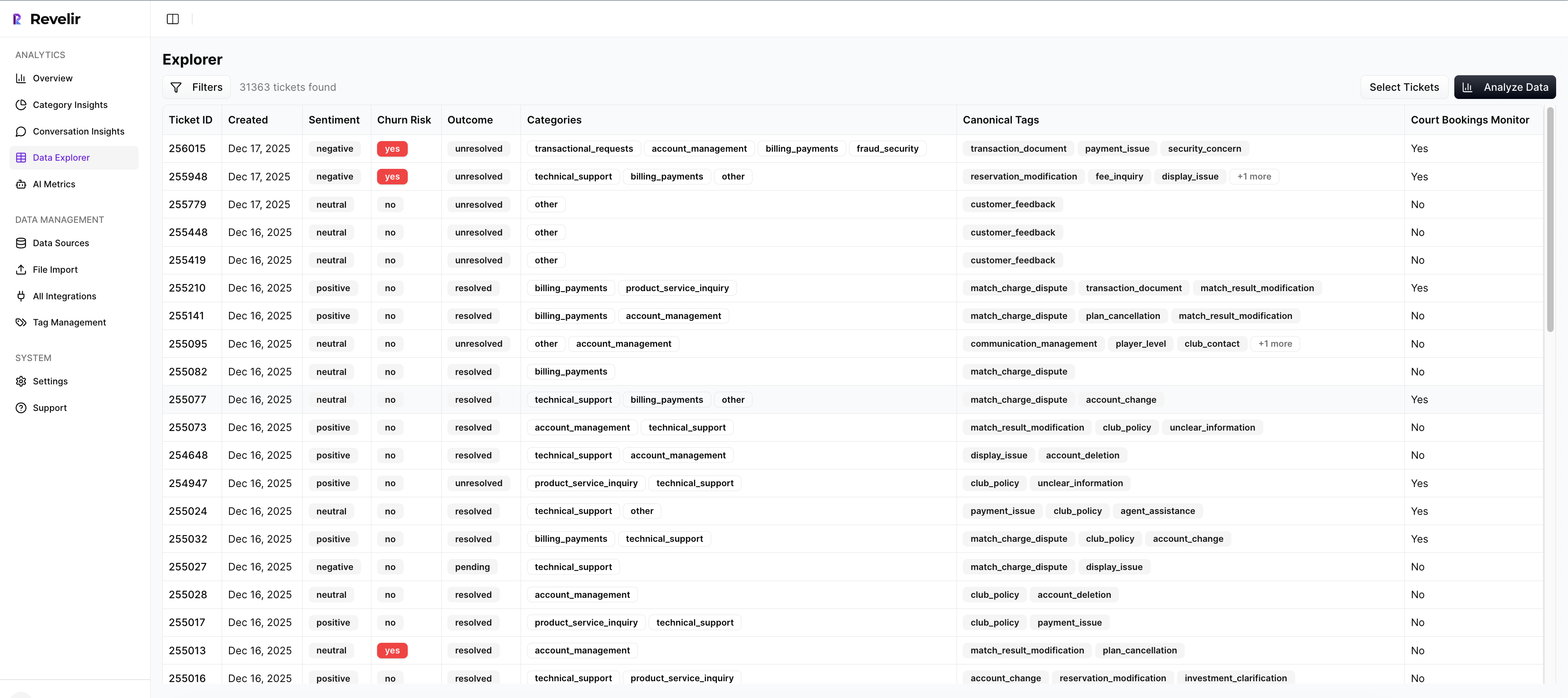
Because coverage is 100%, month-over-month comparisons hold up. You’re not wondering whether a dip is real or a sampling artifact.
Analyze, score, and monitor in one place
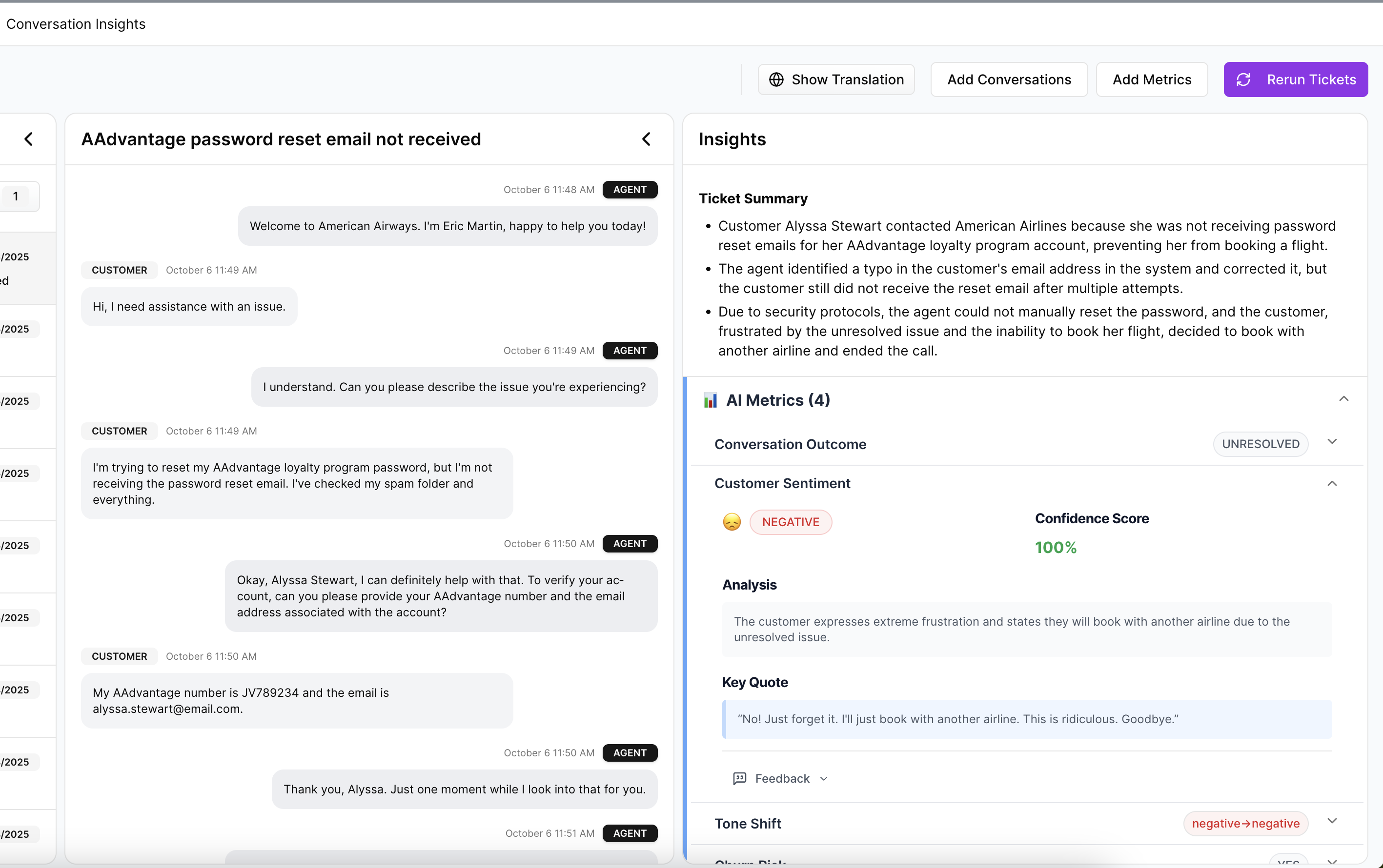
You work in Data Explorer, think pivot table for tickets. Filter by sentiment, churn risk, effort, tags, drivers, or segment fields, then run grouped analyses by driver or canonical tag. Conversation Insights sits one click away, so any aggregate can be opened to the exact transcripts and AI summaries. Post-release, you re-run the same views to confirm movement in negative sentiment, effort, and churn risk.
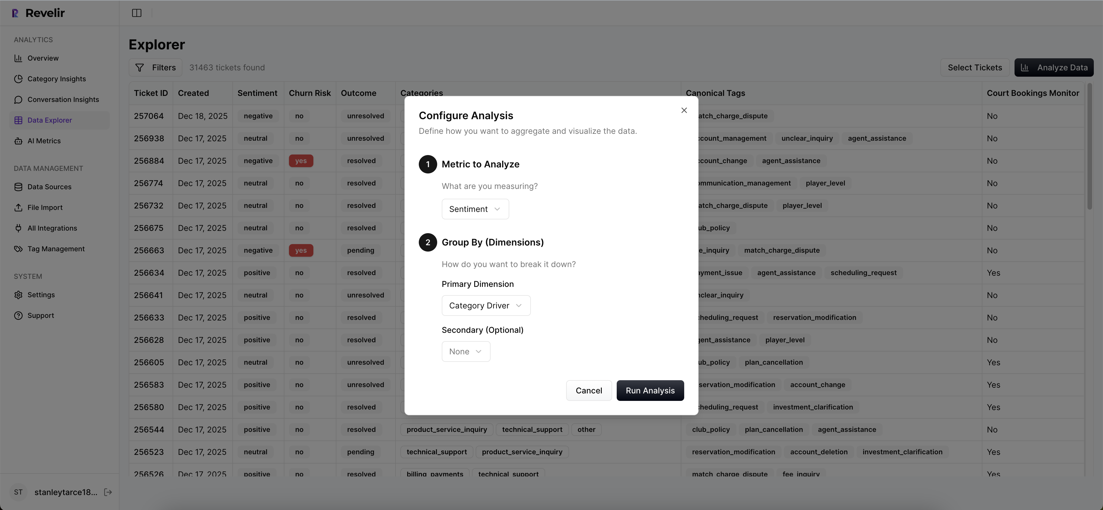
Revelir AI brings the pieces together: full-coverage processing, an AI tagging and metrics engine, and evidence-backed drill-downs. If you need to bring metrics into your BI, you can export via API. If Zendesk is your system of record, connect it directly; otherwise, upload a CSV and be analyzing within minutes. Ready to see it on your own data? See how Revelir AI works.
Here’s the thing. You don’t need to rip out tools or rebuild process. You need an evidence layer you can defend. Revelir AI gives CX and product teams that layer, structured, traceable, and ready for decisions. Want a low-friction start? Get Started With Revelir AI.
Conclusion
Roadmaps shouldn’t be bets dressed up as slides. They should be decisions backed by evidence you can open in the meeting. Measure 100% of conversations. Map raw signals into canonical tags and drivers. Score transparently. Validate with quotes, then verify impact after release. Do that, and you ship fewer, higher-impact fixes, with far less debate.
Frequently Asked Questions
How do I connect Revelir AI to my helpdesk?
To connect Revelir AI to your helpdesk, start by selecting the integration option for your platform, like Zendesk. Once chosen, follow the prompts to authorize the connection. Revelir will then automatically import historical tickets and ongoing updates, ensuring you have a complete dataset for analysis. This setup allows you to begin leveraging evidence-backed insights quickly, as the system processes all incoming tickets without manual exports.
What if I want to analyze customer effort?
If you want to analyze customer effort, use the Data Explorer in Revelir AI. Start by filtering your dataset for tickets with high customer effort. Then, click on 'Analyze Data' and select 'Customer Effort' as the metric to analyze. Group the results by relevant drivers or categories to see where the most friction occurs. This will help you identify specific areas needing improvement and prioritize actions based on real customer feedback.
Can I customize the metrics in Revelir AI?
Yes, you can customize metrics in Revelir AI to match your business needs. You can define custom AI metrics that reflect specific aspects of your customer interactions, such as 'Upsell Opportunity' or 'Reason for Churn'. This flexibility allows you to tailor the insights generated to better align with your organizational goals, ensuring that the data you analyze is relevant and actionable.
When should I validate insights from Revelir AI?
It's a good practice to validate insights from Revelir AI regularly, especially before making significant product or CX decisions. After running analyses, take time to drill down into individual tickets using the Conversation Insights feature. This allows you to review the actual conversations behind the metrics, ensuring that the patterns observed are accurate and representative of customer sentiment. Validation helps maintain trust in the data and supports informed decision-making.
Why does Revelir AI emphasize full coverage of conversations?
Revelir AI emphasizes full coverage of conversations because sampling can lead to biased insights and missed critical signals. By processing 100% of support tickets, Revelir ensures that you capture all customer feedback, including subtle cues about churn risk and frustration. This comprehensive approach allows teams to make data-driven decisions based on complete and trustworthy metrics, rather than relying on partial data that may not reflect the true customer experience.

