

Most companies think their feedback program is “data-driven.” It’s usually a dashboard of tickets, a survey score curve, and a few screenshots from social. Looks busy. But when one channel gets all the oxygen, you don’t get the truth. You get the loud minority’s version of it. And that’s how roadmaps drift.
We see it all the time. Power users dominate, enterprise accounts complain publicly, and nobody’s checking whether new users or low-touch segments are even in the dataset. Same thing with channels. Tickets drown out in‑product prompts; social drowns out reviews. If you’re not measuring coverage, you’re encoding bias. And biased inputs compound into expensive decisions.
Key Takeaways:
- Audit coverage first: measure which cohorts and channels are over- or underrepresented
- Ditch sampling debates: analyze 100% of conversations and anchor insights to quotes
- Separate volume from severity: group metrics by drivers and cohorts, not anecdotes
- Apply simple corrections: post-stratification and propensity weights clarify signal
- Make traceability non-negotiable: every chart should click into real conversations
- Build a repeatable cadence: weekly diagnostics with saved views beat ad‑hoc fire drills
Your Feedback Program Overrepresents The Loud Minority
Biased feedback happens when a few channels or cohorts dominate the data you review. High volume creates an illusion of coverage that hides quiet but costly patterns. For example, enterprise Twitter complaints drown out new-user onboarding friction that never makes it to social.

The coverage problem you cannot see
Coverage bias rarely announces itself. You notice volume. You don’t notice representativeness. The fix starts simple: list every source that feeds your signal, define the population you serve, then compare the two. If enterprise tickets are 45% of your dataset but only 18% of your revenue base, your metrics are modeling the wrong reality.
It’s usually not malicious, just unmeasured. Surveys over-index on people who answer emails. Social over-indexes on those comfortable posting publicly. In many companies, nobody’s checking whether low-touch or non‑English cohorts show up at all. That silence won’t complain in the all-hands. It will show up in retention.
Coverage doesn’t need to be perfect; it needs to be visible. Set targets for each source to fall within a reasonable band of its population share. Small gaps? Note them. Large gaps? Plan corrective action. As one reference point, research on survey programs has documented how feedback mechanisms can amplify certain voices and suppress others, especially across demographic lines, which skews decisions if left uncorrected. See this in the Brookings analysis of survey bias.
What gets lost when only one channel speaks up?
Single-channel feedback creates blind spots. Tickets tell you what’s broken for people who reached out; they miss quiet “meh” experiences. Social flags reputational spikes; it misses small but compounding usability hurdles. Reviews reflect expectations; they don’t pinpoint operational friction.
Ask three grounding questions: where do low-voice cohorts live, what channels do they use, and how often do they appear in your dataset? If those answers are fuzzy, you’ll overweight the failure modes of whoever shouts loudest. That’s how a single policy annoyance gets over-prioritized while a signup flow issue quietly drives churn.
You don’t have to guess. Build a cross-source map of drivers, onboarding, billing, performance, account access, and then compare distribution by channel and cohort. Same drivers, different weights. That pattern tells you which problems broadcast and which whisper. Confirmation bias creeps in fast without this check; here’s a helpful overview of cognitive bias in feedback handling. Don’t let the loud define the truth.
Why 100 percent conversation analysis resets the baseline
Sampling invites arguments about representativeness. Full coverage kills the debate. When 100% of conversations are structured into metrics and linked to source quotes, you get a defensible denominator. Now you can pivot by cohort, channel, or driver without footnotes.
This matters because cohorts rarely complain at the same rate. New users often under-report; high-value accounts often over-report. A full-population view lets you separate “we got 30 tickets” from “this affects 42% of new paid signups.” Different actions, different urgency. Evidence wins the room.
The second reason is trust. When you can click into a bar on a chart and show five representative quotes from the less vocal segment, skepticism drains out of the meeting. Decisions accelerate. You move from anecdote defense to pattern validation. That’s the point.
Want to see a full-coverage workflow in practice? If you’re ready to skip theory, See how Revelir AI works.
The Root Causes Hiding Behind Your Feedback Bias
Feedback bias stems from sampling habits, channel skews, and score-first reporting that strips context. The result is a story that tilts toward outspoken cohorts and public channels. For instance, support tickets over-index on break-fix issues while onboarding friction gets buried.

What traditional sampling misses
Sampling misses three things that cost you. Early churn signals, low-frequency/high-severity issues, and cohort-specific friction. Early churn signals appear as subtle frustration and effort cues, often in new-user conversations. Low-frequency/high-severity issues are rare but expensive, think billing reversals or identity verification loops. Cohort-specific friction hides in the long tail until it doesn’t.
It gets worse during spikes. A sudden social blow-up triggers a reactive “audit,” and the sample selection itself bakes in confirmation bias. The loud get louder. The quiet vanish. Meanwhile, the team debates whether “10% of tickets” is representative enough, instead of measuring coverage and correcting skews.
Replace ad‑hoc sampling with complete ingestion and consistent tagging. Then separate volume from severity by grouping metrics under drivers and cohorts. When you see “onboarding + negative sentiment + new customers,” you can choose urgency with intent. Without that structure, you’re flying by narrative.
Why traceability matters more than another score
Scores are a starting point, not a decision. A negative sentiment trend tells you something is off; it doesn’t tell you whether billing confusion or account access is the culprit. What wins in cross‑functional meetings is traceability, every metric linked to examples, so you can explain the “why” with confidence.
Trust is a feature. If you present an aggregate and can’t show representative quotes when someone asks “show me,” you lose the room. People revert to pet theories. Decision latency goes up. You want the opposite: click a segment, pull three transcripts, align on the driver, and commit to a fix.
There’s another dimension here you shouldn’t ignore: human bias in service interactions. Evidence shows certain customers experience different treatment patterns even with the same issue. That’s a signal and a risk. If your dataset over-indexes on those interactions, it can skew your understanding of root causes. Ground yourself with Harvard research on bias in customer service and build traceability so you can audit both the input and the interpretation.
The Hidden Costs Of Biased Feedback Signals
Biased inputs drain engineering time, trigger roadmap whiplash, and hide revenue risk. The price isn’t just hours, it’s credibility. For example, a vocal 10% can steer two sprints away from what actually moves retention.
Engineering hours lost to noisy input
Let’s pretend a team ships a fix for a public complaint that dominated last month’s tickets. Two sprints later, ticket volume shifts slightly, but sentiment and churn risk don’t budge. Frustrating rework. If five engineers spend two weeks on a low-representativeness item, that’s roughly 400 hours sunk.
Repeat that once per quarter and you’ve burned over 1,600 hours on misreads. Opportunity cost multiplies: features slip, technical debt grows, and product credibility erodes. The worst part? The fix that would have mattered, say, onboarding for a quiet but growing segment, remains unfixed. That’s the compounding tax of bias.
You don’t need a PhD to avoid it. You need a defensible denominator and a habit of validating drivers with quotes across cohorts. Make severity and representativeness visible before you assign a sprint. It’s a small change that saves a lot of hours.
Prioritization drift and roadmap churn
Biased inputs create whiplash. Your top three drivers swing with whoever shouts loudest this week. Product leaders hedge decisions. Backlog churn grows. Review cycles turn into debates you’ve already had. Nobody feels great about it.
Here’s the tell: you’re spending more time defending picks than shipping. That’s not a strategy problem; it’s an evidence problem. When you normalize drivers across sources and show cohort-weighted impact, the roadmap stops changing with the wind. Decisions get quieter. Outcomes get better.
Credibility is an asset. Every time you show a trend with traceable conversations, and it holds up under scrutiny, you regain trust. Every time you can’t, you lose it. Over months, that adds up to whether leadership backs your calls or treats your plan as provisional.
What is the opportunity cost of not correcting bias?
The opportunity cost is retention you never see. Quiet segments carry extra effort until they leave. Low‑voice customers don’t file tickets; they churn. That’s revenue you won’t attribute to a bug, a workflow, or a policy because it never hit your dashboard.
Ask two questions: which underrepresented cohorts are growing, and what friction shows up when you actually read their conversations? If you can’t answer, you’re guessing. Add in the fact that survey instruments can reflect systemic biases and you’ve got a second-order risk, misweighting who matters and why. There’s useful framing in this overview of cognitive bias in feedback handling. Don’t wait for the churn report to tell you.
Still wrestling with sample debates and ad‑hoc reviews? Shift to evidence-backed workflows and save the sprints. Learn More.
When Skewed Signals Break Trust And Momentum
Skewed signals erode confidence fast. Leaders sense the data isn’t balanced, analysts build side spreadsheets, and teams revert to anecdotes. One viral post can rewrite a sprint while real friction festers elsewhere.
The day a single tweet rewrote your sprint
We’ve all seen it. A viral post lands, emotions spike, and suddenly the roadmap tilts. You ship a patch for a noisy edge case. Meanwhile, new customers still hit the same onboarding wall. Two weeks later, support volume looks different but outcomes don’t.
The problem isn’t caring about reputation. It’s letting one channel set your truth. With representative metrics and quote-level traceability, you can separate PR response from product prioritization. Handle the tweet. But don’t let it write your product story.
When you can click a chart and show five conversations from the cohorts that rarely speak up, the room recalibrates. People see the whole picture. The sprint returns to signal, not noise. That’s how you protect momentum.
When your team stops trusting the dashboard
If charts swing wildly with sampling quirks, people check out. Analysts run side analyses. PMs pick pet projects. Support feels unheard. The cure is simple, but not easy: make it trivial to connect a bar in a chart to the conversations behind it.
Show, don’t insist. When skeptics can read three representative transcripts and say “Yes, that matches the metric,” distrust fades. Over time, those validations rebuild a culture of “evidence in, decisions out.” It’s not perfection. It’s confidence. And that’s enough to move.
Ask one more question while you’re at it: who isn’t in your dataset? New users, non‑English speakers, low‑touch segments, people who never answer surveys. If they’re missing, you’re optimizing for someone else’s experience. That’s a risk you can fix.
A Practical Bias Audit And Correction Pipeline You Can Run This Quarter
A bias audit aligns sources to your population and corrects skews with transparent methods. Start by measuring coverage, then apply simple statistical adjustments and document everything. For example, post-stratify to plan tiers or regions, then validate with real conversations.
Catalog sources and define coverage metrics
Inventory every stream: tickets, chat, reviews, NPS/PAS verbatims, social, and in‑product prompts. For each source, define a denominator that matches your business, total users, sessions, or accounts by cohort. Then compute coverage ratios by channel, segment, and lifecycle stage.
Write down targets. A practical baseline: keep each source’s share within, say, 10% of its population share, with exceptions noted. This isn’t about GPA precision; it’s about disciplined visibility. When a source or cohort drifts, investigate why. Did a policy funnel more issues into one channel? Did a new market launch change the mix?
Turn it into a weekly habit. Create a short “coverage report” with three parts: where we are, what’s out of bounds, what we’re doing about it. Interjection. Keep it to one page. If it takes more than 15 minutes to update, it won’t stick.
Apply statistical corrections without breaking interpretability
Once you understand the gaps, apply light-touch corrections. Start with post-stratification or raking to align your analysis with known margins like plan tier, region, or channel. When you need more nuance, use inverse-probability weights from a simple propensity model to rebalance who appears in your dataset.
Keep changes transparent. Report raw and weighted results side by side, note the adjustments, and maintain a short log of why you made them. If a decision materially depends on the weighted view, paste links to the conversations that reflect the adjusted pattern. That preserves trust while correcting bias.
You don’t need exotic math. Proven approaches from healthcare and social science are accessible and pragmatic, see this propensity score methods overview. What matters is staying interpretable. Stakeholders should be able to understand what changed and why it’s reasonable in one pass.
How Revelir AI Supports Bias Audits And Corrections
Revelir helps you move from partial, score-only views to evidence-backed insight across 100% of conversations. It gives you full-population coverage, cohort pivots, and click-through traceability, so you can measure coverage, correct skews, and defend decisions with real transcripts.
Full coverage processing to eliminate sampling bias
Revelir processes 100% of your uploaded or integrated support conversations, no sampling, so you avoid “is this representative?” debates. Every ticket is auto-tagged and enriched with AI Metrics like Sentiment, Churn Risk, and Customer Effort, forming a stable denominator you can slice any way you need. That’s the baseline for a real audit.
Because each conversation is structured, you can compare drivers across cohorts and channels without reinventing your schema every week. Raw tags give you discovery; canonical tags and drivers give you clarity for leadership. This combination makes it easy to see whether, say, “Billing & Payments” shows different severity patterns for new users vs. enterprise accounts.
The payoff loops back to the costs we covered earlier. Those 400-hour misreads? They drop when you stop guessing. Prioritization whiplash? It calms down when the denominator is defensible and the evidence is visible. Revelir makes that state straightforward to reach and maintain.
Evidence-backed drill-down for validation and audit trails
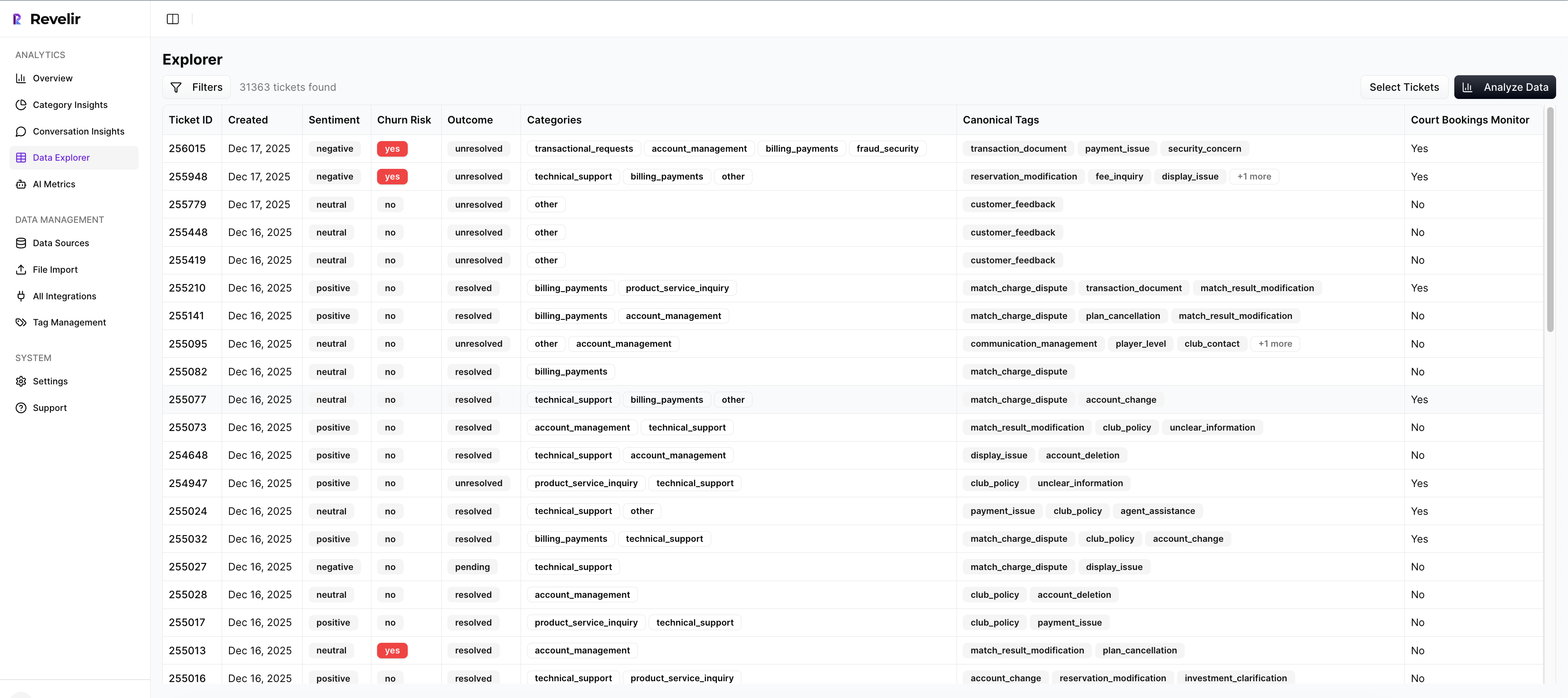
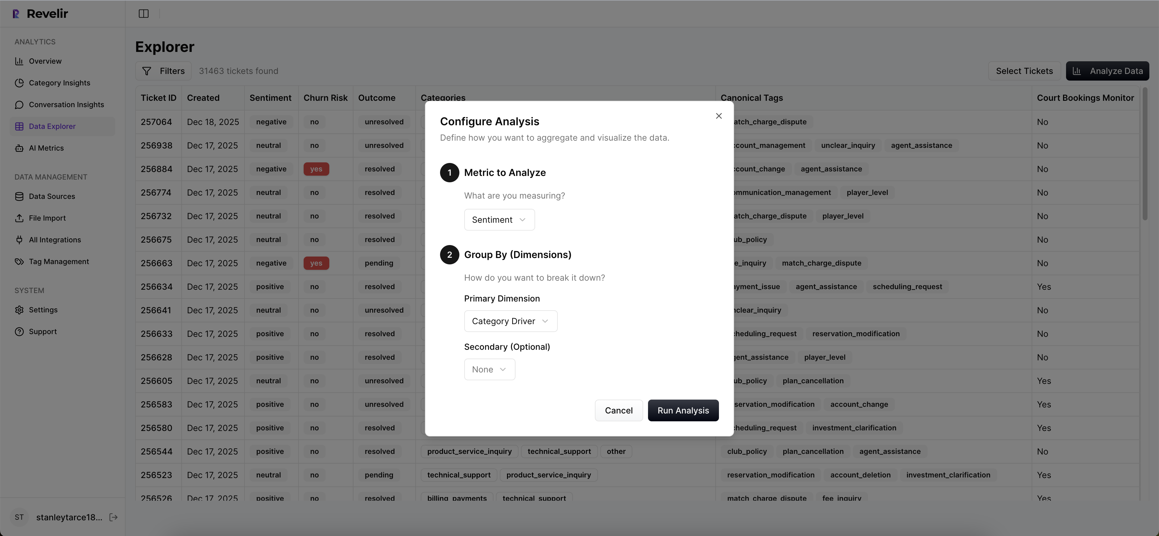
Revelir’s Data Explorer acts like a purpose-built pivot table for tickets. You can filter by sentiment, churn risk, plan tier, region, canonical tags, drivers, and any custom fields you’ve imported. Then use Analyze Data to group metrics by driver or canonical tag, compare cohorts, and spot over- or underrepresentation quickly.
The moment someone asks “show me,” click any cell and jump into Conversation Insights for the exact transcripts behind that metric. Review AI summaries, verify tags and metrics, and pull representative quotes. That drill-down is your audit trail, and the fastest way to turn skepticism into alignment in the room where decisions get made.
If you need to monitor ongoing risk, save views that match your audit cadence, unweighted vs. weighted slices, high-effort drivers for new customers, churn-risk concentrations by region. Revelir keeps those views fresh as new tickets arrive. When you ship a change, you can see whether related sentiment and effort go up or down, and for whom.
Ready to anchor your roadmap in evidence from 100% of conversations? See how Revelir AI works.
Conclusion
Bias hides in coverage, channels, and score-only dashboards. You correct it by measuring representation, structuring every conversation into drivers and metrics, and making the evidence visible on demand. Do that, and you spend less time defending decisions and more time shipping the fixes that matter. That’s the shift, from loud anecdotes to trustworthy signals.
Frequently Asked Questions
How do I connect Revelir AI to my helpdesk?
To connect Revelir AI to your helpdesk, start by logging into your Revelir account. Navigate to the 'Data Management' section and select 'Connect Data Source.' Choose your helpdesk platform, like Zendesk, and follow the prompts to authenticate the connection. Once connected, Revelir will automatically ingest your support tickets, ensuring you have 100% coverage without manual exports. This setup allows you to analyze all conversations and gain insights quickly.
What if I want to analyze customer sentiment over time?
You can analyze customer sentiment over time using the Data Explorer in Revelir AI. Start by filtering your dataset by date range and selecting the 'Sentiment' metric. Run the analysis to see how sentiment varies across different periods. This will help you identify trends and patterns, such as spikes in negative sentiment, allowing you to address issues proactively. Remember, every metric is linked back to the original conversations, so you can validate your findings easily.
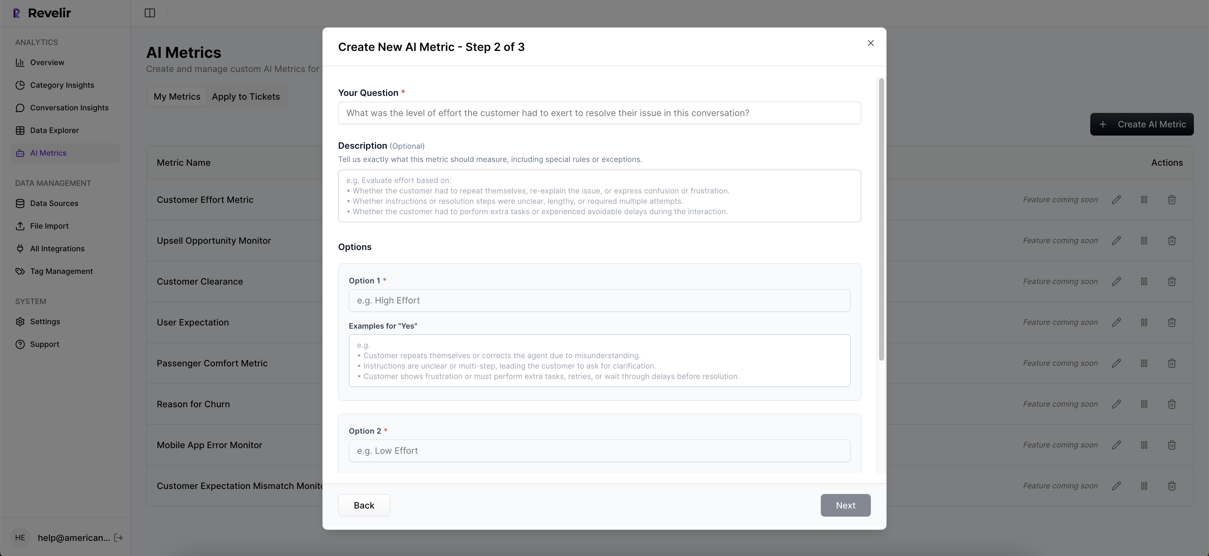
Can I create custom metrics in Revelir AI?
Yes, you can create custom metrics in Revelir AI to align with your business needs. Go to the 'AI Metrics' section and define what matters most to your organization, such as 'Customer Effort' or 'Churn Risk.' Once set up, these metrics will be applied consistently across your dataset, allowing you to gain deeper insights tailored to your specific goals. This flexibility helps you focus on the factors that truly impact your customer experience.
When should I validate insights with conversation details?
You should validate insights with conversation details whenever you notice significant trends or anomalies in your data. For instance, if you see an increase in churn risk or negative sentiment, it's essential to drill down into the Conversation Insights to review specific tickets. This step ensures that the metrics align with actual customer feedback, providing context and clarity for your findings. Regular validation helps maintain trust in your data and supports informed decision-making.
Why does Revelir AI emphasize full coverage processing?
Revelir AI emphasizes full coverage processing to eliminate bias and ensure that no critical signals are missed. By analyzing 100% of your support conversations, Revelir captures insights that sampling methods might overlook. This comprehensive approach allows you to detect early signs of churn, identify common pain points, and make data-driven decisions that reflect the true customer experience. It’s about turning every conversation into actionable insights for your team.