

Retention doesn’t change because a dashboard dipped a few points. You know that. We all do. Churn moves when you lower the work customers have to do to get something resolved. That’s the lever. And it’s measurable if you stop sampling, define drivers, and run clean tests for 90 days.
Here’s the play: use Customer Effort Metric (CEM) at the conversation level, tie it to clear drivers (Billing, Account Access, Onboarding), and treat changes like experiments. We’ll write a hypothesis, hold out controls, and make call-sheet decisions with quotes you can show in the room. Less debate. More movement.
Key Takeaways:
- Shift from score watching to effort-and-driver experiments tied to transcripts
- Pre-commit hypotheses, cohorts, and thresholds so you don’t move goalposts mid-test
- Build a trusted baseline with canonical tags and drivers before touching anything
- Protect high-value cohorts with controls and feature flags during rollouts
- Measure lift with CEM and churn risk, then validate with real ticket examples
- Use full-coverage metrics so “show me proof” is a two-click answer, not a scramble
Why Score Watching Fails To Move Retention
Score watching doesn’t change retention because it’s descriptive, not diagnostic. You need effort and drivers tied to real conversations so your team knows what to fix, not just that a score fell. When every chart rolls down to tickets and quotes, people act. They stop arguing and start fixing.

The Metrics That Actually Change Behavior
It’s usually not the score. It’s the work your customer has to do. CEM shows which conversations were high effort, and drivers tell you where the load comes from, Billing, Account Access, Performance. That combo turns a vague dip into a shortlist of fixes tied to actual tickets you can open and read.
This isn’t new in spirit. The research behind Customer Effort Score has long linked lower effort to higher loyalty, with a strong relationship to repeat contact and churn risk. If you want a grounding, start with Harvard Business Review’s explainer on effort and loyalty. Then apply it locally: your data, your drivers, your quotes. Honestly, the magic isn’t the metric. It’s the traceability that earns trust in the room and accelerates decisions.
Why Sampling And Anecdotes Keep You Stuck
Sampling looks efficient. Until the quiet churn signals slip past you. A 10% skim can miss small but compounding problems, like onboarding friction that only shows up in a specific plan tier. Then someone asks for proof, and the anecdote stack collapses under scrutiny.
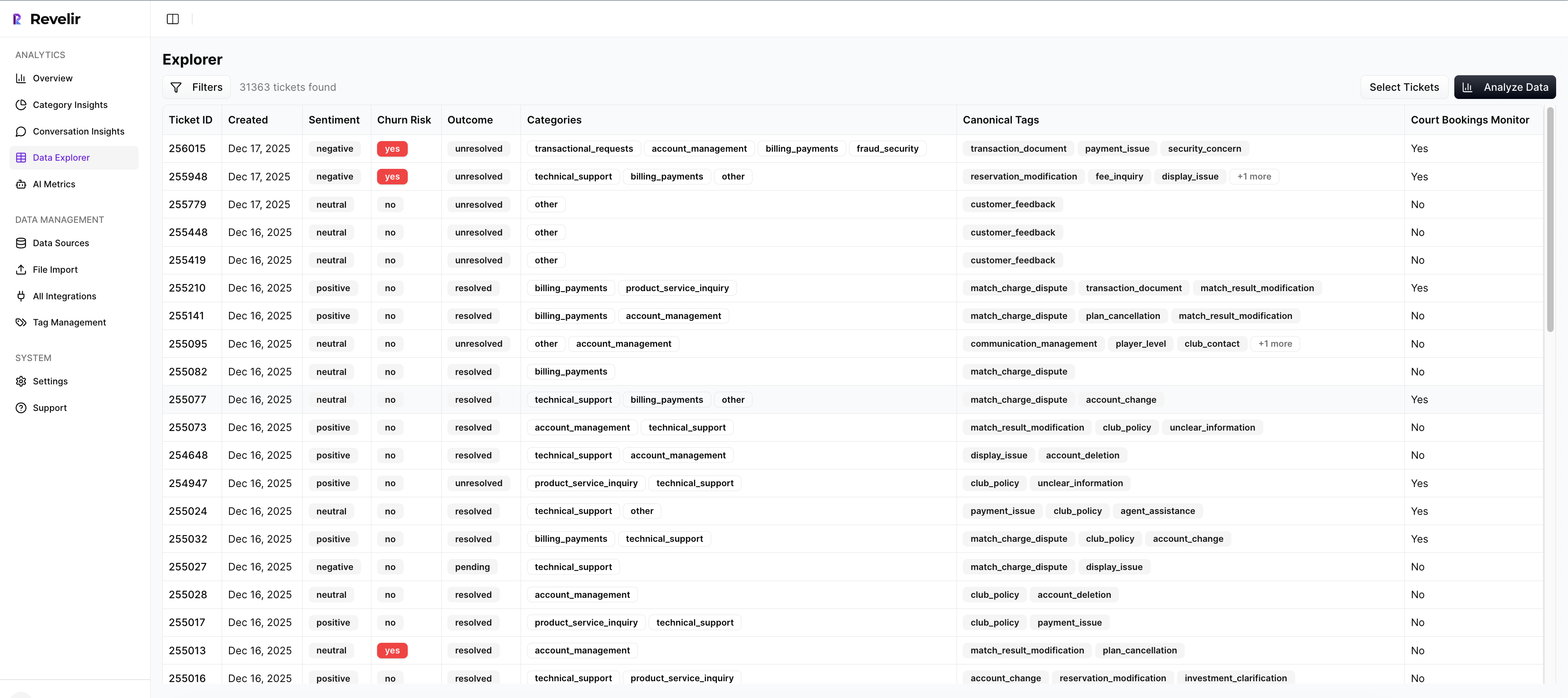
Move to 100% coverage. When every conversation is measured, you can pivot by driver, cohort, and week without debating representativeness. The real unlock is auditability. If a number moves, you click the count, open five tickets, and confirm the pattern. Nobody’s checking blind. Same thing with rollbacks, if effort spikes, you can see it early and act before renewal calls turn tense.
Ready to skip the theory and see the workflow end-to-end? See how Revelir AI works.
Linking Effort To Retention With A Testable Model
Link effort to retention by writing a clear hypothesis and holding yourself to it. Define the driver, cohort, and expected lift. Build a baseline with canonical tags so your test isn’t sitting on noise. Then implement practical guardrails, controls, flags, and pre-set thresholds, so results are believable.

Define A Hypothesis That Ties CEM To Retention
Write it down. Keep it specific. Let’s pretend you’re tackling Billing & Payments for growth-tier accounts. Hypothesis: “Reducing high-effort tickets in Billing & Payments by 30% will improve 90-day retention by 3 points for growth-tier accounts in Q2.” That gives you a metric, a driver, a cohort, a target, and a window.
Pre-commit decision thresholds: what effect size counts as a win, a “needs more time,” or a rollback. Spell out how you’ll treat outliers and late tickets that land after a policy change. You’re not doing academic stats here; you’re avoiding wishful thinking. For templates and cadence ideas, borrow from Optimizely’s experimentation program guide and adapt to CX reality.
How Do You Build A Trusted Baseline With Canonical Tags?
Start by mapping raw tags into canonical categories, then group those under drivers leadership understands. Billing. Onboarding. Account Access. From there, baseline the last 30 days: CEM distribution, churn risk density, and volume per canonical tag. Don’t rush this. Bad baselines ruin good experiments.
Now validate with conversation drill-downs. Open a sample of tickets behind each hotspot and capture representative quotes. If a canonical tag is noisy, edge cases leaking into “Technical” this week and “Billing” next, fix the mapping before the test starts, not after. Your future self will thank you when the results hold up in front of product and finance.
The Hidden Cost Of Guesswork In Experiments
Guesswork drains time and trust. False positives burn engineering cycles. No guardrails on high-value cohorts put revenue at risk. Inconsistent tagging splits your signal and hides real lift. Clean data is cheaper than rework, and evidence beats anecdotes when budgets get tight.
Engineering Hours Lost To False Positives
Let’s pretend you tweak an ops macro and see nicer anecdotes for a week. You call it a win. Product ships a UI change over two sprints. Then retention doesn’t move. If engineering runs ~20 hours per sprint for that line item, you just spent 40 hours on noise. That cost doesn’t include support callbacks or the mental load of rolling it back later.
This mistake is common because teams chase movement without a baseline. The fix is dull but effective: stable canonical tags, driver-level pivots, and pre-set thresholds. You’re buying insurance against rework. In my experience, that insurance pays back in the first quarter you stick to it.
What Does Inconsistent Tagging Do To Your Sample?
Inconsistent mapping turns clean tests into mush. One week, billing edge cases land in Technical. The next week, they’re back in Billing. Your pivot splits the effect, and your measurement under-reads the lift. It’s a quiet failure. Nobody notices until the results feel “off.”
Stabilize mappings ahead of the test. Validate by clicking into tickets for each driver and sanity-checking the examples. If the quotes don’t match the driver’s name, fix it now. Keep a short “exceptions” list for tags you’ll handle manually during the test window so your sample stays coherent. It’s boring. It’s necessary.
Tired of debating samples and edge cases in every review? Learn More.
When Effort Spikes, Everyone Feels It
Effort spikes ripple across teams. CSMs scramble. Support absorbs the heat. Product feels accused. With full-coverage, traceable metrics, you can isolate the driver, show the quotes, and fix the right thing faster. Less blame. More relief.
When Your Biggest Customer Hits A Login Loop
You’ve seen this movie. Account Access issues trigger high effort, the CSM goes into triage, and the renewal call turns tense. Start in your analysis workspace: filter to high-effort, group by Account Access, then drill into the tickets. You’ll see the exact loop, SMS code timing out, reset email not arriving, session invalid after MFA.
Bring three short quotes to product. One from an enterprise admin, one from a mid-market user, one from a new trial. That mix makes the problem vivid without feeling like a cherry-picked story. In my experience, that evidence moves decisions faster than a generic “logins are bad” chart.
The 3 a.m. Incident No One Saw Coming
Payment failures spike after a backend change. Volume climbs. Sentiment drops. Without drivers and evidence, your war room spends an hour guessing causes. With traceable metrics, you group by Billing, open example tickets, and spot the broken flow, card retries failing on a specific gateway config.
The fix ships faster because the “why” is already in the ticket quotes. You also have a clean after-action: volume and high-effort share back to baseline, quotes that confirm the fix, and a note for finance and success. If you like 90-day operating rhythms, tie these checkpoints to your weekly reviews. A short, steady cadence beats heroics every time. For broader operating patterns, see Gainsight’s guide to customer success playbooks.
Run The 90-Day Customer Effort Experiments Playbook
This playbook runs in four stages. Instrument and baseline. Ship low-risk ops changes. Move to product fixes with guardrails. Measure, validate, and scale or roll back. It’s simple on paper. The discipline is sticking to thresholds and evidence.
Weeks 1-2: Instrument CEM And Baseline With Canonical Tags
Turn on CEM, churn risk, and sentiment. Map raw tags to canonical tags and drivers, then verify with conversation drill-downs. Your baseline should capture high-effort distribution, churn risk density, and volume by driver and cohort for the last 30 days. Save your filter views so you can reuse them.
Lock your hypothesis, cohorts, and decision thresholds. Write rollback rules in plain English. One more thing, collect 2-3 representative tickets per hotspot now. Those quotes will become your north star and your “proof” later. If the CEM signal isn’t supported in a narrow dataset, mark it and avoid using it until the data can sustain accuracy. Don’t force it.
Weeks 3-6: Design Low-Friction Operational Interventions
Start with reversible changes. Agent scripts, macros, KB edits, or small policy tweaks. Aim them at the top two high-effort drivers from your baseline. Randomize at the ticket, queue, or agent-shift level where it makes sense, and keep a clean log of who got what.
Review weekly. Pivot CEM and churn risk by driver in your analysis tool, then open a handful of tickets to confirm the pattern. Capture before-and-after examples. Interruption, don’t add five new experiments in week two. Protect the signal you’re trying to measure. That restraint is where teams usually stumble.
Weeks 7-10: Product Fixes With Guardrails And Randomization
Now pick the single highest-impact driver and move to product. Use flags or phased rollouts. Hold out a control segment in your highest value cohort. Predefine a minimum detectable effect so you know what “good enough” looks like for a broader release.
Track CEM, churn risk, and volume by driver week over week. If high-effort share rises above baseline for two consecutive weeks, pause and investigate. Open the tickets behind the spike and look for a common failure mode. Sometimes it’s a simple offset in copy. Sometimes it’s a real regression. Either way, you’ll see it fast because the evidence is built in.
Weeks 11-13: Measure, Validate, Then Roll Out Or Roll Back
Calculate effect size using your control. Keep it practical. Then sanity-check with ticket quotes from Conversation Insights. Do the examples match the measured lift? If yes, write a crisp decision memo: final numbers, representative quotes, rollout criteria, and any ops training needed.
Feed accepted wins into your playbooks and product roadmap. Archive your saved views so you can rerun this cycle next quarter with less startup cost. This is the compounding part, cleaner taxonomy, cleaner metrics, and faster experiments.
How Revelir AI Operationalizes The Playbook
You can run this playbook manually with exports and spreadsheets. It’s just slow and fragile. Revelir AI bakes in full-coverage metrics, driver pivots, and evidence-backed drill-downs so you can baseline fast, test cleanly, and defend decisions with quotes. No new instrumentation. No rebuilding classifiers.
Full-Coverage Metrics With CEM And Churn Risk, No New Instrumentation
Revelir AI processes 100% of your tickets and applies CEM, churn risk, sentiment, raw tags, canonical tags, and drivers. You get a structured dataset you can trust, without building your own models. If a dataset can’t support CEM with enough back-and-forth, Revelir shows empty values rather than guessing. That safeguard prevents misleading reads and protects your calls.
From there, you can filter by cohorts, map tags, and see per-conversation metrics in one place. It’s the base you needed in Weeks 1–2 without the plumbing headache. Honestly, this is where most teams stall. Full coverage unblocks the rest.
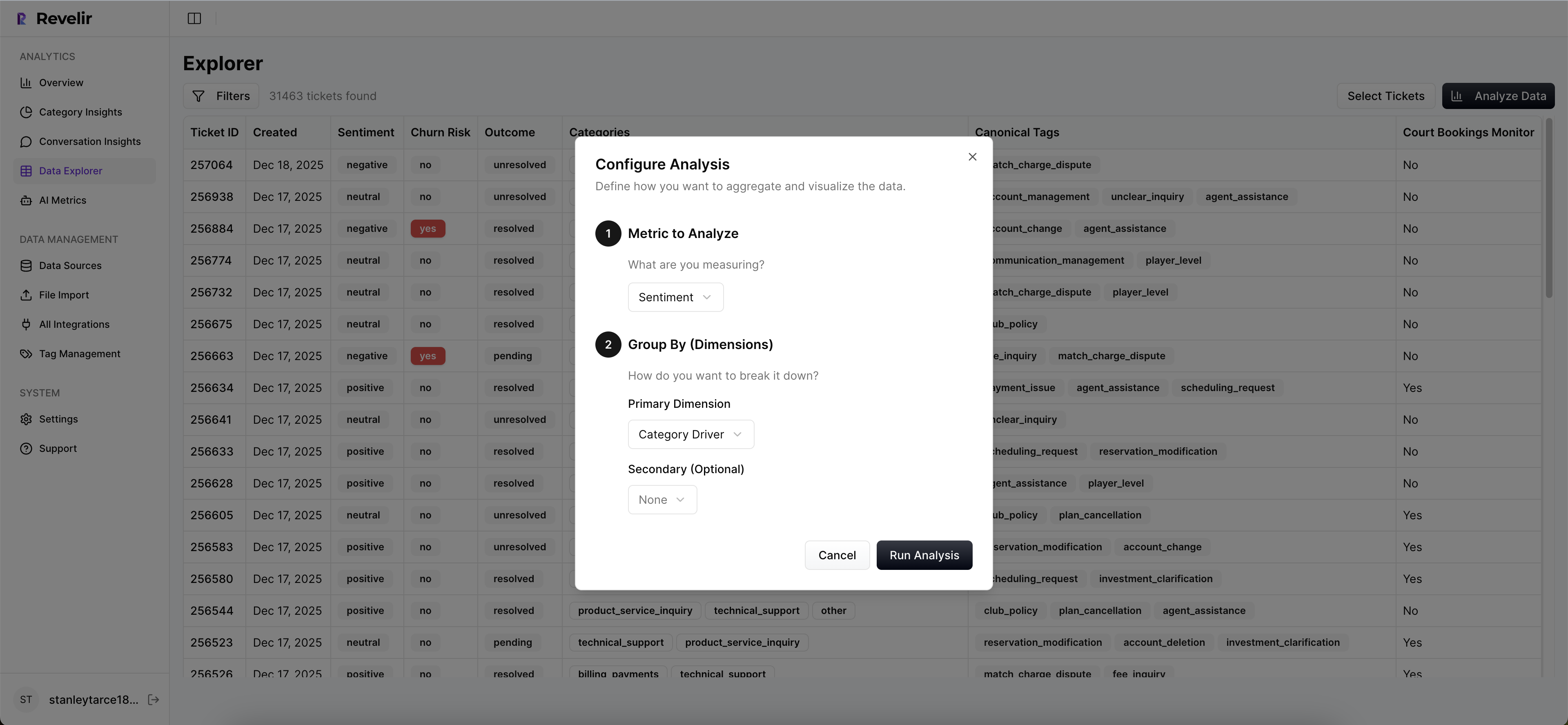
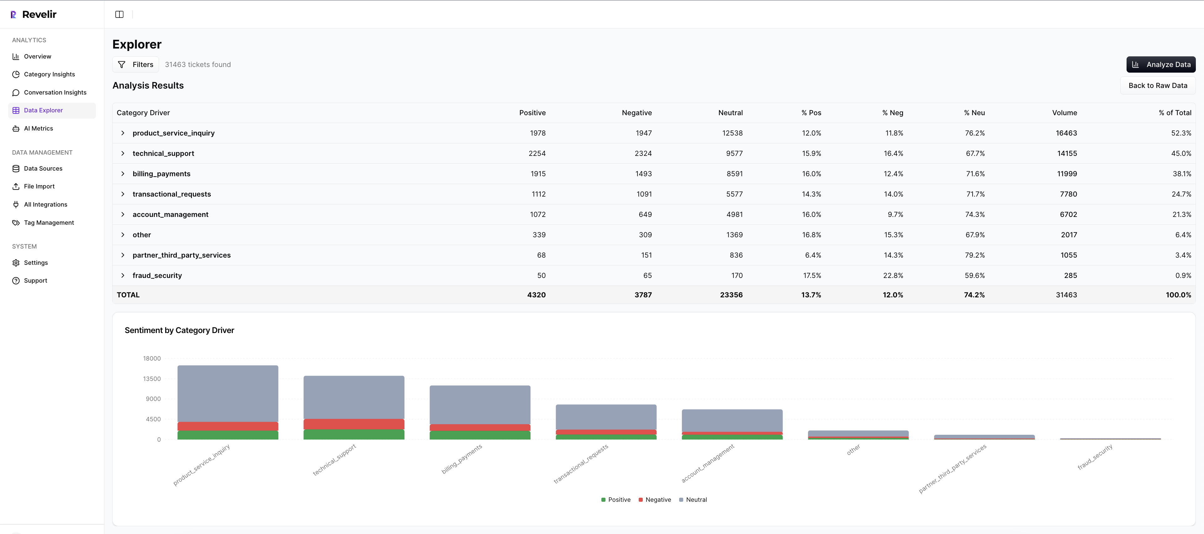
Analyze Data Pivots And Drivers To Find Effort Hotspots
Use Analyze Data to group CEM or churn risk by driver or canonical tag in seconds. You’ll see a grouped results table and a bar chart that makes hotspots obvious. Click any count to jump straight into the tickets behind it. Validate, capture quotes, and move.
This is your weekly cadence during Weeks 3–6 and 7–10. Instead of wrestling with BI filters or arguing about sample quality, you pivot, confirm, and decide. Drivers give you the leadership language; ticket links give you the proof. Together, they cut the back-and-forth that drags these reviews.
Evidence-Backed Drill-Downs That Win Trust In The Room
Every aggregate in Revelir AI links to exact conversations and quotes. When someone asks “show me,” you can. That traceability reduces debate and gets buy-in from product and finance. It also makes rollbacks less emotional, if effort spikes, you point to the evidence and pause with confidence.
As wins stack up, you’ll export metrics to your reporting stack if needed and keep a library of repeatable views for monthly reviews. Over time, your taxonomy stabilizes, your measures get cleaner, and your 90-day cycles speed up. Fewer meetings that go in circles. More fixes that stick.
Ready to cut effort where it hurts retention? Get Started With Revelir AI.
Conclusion
Scores tell you something’s wrong. Effort and drivers tell you what to fix. When you run a 90-day cadence with full-coverage metrics, clean baselines, and evidence-backed decisions, churn moves. Not overnight. But steadily. If we’re being honest, the secret isn’t a fancy model. It’s traceability, discipline, and a team that can go from a chart to a quote to a shipped change without losing trust.
Frequently Asked Questions
How do I analyze churn risk with Revelir AI?
To analyze churn risk using Revelir AI, start by filtering your dataset for churn-risk tickets. Click on 'Analyze Data' and select 'Churn Risk' as your metric. Group the results by drivers or canonical tags to see which issues are contributing to churn. This will help you identify patterns and prioritize follow-ups with high-risk accounts. Additionally, you can drill down into specific tickets to validate insights with real conversation examples, ensuring your findings are actionable.
What if I want to track customer effort in specific categories?
If you want to track customer effort in specific categories, use the Data Explorer in Revelir AI. Filter your dataset by 'Customer Effort' and select the relevant category drivers. This will allow you to see which categories are generating high or low effort experiences. By analyzing this data, you can pinpoint areas that may need improvement, such as onboarding or billing processes, and take steps to reduce customer friction.
Can I create custom metrics in Revelir AI?
Yes, you can create custom metrics in Revelir AI that align with your business language. To do this, define the specific metrics you want to track, such as 'Upsell Opportunity' or 'Reason for Churn.' Once defined, these custom metrics can be applied consistently across your dataset. This flexibility allows you to tailor the insights to better reflect the unique needs of your organization, enhancing your analysis capabilities.
When should I validate insights with Conversation Insights?
You should validate insights with Conversation Insights whenever you identify significant patterns or anomalies in your data. After running an analysis in Revelir AI, click into specific segments to access the underlying tickets. This step is crucial for ensuring that the AI classifications make sense and that the metrics align with real customer experiences. By reviewing actual conversations, you can gain deeper context and make more informed decisions based on evidence.
Why does my analysis show empty values for customer effort?
If your analysis shows empty values for customer effort in Revelir AI, it may be due to insufficient conversational cues in the dataset. Ensure that the dataset includes enough back-and-forth messaging to support accurate classifications. If effort metrics were not enabled for that specific dataset, you may also see all-zero counts. To resolve this, consider including more comprehensive conversation data or adjusting your dataset to include interactions that reflect customer effort.