

Most teams trust their samples. Read a few tickets, chart CSAT, call it a trend. It feels responsible. It isn’t. The sensitive signals live in the long tail, churn mentions, security flags, subtle onboarding friction, and samples are where those signals go to hide.
Here’s the real gap. It’s usually not your dashboard. It’s your denominator. If you only look at 10% of conversations, you’re not measuring reality; you’re measuring luck. That’s why we push coverage sensitivity: can your pipeline actually detect what matters, at the speed your team needs? If not, you’re debating anecdotes while risk compounds.
Key Takeaways:
- Sampling lowers sensitivity, especially for rare but costly events
- Define minimal detectable effect and false negative tolerance before picking sample size
- Quantify costs of missed and late detection in dollars, time, and morale
- Replace anecdotes with traceable metrics tied to real quotes
- Use simulation and power analysis to map coverage to detection probability
- Operationalize with full coverage, drillable evidence, and cohort pivots
Sampling Creates Blind Spots You Cannot See Until It Is Too Late
Sampling hides rare signals because the odds aren’t on your side. Coverage sensitivity is the chance your process detects a real issue given prevalence, sampling rate, and label accuracy. Low-prevalence events vanish in samples, creating false calm. Think churn mentions at 0.5% prevalence, easy to miss, expensive when missed.
What Is Coverage Sensitivity And Why Should CX Teams Care?
Coverage sensitivity tells you how likely your pipeline is to catch a real signal under real conditions. Sampling, label noise, and slow cadence all reduce it. CX leaders should care because sensitivity dictates whether you see risk in time to act. Miss the early signals, and you pay for it later, in churn, escalations, and rework.
Here’s a quick sanity check. If churn mentions appear in 0.5% of tickets and you sample 200 tickets this week, you expect about one mention. There’s still roughly a 37% chance you see zero. That “no problem here” feeling is a math error, not peace of mind. We’ve watched that error sink quarters.
Scores won’t rescue you. A CSAT curve can dip, but it can’t name the driver you never captured. Without traceability to actual quotes, nobody’s checking whether the trend maps to real conversations. If we’re being honest, that’s when debates replace decisions. Full coverage with drillable evidence is the only way out. For more on coverage as missed behavior, see [State Coverage As A Lens On Missed Behavior].
Why Low-Prevalence Signals Break Intuition
Humans think in averages. Rare events don’t play by those rules. A “clean” weekly sample can miss a 0.5% signal several times in a row, giving you confidence you didn’t earn. Meanwhile, the issue grows. Same thing with security flags or compliance phrases, low volume, high impact, and sampling makes them invisible when they’re smallest and most fixable.
The fix starts by naming the problem for what it is: a sensitivity problem, not a dashboard problem. Once you see it that way, you stop arguing about sample size in the abstract and start defining the detection standard you need to meet.
Ready to measure every ticket, not a sliver? See How Revelir AI Works.
Define The Detection Standard Before You Debate Sample Size
Set the bar first, then design how to clear it. Define the smallest effect worth catching and how often you’re willing to miss it. These two numbers, minimal detectable effect and false negative tolerance, drive the sample size and cadence you need. Skip this, and you’re guessing with spreadsheets.

How Do You Set Minimal Detectable Effect And False Negative Tolerance?
Start from impact. If a 20% relative rise in churn-risk tickets among Enterprise accounts matters, write that down. Then set a false negative tolerance, say, 10% per weekly period. Now you have a test you can pass or fail. You’re not arguing philosophy; you’re aligning risk to math.
Let’s pretend you care about three classes: churn mentions (0.3–1.0%), security flags (0.05–0.2%), and onboarding friction in new users (1–3%). You can’t wish sensitivity into existence at 10% samples for the 0.05% bucket. Use binomial power methods to model what it takes. Feature-sensitive coverage work is useful context here; see Advances In Feature-Sensitive Coverage And Detection.
Translate these choices into measurable criteria. Put numbers on acceptable detection delay (for example, ≤7 days) and minimum precision when a signal fires. Those become acceptance tests for your simulator and your reporting.
Align Detection Goals To Operational SLAs
Tie the math to how you actually respond. If high-risk issues demand action within 72 hours, a weekly random sample won’t cut it. Your cadence must make “detected within 72 hours” likely, not lucky. For monthly executive reporting, compute period-level sensitivity and expected time-to-detect.
This is where the plan becomes real. Write target prevalence bands by segment, set your acceptable detection delay, and confirm the team has capacity to act when the alert triggers. Empirical coverage analyses can help you avoid blind spots in design; see [Empirical Methods For Coverage Analysis]. If we’re being honest, this step exposes mismatches fast, and that’s good.
The Real Cost Of Missed And Late Detection
Missed signals don’t just hurt pride. They cost revenue, create escalations, and flood your queue with high-effort work. The kicker is lag. Every week you miss or delay a signal multiplies effort and risk. Finance will ask for numbers. So bring numbers.
Let’s Pretend You Miss One Percent Of Churn Mentions For A Quarter
Assume 20,000 tickets in a quarter and churn mentions at 0.5% prevalence. That’s about 100 high-risk conversations. If sampling and cadence cause you to miss even half, you forgo alerts on 50. If average account value is $25,000 and intervening within a week improves save rate by 30%, that’s potentially 15 saves. You can do the math. The loss isn’t theoretical.
We’re not 100% sure which of those accounts would churn, but that’s the point. Sensitivity isn’t a nicety, it’s a guardrail. In security research, gaps in coverage directly degrade rare behavior detection; see A Study Showing How Coverage Gaps Degrade Detection Of Rare Behaviors. Same thing here. Rare but costly signals need more than hope.
Detection Lag Multiplies Escalation And Workload
Late detection pushes cases into escalation queues. That means more handoffs, more “frustrating rework,” and longer resolution times. Even a 7‑day delay can double the number of tickets that travel through high-effort workflows. You feel it in sentiment, backlog, and agent burnout. Burnout reduces quality, which worsens sentiment. The loop tightens.
Coverage affects discovery rate in practice, not just theory. Simulation work in software testing shows detection curves steepen with coverage; see [Quantifying How Coverage Affects Discovery Rate]. Your support queue behaves the same way.
What Is The Opportunity Cost Of Fixing The Wrong Thing?
When your sample misleads, roadmaps drift. You ship a tidy fix because it showed up in a small slice, while the real driver sits under the surface. The cost is the delta between the fix you shipped and the one you should’ve shipped, plus the future ticket volume you could have prevented. Nobody loves that conversation in Q3.
Stop guessing from samples. Start evidence-backed decisions with Revelir AI. Learn More.
Replace Anecdotes With Evidence People Can Click
When the dataset is thin, the loudest story wins. That’s human. The fix isn’t more meetings. It’s drillable metrics tied to the exact conversations behind them. With traceability, you can audit the insight in seconds and move the room from debate to action.
Why The Loudest Anecdote Wins When Data Is Partial
Partial data invites narrative fights. One vivid ticket becomes “the pattern,” because nobody can test representativeness on the fly. With traceable coverage, you can. Click the count. Read five transcripts. Ask if the quotes match the claim. If they don’t, you correct course early, without politics.
Coverage adequacy and traceability go hand in hand. If you can’t map the chart to the quote, trust breaks. That’s the moment stakeholders say, “Show me an example,” and the air goes out of the room. A helpful primer on why coverage adequacy matters: [Foundations Of Coverage Adequacy And Sensitivity Concepts].
What Happens When An Exec Asks For Proof?
You show the slice, then the receipts. “Negative sentiment by driver for new customers,” click the number, open three representatives, read the quotes. Nobody’s checking your word, they’re checking the evidence. I’ve been in that QBR. When evidence is one click away, the conversation shifts to “What will it take to fix this now?” Not next quarter. Now.
If your pipeline is a sample and opaque, that moment gets tense. If it’s full coverage with traceability, it’s calm. You discuss impact, timing, and ROI. That’s where you want the room.
An Empirical Workflow For Coverage Sensitivity
You don’t need faith. You need a simulator and a few guardrails. Build subsamples, run power analysis, seed rare events, and model time-to-detect. Then pick the coverage that meets your tolerance for missed signals and delay. Simple idea. Practical steps.
Build A Sampling Simulator With Bootstrapped And Stratified Subsamples
Start with a month of tickets as ground truth. Generate thousands of subsamples at 5%, 10%, and 20%. Stratify by tier, channel, and language to mirror your mix. For each draw, compute two things: did the signal appear, and what was its estimated rate? Collect the distribution to estimate detection probability and variance.
Then stress it. Some weeks are weird. Use block bootstrapping to simulate spikes and lulls. Compare the curves. You’ll see where samples hold up and where they crumble. Honestly, this step clears a lot of internal debates because it replaces opinion with distributions.
Run Power Analysis And Test Rare Signals
For binary signals like churn risk, use binomial power analysis to map sample size to your false negative tolerance. Cross-check the math against your simulation output. They should rhyme. If they don’t, revisit your assumptions on prevalence or label accuracy.
Now inject synthetic events. Seed known churn mentions or security phrases at controlled rates. Rerun the simulator and measure recall at each sampling level. If recall stays low for the rare classes, even with stratification, sampling isn’t safe for that risk. That’s your evidence.
Estimate Detection Lag And Translate It Into Marginal Value
Model time-to-detect under your real cadence, weekly random sample versus continuous ingestion. Compute the share of events detected within your SLA window. Then translate reduced lag into business value with finance. Tie earlier detection to save-rate delta, escalation avoidance, and avoided rework hours. This gives you a marginal ROI curve for moving from 50% to 70% to 100% coverage.
If we’re being honest, the ROI usually shows up faster than expected because lag is expensive. Seeing that in your own data is what moves budgets.
How Revelir AI Turns Sensitivity Findings Into Daily, Defensible Practice
Full coverage and traceability aren’t nice-to-haves. They’re the baseline for sensitive detection. Revelir AI was built for this exact job: process 100% of tickets, turn conversations into metrics, and keep every chart linked to the quotes behind it. So you can measure, pivot, and prove.
Full Coverage Processing With Drillable Traceability
Revelir AI processes every ticket, no sampling, so you avoid blind spots and catch rare signals early. Each aggregate count is clickable. One click opens Conversation Insights with the exact tickets and quotes behind the number, plus the AI summary and assigned metrics. This turns “What’s behind this?” into a 10‑second check instead of a 10‑slide debate.
We were skeptical of black-box outputs, too. That’s why evidence is built in. When each metric links to its source conversation, stakeholders can audit the reasoning and stay aligned, even when findings are uncomfortable.
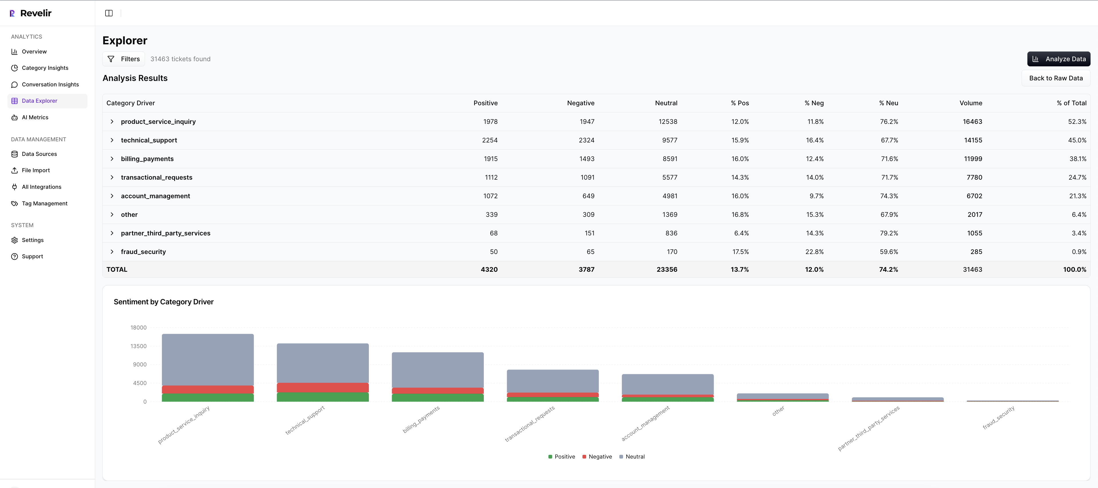
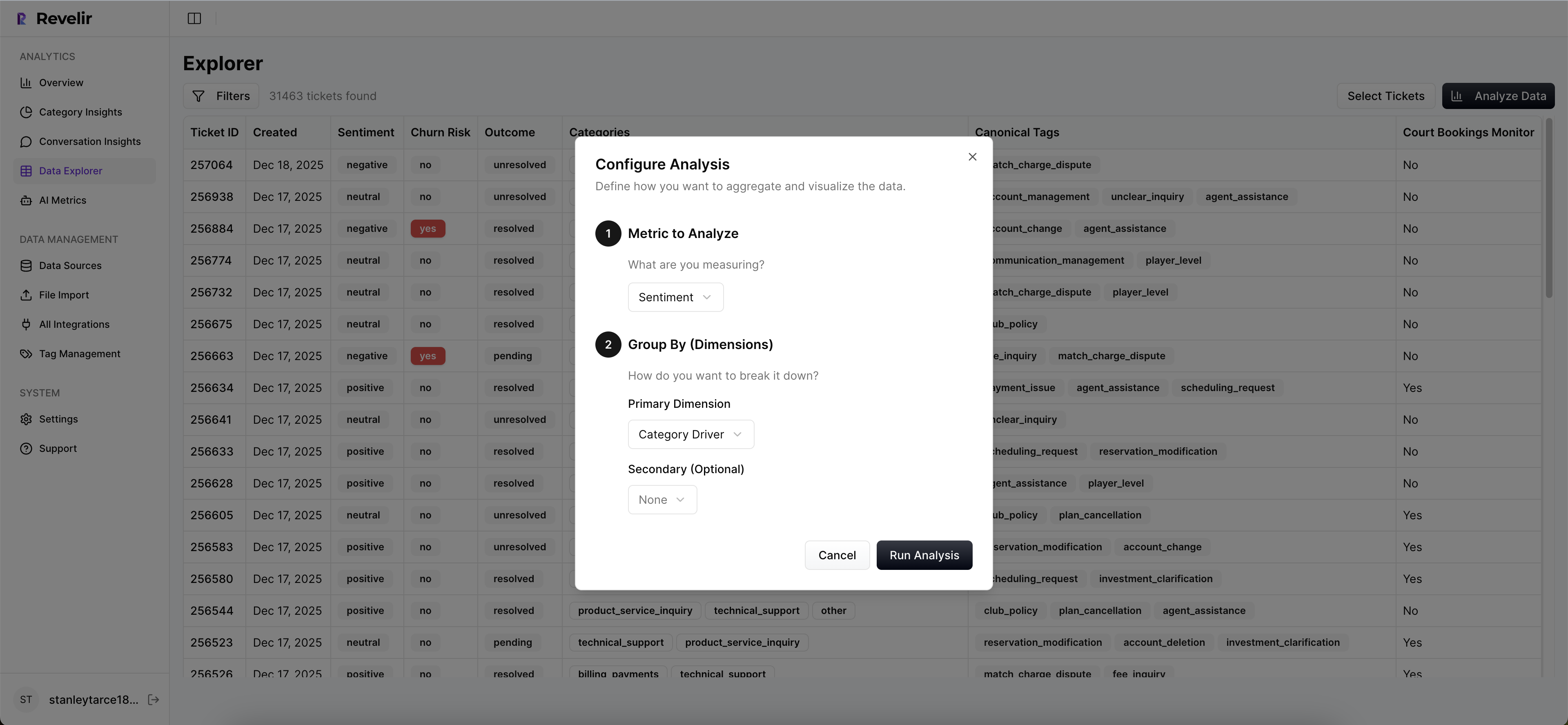
Analyze Data And Data Explorer For Precise Cohort Pivots
Most questions need cohort context. Data Explorer lets you filter by sentiment, churn risk, effort, driver, canonical tag, and metadata like plan tier or region. Analyze Data summarizes results by the dimension you choose, with interactive counts that jump straight to tickets.
Drivers and canonical tags keep the story clean for leadership. Raw tags support discovery. You can start at “What’s driving negative sentiment among Enterprise new users?” and pivot to quotes in two clicks. Same workflow as your simulator, but live.
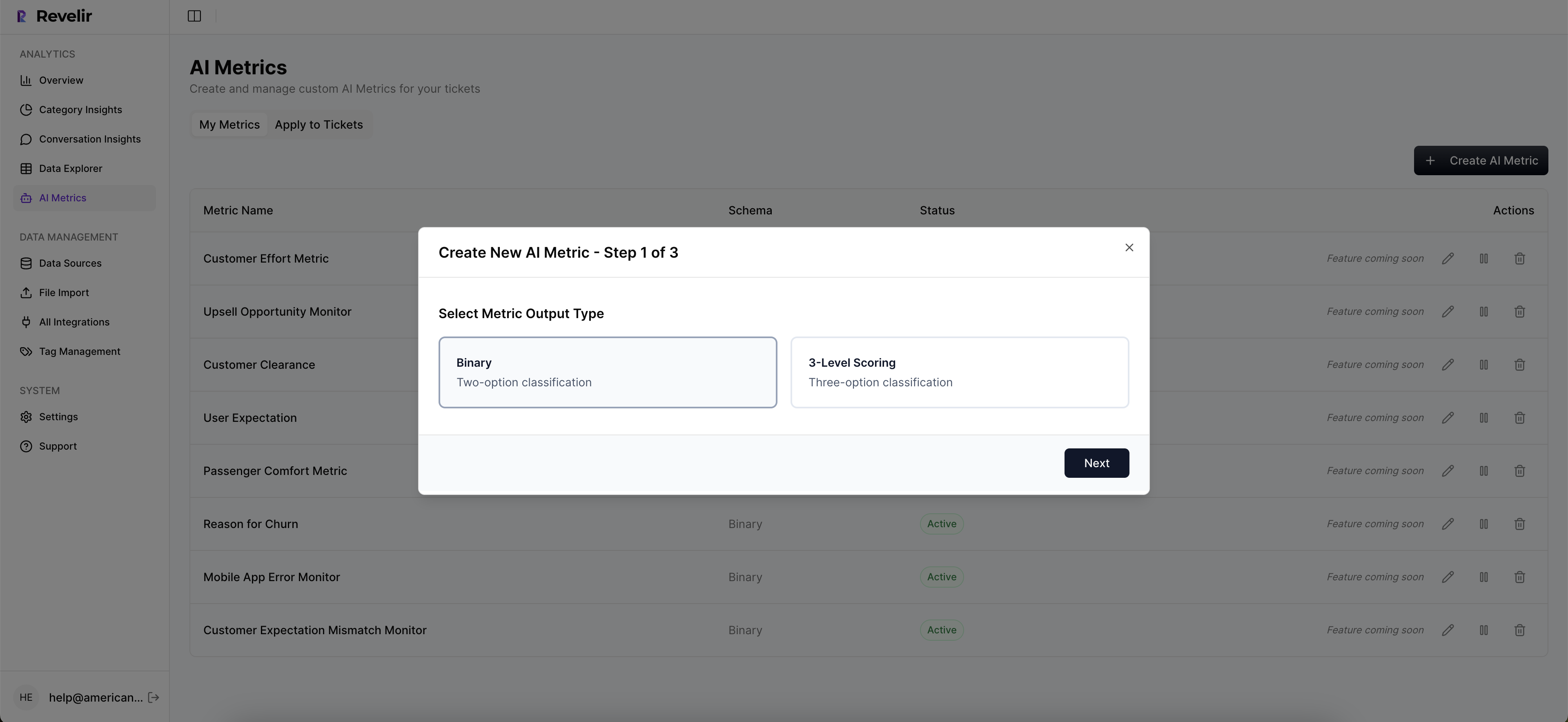
Custom AI Metrics And Export To Your ROI Model
Revelir AI includes out‑of‑the‑box metrics, Sentiment, Churn Risk, and Customer Effort, then lets you add Custom AI Metrics that match your language (for example, Upsell Opportunity or Reason For Churn). That means the signals you modeled for sensitivity are the signals you monitor every day.
When it’s time to refresh the marginal value curve, export the aggregated metrics into your reporting. Finance gets a maintainable link from coverage to ROI, not a one‑off spreadsheet. Evidence-backed and auditable.
Evidence-backed metrics from 100% of tickets. That’s what Revelir AI delivers. Get Started With Revelir AI.
Conclusion
Sampling feels efficient until it isn’t. Coverage sensitivity forces the real question: can you detect what matters, in time to act, with evidence you can defend? When the answer is yes, debates fade and decisions speed up.
Set your detection standard, simulate the tradeoffs, and operationalize with full coverage and traceability. You’ll spend less time arguing about representativeness and more time fixing what’s actually breaking.
Frequently Asked Questions
How do I analyze customer effort in Revelir AI?
To analyze customer effort using Revelir AI, start by accessing the Data Explorer. From there, you can filter tickets by the Customer Effort metric. Look for conversations marked as 'High Effort' to identify where customers are struggling. Next, utilize the Analyze Data feature to group these results by relevant drivers or canonical tags. This will help you pinpoint specific workflows or issues causing friction. By examining these insights, you can prioritize improvements that will enhance the customer experience.
What if I want to track churn risk over time?
To track churn risk over time with Revelir AI, first, ensure that you have the churn risk metric enabled in your AI settings. Then, use the Analyze Data feature to filter for tickets flagged with 'Churn Risk: Yes'. You can group these results by time periods, such as weekly or monthly, to observe trends. Additionally, drill down into specific segments to understand the underlying reasons for churn risk, using the Conversation Insights to view relevant ticket transcripts and feedback.
Can I customize metrics in Revelir AI?
Yes, you can customize metrics in Revelir AI to align with your business needs. In the setup, you can define custom AI Metrics that reflect specific aspects of your customer interactions, such as 'Upsell Opportunity' or 'Reason for Churn'. Once defined, these metrics will be applied consistently across your data, allowing you to analyze and report on them effectively. This flexibility ensures that the insights you gather are directly relevant to your team's goals and challenges.
When should I use the Analyze Data feature?
You should use the Analyze Data feature in Revelir AI whenever you need to gain insights from your support tickets quickly. It's particularly useful for answering questions about trends in sentiment, churn risk, or customer effort. For example, if you notice a spike in negative sentiment, you can run an analysis to identify which drivers are contributing to this trend. This feature allows you to group data effectively, making it easier to spot patterns and prioritize areas for improvement.
Why does Revelir AI emphasize 100% conversation coverage?
Revelir AI emphasizes 100% conversation coverage because sampling can lead to blind spots and missed critical signals. By processing all conversations, Revelir ensures that no important feedback or issue goes unnoticed. This comprehensive approach allows teams to make data-driven decisions based on complete insights rather than relying on partial data, which can skew understanding and lead to ineffective solutions.