

Most CX teams measure impact by comparing last month to this month. Volume down, sentiment up, call it a win. It feels clean. It rarely is. When fixes, staffing, seasonality, and pricing changes overlap, your “before and after” turns into a guessing game. You don’t need louder dashboards. You need causal attribution you can defend.
Here’s the practical version: decide what would have happened without your fix, then measure lift against that baseline. Tickets already contain the signals, effort, frustration, churn cues, product feedback. The trick is structuring them, choosing a credible counterfactual, and making the evidence audit‑ready. That’s how you end debates with product, finance, and your biggest customers. Proof, not hope.
Key Takeaways:
- Before/after deltas confound multiple moving parts; design a counterfactual and measure lift
- Use ticket-derived outcomes (effort, sentiment, churn risk) only with full coverage and traceability
- Quantify costs of misattribution: rework hours, bad roadmap bets, and delayed churn detection
- Build a 6‑step playbook: define outcomes, gate exposure, pick a design, validate cohorts, run power, stress test results
- Structure tickets into canonical tags and drivers so your cohorts match the product reality
- Close the trust loop with linked transcripts in every result you share
Why Before And After Deltas Get You In Trouble
Causal attribution in CX answers whether a fix caused an outcome change or whether the trend would’ve happened anyway. You need a counterfactual and a defensible design that separates signal from noise. With structured ticket metrics and consistent windows, you can show lift that stands up in product and finance reviews.

What is causal attribution in CX, and why does it matter?
Causal attribution forces a simple discipline: compare treated cohorts to a believable version of themselves without the change. That might be a holdout, a staged rollout, or a synthetic control. Retail leaders are already pushing this standard because attribution shortcuts warp decisions and investments, as argued in this 2026 CX measurement perspective. Same thing with support fixes, without a counterfactual, you’re debating anecdotes.
It’s usually not malice; it’s speed. We chase easy stories because leadership needs an update. But when the method is weak, the story frays under light questioning. If you’re the CX leader in that room, you want two things: a clean cohort design and evidence tied to real conversations. That’s the difference between a plan that moves and a plan that stalls.
Why counting tickets misses the point
Raw counts confound everything. A release goes out the same week support staffing changes. Pricing shifts. A regional outage hits one cohort harder. Pre/post deltas can’t separate these effects. You could be celebrating noise. Methods like difference‑in‑differences help by subtracting shared trends on the same timeline, a basic guardrail covered in this causal inference overview of pitfalls.
Nobody’s checking whether the cohorts had similar pre‑trends. Or whether the “treated” cohort also got faster responses because a high‑performer took over that queue. Without controls, you’ll misread a staffing improvement as a product win. That’s avoidable. It just takes a little design discipline upfront.
If you want to skip the theory and see how teams structure this with full‑coverage, traceable metrics, you can See How Revelir AI Works.
Find The Real Root Cause Of Attribution Arguments
Attribution arguments persist because teams lack structured, auditable signals. Exports show volume and CSAT, not drivers or valid controls. When you structure 100% of conversations into canonical tags, drivers, and AI metrics, and link every aggregate to the underlying tickets, debates shrink. You’re arguing assumptions, not data validity.

What traditional approaches miss
Most workflows stop at volume and score tiles. The reason debates keep looping is simple: there’s no shared path back to evidence. Unstructured text means leaders can’t verify “why” without reading a pile of tickets by hand. Black‑box metrics don’t help if nobody can audit the logic behind a trend.
The fix isn’t more slides. It’s a better base layer: consistent tags, drivers, and full‑coverage metrics that are clickable down to transcripts. Now, when someone asks “what’s actually behind this dip,” you show the driver‑level view and three representative quotes. Arguments move from “do we trust this” to “which fix ships first.”
The hidden complexity when your signals are ticket derived
Ticket signals are categorical and sparse. High‑effort flags, churn risk, rare bugs. Low base rates make power and precision fragile. You also have autocorrelation (tickets aren’t independent hour to hour) and operational shocks (staffing, policy, release trains) that distort reads. If your tags drift or windows are unstable, your estimates wobble.
So you enforce discipline: keep canonical tags clean, map raw tags to drivers, and lock stable pre/post windows. Treat quasi‑experiments like real ones. Document assumptions, check pre‑trends, and run falsification tests. It’s not overkill. It’s how you avoid the quiet mistakes that cost you a quarter.
How a counterfactual reframes measurement
Once a credible counterfactual exists, the temperature drops. A holdout cohort, a gated rollout, or a synthetic control clarifies “what would have happened.” Your chart now shows lift against that baseline, not a raw trend line. Better yet, you attach quotes from the treated cohort that explain the “why” behind the shift.
When stakeholders see the same cohorts, the same timeline, and linked evidence, alignment happens faster. You’re not asking for belief. You’re asking them to read the graph and the transcript that drove it.
The Hidden Costs Of Unproven Fixes
Unproven fixes don’t just waste time; they create rework, bad bets, and delayed churn detection. Each misread compounds. Hours get lost, roadmaps drift, and the risk sneaks up on you. With defensible designs, you reduce these costs before they spiral.
Engineering hours lost to rework
Let’s pretend you ship a “login friction” fix. Tickets look better for two weeks, then bounce back. You adjust the flow, then again. If a five‑person squad burns roughly 80 hours per iteration, two reworks in a quarter cost ~800 hours. The kicker: billing configuration was the real driver all along.
The literature on causal bias is clear, weak designs inflate false conclusions, which inflate cost. You can see how this happens in this review of causal pitfalls. Evidence upfront is cheaper than rework. It saves engineering hours and reduces the headache of walking back a win you announced too early.
When false positives drive bad roadmap bets
You celebrate a dip in complaints. Six weeks later, you find it aligned with a staffing shift that temporarily reduced response times. The fix didn’t move the core driver; service levels did. That false positive diverted roadmap capacity, and now you’re behind on the real issue.
Roadmaps are a zero‑sum game. Misattribution steals focus from higher‑impact work and erodes trust with leadership. A defensible counterfactual, holdout, DiD, or synthetic control prevents premature victory laps. It keeps priority anchored to real lift.
Still trying to sort this with manual reviews and a few charts? There’s a faster path. Learn More about building a measurement layer that produces audit‑ready reads.
How missed signals compound churn risk
If churn risk drivers in onboarding are under‑detected, CSMs intervene late. Late outreach increases escalations, which inflate volume and burnout. Burnout drives quality down, sentiment worsens, and backlog grows. The loop tightens.
Full coverage metrics and causal readouts break the loop. When you can show “treated new accounts saw a 3‑point drop in high‑effort rate versus holdout, driven by onboarding flow,” you focus intervention where it matters. You also stop overfitting response time improvements to product changes that didn’t actually help.
The Moment When You Need Proof, Not Hope
The moment you need proof is when stakes go beyond your team, big customers, tight budgets, and skeptical execs. A causal read with traceable evidence ends the debate. Cohorts, windows, lift, and quotes on one page. Confidence follows.
When your biggest customer asks for evidence
You shipped a checkout fix meant to reduce high‑effort tickets. Your enterprise sponsor asks: did this move effort and sentiment for my users? You need a clean read: cohorts, gating, pre/post windows, lift, and linked transcripts. Include three representative quotes that describe the friction, before and after.
Service recovery research shows perceptions hinge on both resolution and evidence of effort, which you can ground in real conversations and outcomes (see this study on recovery perceptions). When you walk them through the design, the lift, and the words customers used, the debate ends quickly. You didn’t ask for trust. You showed it.
A Six Step Playbook CX Teams Can Run This Month
A practical playbook turns attribution from theory into routine. Define outcomes, gate exposure, pick a design, validate cohorts, check power, then analyze with stress tests. Do it once, then reuse the template every sprint.
Step 1: Define outcomes and counterfactuals
Pick one to two primary outcomes from ticket signals: high‑effort rate, negative sentiment share, churn risk rate. If a business KPI is available (refunds, downgrades), add it. Define cohorts and a counterfactual: holdout customers, specific geographies, or a synthetic control built from historical donors. Lock pre/post windows by release date and document assumptions that could violate parallel trends.
Most teams forget the assumptions. Don’t. List plausible confounders (pricing shifts, staffing changes, policy updates) and how you’ll monitor them. For structure, a simple weekly outcome table by cohort and window is enough to start. The prerequisites and pitfalls are covered in this causal methods overview.
Code hint (keep it simple first):
- Compute weekly outcome rates by cohort_id
- Tag records with window_flag = pre/post based on release date
- Store assumptions and known shocks alongside the dataset
Step 2: Instrument low friction gating and logs
Gate the fix with a feature flag or a cohort filter so assignment is auditable. Log user/account, driver, timestamp, and exposure status. Avoid heavy engineering; reuse existing metadata fields for cohort gates. Ensure ticket ingestion captures the fields you’ll need to join exposure to outcomes. Validate with a short dry run before rollout.
It’s usually the join that breaks later. If exposure isn’t reliably linked to cohorts, you can’t analyze. Keep the gating rules dumb‑simple, version them, and write them down. Practical instrumentation choices for quasi‑experiments are discussed in this dissertation on real‑world causal methods.
Step 3: Choose a fit for purpose causal design
Pick a design based on rollout constraints and data shape. Difference‑in‑differences for staged rollouts with credible parallel trends. Synthetic control for a single treated unit with a decent donor pool. Regression discontinuity if eligibility is cleanly thresholded and hard to manipulate. Pre‑register your choice and falsification checks to avoid analysis drift.
Not sure which to choose? Start with DiD if you have parallel pre‑trends; it’s interpretable and practical. If treated units are few, synthetic control often stabilizes estimates. Design trade‑offs in marketing‑like settings are summarized in this short paper.
Interjection: Don’t over‑engineer the first run. Get a credible read, then tighten.
Step 4: Build and validate cohorts from ticket data
Use canonical tags and drivers to isolate fix‑relevant tickets. Construct cohorts with stable IDs (account_id, plan_tier, region). Create pre/post windows (for example, 28 days each) and compute outcome rates. Validate label stability by sampling tickets in a drill‑down view and confirming that tags and AI metrics match the story you think you’re telling.
Nobody’s checking label drift until it bites. Do a quick weekly pass: are “billing” tickets still rolling up correctly? Are effort and churn flags consistent in similar transcripts? Cohort building only works if the underlying taxonomy is clean. Conceptual grounding for causal attribution choices is outlined in this short primer.
SQL template idea:
- Create a cohort table with exposure_flag by cohort_id and release_date
- Aggregate weekly outcome rates by cohort_id and window_flag
Step 5: Run power and sample size checks
Ticket outcomes are often low base rate. Use a difference‑in‑proportions power check for binary outcomes like churn risk Yes or high effort. For DiD, approximate power using cluster‑robust variance and historical outcome variance. If underpowered, extend windows, increase rollout size, or target higher‑incidence segments. Document detectable effect sizes before you analyze.
This isn’t overkill. It’s the guardrail against inconclusive reads that waste time. Practical notes on power in observational settings appear in this causal pitfalls overview.
Python sketch:
- Estimate baseline p0 from pre period
- Solve n per group for detecting delta at your alpha/power
- Simulate detectable effect for DiD using historical variance and cluster size
Step 6: Analyze, stress test, and report with traceable evidence
Estimate the effect with your chosen design, include covariates like plan tier and region, and use robust standard errors. Run placebo tests on the pre period, falsification outcomes unrelated to the fix, and balance checks on pre‑trends. Package results with cohort definitions, assignment logic, effect size, confidence interval, and links to representative tickets.
Treat the report like a mini dossier. Method on one page, lift chart on the next, quotes that explain the why. Robustness considerations for attribution models are discussed in this methods review. That combination, numbers and words, travels well in leadership and customer meetings.
How Revelir AI Makes This Playbook Easier
The playbook works without new tooling. But it’s slower and riskier. Revelir AI speeds the work and reduces mistakes by giving you full‑coverage, structured signals and traceability by default. You focus on design, not plumbing.
Revelir processes 100% of uploaded or ingested tickets, no sampling, and assigns sentiment, churn risk, effort, raw tags, canonical tags, and drivers to every conversation. That creates consistent outcomes and covariates you can trust. Anywhere you see an aggregate, you can click to the ticket‑level view with full transcripts and AI summaries. Leaders ask “What’s behind this?” You show the exact conversations. That’s the trust loop, closed.
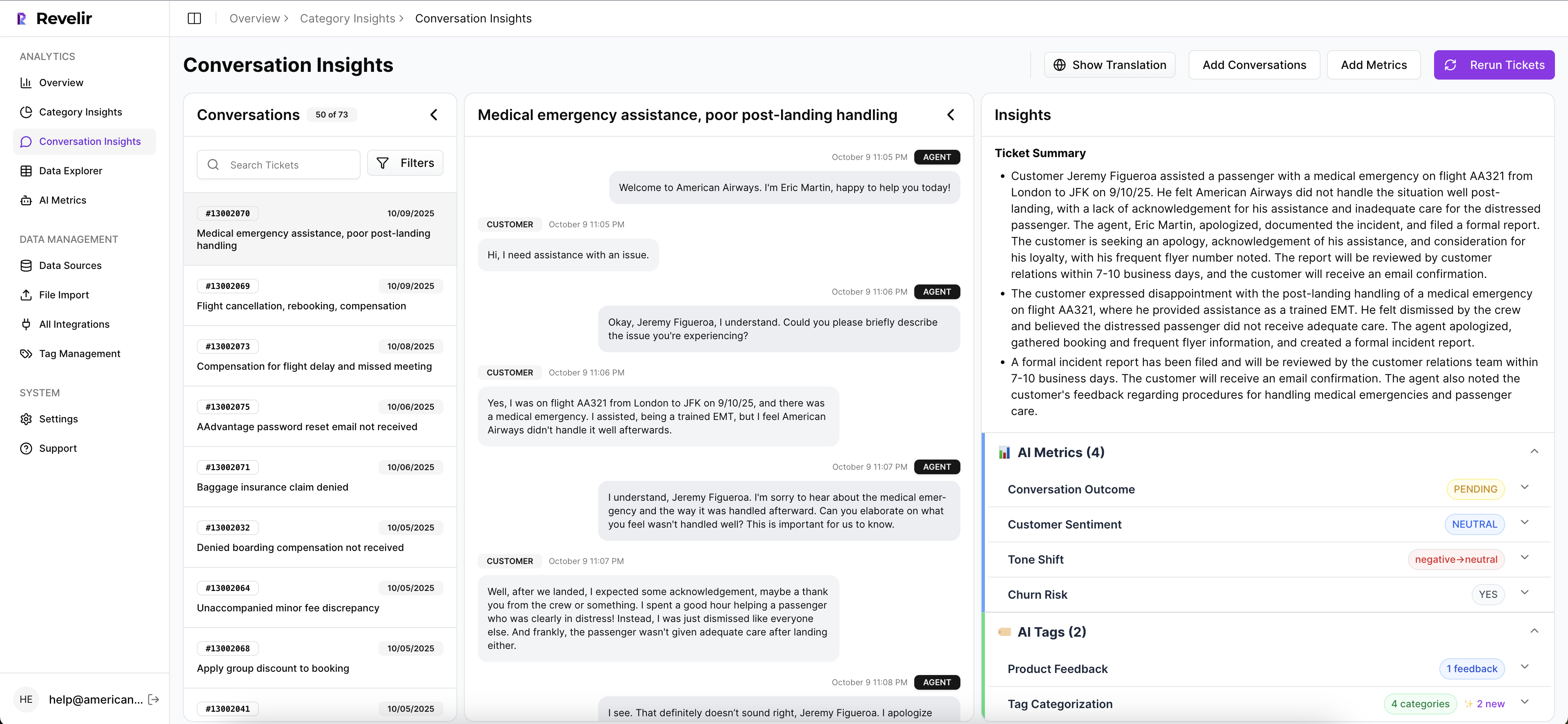
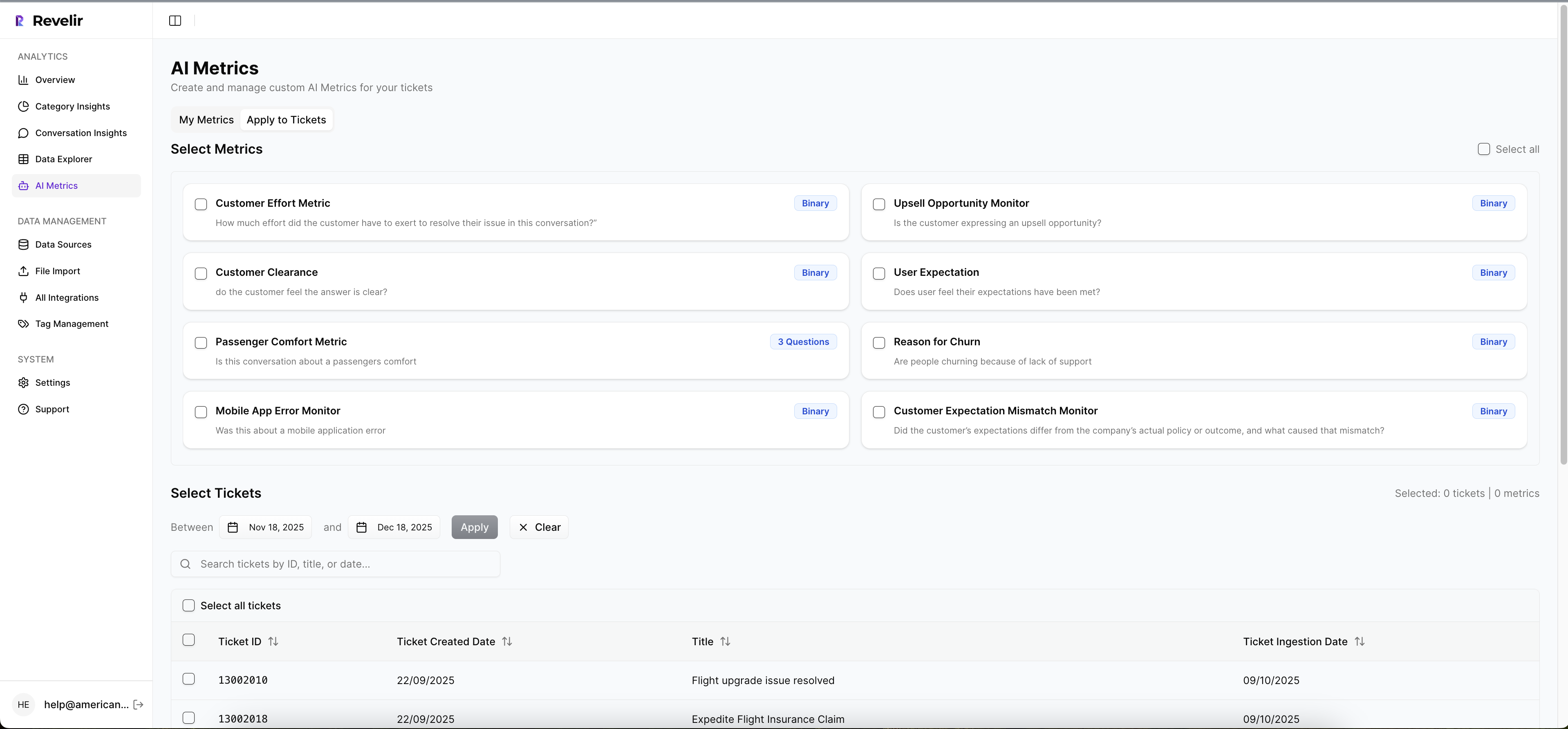
Cohort construction is fast in Data Explorer. You filter by driver (Billing, Onboarding, Performance), canonical tag, segment, or any imported metadata, then save the views you need for your design. With Analyze Data, you pivot outcomes by driver or category to isolate where the fix should show up. When you need to validate, Conversation Insights gives you the transcript, summary, and assigned metrics on the spot. No second system, no copy‑paste fishing.
When it’s time to run the model, export structured datasets via API or CSV, already enriched with the outcomes and tags you selected, and join them to your feature‑flag exposure table. Reuse the same cohort filters for future fixes so the method becomes a habit, not a one‑off project. We’ve seen this reduce frustrating rework and shorten the cycle from “fix shipped” to “effect measured.”
Want to move from anecdotes to evidence this quarter? See How Revelir AI Works. Ready to run your own data through it and validate impact? Get Started With Revelir AI. Also available at Learn More
Conclusion
Causal attribution for CX isn’t a research hobby. It’s how you prove which fixes matter and which don’t, using the tickets you already have. Define outcomes, pick a counterfactual, validate cohorts, and bring quotes to the table. With full‑coverage, traceable metrics, your reads hold up in the rooms where priorities are set. Less rework. Fewer bad bets. More decisions you can defend.
Frequently Asked Questions
How do I set up ticket tagging in Revelir AI?
To set up ticket tagging in Revelir AI, start by connecting your helpdesk, like Zendesk, to import historical tickets. Once connected, Revelir automatically generates raw tags based on the conversation content. You can then refine these by creating canonical tags that align with your business language. This hybrid tagging system ensures that future raw tags are categorized correctly, making it easier to analyze trends and insights. After tagging, use the Data Explorer to filter and analyze tickets based on these tags.
What if I need to analyze customer effort in Revelir AI?
If you want to analyze customer effort, first ensure that your dataset includes sufficient conversational cues. Then, in Revelir AI, you can filter tickets by customer effort using the Analyze Data feature. Select 'Customer Effort' as the metric and group by relevant dimensions like canonical tags or drivers. This will help you identify workflows causing friction and prioritize areas for improvement. You can also drill down into specific tickets to validate your findings with real conversation examples.
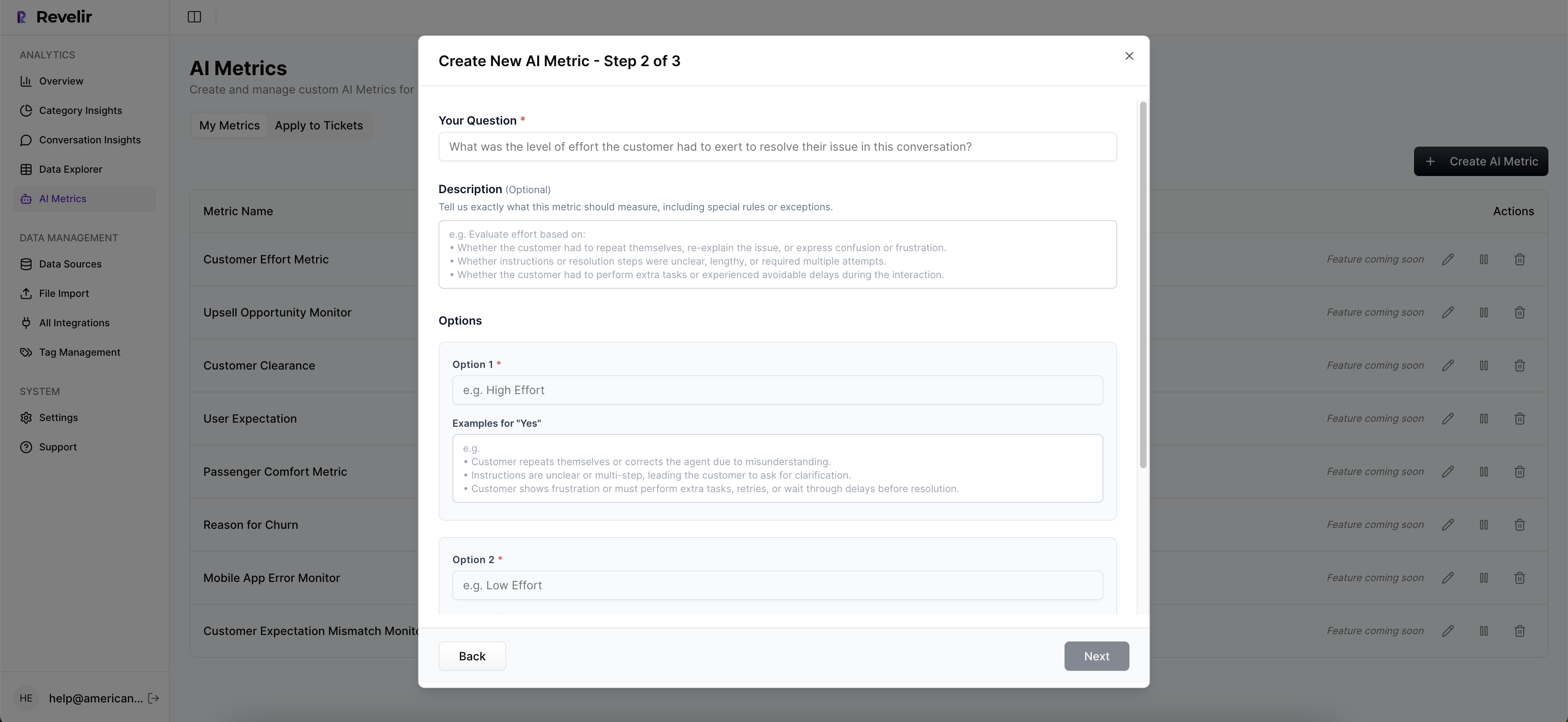
Can I customize metrics in Revelir AI?
Yes, you can customize metrics in Revelir AI to match your business needs. You can define custom AI metrics that reflect specific aspects of your customer interactions, such as 'Upsell Opportunity' or 'Reason for Churn.' Once set up, these metrics will be applied consistently across your ticket data. This allows you to analyze and report on metrics that are most relevant to your organization, enhancing your ability to drive actionable insights from customer conversations.
When should I validate insights with Conversation Insights?
You should validate insights with Conversation Insights whenever you identify trends or patterns in your data that require deeper understanding. After running an analysis in Revelir AI, click into specific segments to access Conversation Insights. This feature allows you to view full transcripts, AI summaries, and associated metrics for each ticket. By validating insights with real examples, you can ensure that the patterns you observe align with actual customer experiences, which is crucial for making informed decisions.
Why does Revelir AI emphasize evidence-backed insights?
Revelir AI emphasizes evidence-backed insights because they provide a reliable foundation for decision-making. By processing 100% of support conversations, Revelir eliminates the biases associated with sampling and ensures that insights are based on complete data. Each metric is traceable back to the exact conversation, allowing you to validate findings with real quotes. This transparency builds trust among stakeholders and helps teams prioritize actions based on concrete evidence rather than assumptions.