

Score-only dashboards feel tidy. They give you a number to hold up in reviews. But churn doesn’t start as a score. It starts as friction hidden in transcripts — the moments when a customer says “this is the second time,” or hints they’re reconsidering the contract. If you’re only watching CSAT curves, you’re late.
The fix isn’t to stare harder at the dashboard. It’s to change the unit of analysis. Driver-level sentiment, tied to effort and traceable down to real quotes. That’s the layer where product fixes become obvious, CSMs know who to call, and leadership stops asking, “Where did this number come from?” You want fewer debates. More decisions.
Key Takeaways:
- Stop sampling. Process 100% of tickets into driver-level sentiment, effort, and churn risk with traceable evidence
- Replace score-watching with seven conversation-derived metrics that forecast churn risk earlier
- Use drivers, raw tags, and canonical tags together to get discovery and clarity
- Trend density and overlap, not just volume, to separate noise from signal
- Validate every spike by clicking into the exact conversations and quotes
- Operationalize in Data Explorer and Analyze Data so teams move from insight to action
Why Score-Only Dashboards Miss Early Churn Signals
Score-only dashboards miss early churn signals because they don’t explain why sentiment moved or who’s affected. Scores summarize, but they don’t expose drivers or friction hotspots. For example, a CSAT dip won’t tell you that new enterprise admins are stuck in account verification loops.
Why conventional wisdom around CSAT misleads prioritization
CSAT and NPS are fine for sentiment trends, but they’re weak at cause. It’s usually the high-friction tickets that never answer surveys, so your clean curve underrepresents the ugliest work. Same thing with “overall negative” — useful, but it doesn’t explain where to place the next sprint. If you don’t tie sentiment to drivers and effort, you end up shipping generic patches (more help docs, mass emails) while the real issue — say, payment retries failing on a specific flow — keeps burning.
The nuance matters because leadership needs trade-offs, not vibes. A tidy CSAT line doesn’t help a PM decide between fixing onboarding steps 2–3 or chasing the latest anecdote. Driver-level breakdowns do. When you can say, “45% of negative sentiment among new enterprise accounts sits under Account Access,” you’re not guessing. You’re prioritizing with evidence tied to actual conversations, not a thin survey sample.
What is the difference between sentiment labels and sentiment drivers?
A label says “negative.” A driver explains “why it’s negative.” That difference is the gap between a dashboard tile and a roadmap decision. Drivers expose the product areas creating friction — Billing, Onboarding, Account Access — rather than lumping everything into red/green. You can trend negative density by driver, see effort overlap, and pinpoint where escalation risk concentrates.
Here’s the thing: nobody’s checking the root cause if the system can’t show it. When teams only see labels, they default to band-aids. When they see drivers, they focus on fixes that move the metric for real customers. If you want a quick sanity check, scan a driver, then click into a few conversations. If the examples match the claim, you’re on the right path.
Traceability is the trust check leadership needs
Executives ask one question when a chart hits the slide: “Show me where this came from.” If you can’t click a cell and land on exact conversations and quotes, the meeting stalls. Evidence-backed traceability converts skepticism into alignment. It’s how a VP of Product moves from “maybe” to “we’ll fix it this sprint.”
Traceability also reduces rework. When everyone sees representative quotes, the spec gets sharper and the fix lands closer to the pain. You waste fewer cycles defending a graph and more cycles resolving the driver behind it. For context, frameworks like Gainsight’s 2025 CX metrics guide emphasize moving from vanity scores to actionable, explainable measures. Same principle here — but with the receipts attached.
Ready to skip theory and see it live on your own tickets? See how Revelir AI works.
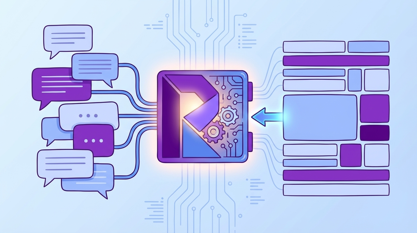
The Real Unit of Insight Is Driver-Level Sentiment With Traceable Evidence
The real unit of insight is driver-level sentiment with traceable evidence because it translates raw conversations into fixable themes. It balances discovery (raw tags) with clarity (canonical tags) and leadership alignment (drivers). For example, Billing negative density surfaces a payment retry issue weeks before renewal season.
Drivers, raw tags, and canonical tags work together
Raw tags catch the messy, emergent language your customers use. Canonical tags normalize that language for reporting. Drivers summarize at a level executives understand. Together, you get a taxonomy that’s flexible enough for discovery, clean enough for decisions, and stable enough for trending. You don’t have to choose between nuance and clarity.
When this stack is in place, the questions you ask get better. “What’s driving negative sentiment among enterprise self-serve signups?” becomes answerable in minutes, not weeks. You can pivot by driver, then click into representative tickets to validate. This is also where Revelir AI shines: full coverage and evidence-backed drill-downs preserve context while keeping analysis fast.
How full coverage changes your detection window
When 100% of tickets are processed into metrics, weak signals appear earlier. You catch churn-risk density rising under Account Access before it shows up in revenue. You see high-effort overlap spike on a specific workflow, not just a vague trend. Without coverage, those signals stay invisible or arrive too late to matter.
Coverage also kills the “is this representative?” debate. With full-population metrics, you stop sampling and start deciding. Market write-ups like Bombora’s churn prediction overview underline the importance of early signals and segmentation; driver-level sentiment with traceability is how you operationalize that inside support data.
The Hidden Cost of Misreading Ticket Sentiment
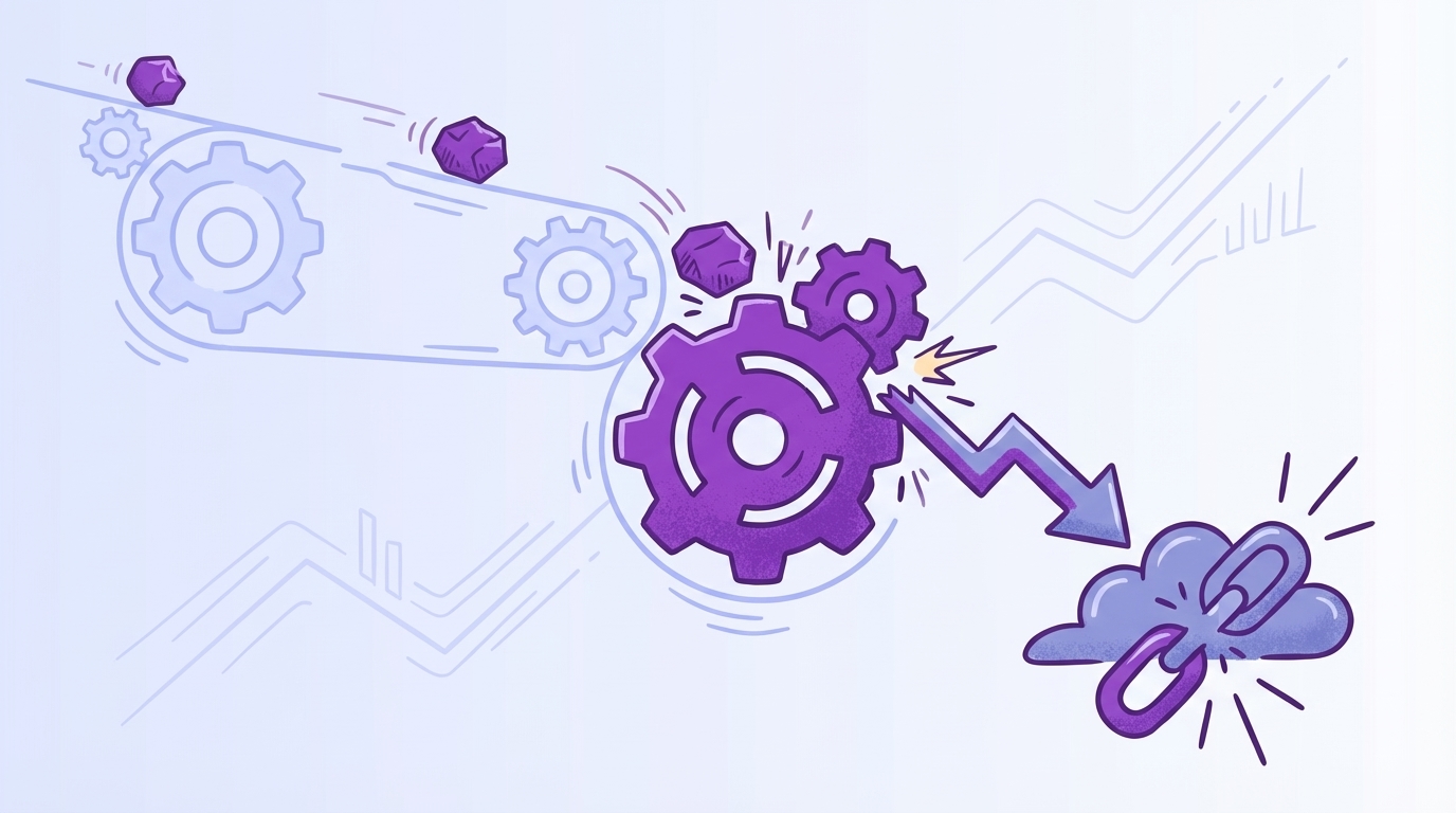
Misreading ticket sentiment burns engineering cycles, inflates CX workload, and erodes trust across teams. False positives push teams to chase noise; blind spots delay attention where it’s needed most. A week of delay isn’t a week. It’s a cohort of conversations you’ll pay for at renewal.
Engineering and CX hours lost to misguided fixes
Let’s pretend your CSAT dips, so you ship a help article and a comms blast. Two sprints later, tickets are flat and escalations grow. You didn’t fix the driver — you documented around it. That’s frustrating rework for support, a headache for product, and a credibility hit in leadership updates. The opportunity cost compounds: the longer the misread persists, the more backlogs swell.
This is why driver-level measures beat generic sentiment every time. They make the cost obvious and the fix targeted. You can point to a sharp rise in negative density under Billing & Payments, not an abstract “sentiment down.” That clarity supports prioritization, aligns stakeholders, and prevents circular debates. As a cross-check, even practitioner lists like BuiltIn’s roundup of CS metrics emphasize linking measures to action — not just reporting a score.
How false positives and blind spots inflate churn
If your model flags generic negativity without linking to effort or churn risk, you’ll overreact to mild noise and miss the quiet, dangerous trend. False positives drag attention to low-impact issues. Blind spots mask the accounts that need CSM outreach now. Both increase churn exposure, especially in enterprise cohorts where every point of effort multiplies risk.
The fix is overlap and density, not labels alone. When you can show “20% overlap of high-effort and negative under Onboarding for enterprise,” you’ve isolated a real problem. That’s a stronger case than “sentiment is down,” and it produces a concrete plan — targeted product change plus proactive outreach on affected accounts.
What is the opportunity cost of late detection?
Every week you miss a pattern creates another cohort with the same friction. Late detection means more escalations, longer queues, stressed agents, and a renewal story that’s harder to defend. It’s not just the tickets. It’s morale, roadmap delays, and the trust tax you pay when numbers don’t connect to evidence.
The uncomfortable part: nobody’s checking for this if dashboards don’t surface it. The comfortable part: you can. Tie driver-level sentiment to effort and churn risk, trend density, and click into conversations to verify. You’ll get fewer surprises and fewer 3am emails asking what went wrong.
If you’re still juggling surveys and ad-hoc reviews, you’re carrying this cost. There’s a cleaner way. Learn More.
When Small Friction Turns Into Renewal Risk
Small friction becomes renewal risk when the same driver repeats across an account without a targeted fix. Repeat-issue rates, escalation velocity, and driver-level negative density reveal the pattern early. For example, two account access failures in a month often precede a tense executive escalation.
The 3am executive email after an escalation
You know this one. A high-value customer hits the same blocker twice, tickets bounce, and suddenly an executive email drops at 3am. Now everything is urgent. If you had seen driver-level sentiment with effort overlap climbing last week, you would’ve routed a product fix and a CSM check-in, not a fire drill.
This is where evidence changes the tone. When you can paste three quotes from real transcripts and show the trend line for that driver, the conversation shifts from blame to plan. It’s not “Support missed it.” It’s “This workflow is failing under load; here’s the evidence and the fix.”
Why your team feels stuck between anecdotes and dashboards
Agents feel the pain in the queue. Dashboards look fine. That gap breeds doubt and slows decisions. When every metric links to representative conversations, the narrative lines up. People stop arguing about whether the problem is “real” and start debating solution options.
A practical move: trend repeat-issue rate and escalation velocity by driver. If both are creeping up, you don’t need a survey to know you have a renewal risk forming. Guides like ChurnZero’s churn analysis steps echo the value of segmentation and pattern validation — you’re just doing it with the evidence in your queue.
Seven Ticket-Derived Sentiment Metrics That Predict Churn
Seven ticket-derived sentiment metrics predict churn by isolating where friction concentrates, how fast it escalates, and who’s affected. They focus on density, overlap, and repeat patterns rather than raw volume. Think: negative density by driver, effort overlap, and escalation velocity — all traceable to real conversations.
Metric 1: Negative Sentiment Density by Driver
Negative sentiment density by driver shows the percent of negative tickets for a driver in a time window. It normalizes for volume and highlights where frustration is spiking relative to baseline. Track it week over week, and you’ll see trouble forming before overall sentiment moves.
Definition in plain English: count negative tickets under a driver, divide by total tickets for that driver, then compare against recent history. Validate by clicking into a handful of examples to ensure the driver context matches. Alert when density rises 30% over baseline for two consecutive periods, or crosses 45% in enterprise segments.
Metric 2: Churn-Risk Density by Canonical Tag and Cohort
Churn-risk density measures the share of tickets flagged “churn risk” within a canonical tag for a cohort like plan or region. Cohorts prevent small-business and enterprise signals from canceling each other out. The result is a focused view of who’s at risk and why.
Compute by dividing churn-risk “Yes” tickets in the tag-and-cohort by all tickets in that tag-and-cohort. Validate with examples and ensure the cohort metadata is accurate. Trigger CSM outreach when a top-revenue cohort crosses its trailing 3-month 75th percentile. This is your “call now, not later” alarm.
Metric 3: High-Effort × Negative Sentiment Overlap
Overlap isolates friction hotspots by finding tickets that are both high effort and negative sentiment, grouped by driver. It answers the “where is the work genuinely painful?” question. Effort sharpens prioritization because customers forgive the occasional bug; they don’t forgive slog.
Calculate the share of tickets under a driver that are both high effort and negative. Ensure effort detection is enabled and populated; if it’s empty, fix the input before you trust the output. Alert product when overlap surpasses 20% for any driver with at least 50 tickets in the period.
Metric 4: Escalation Velocity
Escalation velocity measures the median time from an account’s first ticket on a driver to its first escalation related to that driver. Falling velocity means issues escalate faster — an early warning that patience is thinning. It’s the time dimension most teams miss.
Compute per driver, trend weekly, and spot check timestamp sequences for accuracy. If velocity drops by 25% vs baseline and negative density is climbing, assume risk is accelerating. That’s your cue to coordinate product, CX, and CSM actions before the executive email appears.
Metric 5: Repeat-Issue Rate by Driver
Repeat-issue rate captures the percent of accounts logging more than one negative ticket on the same driver within 30 days. Repeats mean the fix didn’t stick or never addressed the root cause. Accounts notice. Renewals do too.
Compute as distinct accounts with 2+ negatives on the driver divided by distinct accounts with any ticket on that driver. Normalize by segment; an enterprise repeat threshold should be tighter than SMB. Watch for 10%+ in enterprise or 15%+ in SMB with at least 20 affected accounts — that’s risk worthy of a focused fix.
Metric 6: VOC Emergence Score
VOC emergence score spots new problems early by tracking growth of raw-tag clusters relative to their historical average. Raw tags are your early-warning radar; canonical tags follow once patterns stabilize. This metric tells you when a small theme becomes a real topic.
Divide the current 4-week count of a raw-tag cluster by its trailing 12-week average. If the score exceeds 2.0 and the associated sentiment density is rising, pay attention. Click into examples, confirm the mapping, and decide whether to formalize a canonical category for cleaner reporting.
Interjection.
Metric 7: Weighted Sentiment Index
Weighted sentiment combines negative sentiment, high effort, and churn risk, then applies customer value weights. It’s a prioritization layer, not a replacement for individual metrics. Think of it as your executive roll-up when the team needs one number to rank fixes.
Example: index = (1.0 × % negative) + (1.2 × % high effort) + (0.5 × % churn risk), multiplied by a revenue weight per cohort. Tune weights with stakeholders, validate against past periods, and use it to sort the queue — then drill down with the underlying metrics to plan the actual work.
How Revelir AI Computes, Validates, and Operationalizes These Metrics
Revelir AI computes, validates, and operationalizes these metrics by processing 100% of your conversations, turning them into structured fields, and keeping every aggregate one click from the source transcript. Teams filter, group, and drill through in minutes, then share evidence-backed insights. For example, negative density by driver is computed, trended, and tied to quotes in one workspace.
Data Explorer turns tickets into grouped metrics you can trust
Data Explorer works like a pivot table for your tickets. You filter by sentiment, churn risk, effort, tags, and drivers; group by canonical tag or driver; then click any count to see the exact conversations behind it. That’s how you compute densities, overlaps, and repeat-rate metrics with confidence — you can always validate with the underlying tickets.
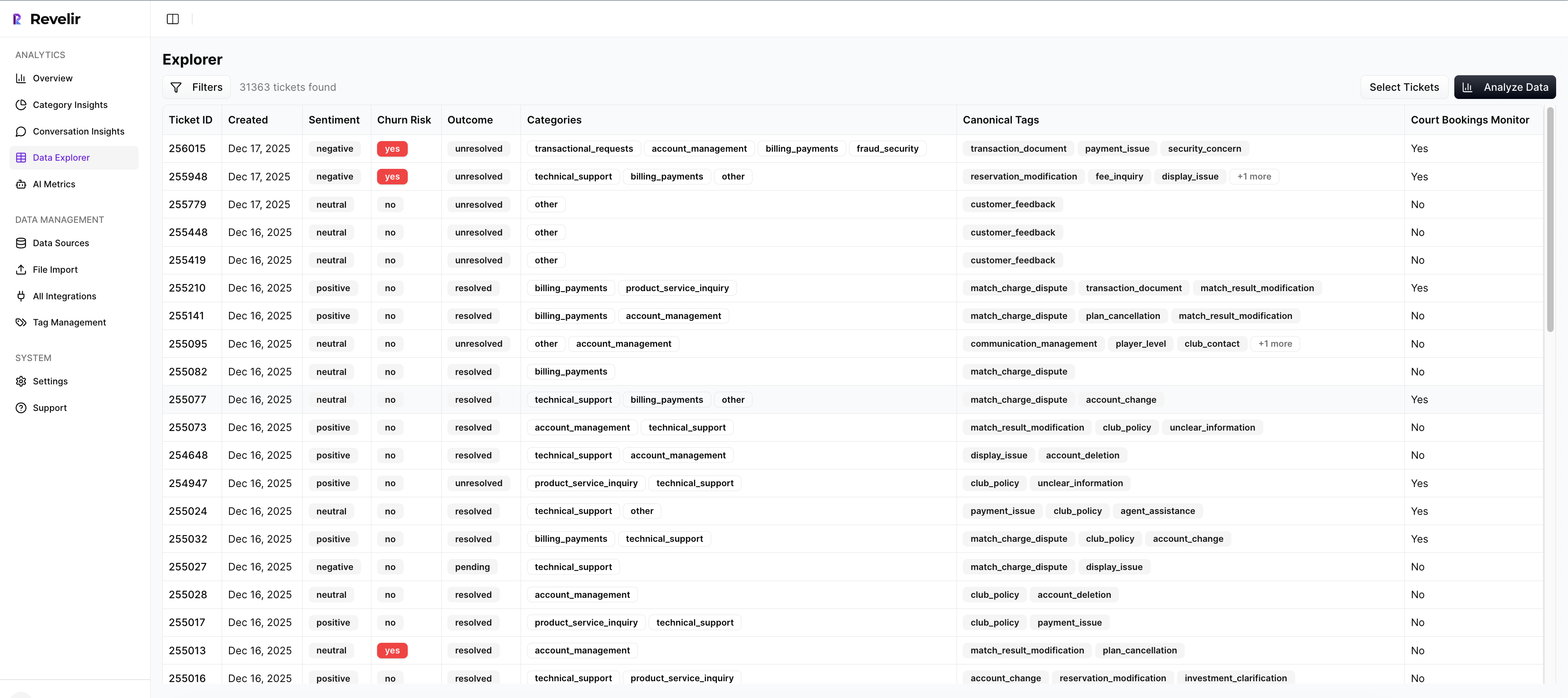
Revelir AI makes this fast because coverage is complete and fields are consistent: Sentiment, Churn Risk, Customer Effort, raw tags, canonical tags, and drivers are present across the dataset. You move from aggregate to example and back without switching tools or exporting to spreadsheets. Fewer exports. Fewer arguments. More decisions.
Analyze Data provides fast aggregation with drill-through
Analyze Data is the “pick your metric, pick your grouping, run” accelerator. You select the metric (sentiment, churn risk, effort, or custom), choose a grouping (driver, canonical tag, cohort), and Revelir AI renders a results table and a chart. Every cell is interactive, so you can drill into “19 churn-risk tickets in Billing for Enterprise” instantly.
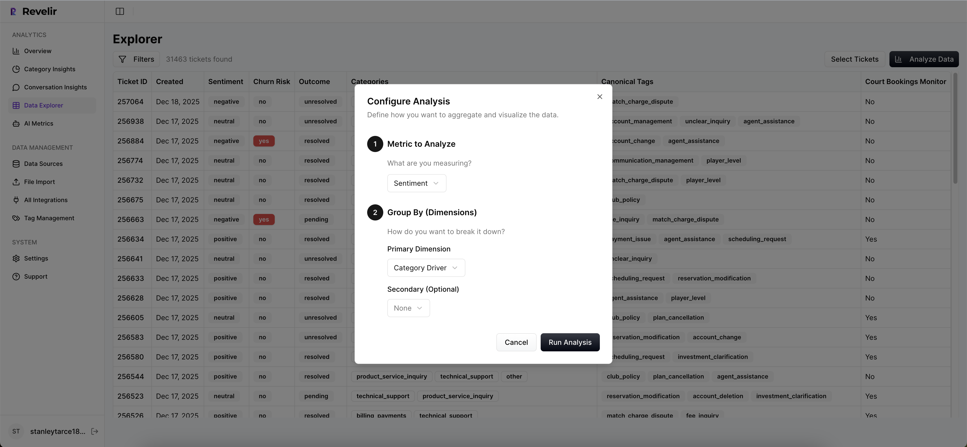
Teams use this to trend escalation velocity by driver, scan churn-risk density by cohort, and validate VOC emergence before recommending fixes. It’s also the place to run periodic reviews — the same setup, month over month, with traceable examples ready for slides. For broader context on CX measurement, resources like Contentsquare’s CX metrics guide echo the need for actionable, segmented views.
Evidence-backed traceability keeps stakeholders aligned
Revelir AI is designed for trust. Every chart and metric links back to the exact conversation and quote that generated it. When someone asks, “Show me where this came from,” you’re one click away. That’s how you close the trust gap that stalls decisions and turn meetings into alignment sessions instead of forensic reviews.
This traceability also tightens feedback loops. Product sees the driver and three quotes, ships a targeted fix, and you watch density and overlap shift the next week. CX coaches with clarity. CSMs reach out with context. You’re not debating the number; you’re acting on the evidence.
Custom AI metrics and taxonomy mapping reflect your language
Revelir AI adapts to your business language. Use raw tags for discovery, map them into canonical tags, and organize under drivers leaders recognize. Enable core AI metrics (Sentiment, Churn Risk, Customer Effort) and define custom metrics when needed. The output stays aligned with how your org talks about problems, so reporting is clear and adoption sticks.
Because Revelir AI processes 100% of conversations and remembers your mappings, your taxonomy gets cleaner over time. Analyses get faster. And when you compare periods, you’re comparing like to like — not a shifting set of labels. Want to see your own data in this flow? See how Revelir AI works.
Revelir AI ties directly back to the costs we unpacked earlier: fewer misguided sprints, earlier detection of churn risk, and less time lost to defending charts without evidence. It’s the intelligence layer that sits on top of Zendesk or your CSVs — not a rip-and-replace — so you can go from unstructured text to structured, defensible metrics in minutes, and keep the receipts for every claim.
Conclusion
Most teams aren’t short on data. They’re short on the right unit of insight — driver-level sentiment, tied to effort and churn risk, with quotes attached. Shift to the seven metrics above and you’ll see churn signals earlier, prioritize with confidence, and cut the rework. If you’re ready to anchor decisions in evidence, not anecdotes, it’s time to operationalize this approach.
Frequently Asked Questions
How do I analyze churn risk in support tickets?
To analyze churn risk in your support tickets using Revelir AI, start by opening the Data Explorer. Filter your tickets by selecting 'Churn Risk = Yes'. Then, click on 'Analyze Data' and choose 'Churn Risk' as your metric. Group the results by 'Driver' or 'Canonical Tag' to see which issues are most associated with churn risk. This method allows you to pinpoint specific areas that may need attention and helps prioritize follow-ups with at-risk customers.
What if I want to track customer effort in tickets?
You can track customer effort by using Revelir AI's Customer Effort Metric (CEM). First, ensure your dataset has enough conversational cues for accurate classification. In the Data Explorer, filter tickets by 'Customer Effort = High' to identify where customers are experiencing friction. You can also use the 'Analyze Data' feature to group by 'Customer Effort' and see trends over time. This will help you diagnose training issues or operational improvements needed for your support teams.
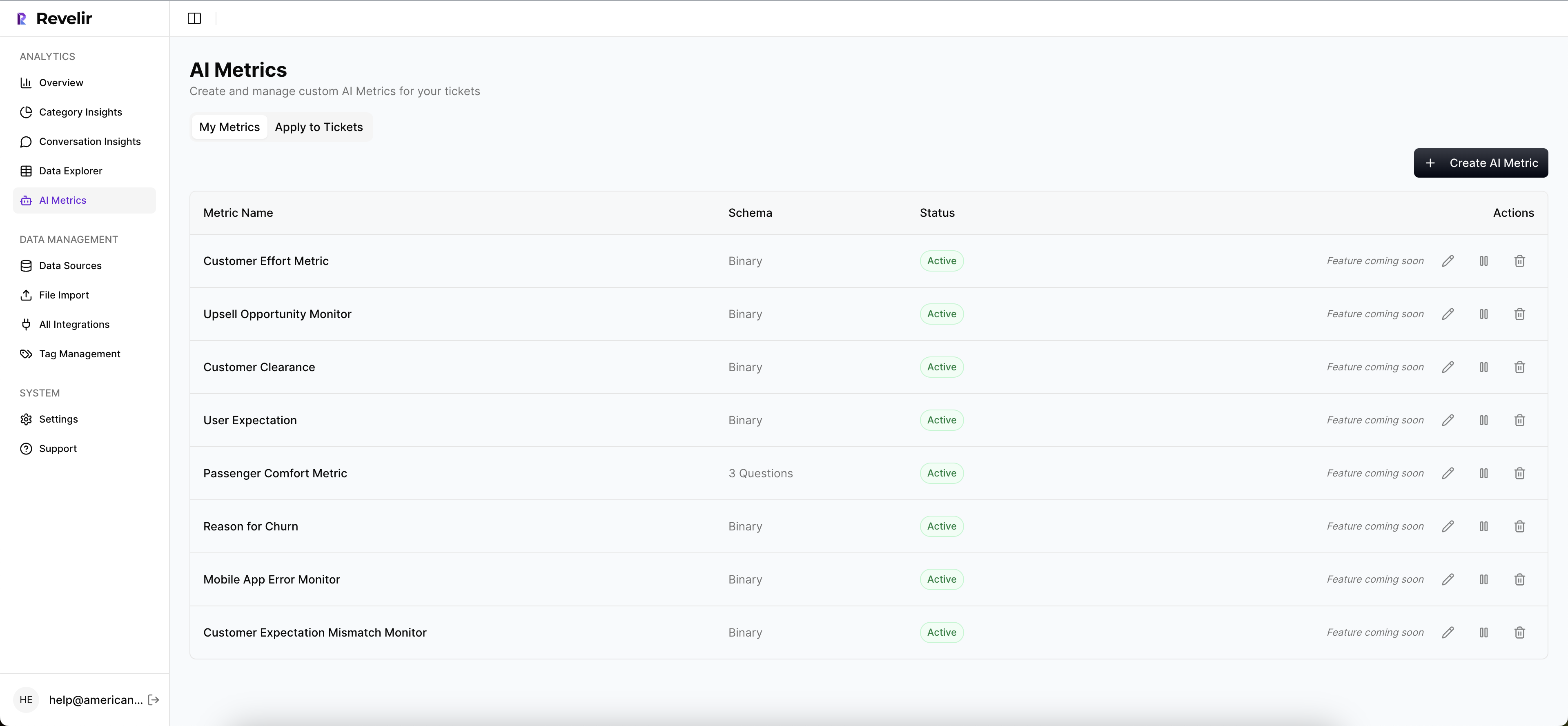
Can I customize metrics for my specific business needs?
Absolutely! Revelir AI allows you to create custom AI Metrics that align with your business language. You can define what matters most to your organization, such as 'Upsell Opportunity' or 'Reason for Churn'. Once you've set up these metrics, they will be applied consistently across your dataset. This customization helps ensure that the insights you gain are relevant and actionable for your specific context.
When should I validate insights with conversation examples?
You should validate insights with conversation examples whenever you notice significant trends or anomalies in your data. For instance, if you see a spike in negative sentiment related to billing, click into the Conversation Insights to review specific tickets. This step is crucial to ensure that the patterns you observe align with actual customer experiences and to provide context for your findings to stakeholders.
Why does Revelir AI focus on 100% ticket processing?
Revelir AI focuses on 100% ticket processing to eliminate the biases and gaps that come from sampling. By analyzing every conversation, you capture all potential churn signals and customer frustrations that might otherwise be missed. This approach ensures that your insights are comprehensive and actionable, allowing you to make informed decisions based on complete data rather than estimates.